Line25 is reader supported. At no cost to you a commission from sponsors may be earned when a purchase is made via links on the site. Learn more
Making an attractive and user-friendly website is essential for any website, whether it’s an e-commerce website, a blog, or a law firm website. However, as a law firm website, your site design should be designed in such a manner that your users can use it with the utmost ease.
A law firm must convey the right message to the users. A good law site has effective designs so that it sets it apart from others. A good site focuses on the speed of the site, high-value customer, excellent theme, and one where users can quickly get what they want. Based on these conditions, we have shortlisted some of the best examples of law websites.
Following are the examples of some of the top law website designs:
1. Arnold & Itkin:

Arnold & Itkin LLP is a law website which looks attractive because of the images, fonts, and their color combination. Moreover, on their websites, you can quickly know who they are and what their mission is, and they have conveyed the right message through their site flow. They have shown testimonials through videos, which is excellent. Their site has an engaging call to action so that visitors can easily communicate with the users. Overall it provides a unique user experience, and one can smoothly go through their site.
2. West Coast Trial Lawyers:
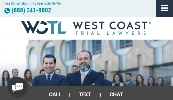
West Coast Trial Lawyers have everything on their website. The first look of the website is impressive as they have attached YouTube videos from at the top the website to know more about them, and putting video is a great idea. On the very first page, they have shown their achievements to attract the user. It’s a great way to create engagement. Further, they have put all the information about what they offer to their clients, what their strategy is, and what makes them unique. They have also put reviews of their clients through videos and included an engaging call to action. They have put their contact numbers almost everywhere on their site so that the user can easily get in touch with them. They also have an FAQ section on their site so that the queries can easily be solved. Overall, they have attractive images, videos. Users’ queries can easily be addressed; site navigation is excellent, their site is linked with other social media platforms also which is good for awareness of their site.
3. W3IP LAW:
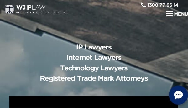
W3IP LAW is a Sydney based law firm their website has a very sophisticated look. They have also put a video where they have given brief about their work. Through that video, only the users can quickly get the idea about the firm. Users will easily get everything on one page as all the necessary information is available there. The site navigation, along with user experience is pleasant. They have also designed specific icons for various options on the website, which makes it look attractive.
4. YLAW Group:
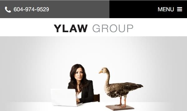
YLAW Group’s website looks creative as they have used Slide share. Through Slide share, they have given a brief about what they do. Moreover, they have shown their achievements, contact details, and linked their site with other social media platforms so that people get aware of their firm and can easily get in touch with them. They have used good quality of images and have excellent site navigation. They have also given information about their firm on the welcome page itself. They have highlighted their areas of working on the homepage along with other advantages that make them stand out.
5. Gecic Laws:
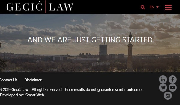
The look of this website is different from others as the preview is impressive you can go through all the essential sections of the site by scrolling. The effects given to the scroll function is good enough. They have a great welcome video that can grab people’s attention easily. You can customize your search based on location. They have included essential sections such as practices, people, the firm, culture, insights, and more. Overall the site looks attractive and quite impressive and has a great user experience.
6. Miles & Stockbridge:

When you open this attorney site, they have kept a video regarding what their goal is and what their thoughts are regarding their work. So through this, it’s a good way to give information to your users about your firm’s thoughts. Moreover, they have shown the blogs they have written to create engagement and about the events so that people should know about the work they have done and where they stand in their community. You will also find useful sections like industry focus, lawyers, practices, cases, and more on the navigation bar. The floating navigation bar is a smart way to increase the user interface of the website.
7. Hodgsdon Russ:
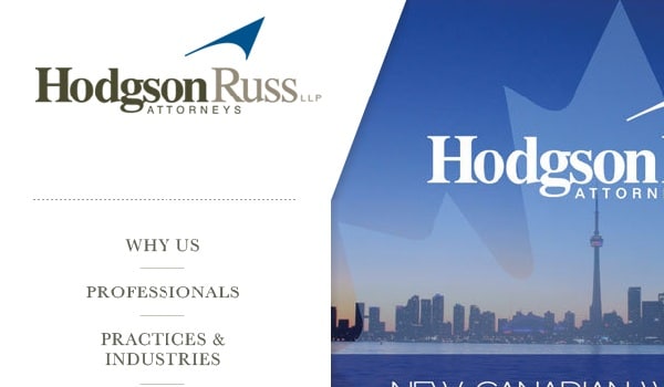
This law firm website has a very colorful yet stylish look as the coding is done in such a way that all the details regarding the firm are arranged systematically and look attractive because of its colors. The navigation bar is placed on the left side, which is not usually found on websites. They have also smartly incorporated previews of the sections on the navigation bar to provide brief information about each section to save users time. The site feels good, and the combination of fonts and colors is classy.
8. Oblon:
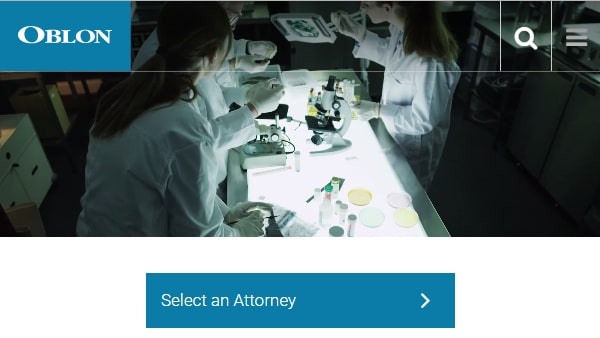
Oblon is a law firm with a site that has refined look. The firm news updates are given on the site so that users know about their work, information about their firm members, and how they work. You will find a video on the welcome page that looks attractive. If you place the cursor on different sections, you will get a preview of that section. This saves loading times and eliminates unnecessary jumps from one page to another.
9. Waldon Adelman Castilla Hiestand & Prout:
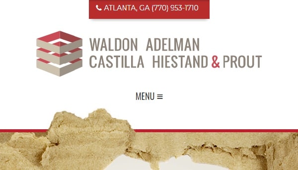
This lawyer website does something which is out of the box, as their website says this thing, their theme is different from others as this shows their firm’s thought about how they work. The site looks attractive, and they have different pages for the service, about us pages that generally every site has. You can also find the latest trial results and news on their homepage. The overall theme of the website is consistent on every page, which makes the site look connected.
10. GIVENS GIVENS SPARKS:
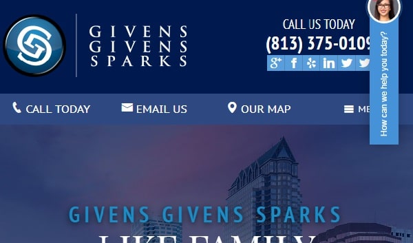
This attorney website has used a sophisticated color scheme. They have given all the necessary information about what they do. The call to action is well placed to grab the attention of people. They have a form page so that people can easily contact them. A plus point of this website is the live chat option for solving your queries. All the achievements and cases they have won are shown so that the user has a good image of the firm. They have also included their best results and additional benefits of choosing Givens Givens Sparks.
11. Quinn Emanuel Trail Lawyers:
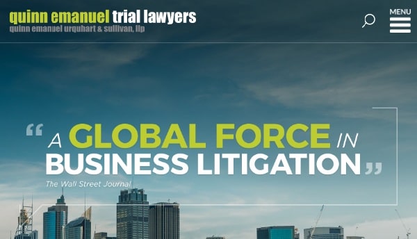
Quinn Emanuel Trail Lawyers has a great theme as the images in the background are of the famous beautiful places. They have a page regarding the firm news so that users get regular updates. They have shown all the details in numbers regarding the achievements and details regarding the locations of their offices. They have smartly used a world map to highlight their work locations. You can also search for lawyers by the attorney’s name that is placed in the middle of the page to grab the user’s attention.
12. Horea Crisan Lawyer:
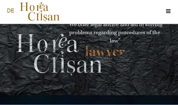
The effect and look of this lawyer site are different from other websites. The theme is very sophisticated, and it gives the website a clean look. The site provides all the information about what their aim is and how they can help their users. They have also given importance to the location of their firm and contact details so that the users can contact them easily. They have used scroll function in an effective way which is not found on regular websites.
13. Bhatt Law Group:

The Bhatt Law Group has a fantastic website design. They have a set a color combination of orange and black which looks good on their website. Also, all the calls to actions are correctly placed and all the details regarding their lawyers, services are given in-depth so that people can easily get what they want. They have also shown their achievements and to get in touch with their clients, they have put the information about the languages they speak. So that they get more familiar with their clients. Overall it’s a great law firm website. It provides all the details regarding their firm, and the website site flow is also exceptional.
14. Weinberg Wheeler Hudgins, Gunn & Dial:
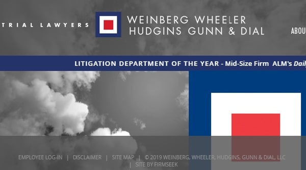
This law firm site has different attractive images and has different types of pages like about the firm, and career. Moreover, there are options like news and events. They have shown the achievements, information about their services and the locations of the offices. This one of the few websites which has used the double navigation bar persuasively and attractively. However, they can improve their website by adding more to their homepage.
15. Robbins Firm:
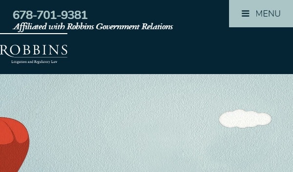
Robbins firm is a law firm where they have created a standard look of how a law website should look. Through slide share, they have conveyed their way of working and how it’s going to help their clients. They have provided pages like raves results and contact details. They have shared about their working style and what benefits they will get if someone hires them. They have also included original photos of their staff and office to make the users feel comfortable.
16. Parris:

The website has some excellent pictures, and they have shown their achievements in numbers, as numbers never lie. They have demonstrated their cases through images and in-text also. In their site, they have put information about their areas of practice. On the website, they have also shown the awards to build the trust of the user that they are excellent in doing their work. They have put a call to action on the beginning and at the end of the site and also have chat boxes to have a conversation.
17. Tremain Artaza:
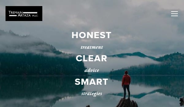
Tremain Artaza provides a classy and decent website where they give information about how they work and how they strategize things. On their website, they also provide different web pages like FAQ’s, practice areas, and contact details. They have also shown the awards and reorganizations to impress their clients and to create a good image of the firm. The site is well designed, along with being mobile friendly and responsive.
18. Bighorn Law:
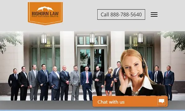
They have included an original photo as the welcome image, which makes the site look familiar and friendly. This firm’s website has details regarding their team, their practice areas, different locations where their offices are located, information about their firm’s attorneys and the work they have done till now. They have used a call to action like contact now and chat boxes to connect with people.
19. BD&P:
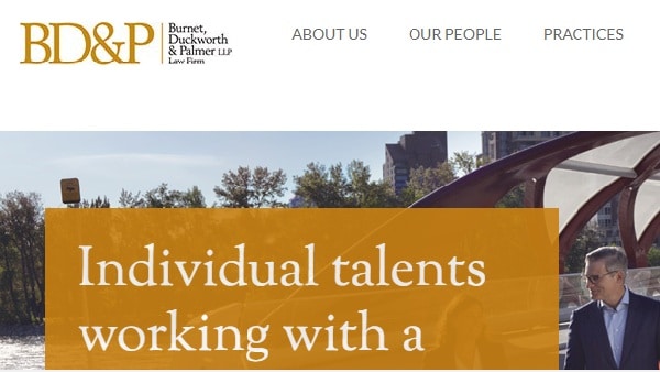
BD&P is a law firm that has a very classic theme. They provide information regarding the people, their area of practices, news events, and their publications. They have linked their sites with other social media platforms like Twitter, LinkedIn. You can also search for lawyers based on practice area and name, which is a handy feature, especially for large firms like BD&P.
20. Turks legal:
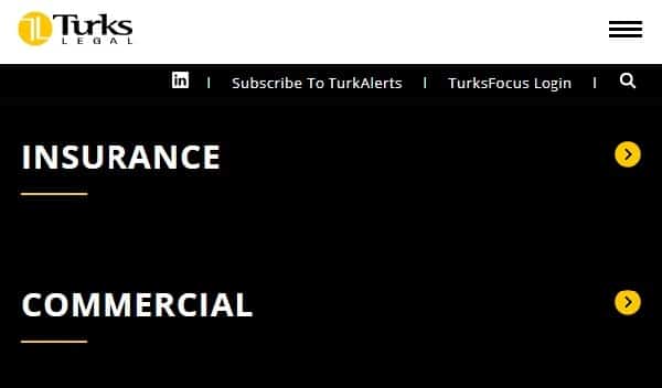
Turks legal’s website clearly shows what they do and in which field they are best at. On their website, they have given detail about their work, events, services, about their team, news, contact details, career, so that the user gets to know everything about their firm. However, they could use a brief introduction to all the services on the homepage to inform users about their services.
When creating a website for an attorney or a law firm, you should design your website taking inspiration from these examples and not make the mistakes they’ve made. Also, make sure you make the lawyer website mobile friendly to target more users. You should also check the speed of the website to make sure you don’t test the user’s patience.
Which of these attorney website design examples were your favorite? Which lawyer website design examples did you dislike?