Line25 is reader supported. At no cost to you a commission from sponsors may be earned when a purchase is made via links on the site. Learn more
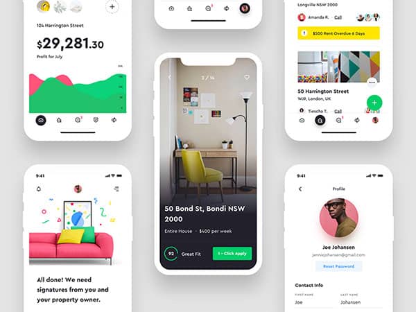
When using a mobile device, users want their experience to be efficient and intuitive. As designers, it is important to understand how to work dynamically in order to create increasingly effective user interfaces.
This will help us to create positive user experiences and keep us moving forward as designers.
We know that fast and efficient mobile phone use is entirely possible. People often check mail when walking down the street, crossing roads or even while rushing through a shopping centre or airport.
This is because the UI for downloading mail has been streamlined to the point that it is fast and effective to use. As a result, we feel completely comfortable with the process.
As technology advances, mobile phones become more and more popular. Users often prefer to use mobile applications because they are so quick and efficient.
Even in gaming, people prefer playing multiplayer games on their mobile phones instead of consoles or computers.
Information can be accessed at the touch of a button. Technology is advancing so rapidly that it no longer makes sense to users to feel slowed down by an inefficient process.
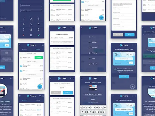
Not every application can work as efficiently as a mobile interface. Things look way different when we’re talking about mobile apps, compared to web application development, for example.
There are times when speed will be sacrificed because a user needs to be shown what to do.
Sometimes users will have to focus on a task, fill out a form or download a large document. However, getting the balance right is the skill of a great designer.
As a designer, how do you create the balance between speed and efficiency? How do you keep momentum while ensuring usability?
This article explores the different areas or contexts of mobile design. It will provide insight into when to speed up or slow down an application in order to ensure user efficiency.
We will discuss when to create friction in order to slow down a design, and when to be innovative and ensure your user achieves momentum.
Challenges
Mobile devices can be difficult to design. They have limited space and this is often frustrating for viewers. When viewers use the device they do so because of its simplicity.
They are able to use an application while going for coffee or waiting for an appointment.
However, users do not simply want efficiency. They often want great information which excited and inspires them.
In addition to user needs, technology is constantly changing. Phones are continually changing in size and wearable technology is becoming increasingly more popular.
Designers need to be dynamic to keep applications technologically advances and usable no matter the screen size or level of user skill.
Creating friction in mobile design
Friction slows down mobile app users so that the interface is easy to understand. Although it is commonly believed that an application should work as quickly as possible in order to enhance user experience.
However, a certain level of friction is necessary so that a user may understand the application. By consciously creating friction, a designer can manage the way an application flows.
As designers, the goal is to find the balance of slowing the user down without limiting progress.
In order to create a balance between speed and efficiency, the time a user spends engaging with your user interface should be proportional to the end results.
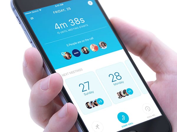
If a user engages in often used tasks such as receiving mail or downloading a song, the number of interactions between a viewer and their task should be low.
However, with larger, more important tasks such as making a bank payment, it is crucial that the viewer ensures that payment will be going to the right person and no mistakes are being made. In this regard, it is often helpful to slow a viewer down.
As designers, it is often helpful to see User Interface friction as existing on a pole or continuum. On one side, there is the UI which is designed for frequent use.
Users value speed and efficiency because they are aware of exactly what they must do on these apps, and how to do it. All extra elements have been stripped away and efficiency is key.
On the other side of the continuum is the application which seeks to assist the user use the application to achieve correct results.
Speed is not considered to be important. Instead, the user is given a lot of information. This helps to create understanding. These tasks often take longer.
However, the extra steps are necessary to achieve the correct results. Filling in a tax form or loan application would need clear instructions rather than a speedy process. Clients can feel lost or uncertain without clear instructions.
When you’re creating a UI, you’re looking to find the perfect balance between speed and friction. Too much information will frustrate your viewer, but not enough will leave your viewer feeling lost.
As a general guideline, the less frequently a user interacts with an interface, the more friction will be needed.
When you’re creating a design, your user will often use it less frequently than an email application and more frequently than a tax form or legal document.
As a designer, you’ll need to work out how much friction you need to keep your application comprehensible while removing any unnecessary steps.
Your goal as a designer is to keep your application easy to use. Too many steps will frustrate your viewer. Not enough may cause them to give up on your application because it appears incomprehensible.
When working with your design, you’ll need to think carefully about where to add friction and where to remove it because it appears to be too much.
Some tips for designing mobile applications:
Look at your application from the customer’s perspective.
When you are able to see your app from the customer’s perspective, you’ll understand what it is being used for. When you understand your client’s goals, it will be easier to achieve them.
Does the app share information or is it used to make sales? How do you prevent clients from becoming lost? How much information do you require viewers to fill in, and which steps could be left out? Assessing this information will assist you with your goals.
Research your users
This will give you insight into where any struggles may lie. How could you improve your user experience? Why does the application exist and how can this benefit your clients? Can your users find their way around the site? Are they able to find a way to undo errors? What would make your user abandon the application?
Interviews, testing and analytics will give you the information you need to improve your user experience.
Creating a solid understanding of your user needs and experiences will help your application stand out from the competition.
Look at the core solutions and work on these
By focusing on the problems your application would need to resolve, you’ll be able to think it through. By focusing on the essentials that your application will need, you won’t get distracted.
Ensure the most crucial aspect of your design is well thought through so that your app will be accessible and easy to understand.
Kill off any extra features that you don’t actually need. Anything more than your core features should be given far less of a priority.
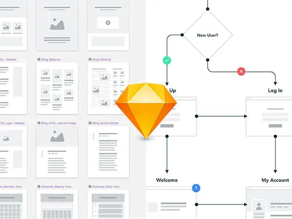
Create a sitemap
Understanding how your app will be structured is crucial. By creating a flowchart, you’ll be able to work out how your users will find their way around your app and find the information they need. Your goal is to make your application incredibly easy to understand.
Set out the goals for each page
Explore what you need to achieve with each page. What technology is needed to achieve this goal? Set out your call to action. How do these elements support business goals or core features?
Ask for feedback
As a designer, you might have blind spots. Ask your users to assist you with sharing any struggles you might be having.
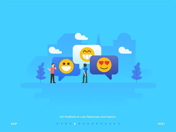
This will help you before you commit to your UI design. Your prototype should be a trial run where any faults in the design can be exposed quickly.
Design your user interface
Once your design has been laid out, it is time to focus on your style, layout, use of colour and animation.
This will assist you in sending out the correct message to your user. Your user interface will also keep your site consistent and easy to understand.
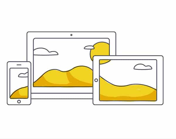
Consider devices, screens and mobile trends
When you’re designing an application, you know it will be used on mobile. However, screens and resolutions constantly change and evolve.
You’ll need to make your design accessible to people with very small screens, those with large fingers and those unfamiliar with mobile technology. At the same time, consider design trends.
If minimalism is currently trendy and would make your application feel modern and sophisticated, it is worth taking this into account.
Ask for feedback
Now that your application has been ‘formed’ it is a great time to ask for user feedback. Let your viewers show you where they struggle with your application. Ask them for insights into the aesthetics of your site.
Tip: keep the different elements of your design to a minimum. Too many colors, font styles or shapes can make your design feel cluttered. Consistency will help you to create order on your site.
Work with developers
Coders will assist you in developing your application. However, it always helps to remember that your developer will see your application from a different angle or perspective.

Communicate clearly with your developer. Ask for feedback and check that your designs are being carried out in the way you would most like.
Launch, receive feedback and rethink your design
Designing an application is often an iterative process. You’ll never get it right on the first attempt. Once you’ve launched your application, it is time to see how real users work with it.
Once your users engage with your app, it will be time to see how to repair the flaws and enhance those aspects your viewers love.
Helpful tips for designing your application
Keep your screen simple and focus on interactions
When you’re designing an application your most important goals is to ensure that your user knows what to do. Keep your page as clear as possible. This will prevent your user from becoming overwhelmed.
When you are designing your application, keep your site consistent. This will help your user feel familiar with designs. Keep your navigation buttons consistent and familiar. Your viewer should know what to do with each aspect of your site.
When designing your application, it is also helpful to explore the international standard apps. This will help you to explore how to optimize your screen use, keeping your users engaged.
Design with your user response in mind
Screen sizes are the greatest challenge when it comes to mobile design. Sizes vary and wearable devices are becoming more popular.
However, if you establish a persona for your user and work out behavioral patterns, you’ll be able to create a predictable set of actions.
This will help you to map out your application. By designing your application around your user experience, you’ll be able to create a positive user experience.
When you design an app, it should meet the needs of the intended audience. As a designer, you’ll be working on the ways your user responds to your app.
You’ll also want to encourage activities such as site conversions. Each aspect of your app is designed towards usability.
When designing your application, you can use color to assist your viewer with navigating your site or creating hierarchy and balance. Colour can even be used to send out an emotional message or help a viewer identity with a brand.
Consider the psychology of colour carefully when designing your application. Red, for example, can be attention-grabbing but should never be used as a call to action because it also represents danger. Orange would be a better option.
Create an easy outline for your content. This will keep your page well organized and structured.
Use branding as part of the design
When you’re creating a mobile app, you want clients to buy into the brand. A logo is very important because it gives a visual message of what you would like to portray.
The design or aesthetic of the site will also send out a message to your users. Would you like your site to appear trendy, sophisticated or traditional?
By creating a visual representation of the brand, a company’s message can be developed and shared via the mobile application.
Keep your UI familiar
When you want clients to use your application with ease, your goal is to create a UI that is both intuitive and efficient.
By drawing on familiar patterns or icons, you’ll help your user to feel familiar with your designs. This will help your site to feel usable.
Remember to centre your app design around its purpose. This means that if users will need to fill in a form, the fonts should be set wide enough apart and be easy to use. All actions such as gestures or swipes should be familiar to the user.
Deep any instructions to an absolute minimum and keep your language clear and precise. If you use animation to share a message with your user, do keep it brief. This will prevent you from cluttering your site.
Use a grid to design your application
When you’re working on a mobile application, your design will centre around a touchscreen. Using a grid assists with creating touchpoints for a mobile screen.
A grid will help you to separate the different aspects of your designs such as videos, text and colour in order to give a clear hierarchy to your designs.
Grids will keep your content orderly and your screen uncluttered.
When you design your app, you’ll need to keep your buttons spaced widely apart so that your users do not unwittingly tap the incorrect keys when creating a response.
Remember to balance your speed and friction times so that your user will have an application that responds appropriately.
Follow feedback. Explore your user experience and make change to your application so that your process can evoke the very best from your user.