Line25 is reader supported. At no cost to you a commission from sponsors may be earned when a purchase is made via links on the site. Learn more
You thought of the perfect app with the perfect name and appearance.
Well then, it is time to consider all the nitty-gritty details and to put sleeves up. Unfortunately, designing a mobile app is easier said than done, so you may start preparing for some long and challenging work.
So, which is the most important factor for the success of one app? Designers would choose UI and they would not be wrong-it is not rare for the overall impact to depend on the first impression.
1. Think of places where your app may be used
The fact that you are designing a mobile app doesn’t have to mean it is going to be used in every place and every occasion. You need to be particular about the places where users will access your app. Believe it or not; this can affect the way in which you design your app.
For example, if you designed a geo-location app which works with GPS, and it is meant to be used while walking, make sure that its basic functions are highly visible and easily accessible.
Likewise, if you have an app used for online purchase of products/services, include ‘buy’ or ‘delivery’ buttons, big enough not to be overlooked.
Apps meant to be used while sitting/travelling should focus on large, readable text; and facilitated scrolling.
2. Define your ultimate goals
A goal-orientated approach is the safest way towards mobile app success. Therefore, think about functionality and the purpose your app is going to serve.
Observe your users while they are accomplishing their tasks and make a list of the ultimate goals they might be pursuing.
Ask yourself what they are trying to achieve and make sure you provide enough functionality to take them there.
With time, you will ‘polish’ and improve your app, and you will select the most important goals. Your task then will be to provide the best possible features to serve those goals.
3. Design is all about clarity
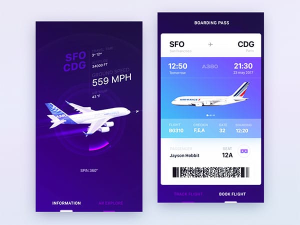
Be clear on your features, even if you think they are modest.
Your users need to be ‘on the same page’ and to have a precise overview of what they could or couldn’t do in your app. You certainly don’t want to raise some false expectations.
Here are some clarity tips:
Keep menus simple and readable, so that even novice users will understand what your app is about. For instance, include an icon for every particular function or add labels if really necessary.
Regardless of the message you’re trying to convey, remain brief and concise. This is especially important for usage guides or onboarding sessions.
4. Don’t overlook size
The fact that a single platform is being used on different devices with very diverse screens is not a guarantee that your app will be equally functional for all of them.
Screen size/resolution can differ even under the same brand.
What you need is an app with equally scalable graphics and UI elements, which will preserve consistency on all devices.
5. The ‘multi-user’ and the ‘multi-device’ cases are obligatory parts of your work
Take into consideration that a single user may use various devices, the same way as a device may be used by more than one user.
It is essential to create a registration process, where each user will have an account he/she could use on every device containing your application.
An additional advantage of creating accounts is that syncing between devices becomes much easier.
Also, make sure you create an easy to use register and login process. Many apps make it difficult to register. If it takes more than 1 minute, you’ve already lost a good percentage of potential users.
Some UX designers advise that you should leave certain parts of your app open to non-registered users. In this way, they can tell if they need your app or not.
6. The platform can make it or break it
Don’t be tempted by the pile of platforms on the web. Your task is to choose the best one (best ones) among them; and to be careful when transferring your app from one platform to another.
Think which is the most suitable platform for your app-you certainly don’t want your app to be dysfunctional because you displayed it on Meteor instead of React.
Make sure you’re using the best generic codes and source products for your type of app; and that they correspond to the platform you’re planning to use.
7. Use color to indicate purpose
Colors are either applied to indicate purpose, or ordered in a gradual manner to highlight importance.
Take black grayscale as an example: If you start with a black button and you make each following button slightly lighter, you’re sending the following message to your user: The most important is the first button, while each of the following is less and less important. The last one, obviously, is the least important one.
Don’t use different colors for each button and try to make a clear distinction between them and the background of your app’s pages. Additionally, think about the meaning of the colors you’re applying.
Users are very likely to avoid your orange ‘buy’ button, because the general perception about this color is that it creates urgency.
8. Label icons when you have to
Icon labeling may not be considered as the best idea for icons by some, but I’ve stumbled upon various icons in apps and dashboards and I didn’t know what they represented.
Instead of wasting the user’s time to discover what each one of those is doing, label them, so he can click directly where he needs to go.
You may want to follow Apple or Google which do that. Don’t perceive it as a a complication you don’t really need. They are creating user guidelines for a very good reason.
9. Design ergonomically
Touch and ergonomics are essential for modern mobile design, as almost all of the operations are done with tapping. Therefore, you should focus your design on ergonomics.
Take yourself as an example. Think how you hold a phone and the exact part where your thumb is positioned.
Think about your logical perceptions on the menu’s location or the items you expect to find on the bottom/top of the screen. Outstanding apps already pushed intuitive touch layouts forward and your task is to follow them.
10. Give feedback at every moment and on every occasion
It somehow comes naturally. Users are used to the ‘action-reaction’ process and they expect their devices to respond fast for an effective interaction. Due to many reasons, this is not always the case, but it is certainly the biggest drawback from using a newly introduced app.
Don’t know how to achieve that? You’re afraid it’s going to be time-consuming? Well, proper interactions take time and you have to learn at least how to fake them.
The general rule is: provide feedback for every interaction! Thanks to cute animations and short, inspiring messages, users will understand they performed well and that their actions actually mattered. As a result, they will be satisfied and they will continue using the app.
Think about few real time examples: you push a button, and it obtains a certain form. You push it back, and the form changes. This should exist in mobile design too!
You need visual cues and moving symbols. When a user taps on an item, the item should glow, bounce, slide, or change colors-whatever it takes to convince the user that his attempt was successful.
This approach can ‘buy’ some time for the system to analyze the interaction, without the user noticing it. It is exactly ‘behind the curtains’ where most of interaction design takes place.
Ending thoughts
Summing up, which are the essential tips to remember from now on?
We would advise you to keep things simple from the beginning; and to follow basic guidelines from proven design players (Android and IOS).
