Line25 is reader supported. At no cost to you a commission from sponsors may be earned when a purchase is made via links on the site. Learn more
Posters are an essential part of advertising an upcoming event; Whether it’s an upcoming film, an album debut, or an inauguration party, you will need a beautiful poster to attract people’s attention. A great poster must make a good impression and must have a strong impact on the viewer. If you’re working on designing a unique poster, we’re sending some inspiration your way!
There are a variety of techniques that you can use in order to enhance your poster design. You can mix colors, distort shapes, change background textures, and use cool typography (this one is very important!) in order to achieve one-of-a-kind results. There are also certain rules that are important to follow depending on the type of poster that you’re working on. Although some posters can simply feature a big visual, most try to communicate something specific to the viewer, and they must accomplish this in a certain way.
If you’re trying to advertise an event, make sure you follow the correct order (as you can see in the examples we have provided). Your poster must have a headline – what’s the name of the event? Second, it must answer the what, when, and where – provide simple and clear information about the type of event, the location, and the time. Lastly, you’ll want to include the fine print – the additional information that the viewer might want to know when deciding whether or not they are interested in your event. The way you organize this information is entirely up to you, as long as there’s no ambiguity and everything is presented in a clear, neat manner.
In this article, we’re featuring 40 poster design projects with unique concepts that truly make an impact. We collected some of the most interesting and surprising poster examples that we could find, and we hope that they will generate lots of new ideas. Take a look and hopefully, you’ll discover some new techniques that will surprise you and that will inspire you to create something new and distinctive. And don’t forget to let us know what you think in the comment section below!
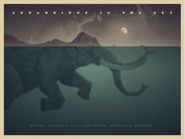
Explosions in the Sky
This creative poster is a 24″ x 18″ two color print screen print on 80 lb. French Speckletone “Sand”. It is also available in an art print version without the text.
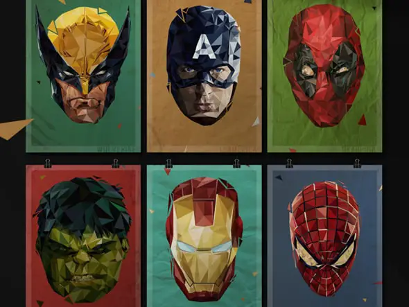
Polygon Marvel Heroes
Here are some unique Marvel superheroes illustration designs, for posters, t-shirts and advertising use.
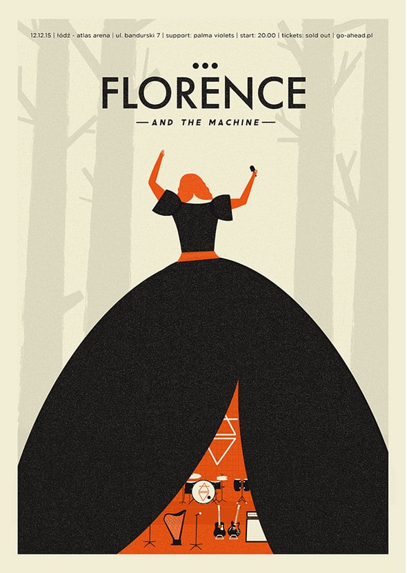
Florence and the Machine
This is a selection of gig posters & Sony music promo poster. Check out the link above to see the whole collection. This Florence and the Machine poster is just one of the many.
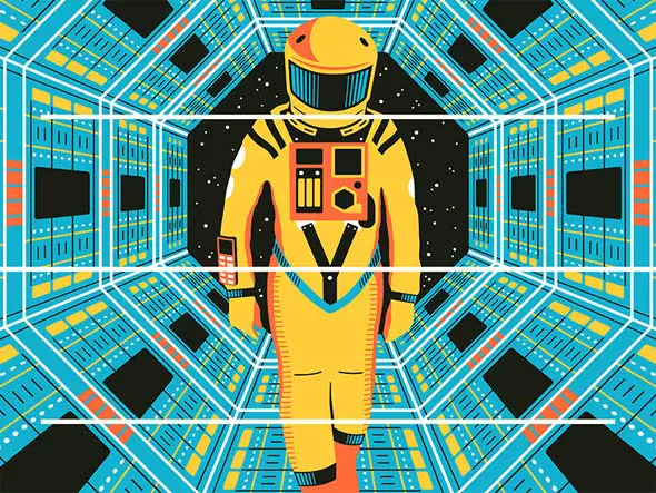
A Space Odyssey
This poster was created for Gallery1988′s annual Crazy 4 Cult show, as a tribute to Kubrick’s timeless space epic. It’s 18″ x 24″, comes as a 4-color silkscreen print , signed & numbered in a limited edition of 50.
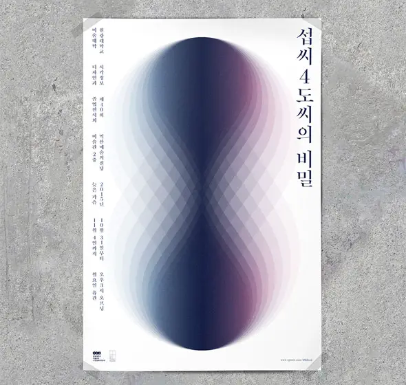
The Secret of 4°C
This project is called “The Secret of 4°C – Graduation Exhibition in Major Visual Communication Design, Wonkwang University, 2015”. The designer tried to represent a state of water in marvelous 4°C by using the shape and gradation of a dewdrop.
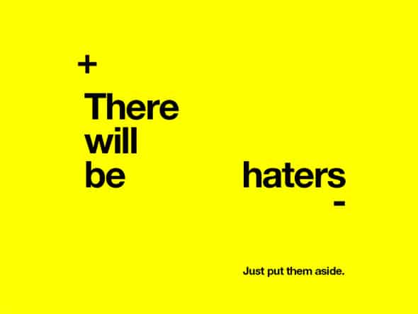
There Will Be Haters
This minimalist poster is part of a side project at the designer is currently working on at Studio-JQ. This is a visual campaign which will give designers a true insight and help prepare them for the tough world which lies in front of them.
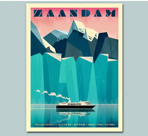
Glacier Bay Alaska
This is part of a travel poster series created by the designer and it is aimed to touch on every major trip he’s been on.
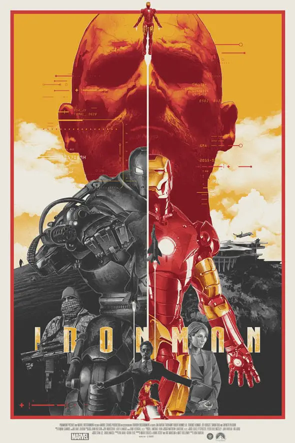
Iron Man
This is a selection of screen printed posters made for various clients between 2014 – 2015. This poster is “Iron Man” Regular Edition / 24 x 36″ / 6 colours.
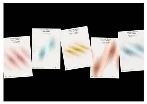
Transient Series
Transient Senses is a creative project made of different formats, such as a sound installation, video projections, audio and text, interactions, and more.
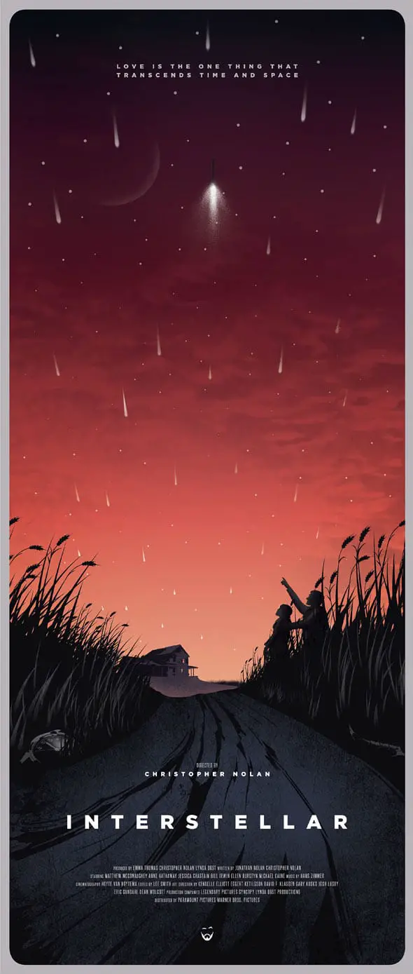
Interstellar
This is a set of movie posters. The one below is an Interstellar poster. Check out both of them in the link above.
Nice Poster
This is a poster featured in JCDecaux and CR campaign across the UK. Check out also the video animation in the link above!
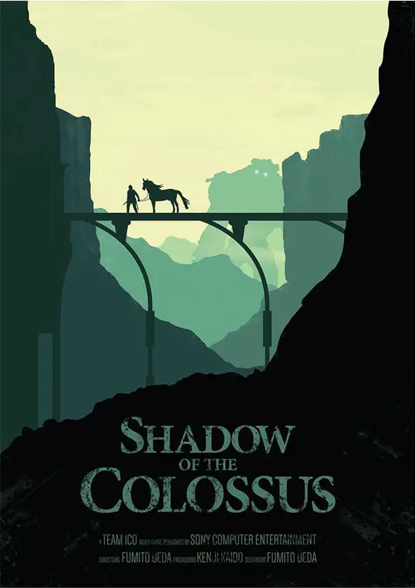
Shadow of the Colossus
This awesome Colossus series was designed by Conor Smyth. Check out the complete collection in the link above and be amazed!
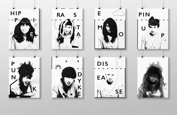
Cut
This posters project has a very interesting concept. It illustrates the prejudices that appear when we see a person’s haircut and when we feel like we already know him/her just based on the looks.
More than Men
If you’re a Marvel comics fan, check out these inspiring posters with a vintage touch. You’ll love them! It’s called More Than Men and it’s all about superheroes.
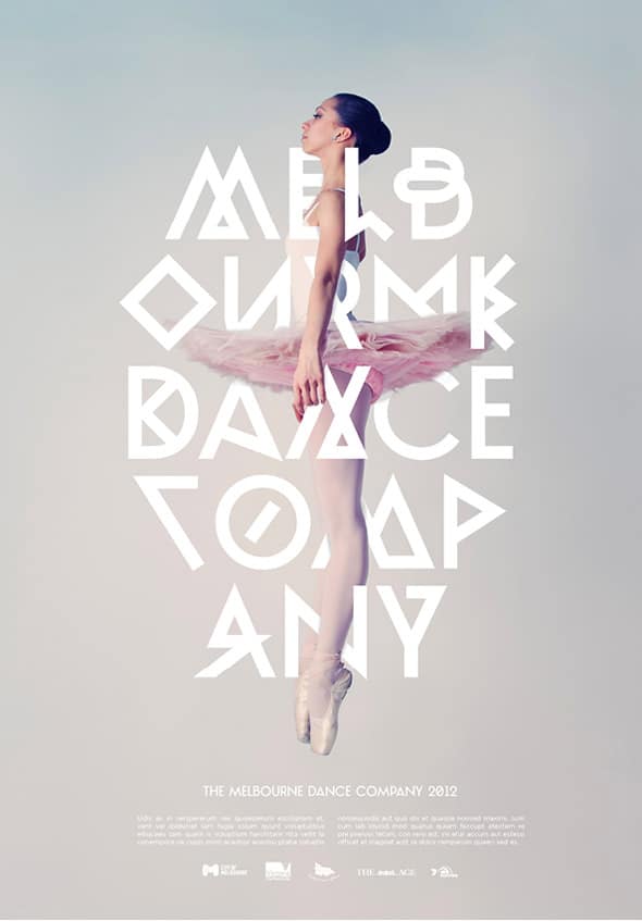
Melbourne Dance Company
This is a lovely poster created for the Melbourne Dance Company, a company which houses multiple and varying dance styles and programs and can cater for all your dance needs.
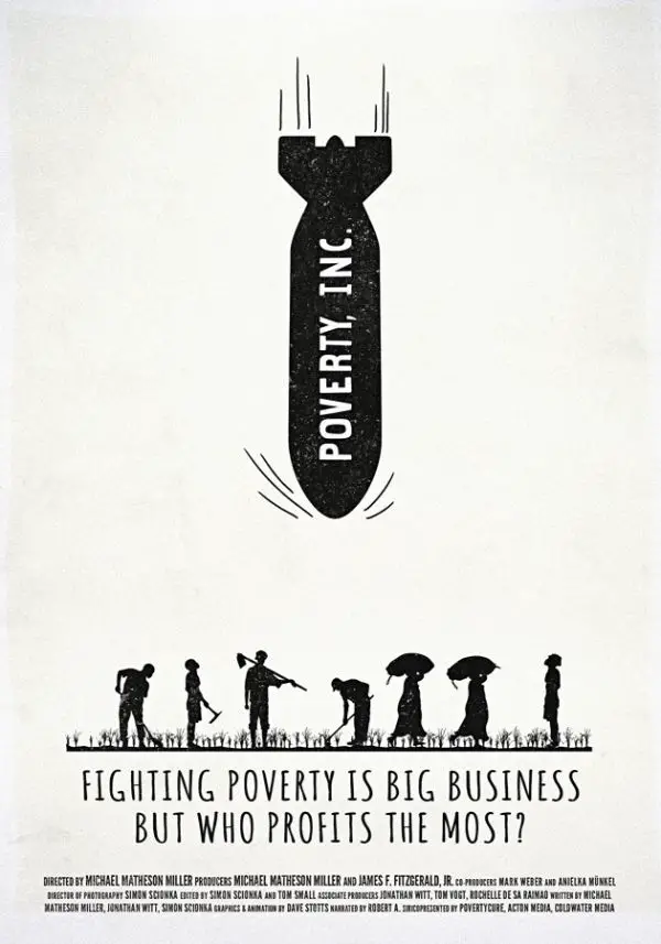
Poverty, Inc.
If you’re a minimalist design fan, you’ll be intrigued by this poster! It has some amazing details which will surely inspire you.
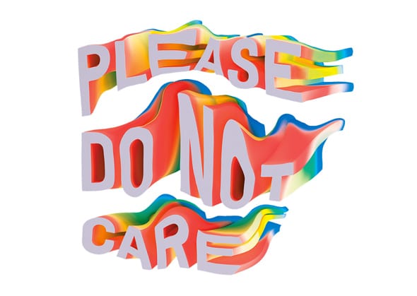
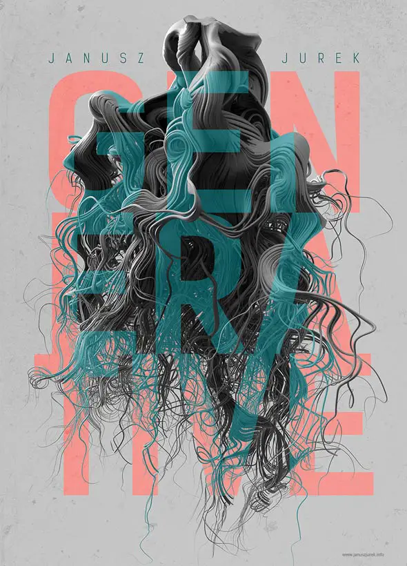
Generative
This incredible poster design was created by Janusz Jure. It combines 3D imagery with large typography, overlays and more.
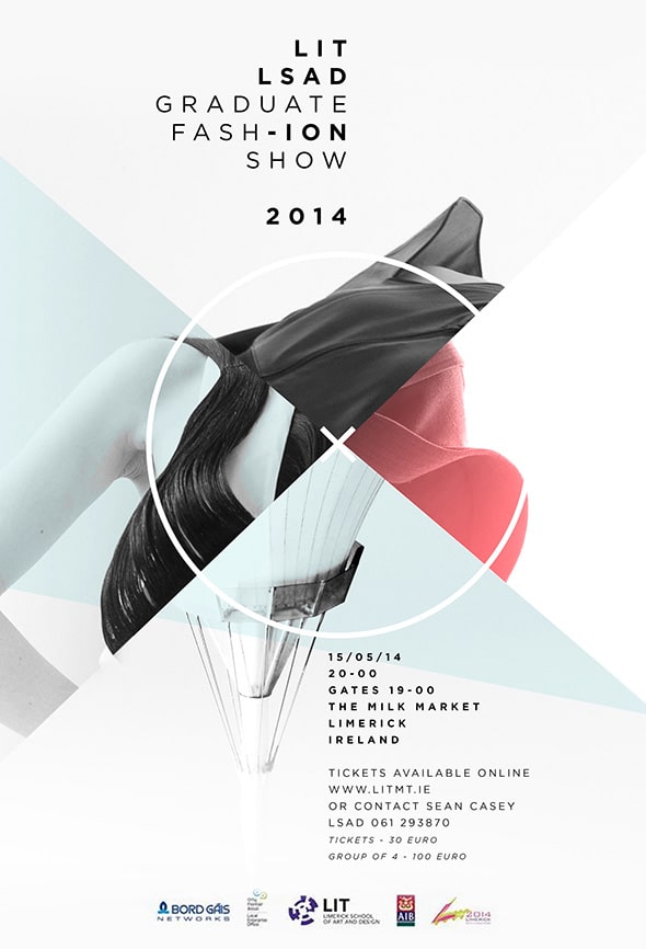
LIT LSAD
This poster design project encompasses four important aspects relating to the Fashion Course at LSAD – Location, Individuality, Character, Form.
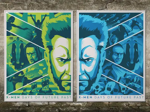
X-men: Days of Future Past
The designer had a blast designing these X-Men Days of Future Past posters. Check out all of them in the link above.
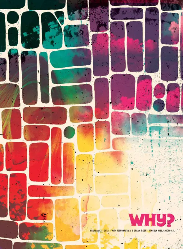
Why
This is a music band poster for Why? and their upcoming Chicago show. The concept is based on the idea of a prism and the colors of light.
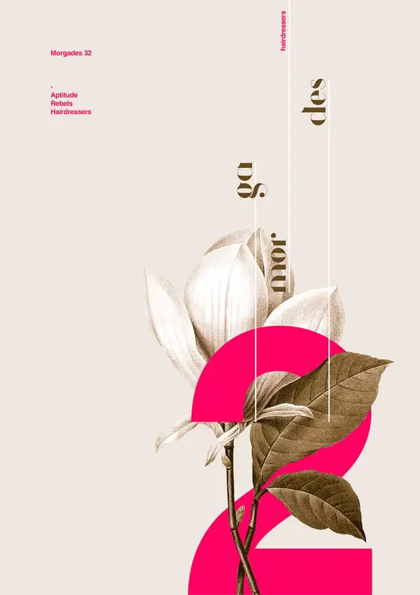
Hairdressers
These posters were created by Xavier Esclusa Trias and Twopots Design Studio. We love the details, colors, typography, and all the other elements.
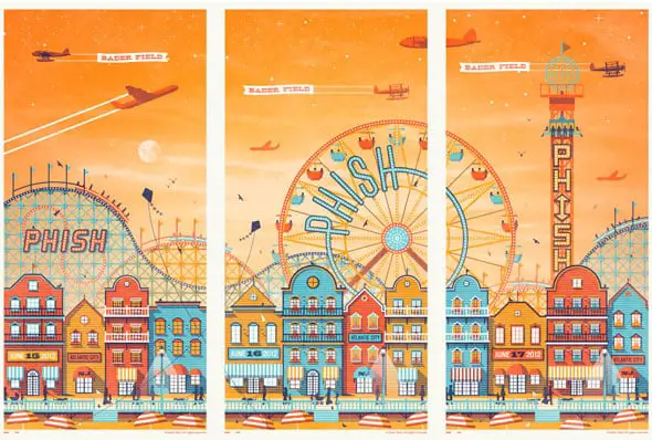
Phish Atlantic City
These are the posters designs created by the designer for Phish’s three-night concert series in Atlantic City, NJ.
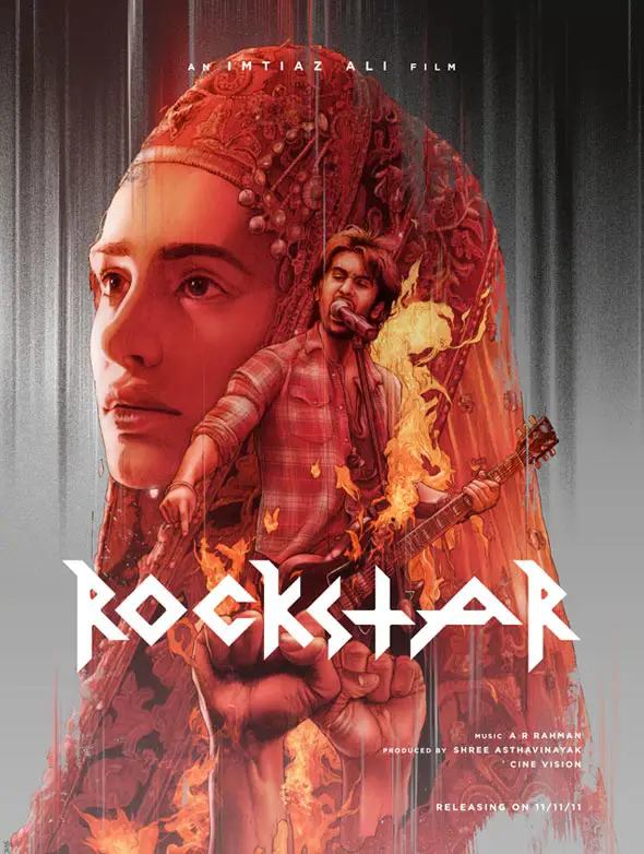
Rockstar
In this project, you can see the originals that were modified in the end, while the official website showcases the finals. Make sure you visit that one too to see the complete project.
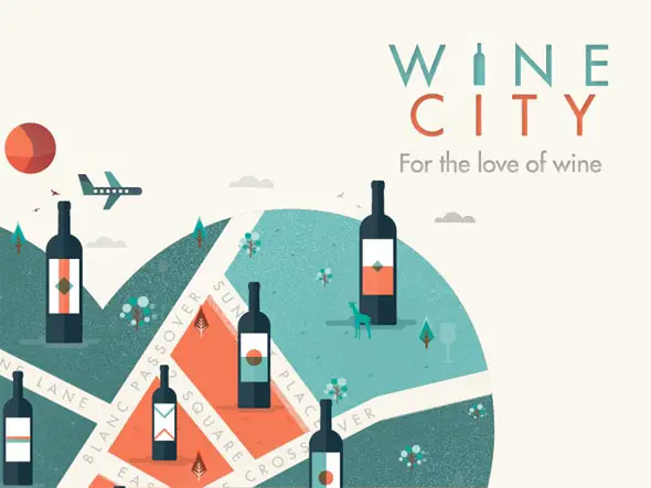
Wine City
This project is called WINE CITY // For the love of wine and has some really beautiful illustrations that follow the flat design trend.
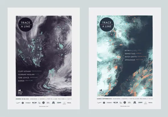
Trace a Line
This project is a series of hand-drawn posters created for the 2014-2015 season’s events organized for the French cultural webzine Trace A Line.
Baby To Be
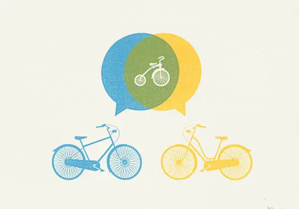
This poster was designed as a celebration for the designer’s first baby. This poster is now reprinted with new colors.
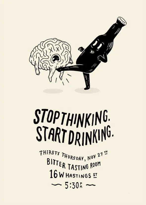
Stop Thinking Start Drinking
These are some really awesome and fun illustrations! Prints & T-shirts are also available for purchasing.
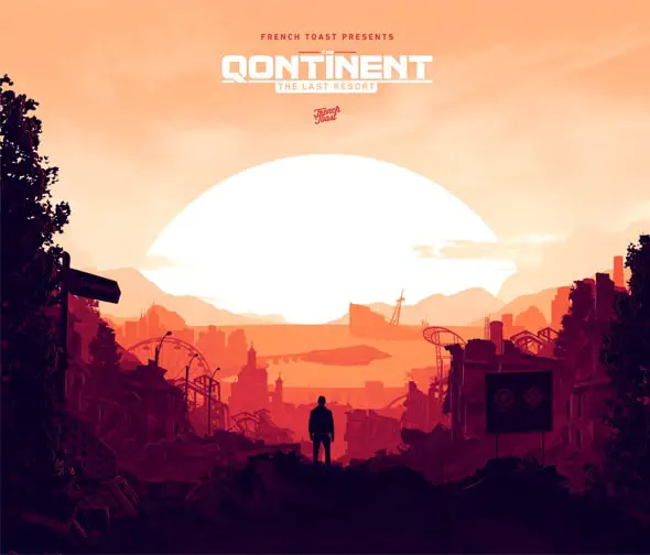
The Qontinent
The Qontinent is a hard dance outdoor festival taking place in Belgium and this poster was made for the theme the festival had, called The Last Resort. The concept is to balance between a post-apocalyptic feeling and a sunny & warm atmosphere.
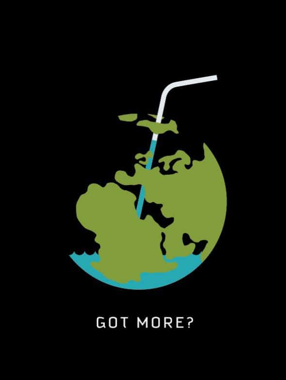
Got More?
Check out these gorgeous illustrative works in the link above. They will surely give you the much-needed poster design inspiration.
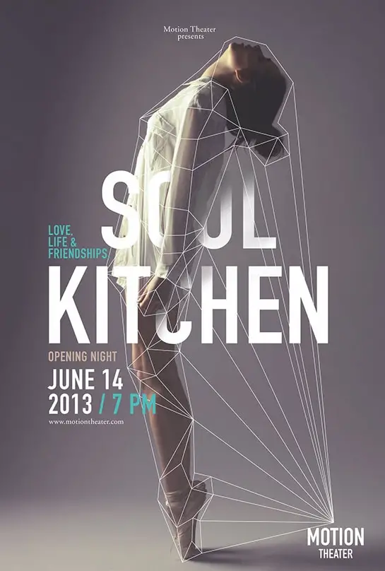
The Motion Theater
The concept behind this work is the development of a dance theater company. The design incorporates attributes such as dynamics, elegance and sensuality, which often define dancing.
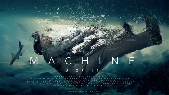
Machine
The concept behind this movie poster was to capture the state of mind of the viewer and main character, as well as the overall feel of a film in one scene image.
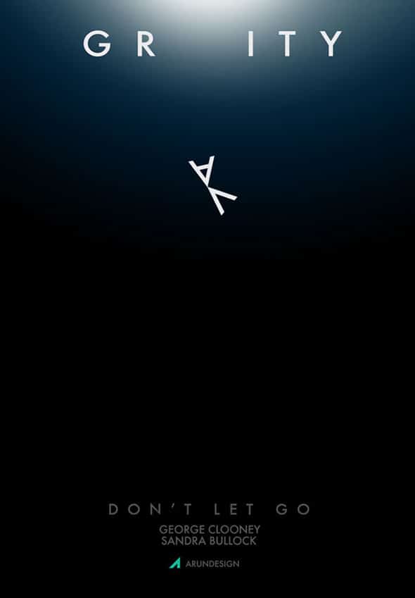
Gravity
This is an ultra-minimalist, fan-made movie poster for Gravity, which the designer dedicates to the director Alfonso Cuarón, actors George Clooney and Sandra Bullock and kickass VFX team for the outstanding work.
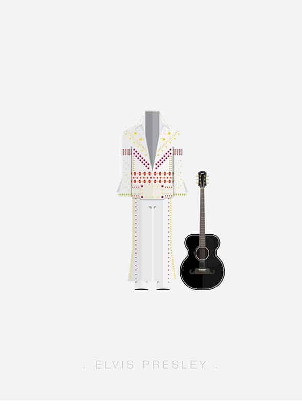
Elvis Presley
Are you a music fan? Then you’ll love this set of posters! This Elvis Presley poster is just one of the many posters created for this project. Be sure you’ll see them all!
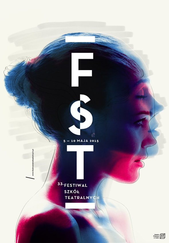
FST
These awesome FST posters were created by designer Krzysztof Iwanski. We love the colors, technique and all the details.
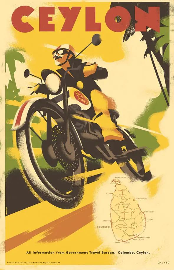
Ceylon
Created by designer Mads Berg, these awesome posters have a unique illustration style and a vintage touch.
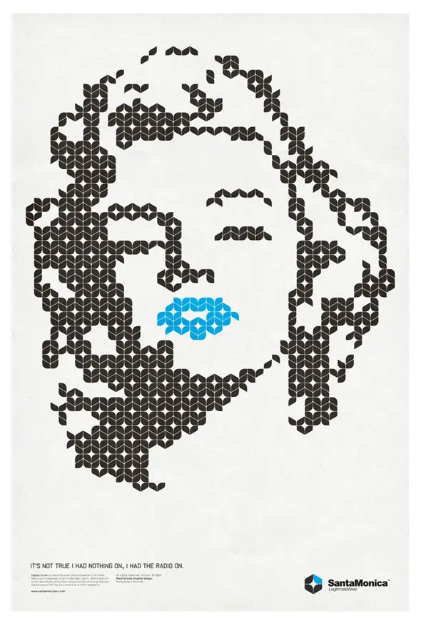
Star Grid Marilyn
If you love incorporating geometry into your posters, then you’ll love this awesome series! All the posters are made of smaller geometric elements, creating patterns and shapes.
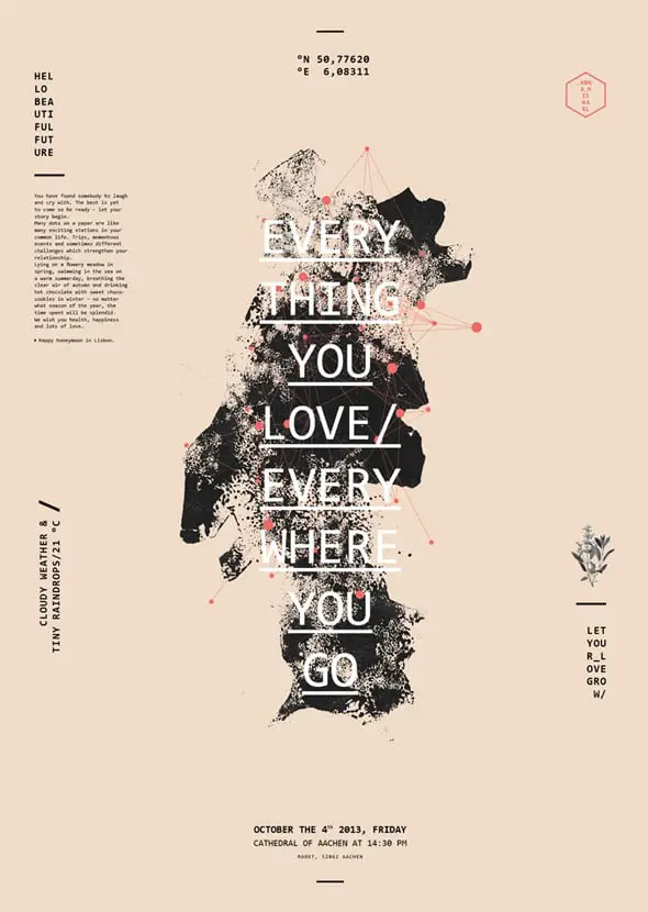
Everything You Love
This poster shows various facts about a wedding. It’s a bit abstract and nondescript but was created to be a lovely memory of a beautiful day.
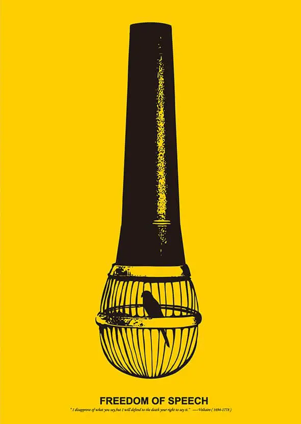
Freedom of Speech
This poster design was created for Shu-Te University, Kaohsiung City by the Shu-Te University, Department of Visual Communication Design, Kaohsiung City.
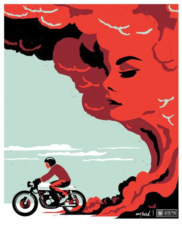
The Road Beckons
This is a poster called “The Road Beckons” made for an Oil & Ink Motorbike Print Expo at Deus Ex Machina, Venice.
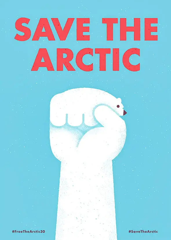
Save the Arctic
This poster is part of the Greenpeace “Save The Arctic” campaign and has the purpose of raising the awareness on this big problem.

Great poster concepts and design. Please, would you mind sending me the list of different types of poster lay-out?
LOVE the Interstellar Poster! Classic!
Looks very interesting. I suppose every image has some hidden meaning in it.