Line25 is reader supported. At no cost to you a commission from sponsors may be earned when a purchase is made via links on the site. Learn more
Take a look at these beautiful and unique patterns and texture designs for some creative inspiration! These great patterns and textures can be applied to almost any domain, from architecture and interior design to web, prints, fashion, and more.
Texture is an element of design that can create realism. This element is important because it can bring interest to an image. Adding texture to a composition brings it to a whole new level. Whether it is a soft, wispy texture, or a rough bumpy texture, adding it will surely bring a design to life. Remember that in most designs, texture is an illusion, using forms to create a more realistic-looking texture, but it can also be a tangible texture as in traditional art.

The foundation of all textures and patterns shapes, line being one of the most basic, but most important elements of shapes and thus, design. The line may seem simple, but there are plenty of different variations: thick, thin, long, short, curved, or straight. In most effective designs, lines are varied to create interest. They can even create emotion. For example, a curved line evokes peace and serenity, whereas straight lines evoke feelings of order and stability. The line, which can be used very obviously, or subtly, is used to create movement, directing the viewer’s eye.
Shapes are created by connecting lines. In design, there are two types of shapes: organic shapes and geometric shapes. Organic shapes are usually more free-flowing and curved – based on the forms found in nature such as flowers, animals, and even human beings. Geometric shapes are precise; often used to create man-made structures and objects. From a pencil to a skyscraper, you will likely be using geometric shapes. These shapes can be used in combination to create interest in a design.
These patterns and textures designs are both modern and vintage. You will find patchwork-styled patterns, geometry shapes, colored fabric patterns, tiles, wallpapers, unique and artsy textures, funny and smart prints, and more.
Also, the pattern and texture designs in this list are both monochromatic and colored. They go from really simple, but interesting patterns, to complex, artistic ones.
These patterns and textures designs can inspire you to create cool website backgrounds, awesome prints, logos, vectors, backgrounds, and any other types of designs.
Enjoy!
Original retro wallpaper & vinyl wallcovering from the sixties & seventies
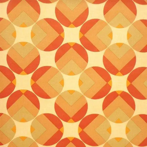
This texture is similar to retro wall coverings from the sixties and seventies and it can be a great asset to a designer’s collection. It uses orange tones and geometrical details.
Orchard 01 fabric
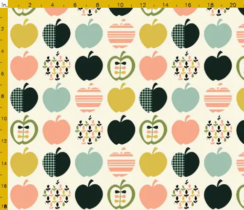
The Orchard 01 fabric looks friendly and nice and it would look perfect in all sorts of projects. The colors this pattern uses form a friendly palette that can also be used in a flat design, for example.
Tiles
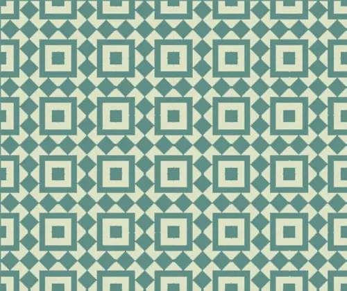
When thinking about rhythm in design, you can refer back to what you know about rhythm in music. A song with a good rhythm is one that has a repetitious pattern that provides a sense of expectancy, though, throughout most songs, there is variation so that it does not get monotonous. The same is said for rhythm in art and design. If you’re a fan of tiles textures and repetitive patterns, you’ve come to the right place. This pattern is made of blue tiles and simple repetitive shapes.
Ahoy by Lorena Disseny
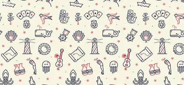
Do not confuse rhythm with repetition or pattern. They can work harmoniously together, but they are separate ideas. Rhythm is when you can expect various elements, but they are not uniform or repeated. Instead, they are varied. Rhythm is most often used in design to create a flow or movement in a composition. Take this pattern for example! It is called Ahoy and was designed by Lorena Disseny. It uses several sea motifs such are the octopus and the whale.
iPhone Wallpaper
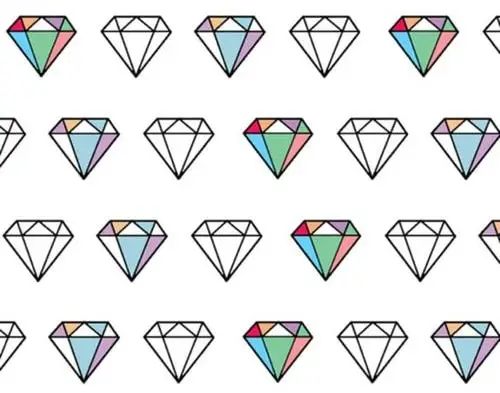
The best way to describe rhythm is to dissect it in composition. As you can see in this example, there is a certain rhythm. This is a diamond icon wallpaper that can be integrated into all sorts of creative projects, even interior design ones, why not!
Pasariños by Gustavo Pergoli
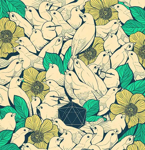
This is a retro pattern designed by Gustavo Pergoli. It looks elegant and the colors are well chosen. The artist used birds and flowers in this pattern design and didn’t exaggerate with black details, making this pattern look really great. There are many ways to create an emphasis in a piece, and many times you can combine these ideas to make a piece of a composition stand out more. See how this pattern was created, for example.
Alchemy by Anton Repponen
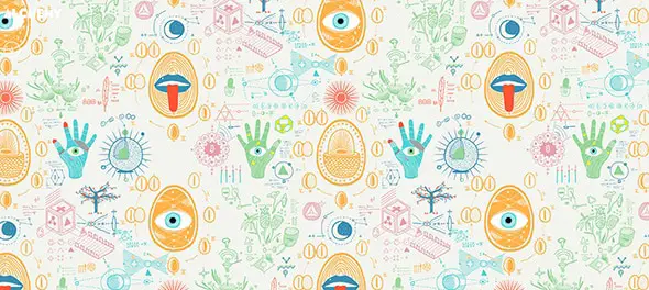
Alchemy, designed by Anton Repponen is a great example of letting your imagination flow for creating a really nice and eye-catching pattern. This pattern uses repeating hand-drawn elements and a large palette of colors.
Geometrica by Guy Moorhouse
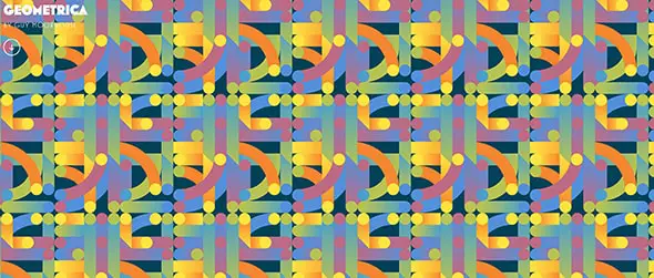
Geometrica, designed by Guy Moorhouse is also made out of repetitive simple colorful shapes. The designer mixed shapes and colors in a creative way and the result is definitely unique and worth following for future projects.
Patterns – Debbie Powell
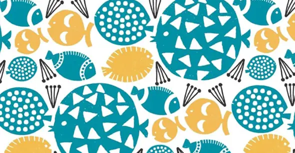
This is one of Debbie Powell’s pattern designs. You see more of her work on her portfolio website. Her projects are colorful and the patterns she creates can definitely grab people’s attention.
Woodland Prints – Sophie Brabbins
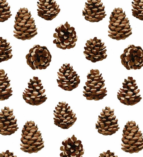
Woodland prints by Sophie Brabbins can make the perfect wallpaper for your room. This pattern contains wood pines in different views.
Sky and Water II – M.C. Escher
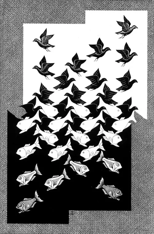
Visual movement can also create an emphasis. Remember that line can move the viewer’s eyes across a composition. Creating this kind of movement can create an emphasis on the design. Take this for example – this black and white pattern is mesmerizing. It was created by M. C. Escher who was known for his optical illusions.
Ditsy fish fabric
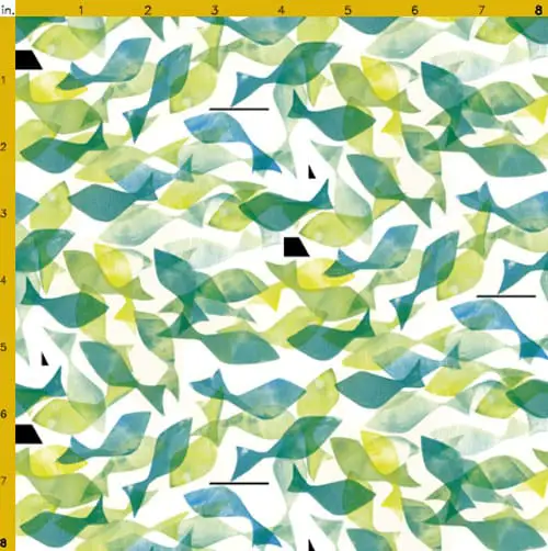
Visual direction is how you then lead the eye to the next element of the design. The Ditsy Fish fabric pattern is a great example of this technique. It is made out of watercolor fishes of different blue and green tones with different opacities.
Hero fabric by spellstone on Spoonflower
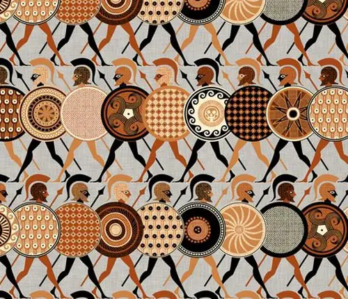
Symmetrical balance is when both elements in a design have the same visual weight. Think about a line or axis straight down the center of the composition. The elements in the design should have equal weight on both sides of the line. This does not necessarily mean that the elements are the exact same, just that the perceived weight of both elements is equal. Symmetrical balance is oftentimes regarded as elegant and formal. Be careful using symmetry, though, as it could end up looking boring. This Hero Fabric pattern is a good example of how symmetry can be used in the design.
Black Swans Pattern by Georgiana Paraschiv
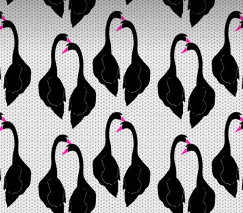
The Black Swans Pattern can be a great starting point for other awesome patterns. Designed by Georgiana Paraschiv, this pattern uses repetitive pairs of swans on a monochrome background.
Victor Moscoso inspired pattern
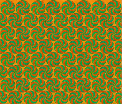
It is important to know the basic elements and principles of design in order to create effective and attractive designs. Here’s yet another great geometric pattern that uses bold colors such as green, orange, and light brown and takes advantage of the rules of symmetry.
Daniel Ogassian; Glazed Ceramic ‘GeoWeave’ Tiles for Ann Sacks
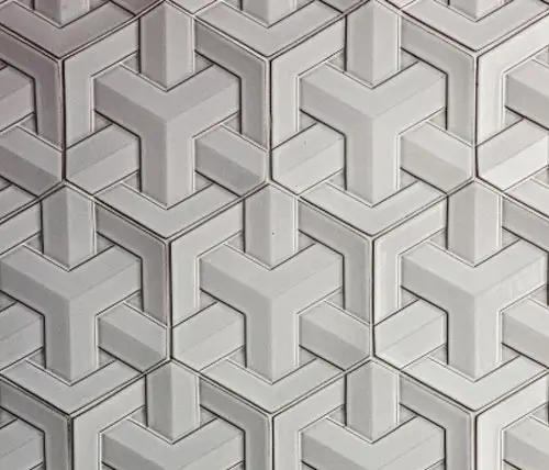
If you’re looking for some more tiles pattern check out these glazed ceramics and find your inspiration.
Pattern inspiration
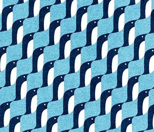
This pattern uses curvy repetitive shapes and a blue color palette. The pattern seems to be made out of small penguins.
Third Eye Blind
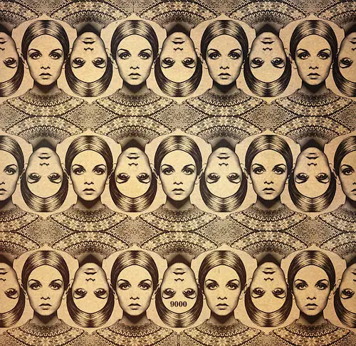
The Third Eye Blind pattern is hypnotic, retro, and unique. Besides its unique design, this example can be a great source of inspiration.
Sparro
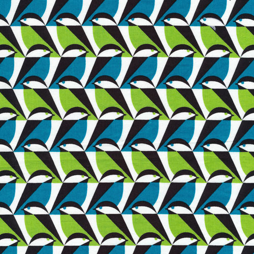
Do you like bird patterns? If so then you will definitely love this colorful example.
Geoff McFetridge: Meditallucination
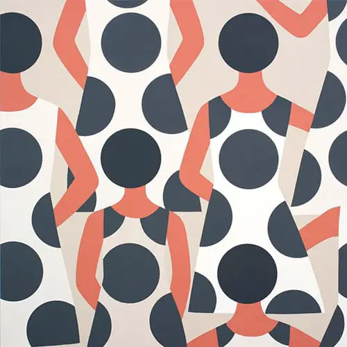
Meditahallucination can definitely grab one’s attention. The pattern is made out of a woman’s shape with a white dress with huge dots.
Franco Matticchio
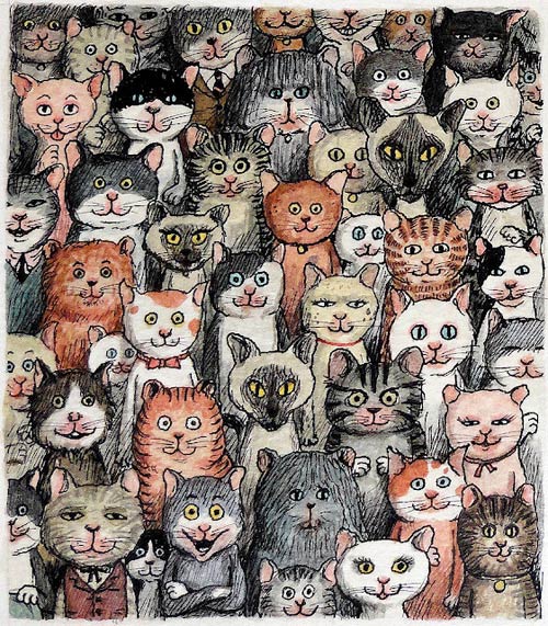
This pattern is cute and made out of plenty of hand-drawn cats. It can definitely be a great starting point for awesome patterns.
Batik Patchwork Grey tile
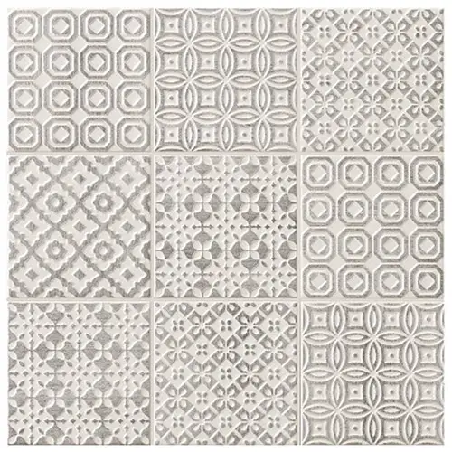
This pattern contains several grey tiles, all comprised in one pattern. You also have examples of using this texture in real life and it looks amazing. The details on the tiles use earthly hues and they’re inspired by Moroccan motifs.
TOUCH CONTAGIOUS
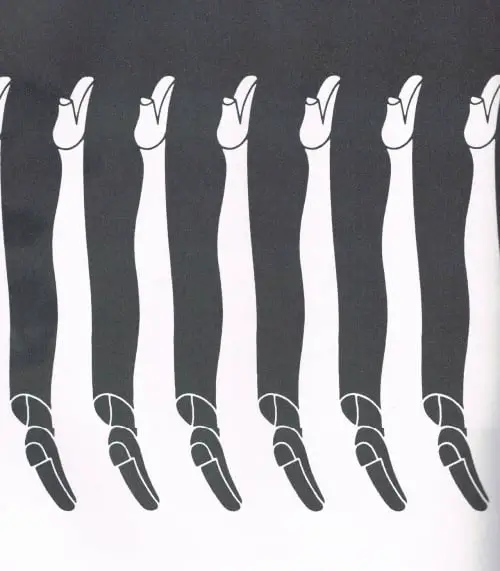
This is yet another cool black-and-white pattern. This one is designed to show both men’s and women’s legs, using negative space to create the women’s legs.
Related Resources: