Line25 is reader supported. At no cost to you a commission from sponsors may be earned when a purchase is made via links on the site. Learn more
You should devote your time as a musician to composing and making music. However, living in a digital world allows you to have a web presence in order to stay in touch with fans, talent scouts, and manufacturers. When people want to learn more about an artist, a website is an ideal method to showcase everything in a professional package.
A website that you design and manage is the most effective method to establish a memorable first impression. You need a very appealing music website with clear and succinct information no matter what type of music you make. If you want your music to be noticed, you must use the Internet’s power to get it to your audience.
Building a website for musicians is a crucial aspect of advertising your music online, whether you’re in a band, a solo artist, or an independent producer. Creating a music website might be a difficult process if you are not technically skilled. When creating one, there are several aspects to consider. From conceiving the aesthetic and usefulness to the actual construction.
Fortunately, there are several guidelines for creating a professional, eye-catching website.
Get a domain name for your brand
Register a domain name for future usage as early as feasible in your music career. It is critical for the legitimacy of your brand in the eyes of website visitors, fans, event organizers, labels, and so on.
Even if you haven’t started doing gigs or recording music yet, registering it protects you in the future and assures it won’t be taken by someone else. Remember that your domain name should match or be similar to your social media usernames.
Choose the best website template
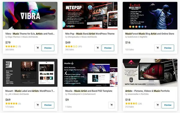
A template is also a good alternative if you’re short on time and want to rapidly create a current appearance for your music. Consider a WordPress theme for musicians to be the general framework of your website or a simple music website template. When building a music website from scratch, a customizable website template is an excellent solution.
Your followers will be able to easily explore your content, listen to your music, and purchase your merchandise from their smartphones. Consider a template to be the general framework of your website.
Use an engaging header image
A header image, while not as vital as music, will offer your visitors a cause to hit the play button. You should check for a few factors while selecting the right banner picture for your music website.
The image should be of good quality if you want to make a professional impression. It should also provide an insight into your band and how you sound. The page’s title should inform the reader exactly what the page is about. Remember, if there is any misunderstanding, they will quickly move on.
Include an EPK (Electronic press kit)
Your EPK contributes to the professional image of your music. An electronic press kit is similar to a paper press kit or mini-portfolio that you send to producers and talent scouts to showcase yourself and your music.
Every musician’s website should include an electronic press kit (EPK). It’s the simplest method to get the media, bloggers, promoters, and venues to help you market your music or events.
Use good typography
Your website will include a lot of material, from your Press Kit page to album descriptions and more. Choosing appropriate typefaces also allows you to communicate your message clearly.
Also, avoid using fancy typefaces, which may seem nice but may confuse your message. Another important tip to remember when it comes to typography is to keep everything consistent. Select a single content font and utilize it across your website. Individuals must be able to clearly comprehend your written content.
Set up clear a call-to-action
A website’s goal is to attract visitors. Choose one key item to highlight to tie your musician website design together. A call-to-action is an excellent method to draw attention to a forthcoming single, a new video, or to join your mailing list.
Make it stand out by using a border, a strong typeface, or a large button. Make sure it doesn’t clash with the rest of your colour scheme or obscure any key pictures. You may use your call-to-action to help you decide how the remainder of your website should appear.
Add high quality and professional images
On your website, only utilize high-quality media. Getting professional pictures of your brand is a fantastic investment for your profile and website. You’ll also need nice images to put in your content area. Imagery will bring your website to life in all areas, including your bio, electronic press kit, and music page.
Grainy photos or badly cropped images can have a negative impression on visitors, so make sure the graphics you use on your band’s website are of high quality. Use excellent, consistent pictures that represent your music across your website and social media channels once you have them. This will offer your branding a feeling of coherence.
Engage with fans through a blog
Users and casual visitors can convert into leads and fans via the blog area. Consider adding a blog to your website if you truly want to offer listeners of your music a cause to return.
If writing isn’t your thing, think about making video or photo blogs and integrating them into your website instead. Having a blog with well-written articles, news, views, and entertaining material enhances the visibility of your website in search engines.
Numerous musicians put their hearts and souls into their music, and it is only natural that this passion should be carried over to their website. A musician’s website should be built to attract new fans while also keeping old followers interested. Let’s look at several artist websites that are doing it correctly.
Examples
Ni/Co
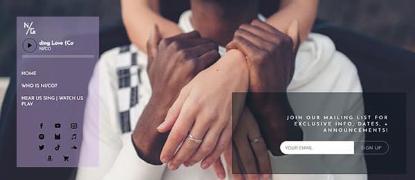
Pop/R&B band Ni/Co has designed a website as the ultimate internet calling card, using calming hues to surround their music.
To engage their visitors, they’ve kept things simple with a sidebar menu that floats above their website sections.
With a massively successful YouTube channel, they’ve arranged their most popular videos into columns on the page. Every picture they utilize is consistent with their brand and is simple to include in a publicity campaign.
Plants and Animals
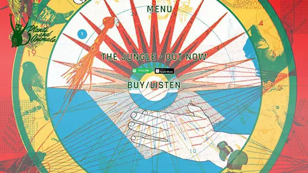
The Plants and Animals website achieves a degree of visual interest with the use of a picture background and bold typographic connections.
Take note of the opportunity to browse photographs, subscribe, and “listen to tunes,” all of which keep website users engaged.
The Chemical Brothers
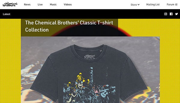
The Chemical Brothers utilized a long-exposure “light photography” shot as their backdrop, implying that they make electronic and dance music.
The vibrant light streaks assist to bring the basic foreground material to life.
No Sunshine
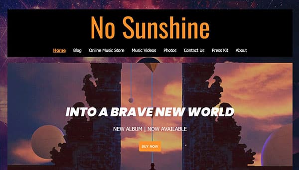
No Sunshine, a progressive rock band, has a wonderful website design example that incorporates album art.
They’ve placed their artwork in the backdrop of their website and then used it as the main picture. The orange button stands out as a strong call-to-action urging visitors to purchase their latest album.
The fonts used in their call-to-action and title are repeated across their website, creating a unified and appealing browsing experience.
Bruno Mars
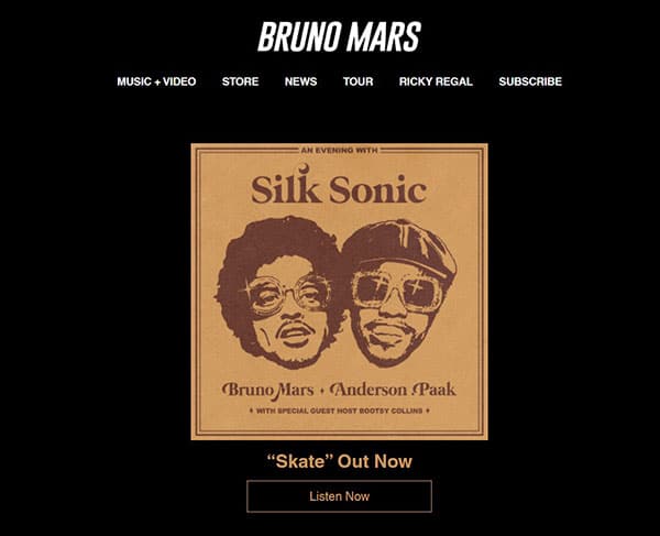
For the singer, songwriter, and producer Bruno Mars, a basic grid-based style and easy navigation work well, allowing you to obtain rapid access to vital information and remain up to date via links to social networks.
There’s a lot of multimedia on this site that gives you the impression that you’re at a Bruno Mars concert.
Wolf & Moon
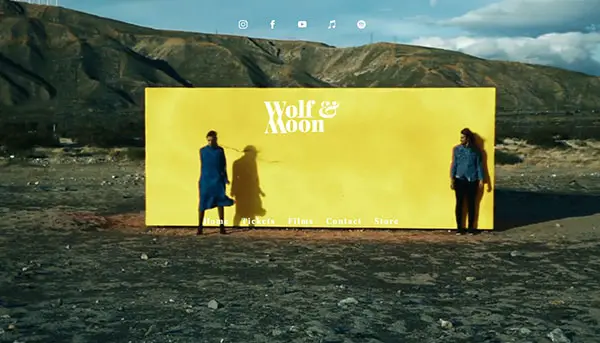
Wolf & Moon, a folky music duet, employs a unique, fascinating video to draw attention to their website design.
The things resting above their video are easier to read when they are written in white font. The hues utilized in the video, blues, and yellows, are also used across the remainder of their website.
You may get a sense of how their music could sound just by watching them move around backward. You want to go deeper and learn more after seeing this video.
Jamie Cullum
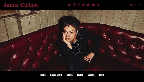
Jamie Cullum’s website design is highly recognized in the design community for its minimalism and effective use of white space.
The design is attractive, simple, and easy to read and navigate, with some gorgeous typography and sleek silver buttons in the upper right-hand corner.
Francesca Battistelli
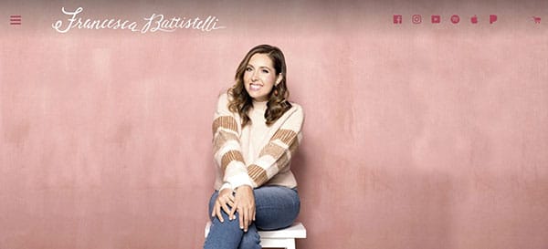
Illustration may assist create the tone of the design and hint at the sort of music produced by the musician.
The watercolor effect, along with a neutral color palette, produces a warm, inviting atmosphere for this artist’s website, as well as an indicator of their musical style.
Queen Makedah
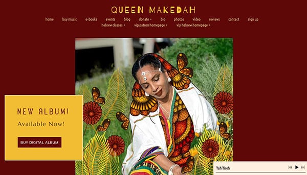
Visit Queen Makedah’s website to get a feel of how to employ animation to create a visually appealing online experience.
The video in her main image is subtle, beautiful, and one-of-a-kind. It provides the impression that she is creative while yet being professional and polished. Furthermore, it establishes the tone for the remainder of her website’s design: earthy, clean, and serene.
This flowing animation draws your attention. Her personality and music will captivate you just as much.
U2
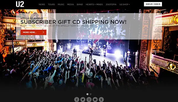
The navigation of U2’s design uses strong, bold white text to attract attention to what’s important: the many methods to navigate the site.
The design is divided into three columns, making it simple to show and see a large amount of information on a single page, much like columns in a newspaper or magazine.
The Specials
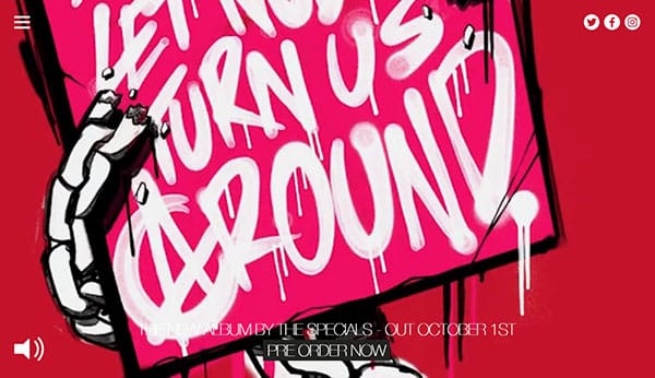
This website for The Specials needs only a simple, uncomplicated design with a checkered pattern stripe at the bottom of the page to get their music out there.
For three years, the Specials blog has been updated, promoting forthcoming events and providing a behind-the-scenes peek at what it’s like to be Special.
If you’ve been feeling discouraged about achieving that ideal, professional look, maybe these designs will encourage you to undertake some tweaking – or start from scratch to fit your sound. Keep these examples in mind if you ever find yourself working on an artist or band’s website in the future. This showcase contains a variety of design styles, ranging from those that serve as a basic online home for the band/musician to others that include full-fledged online storefronts, discographies, and forums.