Line25 is reader supported. At no cost to you a commission from sponsors may be earned when a purchase is made via links on the site. Learn more
No form of media could replace a hard paper copy of a magazine. People have been especially fond of attractive cover designs. The cover is a significant factor in helping a buying decision. Due to this very reason, designers and publicists take special efforts in making sure the cover design is on point – digitally as well as print-wise. Making a creative magazine cover design might come off as a significant challenge. It can be difficult especially for the untrained beginners in graphic design. As such, we have created a guide that consists of 11 tips to get your magazine cover design just right.
Before beginning this article, we need to understand a couple of concepts. Magazine cover designs usually make use of grid layouts. Grid layouts ensure that the text, images and other visuals are all correctly aligned as well as decide the visual hierarchy of your Cover. A few design elements such as color, visual 3D effects, typography as well as placement are vital as these form the essential part of our design.
The most understated fact about a Magazine cover design is that this is The One page that decides for a reader whether to buy the specific publication or not. Many times, designers avoid this fact altogether and put in every single detail there is to the content. This ends up cluttering the page and making it look cheap overall. To ensure your design is clean, sophisticated and sellable, we have a few pointers that you can keep in mind before jumping onto the design.
In this blog, we shall see a few tips and techniques which could help your magazine cover design stand out effectively.
1. Keeping an Audience Category in mind:
It shall never happen so that absolutely everybody shall find interest in your magazine and its content. So as the first and foremost step, it is essential to keep a target audience in mind before moving on to the design. The easiest way to acquire a target is to think about who in particular would be reading this magazine – map the persona of the individual and make a note of all the characteristics that could potentially be important.
For example, a fashion magazine aims to reach out to people who are interested in fashion. However, if you furthermore decide on the person who would be interested – her likes, dislikes, interests and hobbies, you might be able to target more efficiently.
2. Typography and Placement:
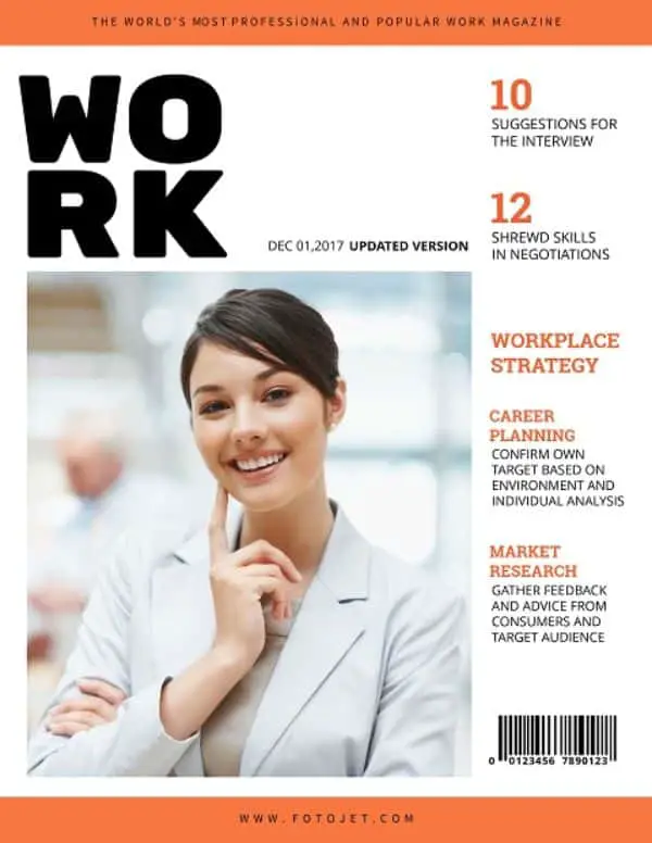
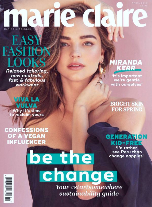
Typography consists of a significant part of any cover design. Equally important is the job of exact placement. It is safe to say that the cover design must be a harmonious melange of image, background, text as well as color. Alongside, a visual hierarchy can also induce attention towards the more important subjects (Magazine name, unique issue feature, etc.), followed by supporting information (Article headlines, issue, date, etc.)
3. Do not be Shy with Cover Designs:
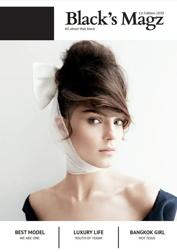
What’s the point of an attractive cover if casual browsers do not get enticed to pick it up and look inside? An attention-grabbing cover is quite vital to make sure that readers take a look inside the publication. For example, several colors and a crowded layout might make the Cover look cheap and dated. However, a balanced, graphical and straightforward layout with a minimum font type and color alongside a strictly captivating image might do wonders.
Here is a simple trick for the same: The A, B, C Rule. Stick to one (A) heading – the title of the magazine, (B) Sub-heading – the main article of the issue and a larger (C) sub-heading – smaller article highlights. Almost every magazine cover design uses this rule to maintain the visual balance of the layout.
You can try pairing all these headings with striking yet straightforward photographs and some negative (white) spaces to make the Cover look less-busy and more pleasant to look at – graphically a well as readability-wise. You can also attempt to stick with a black and white picture for a dramatic, intense look as it is classy as well as a balanced choice.
4. Choose the text color wisely:
How you select the text color for the cover design turns is a vital part. It has the power to change the tone as well as the feeling that the Cover gives out. As you might know, black and white is the perfect combination when it comes to a sub-headings and smaller heading. But for more significant titles, you can choose some beautiful bright colors, but make sure you do not overdo it.
Take care of the fact that text must be representative as well as attractive. Try avoiding longer sentences on the cover page and make sure that number and alignment are in such a way that it doesn’t gather much attention – but yet, has a visual hierarchy to it.
5. Background and Photo:

Ideally, the photo must take up a more significant portion of the cover page – that way, you can convey a great message with a single visual. However, this also proves the importance of a catchy picture as a cover. If your cover photo is a person, try to keep them engaged with the camera. The photo with an eye-contact with the audience always draws attention and turns out to be a great example.
It is also recommended by designers that you put the picture on top of either a transparent or solid color background, which shall help the image as well as text stand out better.
6. A pop of color never hurts the eye:
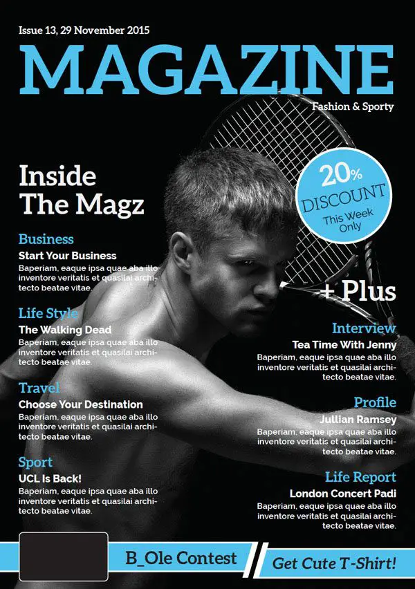
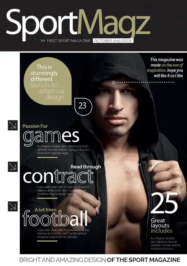
You might find that some magazine cover designs use the color fact very sparingly, proving that the color-pop can turn out to be more effective than a page full of colors. The best and easiest way to go about this is to pair a black and white image with a sharp text in solid colors, or vice versa. Typography that is bold and bright, along with banners and dividers can break the monotony and give an overall masculine edge to the design.
You can try a hot orange or an acid yellow for a stark, optimistic pop of color. It goes excellent with sports and travel magazines. A serene sky blue can give a relaxed, yet luxury vibe as well. On the other hand, a red might look punchy while giving a modern touch to a primary monochromatic picture.
7. Gather ideas from everywhere:
Being a designer, you might tend to get confused after some point. When designer submerges into a project with a particular idea in mind, it might be challenging to get out of it within a snap. The best solution to avoid this problem is to keep gathering ideas and inspiration from everything around. You should take notes and save them safely to ensure the usage whenever necessary.
For example, if you have a Lifestyle Magazine, a cover design which could be as simple as a sketch from your childhood could also be a great story to capture. You might have to rework on the design – but the point is to gather inspiration from all walks of life.
8. Contents Page is as relevant as the Cover:
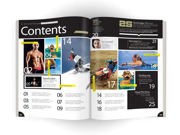
Though you might work hard on the cover, once the reader opens it, the inner pages should be just as beautiful. It is part and parcel of publication design. The most crucial page after the Cover is always the contents page (index). It should be functional, and must allow the reader to articles and sections easily. If your magazine has many articles, you can also split the contents page into a spread – just make sure the synergy is maintained with the Cover as well as rest of the magazine. This shall also give much room to induce an extensive ‘Contents’ heading, and images as well.
Make sure that all the pages are structured based on a grid layout which is not restrictive and dull. You can also look at grid layouts used by the sports magazines – a melange of large and small pictures which are exciting and non-chaotic. Large and stylish typographic page numbers set in black and white also help to browse the contents of the magazine easier.
Try restricting number of articles that are highlighted in each row or column to ensure a breathing space to each item and also increase the white space in the layout. Make sure to keep in mind that the contents page of a book or report is very different from that of a magazine. Enticing images and interesting typography are the keys to a useful content page.
9. Graphical Illustrations are Unique:
Illustrations are always more interactive and unique. They look super-stylish and are an excellent choice for magazine genres such as technology, arts and design. You can also fuse images and illustrations to give a unique look. However, one must not overdo the illustrations in these cases to avoid clutter.
Get friendly with applications such as Adobe Illustrator, CorelDraw and Inkscape. They would allow you to create vector graphics that can directly be dropped into the InDesign layouts quickly.
A vector image is excellent when it comes to expressing abstract and fantasy-oriented ideas. Hence, they are a perfect example for magazines that don’t fall into lifestyle and fashion genres. Adding illustrations which might be digital or hand-drawn is a tremendous unique value addition to the individual or limited-edition issues. Illustrations also help in promoting consistency through your magazine design that helps the development of a brand look for your publication.
10. Layouts with Infographics:
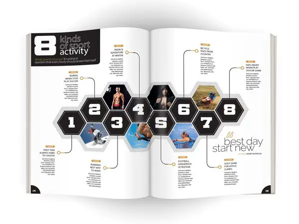
Magazines such as National Geographic and Esquire are huge fans of infographics. They use infographics to illustrate articles in a fun, exciting and technology-forward way. Many magazines these days are moving away from traditional textual layouts for design covers. They are taking inspiration from eBooks and website displays to create print layouts that could be more engaging and interactive.
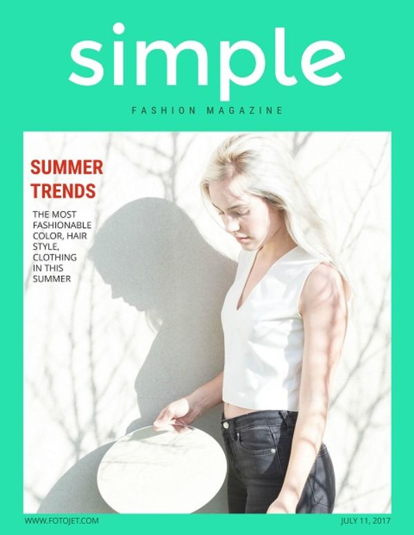
11. ‘Less is More’ in Fashion -Always:
The biggest challenge with fashion and lifestyle industry is staying up to the mark with trends, and yet keeping the content inspirational. A sophisticated, yet minimal design is a high starting point for photographs and retail showcases – and luckily, it is also easier to tap into the trend for ultra-simple as well as a stylish print design.
Make sure that the images and visuals are the main focus of the layouts, allowing them to be the 2/3rd of every page. The ideal way is to pair these images with plain white backgrounds and rich black fonts. Make sure that you avoid fuss at all the points to avoid the designs from looking cheap. Do not make the typography to ‘shouty’ either. A great way to nail the placement in fashion magazines is to place the photographs off-centre. This ensures a subtle artsy look for the overall spread. For this method, you can select images which have a similar color theme or style.
Conclusion
In brief and precise words, the above tips give the designer plenty of ideas for creative magazine covers. However, there might still be a lot more techniques that still have to be explored. Magazine cover designs might look simple at first, but honestly, they can be one of the hardest things related to publication design. Right from clicking the right image, keeping in mind the rest of your magazine, to selecting the fonts, colors and placement – everything needs to be in synergy along with the content inside. The pointers mentioned above shall help improve your skills, but after all, practice is what you need the most. All you have to do is try to experiment with a lot of fresh ideas and understand what your design talks about.