Line25 is reader supported. At no cost to you a commission from sponsors may be earned when a purchase is made via links on the site. Learn more
A gradient is a gradual blending of colors where one color transitions to another color slowly. It can be a blend of colors from the same shade or can be a blend of different colors. It is possible to create gradients where one color simply blends into a different color or white or black color. The right way of having a gradient is to have colors blend smoothly into each other. The stacking of colors doesn’t lead to gradient formation. It is a colorful design when the colors don’t blend into each other.
Companies like Instagram, Firefox, and Tinder have one thing in common. They have a logo design that employs colorful gradients. There are also issues and polarized ideas regarding gradient. Some find blending different colors powerful, while others seem to religiously hate the idea of it. But, a gradient-based design is successful if it is done correctly and with rightly selected colors.
When should you choose the Gradient logo?
A logo design based on gradient often seems to stand out. Lately, the logo designs with gradients have been the trend, and it is a trick to being noticed and standing out. Gradient-based logos often stand out because gradients give the logos a 3D effect, making it look more realistic. The designs seem to jump out of the screen. For instance, the image below can show you what design with and without gradient appears.
Choosing a gradient-based logo should not be because you want to be in the trend. A logo design should represent the company as well as align with your target audience. A successful logo talks about your brand’s identity, and it does not matter if it is gradient design. For instance, if your company is all about health and wellness, you get more options to experiment with colors while you design your logo. But if you are a law firm, you have to stick with flat prints and colors. Let us take a look at the tips to use and define the right gradient for a logo.
1. Create a logo design before applying gradient:
![]()
It is very tricky and cumbersome to print designs that employ gradient. Hence, a logo should be designed first without applying gradient. It is for when you have to use the logo on the print media. A logo that undergoes printing may not render well, washout, or even complicate the underlying meaning.
Therefore, you should use a stable version of the logo while printing on papers, signboards, letterpress papers, and embroidered fabrics. It would show your logo clearly to the target audience and send the right message to them. The gradient should be applicable only when you have to display the logo on the screens. The latest monitors have the ability to display a large variety of colors, and therefore, the gradient-based logo may render well and look good on screens of mobiles or TV. The bottom line of it is, no matter what kind of logo you design, it should be simple and sweet.
2. A gradient logo should be used for a creative industry:
![]()
An industry that is involved with creativity should always use gradient in its logo. The underlying meaning of this is, these companies can choose to experiment with bright and vibrant colors to produce an eye-catching logo. For instance, the Airbnb logo is a sky blue, gradient logo which represents clear blue skies. Airbnb is a company that is involved in travel and tourism. And people associate this company with vacation and holidays. Therefore, the application of gradient in the Airbnb logo justifies the use of gradient.
Look at Google’s logo, which has different colors with no sign of gradient. It also represents the company well, even in the absence of a gradient. Also, they don’t seem to need the gradient effect on their logo. The gist of the story is if the logo without gradient is useful in representing your brand and company, then don’t apply a gradient to it.
3. A gradient-based logo should have a subtle intensity of gradient:
![]()
A full-fledged gradient use in a logo design may not look professional for the company and its brand story. Hence, a subtle gradient does the trick where a completely gradient-based logo design may fail. In the previous example, we took Google’s logo as an example of a flat design. Designers say that even Google’s logo has a hint of linear-gradient employed to its logo even though it looks dull.
This kind of effect adds depth and meaning to a solid logo without making it look embossed. Not to mention that the logo may not render well if it is going for the print. For instance, the logo on the right in the image may present well in printing, while the logo on the left should only be applicable on digital platforms. Take a look at the logo with the gradient. A very subtle hint of gradient makes logo professional and empowering. Hence, the gradient should be used very less during the logo design.
4. Add gradients to a logo for professional design:
![]()
You should use a gradient for designing a logo that needs a professional touch. If the client were able to design the logo by his ability, they would not come to you. Hence, a gradient-based logo should reflect professionalism. For instance, if the logo needs a glint on it, you should see how you can place the light source to create a logo that gives maximum impact to the audience. You should also define the right direction and the source of the light that shines on the logo.
If you have to highlight different parts of the logo, then all those parts should not be given a gradient. Place only one gradient within one logo. And the placement of gradients should be intentional. Let us look at the logo in the image. It has gradients in certain areas of the logo. The company emblem reflects a professional outlook to the target audience. Hence, this kind of logo design is useful as well as impactful. Only a well thought logo design looks correctly executed.
5. Optimize your gradient levels for the printing:
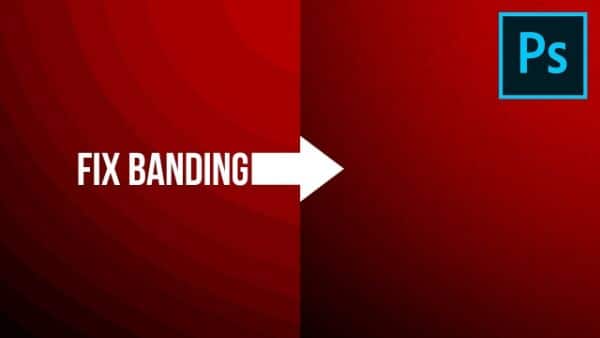
As we saw previously, gradients don’t come out well when it is under printing. With a poorly printed copy, the gradient may look like banded instead of colors blending well. The copy is dependent upon the quality of the printer and the paper used during printing. It is crucial to prepare for this unsightly occurrence in advance. Adobe has specific techniques to remove this issue. You should exercise sufficient caution while designing the logo in the designing stage. While designing the logo, you should not ignore the problems that may develop during printing.
You can try printing the logo before you finalize the design to see the result of the gradient on the paper. It gives you an insight into how the logo appears after printing and what gradient effects stay. The image that we see here has a banding effect on one side, which has layers of colors instead of blended colors. The colors appear in stripes, and this generally happens while printing. But, we want the result of the printing similar to the right-hand side of the image. The image on the right represents well-designed gradient levels. Hence, we should keep in mind, the gradient levels while designing a logo meant to go for print.
6. Choosing the right colors for the gradient-based logo design:
![]()
You can make a gradient look cheap by the selection of colors or exotic. It all depends on what colors you choose. The designers win by selecting the right colors for the gradient. You should practice caution while selecting the colors for designing a logo with a gradient in it. Eventually, the colors represent the company’s story or the brand. Generally, selecting the colors from the same color family generates a sharp gradient.
You should experiment with light shades to create multiple gradient designs. And then one of them that looks perfect should be given a chance. To test the gradient, you should combine it with text and other images. It gives you an understanding of how the gradient appears and is going to look in the future. A gradient-based logo design should be versatile and adaptable. It means it should look good on the website, product, or company’s logo.
Don’t use too many colors. Instead, use two or three maximum to induce a more considerable significance. If you use too many colors in a logo, it may not come out as expected. For instance, if you combine five or six shades in a tiny logo, it can come across as a blemish of a poorly designed logo. If possible, avoid using more than two colors while using the gradient.
7. Consider contrast levels while using gradient:
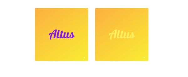
While playing with gradient, you should always keep contrast in mind. Contrast means the way two or more colors appear together that is not overwhelming to the eyes. Logos with poor contrast is a big turn off and may need the users to squint their eyes to take a look at it. When you design a logo with different colors with gradient, you should look at it from all angles. If needed, you should also ask your colleagues or coworkers to see what they have to say.
For instance, if you have red fonts against a yellow background, it proves to be overwhelming to the human eyes, and this may turn a user off from the design. The same thing applies to the logo design while selecting colors. The front design should be of high contrast, while the gradient background should have low contrast. Look at the image we have used. The image on the left has right contrast levels with a bright background paired with a dark-colored text. It is an example of good contrast while the image on the right-hand side explains reduced contrast levels.
8. Optimize the gradient design for printing:
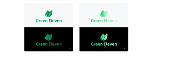
The logo design with a gradient should have a carefully curated design if it is going to appear on multiple backgrounds. Hence it is always recommended to have a logo design with a black experience as well as white. The logo with either black or white background should enhance the readability of it. Various combinations of colors and the gradients should never hinder the readability of the logo.
Let us look at the example here. The image on the left-hand side looks perfect with both a black and white background without hindering its readability. In the white background, sift through the logo and its gradients. You can see that G appears lighter and n on the extreme right looks darker than the rest of the letters. The same is visible in the black background image.
On the right-hand side, the logo appears correctly with the black background, but it looks poorly designed with a white background. It seems like the logo washes out. You should take care of this issue when this kind of logo goes for printing. The gradient that gives excellent results on a screen or a monitor may not perform well in a printed copy.
9. Consider the accent marks and the punctuation while using gradient:

The gradient looks perfect when you pick up the right color combinations. You should avoid white gradient usage when you have a white background for the logo. While writing the text in lowercase, the accent marks tend to wash out in the background. For instance, the mark on the top of the alphabet I in the lowercase washes out if you use the white gradient with white background. It degrades the readability and defeats the purpose of having the gradient in the first place. The uppercase letters may look fine. But lowercase letters may have difficulty with rendering individual letters.
The same applies to the punctuation marks if there are, in logo design. If the gradient is on the bottom of the text, then the punctuation mark may lose its visibility. Hence, you should always play and experiment with gradient and color combinations. It plays a significant role in defining a good logo design.
Conclusion:
Use the gradient selectively. The company for which, you design the logo, may become a big firm one day and may decide to etch the logo on the walls of their organization. Gradients, in such situations, don’t work nicely. Eventually, it is all about a design that represents a meaning else it does not deserve a place in your project.