Line25 is reader supported. At no cost to you a commission from sponsors may be earned when a purchase is made via links on the site. Learn more
These days, a significant trend in typography design is going “big”. And honestly, it’s a great thing! Given the fact that the major use of typography is to highlight specific points or concepts in a given visual, big typography only makes more sense. The potential reason to introduce text in your design is to make it readable. Right from navigation, to entering blogs onto your website, designing web pages for your e-commerce websites or any other such visual communication, design requires a great deal of typography knowledge. And the best part of it is, you can nail big typography by knowing just a few basics about typography.
Typography is a superb way to give your visual design a face-lift. And the right way to go about it is to use the latest trends and tips in typography. These days, designers prefer to use optimal, more straightforward typefaces and pair them with original bold headings to use it as a visually clear and robust communication strategy. Many customizations are available when it comes to using bold headings – cut-outs, text gradients, bold colors – to name a few. The aim remains the same: to create lettering that stands out and strikes.
To be honest, keeping your website up to date in terms of design trends is an essential task. It makes the web page more relevant and grabs attention within the first 5-10 seconds, which is also an average human being’s attention span while looking at a visual. To fit in this small time span, big typography is a promising tool. Recreating your web pages and changing the typefaces can prove to be a good help as it gives a fresh new look to the page.
And in case you are wondering where to start, here is a blog that captures it all. Right from what exactly qualifies as big typography to the various trends that are currently working best for designers, we have it all.
Guidelines to Big Typography
1. How big is really big?
It is imperative to know what qualifies as big typography. Is it the size? The color? What sizes to use to cover the different parts of a web page? Well, we have a few loose guidelines that could prove to be helpful to establish at least a basic wireframe for your web page.
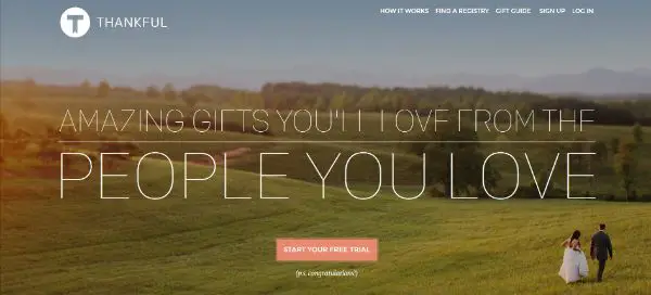
- Header text: 30 points or more
- Banner text: 50 points or more
- Navigation and Call to Action text: 14 points or more
- Body copy text: 18 points or more (in case body copy is part of the typography)
Please note, these are sizes which can provide a framework to your web page or design. You can always customize and play around with the sizes according to your likes and visual aesthetic.
2. Influences:
You can say that most influences that brought about a change in the typography segment are primarily linked to a lot of user interface and user experience methodologies. Issues such as responsive designs, flat designs, mobile and app-friendly design are a few trends to be named that have a considerable influence on the release of big typography as a thing. And what’s common in all these – it’s all about usability!
What is essential for all these calls to actions is the fact that these ‘actions’ must be readable, and they should entice the viewers to take action – not just stand out. And what could be more readable than big words?
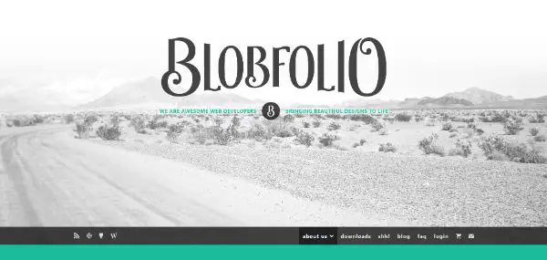
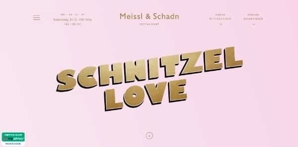
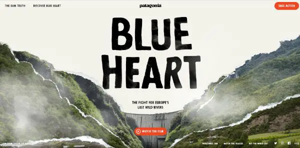
3. Flat Design:
Flat design refers to the use of a simple, minimal yet healthy typography style. It is one of the significant trends that has influenced the big typography scene. Simplistic sans serif typefaces that have a wide array of variations and weights are a common feature of flat design.
When you are using oversized typography, it is a mandate to keep other design elements as minimal as possible – like the palette and typeface. You simply do not want to overdo it with multiple layers and effects. Use as minimal variances in a typeface as possible to reduce the noise in your design. You can always use a secondary typeface, however, make sure to use it sparingly just as an added element, and not as a distraction. The focus should remain on a single bold typeface for the original lettering.
Block letters and characters which incorporate more massive strokes and edges are creating an impact. These characters are a verified part of the flat design scheme as they work strikingly against bright colored backgrounds. Just like the design scheme of flat design is minimal, the language must be natural as well. We’re looking towards easy words which make all the more difference. Bigger typography disables the use of jargons which might even spoil the visual aesthetic of the page. This also highlights the word or phrase that has to be in focus.
Significant type with a bolder color is also gaining popularity. Brighter colors (take, for example, neon hues) are also making a comeback when it comes to more prominent lettering. Colors ensure that your text doesn’t go unread – the placement and size are where you need to up your game at!
4. Big Type:
A wide array of projects have the potential to benefit from bigger typography. To be specific, big typography can be an artistic element in your overall design give you that eclectic touch that makes your web page look more sophisticated and robust. Big typography also works wonders when you do not have any images on your web page, but want to break the visual monotony.
Designers these days also use significant type for static pages of their websites – such as coming soon or launch pages. These pages usually aim at bringing in as much traffic as possible through email channels. Using attractive significant type on these pages only ensures that your message doesn’t go unread, and encourages to sign up for your website updates, products or app services, and more.
Big typography is also a reliable option to use for landing pages that direct you to the website. Portfolio design is another proper use of big typography. And the type that is usually highlighted is the name. However, the big type does ensure that people who visit your website should recollect who and what your part is of the design scheme.
Different Trends in Typography:
Let us now talk about some common trends in big typography that can elevate your visual communication design and up the typography game:
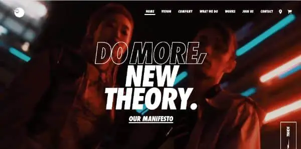
1. Outlined Fonts:
Outlined fonts are underrated, but a great deal when it comes to big typography. While the usage of these fonts ensures that your design has a visual balance of color and font, there are a few pointers which need to be kept in mind.
Sans serif fonts look the best when it comes to outlined fonts. They give a sophisticated, more structured look to the page and makes it look polished. A trick to use outlined fonts is also ensuring you use all caps. That way, their block grid of letters is maintained, without anything bleeding from the edges. Outlined fonts usually look superb when paired with filled lettering.
Outline fonts are a lot more fun to use unless and until they are readable; otherwise, the entire point of big type is jeopardized. The letters can get lost in the background colors, images or videos – so proper care needs to be taken when it comes to color, placement as well as contrasts.
Another key to using outline fonts – or any big type, for that matter – is not to overdo it. An outline font is the best to create an emphasis point, and not an entire message or text body.
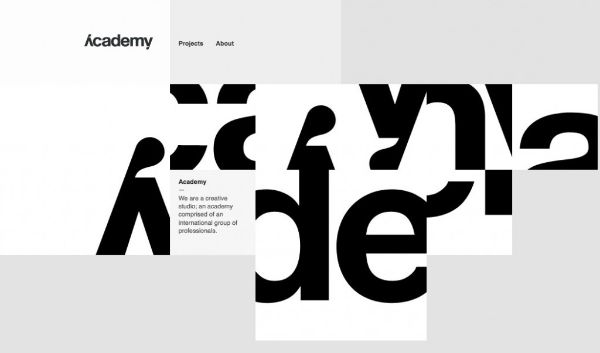
2. Glitch Text:
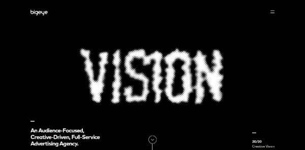
Pop culture has always had a significant influence on communication design. And while it might sound ridiculous, Tik Tok has also influenced typography. While the glitchy effects influence a glitch text, the sole purpose of this type is to give an artistic feel to the design, rather than a readable one. But sometimes, the readability issues of a glitch text can also cause a wanted distraction – only ensuring focus on what needs to be highlighted.
You cannot pair a glitch text type with any other font typeface for a big typography effect. It only works best in singularity. However, glitch text can be used in a lot more fun ways, majorly in headers and homepage banners.
3. Serifs:
Well, it is no surprise that serifs have made a stronger comeback with tiny extra strokes that highlight your text more than ever. Also, just to bring it out in the clear, serifs do not decrease the readability of text!
In case you wish to use serifs for your projects, you can begin by looking for styles that have regular to thick or heavy strokes. Pay special attention to the spacing between lines when it comes to descenders, serifs, ascenders to ensure that every word is easily understood. From serifs that are simple and follow a square rid structure, to more elaborate styles, this kind of typography has a lot of character and a desirable charm.
4. Overlays and Cut-outs:
Layered effects tend to add a particular dimension to the design to make it look more elevated as opposed to flat. Typography is a great way to experiment with this trend.
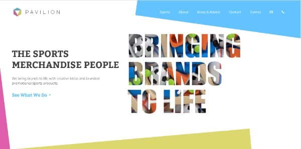
Cut-outs and overlays are effects that don’t necessarily incorporate a background fill color. Cut-outs allow the background layer to show through the type – for example, animated imagery, videos or even some other text. An overlay is necessarily a transparent layer so that you can see the background through them while still reading them.
Both of these techniques are almost similar and have much visual interest that can strike to be as fun to create. The best way to work with them is to combine large lettering, barely a few words and a display typeface! Overlays work best with photographs, textures and even videos in the background. And as usual, the same rule implies to this design as well – do not overuse the effect; otherwise, it ends up overwhelming the user!
5. “Overdone” Effects:
Overdone is one such term that is never favourably used while talking about any kind of design or technique. But when it comes to overdone in typography, there is a fair chance of things working out themselves. This trend has a slightly retro feel, and usually, it incorporates so many effects that the text is unmissable! There are tons of outlines, shadows, fades, bevels, numerous colors and almost every effect that has ever been made!
And what’s more? The excessive effects you use, there are more chances of users liking it better! This style usually works best with a simple scheme.
6. Custom Everything:
One of the most religious rules of typography is to let lettering be just lettering. It’s better if you do not alter or amend any typefaces – just pick one that works for you and go with it.
But designers seem to be challenging this concept with a positive result – by making tiny yet noticeable adjustments to make them look more custom and unique. Some designers are also going all out with their customization skills and getting new typefaces made for their projects altogether!
While this can prove to be fun, it is a rather pricey alternative and might end up taking a whole lot of time. It’s a common choice for more prominent brands or for projects that require a typographer on the team itself.
To conclude, big typography is undoubtedly gaining a whole lot of popularity amongst the designers now, and the users are ready for it too! Since a lot of the styles and ideas are borrowed from the existing familiar schemes, the users are not overwhelmed when they see bigger typography. What it accounts to at the end are the readability, usability and accessibility. If the users are successfully able to navigate and click wherever required -especially after using oversized texts – then your design has already hit a success!