Line25 is reader supported. At no cost to you a commission from sponsors may be earned when a purchase is made via links on the site. Learn more
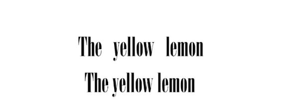
Kerning is the adjustment of space between two consecutive characters. Kerning aims to find a balance between the negative space and all text characters, pair by pair, to improve overall readability. It also helps make the overall text satisfying to the eye. You may not tell an excellent kerning effort by seeing one. Still, you definitely can tell a bad kerning example the second your eyes fall on it. Something is going to feel off and weird.
Kerning helps improve the design and appearance of your text. It can help a user create better designs, presentations, or any other visually appealing story. Modern fonts generally come with kernel pairs incorporated. However, with some fonts, you still need to adjust them yourself. Use these tips to perfect the art of kerning in your typography:
1. Learn about the relationship between the letters:
Kerning is about ensuring there is equal space between all characters as much as possible. You should not take a mathematical approach and literally keep the exact linear distance between the letters. Unique letter combinations create a different amount of perceived spaces between them. Any particular word would look the best when its mathematical distances vary in accordance with its shapes.
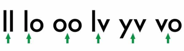
Space between two straight lines would always be more than the distance between one straight and one round letter. And the gap between one straight and one round letter has to be more than the distance two round letters have in-between. And when we talk about mirror relationships, the distance between one straight and one round character should be the same as one round and one straight character.
2. Font and size DO matter:
The phase size doesn’t matter sounds good and holds relevance in a philosophical sense. However, when we talk about typography and design, such factors do make an impact. Before you start kerning your font, you need to first decide on the text size you want to go with. If you feel like resizing it, all the work you put in kerning might come undone.
This is strictly because smaller point fonts require the letters to have more space between each other to keep the word legible. On the other hand, bigger size points would need the letters to stick closer for increasing readability. This needs to be taken considered when designing a logo for t-shirts, banners, and also on smaller areas like business cards.
Most people resize their logo to adjust it according to the place’s size requirement where it is supposed to be used. Don’t do that; create two variations instead. Both of them should be kerned differently. Size of the letters also make the font selection process crucial. You also need to keep in mind the shape of individual letters before starting.
3. Consider less to be more:
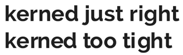
Under-kerning might lead to a copy that looks awkward or is challenging to read. However, over-kerning can result in it becoming indistinct. Mostly when seen in smaller font sizes. The words could also end up implying something different entirely.
Most of the time, if kerning is not well done, the lowercase c and i can look like a lowercase ‘d’. Similarly, r next to n can look like ‘m’ if you are dubious, always keen more towards under-kerning. If the kerning gets too tight, it becomes difficult for the audience to read as it causes eye fatigue. The true balance you should seek is for characters of a word to be tight enough to form coherent words but, at the same time, lose enough to retain their identity. Especially in print design, tight kerning can lead to printing errors as the ink bleeds errors. Hence you need to account for the ink and chances of it spreading when kerning letters for print.
4. Stick to three letter groups:
If you are working with long words, kerning in three’s group can be an exceptional way to go about it. It can get more obvious for you to overlook details when looking at the whole word.
Take the initial three characters of the word and hide the other letters or change the character’s colors you are working on currently. Once done, shift to the next set of three, one letter at a time. This yields better-kerned letters compared to doing it all at once.
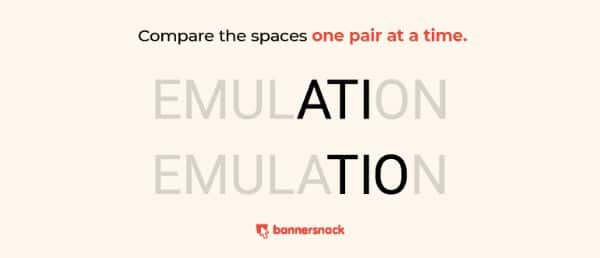
5. Look out for tricky word combinations:
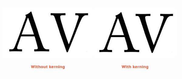
Text kerning also requires the designer to make negative adjustments. Certain letter combinations would create more perceived space than others. If that is the case, adjust the letters into each other’s negative spaces. This is most prominent in capital letters. Kern pairs that involve letters such as V, A, W, T, L, P, F, or similar ones need to be looked out for.
When A or V are set next to a rectangular letter such as M or H or even straight letters like I, their diagonals would almost touch the adjacent letter’s horizontal line. However, suppose an arrangement arises where A and V are next to each other. In that case, the combination of two diagonals can create too much negative space.
6. Know your terms:
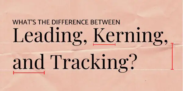
Typography has three similar concepts to amend the letter space. They are – tracking, kerning, and leading. Leading and kerning are relatively easy to differentiate; however, kerning can confuse track quite easily. It is essential to know the dissimilarities between them as a designer.
Leading is the fine-tuning of vertical space between two consecutive lines of a text. The maximum distance is measured from the baseline and also needs to account for special features of individual letters such as descenders and ascenders. Tracking focuses on the horizontal gap between the letters. However, unlike kerning, tracking doesn’t adjust space between individual characters and decreases or increases overall space between the letters in an uniform manner.
You can make use of negative letter tracking to make excess characters fit in a limited space. However, if overdone, the characters can overlap and make the text incomprehensible. Positive spacing helps the word look airier and fill the space when you don’t have enough content to fill it. If you overdo this, the words would have little to none spaces between them. It is smart to be cautious of leading and spacing first and then move on to kerning.
7. Kern yourself and don’t depend on software:
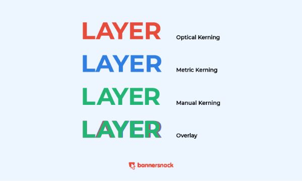
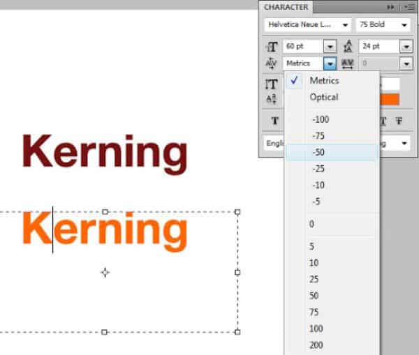
There are graphic design platforms that have two kerning options – Optical and Metrics. These kerning options are available in Photoshop, Illustrator, and InDesign. To access them, you need to go to the Character panel. If you use the metric setting, it uses the fonts built-in kern pairs and space the fonts. The font designer mentions this in the font file.
The optical setting overlooks the built-in kern tables. It adjusts the spacing between two characters based on the character shapes and using a random algorithm. While you can get a decent job done with such kerning options, it would still leave some oddly-spaced letters. Human eyes are incredibly dependable when it comes to kerning. Besides, it also gives you the most control. If you overlay the kerning of all three methods, you can see the difference between all three.
8. Flip the text upside down:

Since we get too familiar with the words that we work with, it affects our proper kerning judgment. A simple yet effective solution to avoid this is to turn the words upside down. Now your mind would not be distracted by the meaning but see the characters as individual characters. Hence, you’d think about spacing them purely based on logic.
9. Achieve rhythm and consistency:
The best typography and font kerning examples are the ones that have a good sense of rhythm and consistency. One character next to the other should look rhythmic and balanced. If you aren’t sure if you’ve achieved this, you can test it repeatedly by stepping back from the monitor and observing the text.
10. Spacing between the words also matters:
Kerning mainly focuses on the spacing between characters. However, you shouldn’t get so overwhelmed that you forsake spacing between two words either. Generally, free fonts on the internet that people use are poorly spaced, so you need to be careful when using those.
11. Allow breathing space for your letters:
Generally, designers tend to get so into kerning that they over-kern the letters to the extent that the text becomes too tight. Every word should be spaced enough to stand out from the others, but at the same time, they need to be close enough for the audience to see the natural flow of the sentence. The space between words also impacts the perceived space between your letters. If the space is too much, it will make your words look too tightly kerned, and similarly, if the words are spaced too loosely, each word would look extremely loose. Generally, having a uniform space between all words should help maintain optical balance, however in certain situations kerning according to shape and other parameters might help form a better balance.
Now that you know the fundamentals of kerning, let us have a look at the automatic kerning options provided by some of the popular platforms such as Word, Photoshop, and more:
1. Kerning in Photoshop:
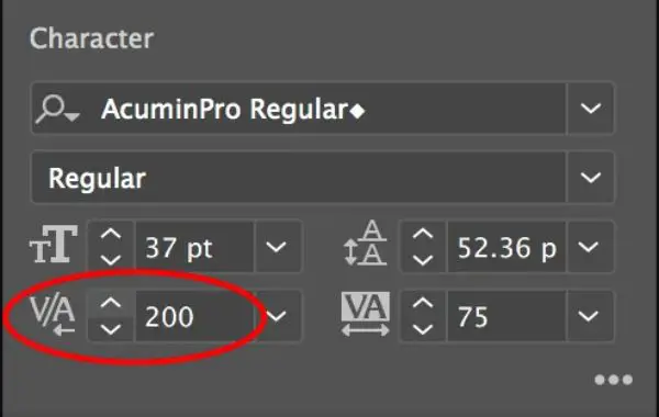
Photoshop has easy kerning options that any designer can make use of. Trouble comes in finding the tool initially. Whatever type of content you have open on your Photoshop that you want to kern, take the cursor between two letters and select the ‘Character Panel.’ There is a little tool with the letters V/A that have a little arrow below them.
This itself in Photoshop’s kerning tool. By default, it is set to optical. If you click on the arrow, you can see other options for kerning too. There are numerical values that denote different spaces, so you might have to try multiple options before getting the ideal spacing you’re looking for. Negatives would reduce the distance, and positive numbers would increase it.
2. Kerning in Word:
Word is the go-to app for writing copies or content. Similarly, you can also use it for designer posters or infographics. Here you would want your content or copy to look as visually aesthetic as possible. One right way of making sure the letters look aesthetic is to use kerning.
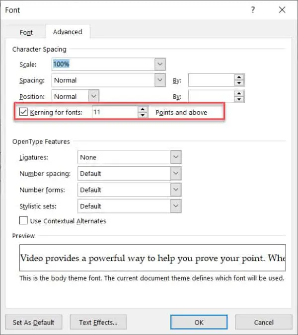
For kerning in Word, leave your cursor between the letters you want to kern. Next, go to ‘Format’ and select ‘Font.’ Then select the advanced panel from the popup window. Here you can see ‘Kerning for fonts’ with an empty box to the left. Check this box to activate kerning. On the right, you can enter a numeric value in the box that would determine the spacing. Here again, you’d have to go through trial and error. However, one advantage is it doesn’t have predefined numbers, so the range of modification increases.
3. Kerning in Illustrator:
Kerning on Illustrator is pretty much similar to how you do it on Photoshop. Click on the text tool and put the cursor between the two characters you wish to kern. Now search for the characters panel and look for the V/A tool. Now you can use the arrows to the left of the numeric value to decrease or increase the spacing value.
These were the 11 tips for mastering kerning in your typography. Make sure to understand all these tips and tricks and keep them as consideration points in your mind when you work on your content next. Kerning can give you an extra mile on making designs that look beautiful, balanced, and professional. It gives you an edge as most people don’t bother much with it. Keep practicing, and you would surely be able to make full use of kerning for all your design and content projects.