Line25 is reader supported. At no cost to you a commission from sponsors may be earned when a purchase is made via links on the site. Learn more
We all, as humans, hate the process of change, but at the same time, we love the idea of flexibility. This is because we love the freshness in our life. We love to play around with something that can take different forms for a good number of phases. The human mind is the best example of variability as it demands stability and fluctuation at the same time. Not a single one is accepted as a standalone. This is why we need variable fonts.
In the same way, the concept goes with the design industry. It was working on a similar concept and font style since the time existed. It was also fine with it, but somewhere demanded change or newness in the existing concept. This is the reason to solve this problem, big companies like Apple, Microsoft, Google, and Adobe jointly came up with the idea of ‘Variable’ fonts. Variable fonts are single fonts used in multiple dimensions. These fonts can be accommodated into a single file for and after multiple uses. Within these fonts, the variations are defined explicitly into a single or multiple axis space.
The axis is designed in a way that it presents the width, weight, and height of the fonts in advance, making it easy for the designers to experiment as well as saving a great amount of time. The bandwidth issues related to the fonts are solved in substantial aspects. One more core benefit attached with this new technology is that it loads quite quickly on the website under Chrome, Safari, Firefox, Edge, and Opera, which is almost used by most of the users in the present time. ‘Fvar’ table is present with numeric value at every point to define the axis in a measurable way like ranging from lowest weight to heaviest weight and ultra-light to extremely bold.
This helps the designers to try out different axis and come up with the best one suitable for a particular design or branding campaign. Also, options are available for selecting single-axes instead of multiple, for instance, only the width of the axes and not the weight of the axes or vice versa.
Beneath, is the list of top super flexible and useful variable fonts that one can use in their next branding campaign:
1. Compressa:
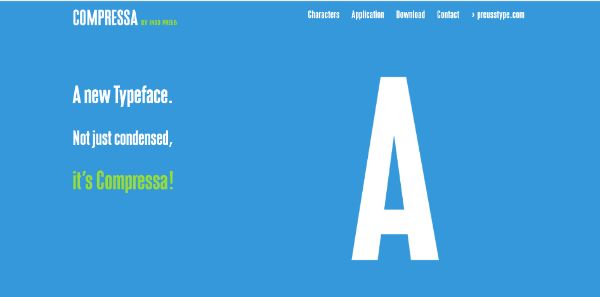
Compressa is a part of the variable font family and is designed by Ingo Preub, depicting it as his one of the finest contributions to the design industry. The fonts are developed to present a solution or say ease to the branding dimension. They are crisp and clear, written in capital letters. The fonts are designed in such a way that it can easily be created in multiple styles. One more advantage of Compressa font is that multiple layers can be spread on it and the look remains the same.
There is no change in the overall outlook of the fonts when used in digital as well as printed forms. The design inspiration is derived from Sans Serif typeface, making it go hand in hand with any kind of brochure designing, letterheads, product labels, promotion flyers. It is created using lines and curves in equal proportion, making it flexible for the consumers to read. The fonts are created in such a way that it showcases the ability to stand out from the crowd, and this is the reason it is used maximum while designing advertising campaigns. The fonts attract the user’s attention and can help in converting the leads through a mere medium of proper use of typography.
2. Agrandir:
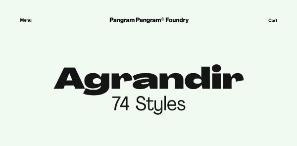
Agrandir is the new addition to the variable family. This font is born directly in its teenage days. The reason being, they are funkier in appearance and depict a new kind of kick and energy. The coolness and spunk of these fonts are often used for comic books, comic brochures, storybooks, sarcastic designs. The teenage-looking fonts have 74 baby products that segregate themselves with the help of 3 axes- weight, width, and angle. It also has three individual styles like default, geometric and grotesk, making it flexible for the designer to use and play around with alterations.
The main purpose was to solve the problem of visibility for the users as other fonts are difficult to read. Also to make sense on bigger hoardings. Afrandir fonts are visible from a long distance as well as are attractive enough to grab attention on the very first go. The variable font is accompanied by the feature of smart punctuation to help the designers to correct the auto typing errors in the creation stage. This is time-saving as well as the impression of the brand in front of the users. One more additional feature, which is a big plus of Agrandir variable font is the feature of case sensitivity. By now, there builds the ground for no doubt that Agrandir variable font style is the new ‘cool’ in the typography market.
3. Dinamo Pipeline:
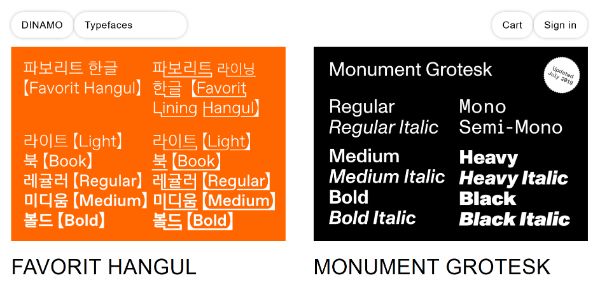
Dinamo is also a recently updated version of variable fonts. This comes in handy for the designers who want to play in between professional and comic look. The fonts are made in such a way that it gives a feeling of formalness as well as on the same hand gives a feeling of quirkiness and fun to the readers. The fonts are available with a good amount of axes option and are flexible with shades and sizes.
Dinamo pipeline goes very well for books, newsletters, letterheads, banners. This makes it stand out on all large, medium, and small surfaces. It may seem a little confusing to some users in the beginning, but when observed in totality, it works pretty normal and would serve good readability to them. The single font, as well as multiple variable font usage, is tested, which leaves no space for confusion or setting back from using at important launches. The typography here serves every kind of purpose, and this is the major contributing factor as well as considered as the USP of the product. Dinamo is the most used font so far by expert designers.
4. Clother:
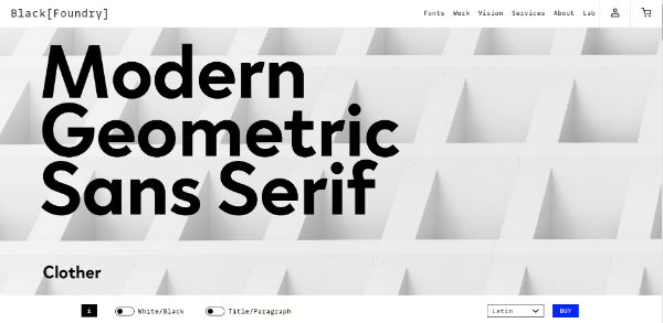
Clother variable font gives a tinge of ancient feeling as it involves a slightly different style compared to other existing fonts. The fonts are discovered by Julie Soudanne, Jeremie Hornus, and Ilya Naumoff. The font seems to get inspiration from Times new roman of the earlier times. It is a 2018 addiction to the variable font family.
These fonts are used for achieving a plain look but also a little tinge of the old school. It also looks a little irregular from the normal. The main benefit of this clother font is that they are available in many different languages, making use at multiple places and understandable by multiple audiences at the same time. It is advisable to purchase single-weight fonts for a beginner and try to experiment it with multiple layered graphics to understand how it works. Once the font is well understood, then buying the bulk option is more suitable as it includes various axes together at a discounted price.
5. Grafier:

Grafier is our personal favorite variable font as it is curated after seeking inspiration from many different sources. The primal inspiration was the Baskerville, and later it was modified. It was done by adding various graphical dimensions to it, to make it stand out from the crowd. The fonts are unique, and this is the reason most designers use it while launching a particular product in the market. This creates a good impact on people’s minds. They are available in 10 different styles with infinite options to recreate the overlapping graphics. The fonts can also be paired with some other simple fonts. This would make the entire product look decent as well as at the same time eye-catching. The fonts can be understood well by experimenting with different axes and color schemes.
6. Handjet:
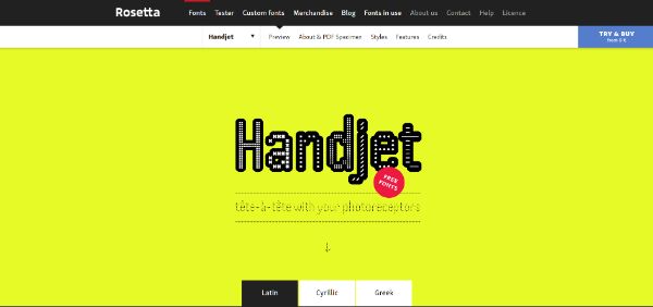
Handjet is an interesting product by David Brezina, made in grid-type dimensions. The fonts look a little similar to comic sans. It can be used perfectly for comic book headings, talk show banners, comedy show banners, kids activities book, kids show. It can also be used on the small banner size along with large hoardings; the effect of the grid would look the same on both sizes. As it is grid-based, it is advisable to use a single version of it and practice multiple experiments on it before investing a fortune. As a beginner, it would be a little difficult to use and understand, but if practiced well, can be of ultimate use for your next campaign design. The fonts are available in Latin, Greek and Cyrillic.
7. Inter:
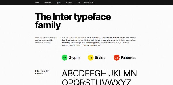
Inter is another pick for large banner designs. The fonts are tall in size. This is the reason it perfectly works for grabbing the attention of the audience from a great distance. A good number of designers adopt fonts due to their simplicity and feasibility to use. The fonts can experiment with almost every other kind of font, and it would still suit well with them and make your product stand out. In total, there are eighteen styles available, nine regular and nine italic versions of the same.
8. Innsbruck:
Innsbruck is designed purely to keep in mind corporate needs. The fonts are used by most of the corporates for their daily updates and news. The fonts are simple and easy to experiment with, which makes them easily adaptable by designers. Even as a beginner, it is advisable to purchase a whole set of fonts. One more pro-tip here would be keeping these fonts handy to use in any emergency.
9. Movement:
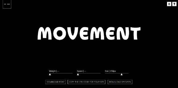
Movement, as the name suggests, is moving fonts that move with every change in axes. This font is a fun creation of Maria Ramos and Noel Pretorius. The fonts are purely made up of curves, and there is not a single usage of straight lines in their entirety. In case you didn’t notice, the same fonts are used in the logo of your favorite food joint- MacDonald’s. They are fun to use and is easily understood by the audience.
10. Secuela:
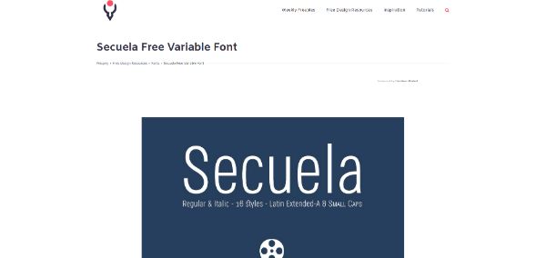
Secuela variable font is a combination of straight lines and curves. This gives it a calm and soothing personality to the product. The fonts are available for free for both personal and commercial use. It is an opportunity for beginners to experiment with low budgets. The fonts are made up of 704 glyphs, attached with a good number of variations. It also has its own unique lower-case Italian variation alongside capital letters. Secuela is a good option for designing invitation banners, visiting cards designs.
As we see, designing is taking a leap and going to the next level with the invention of variable fonts; there is a sure shot surety of a better future with new addition and up-gradation in the typography industry. The effort here should be to enable the user to electronic files and compatibility with other new technologies launched alongside in the market. At present, the designers should mainly focus on the experimentation part and learn to build up new styles from the existing font styles. This would help further innovation when the problem is faced in the experimentation stage. It is still a baby technology, and any changes at this stage are easy to implement. This is only possible when the designers and brand experiment with it daily with every upcoming campaign.