Line25 is reader supported. At no cost to you a commission from sponsors may be earned when a purchase is made via links on the site. Learn more
One of the most underrated aspects of graphic designing is font pairing. The importance of using unique and creative fonts is increasing every day. Unfortunately, this makes it challenging for graphic designers to find the right combination of fonts to make the design look more visually appealing.
Some designers undermine the importance of font pairing and go with either the traditional and overused pairs or just with two random fonts. The result of their design is not that great. Then some designers spend a lot of hours trying to get their font combination perfect.
As a designer, you do not want to be either of them. Rather you should have your set of font combinations ready. If not that, then at least you should know the basics of font pairing and follow that. For this, we have collated the ultimate font pairing cheat sheet that will help designers choose the right fonts for their design.
1. Understand the Language of Fonts
The science of typography is very vast and detailed. You may not have 100% knowledge of this science, but you must know the basic terms and the type of fonts. This will help you understand this guide better and empower you to make better choices whenever you work with fonts.
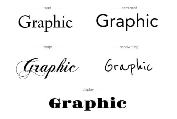
- Serif: Fonts with a small extension or small feet are called embellishments after the letter stroke.
- Sans Serif: Fonts opposite Serif- meaning those who do not have the embellishments after the letter stroke.
- Script: Fonts that have all letters connected and look like cursive writing done through the hand.
- Display: Fonts specially created for headings and look good only when used for smaller text in big size.
- Decorative: Fonts that have a more vintage or hand-drawn feel can be used for ornamental purposes.
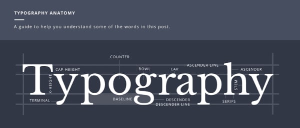
While there are more detailed categories for fonts, understanding the above should be good enough to help, you improve font pairing. Along with this, it will also be useful if you understand a few more terms about typography, such as kerning, glyph, stem, counter, etc. This advanced knowledge will help you identify the fonts in a better way.
2. Define the Content Style
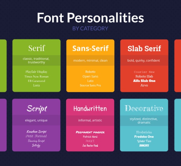
Not any font can be used in any design; there has to be well-thought logic and design concept behind the usage of any font. This is generally governed by the content style, the target audience, and the purpose of the content. As a designer, you need to first understand the content and what you are trying to communicate, and to whom. For example, content could be educational and long or promotional with a short call to action. Or the design is related to sports or women cosmetics. In each of the cases, the fonts to be used need to support the content style.
Following are the major types of content you will get and the corresponding font style that you can use:
- Clean or Simple: Use minimal, san serif fonts with a modern and neat look
- Classy: Use serif fonts with decorative elements which give a luxurious feel
- Casual: Use friendly, handwritten fonts to look informal but casual
- Quirky: Use fonts that go out of the way to look creatively different and leave a good recall
- Techie: Use fonts that are either bold or give a modern futuristic and geeky feel
- Vintage: Use retro fonts or old school calligraphy or bold western fonts
- Display: Use strong bold or creative fonts that can catch the attention of users
3. Use Complementing Font Styles
Now that we know the various types of fonts and the type of needs, we can understand how best to pair them. As a rule, it is always advisable to pair complementing font styles. Use display or quirky style of font for headings where you want to draw the reader’s attention. Then you need to match it with simple and clean fonts for paragraph text. A strong, heavy font style will always look better with a thin neater type of font.
Do not use fonts that compete with each other for attention. This will only confuse the reader about the messaging and also make the design look bad. Instead, you can get creative and pair fonts with complementary moods. For logos especially, you can go for serif fonts for the brand name and then use a neat san-serif font for the tagline. Even for social media posts or other promotional designs, you can opt for decorative headings and then support modern-looking fonts. Also, never use fonts that are too close to each other. That will defeat the whole purpose of font pairing. At the same time, do not use fonts that are worlds apart, as they will only confuse your messaging.
4. Do not Underestimate the Power of Kerning

Kerning is the space between each letter of character in the text. Not all characters are of the same make. Some have extended strokes, while some have simple extenders. The creator of the font style decides how much space will be there between each character. Generally, this is not kept the same for all letters. Rather based on the letter, they are assigned a specific space so that the letters would look visually appealing when used in words.
As a designer, you need to understand that the default kerning may not suit each design. Therefore, you need to work on finding the right spacing between the letters for your design. Kerning is not easy and needs time for you to master it. But it can help accentuate your designs. For font pairing, this becomes more important as you can adjust the fonts to match each other. In logos, you can use bold fonts for the business name. For the tagline, which will mostly be bigger than the name, you can use kerning to make the font style look condensed and, at the same time, match the width of the name.
5. Follow the Three C Formula
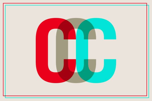
As mentioned at the start, it always helps to have your own set of rules for font pairings and abide by them whenever you are stuck. One such common and effective rule in font pairing is the Three C formula:
- Concordance: Use font styles that belong to one large family. Such superfamilies are easy to find, and they make life easy for designers as the fonts always go well with each other. Many families provide serif, sans serif versions as well. The idea here is that because the fonts have already been designed to support each other, they will look good for all designs.
- Contrasting: Use font styles that are in contrast to each other. If one font is strong and bold, then the other one should be thinner and neat. If the headlines are in serif font style, then you should pair them with a sans serif font. You can make use of typography science here and check the various aspects of the fonts like x-height, weight, axis direction, etc. and use these parameters when finding a complementary font style.
- Conflicting: Use font styles that are not very far away from each other. You may want to avoid it, but there will be times when you need to use fonts that look a bit similar. The key here is to maintain a hierarchy of titles and headings. Another good hack is using colored text. Make your titles stand out with bold colors and follow it up with a similar font style but in a weaker color.
6. Never Compromise on Legibility
This needs to be the rule number zero! No matter how creative or awesome font collection you use in the design, it all goes waste if the text is not readable. The very basic purpose of designing or adding text is that you want to communicate something to the reader; if readers are not able to comprehend what is written, that defeats the whole purpose.
Do not use detailed or handwritten decorative fonts with very small font sizes. Display fonts are meant for headers and short text. Do not deploy them for paragraphs. The ability to read text easily and in a pleasant manner adds a lot of value to the design’s user experience. If you are designing for print media, it will be helpful to get a print in the application size and check for readability. If you are designing for digital media, always see how the design will look on small mobile screens. As a rule, you can decide never to use font styles lower than 6 points.
7. Always Fix the Paragraph Font First
One good hack to get your font pairing right in less time is to fix the paragraph font first. This is because the major part of your content is going to be in this paragraph text. Also, this text needs to be neater, readable, and easy to integrate into the design. For paragraph text, the options of font style are also limited. You can and should never use display or decorative font styles for paragraph text.
It would be a good idea to fix which font you will use in the paragraph text first. It can be a serif or a san serif font style with a clean look based on your content type. Once that is done, you can start looking for the font that will go well with it. Then, you can use the tips mentioned above and quickly come up with a complementary font. Following this process will make font pairing easy, faster, and, most importantly, ensure the readability of your paragraph text.
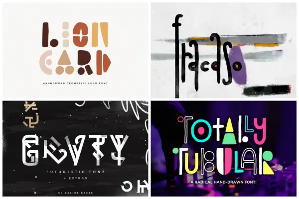
8. Do Not Use More than Three Fonts in One Design
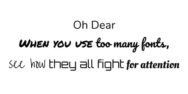
One more tip that you can use as a base rule is not to use more than three fonts in a single design. Ideally, you should be using two fonts as a pair in the design. If need be, add a third font style for additional messaging. But never go beyond that. Using too many fonts will confuse the reader and also make your design clumsy.
As an exercise, you can browse through some good designs on the internet and check the number of fonts they have used. You will never find more than three fonts. This is a good rule to remember and implement. Even if the client asks to use more fonts, you should put your foot down and refuse.
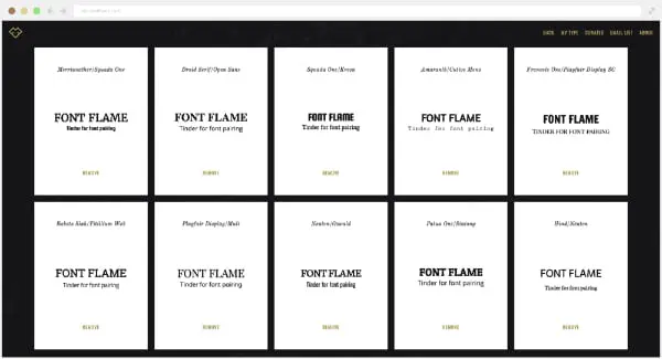
9. Make Use of Online Font Pairing Tools
Even after following all the above rules and tips, there is a chance that you are not getting your font pairing right. Then you can turn to online tools for help. The good news is that many such good tools can provide you with good font combinations:
- Google Fonts has a huge repository of fonts and helps you find the perfect pair for the font you select.
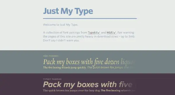
- Just My Type from Typekit and Hoefler & Co also is a good resource for font combinations.
- Type Connection is a fun game that teaches you how to pair fonts, and this way, you get the pairs and learn how to do it.
- Typography.com is also a reliable source for getting font pairing suggestions online.
Do not shy away from using these online resources for finding font combinations. Most of them also provide paired fonts for download, making your work easier.
10. Have Your Own Set of Font Pairs
A professional designer will never afford to invest the time and energy to find the font combination for each design. Based on the design work and its importance, you can decide how much time you spend getting the font pairing right. For example, when designing logos, you must dedicate 20-30% of your time to getting the right fonts for brand name and tagline.
With routine digital media designs, you should develop your standard font combinations. For example, use a good display font with a san serif neat tagline if it’s a promotion post. If it’s an invitation, then go for handwritten fonts. The idea is to have 5-6 fonts ready of each type in your collection and be familiar with them. This way, you can quickly deploy them and get the design right.
Font pairing is more of an art, but there is still some science attached to it. Understanding this logic and implementing them will help get better font combinations that make your design look better. In addition, the above points can serve as a good font pairing cheat sheet that you can bookmark and share with your fellow designers.