Line25 is reader supported. At no cost to you a commission from sponsors may be earned when a purchase is made via links on the site. Learn more
All the mathematics involved in creating a responsive website design can be exhausting and time consuming, but thankfully there’s a range of responsive frameworks available that make the process quick and easy. These frameworks or boilerplates have all the complicated grids, layouts and media queries in place ready for you to add your own design and markup. Here’s a roundup of the most popular frameworks currently being used by designers.
Bootstrap
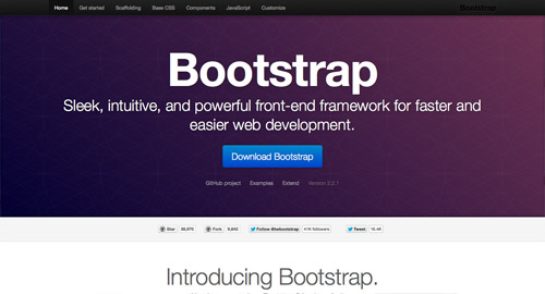
Bootstrap, made by the folk from Twitter, has to be the most widely used framework. It is built with the most comprehensive list of features and can be quickly customised for each individual project.
Foundation
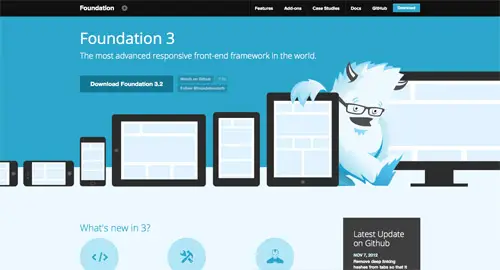
Foundation is an advanced responsive front end framework based on a flexible grid that can be customised to your exact needs. This makes it easy to develop layouts for mobile and desktop devices using the same markup.
Skeleton
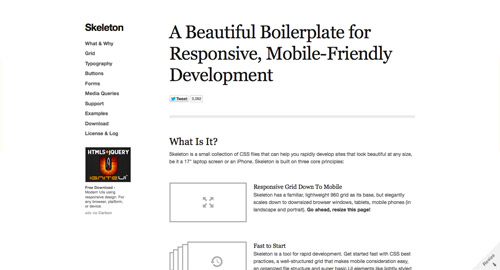
Skeleton is one of the more lightweight frameworks that’s based on a simple grid system. The Skeleton grid elegantly scales from 960px right down to tablets and mobile viewports in landscape and portrait.
Golden Grid System
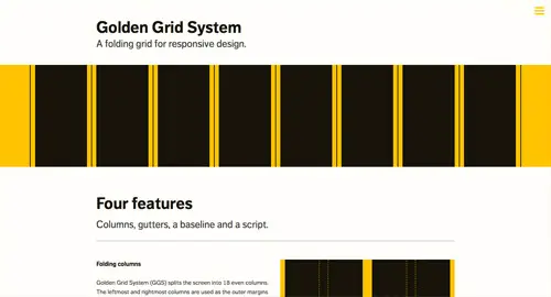
If you’re passionate about grids, you’ll love the Golden Grid System. It starts as a 16 column grid with neat margins and gutters, but neatly folds up as the viewport is downsized to create 8 or 4 columns layouts for tablets and mobiles.
320 and Up
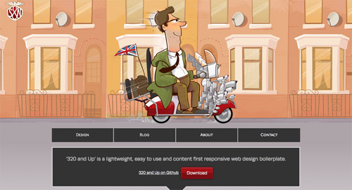
Some designers prefer progressive enhancement over graceful degredation. This is where the 320 and Up framework comes in. It’s designed to create layouts for small screens up, rather than from the desktop down, which ensures the content comes first.
Less Framework
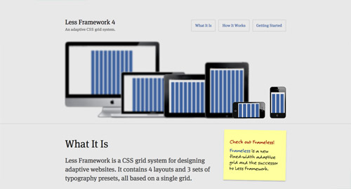
Less is one of the classic frameworks that is based on a simple fixed width adaptive grid. It contains 4 ready made layouts and 3 typography presets to cater for desktop, tablets, mobile and landscape mobile viewports.
1140px CSS Grid System
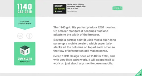
Creating responsive designs doesn’t just mean you’re catering for smaller resolutions, it also means you can go super wide for your maximum layout and still cater for the common desktop resolutions. The 1140 grid creates a nice screen-filling design on 1280px monitors and scales nicely for anything smaller.
Wirefy
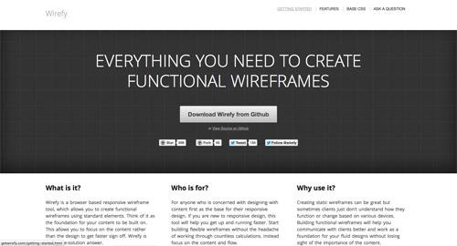
The idea of a responsive design doesn’t always make sense to clients, but it’s pretty time consuming building concepts to show them how it all works. Enter Wirefy, the responsive wireframe framework that makes it easy to mock up layouts with elements such as slideshows, galleries, menus and forms.
Gumby Framework
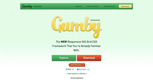
If you’re new to responsive web design, the Gumby Framework might be a good place to start (update: Gumby network is retired). It’s simple and lightweight, and unlike some of the more daunting frameworks, it actually comes with a PSD and UI Kit which makes it easy to mock up your designs the traditional way.
I have been drawn into the vortex that is the twitter bootstrap. It is so adaptable and its javascript library is deep. It just saves time for everyday framework development.
i'm using Bootstrap but i really wish they would take on 320 and up's approach to responsiveness.
Nice. I'm bookmarking this page for easy reference. Responsive design is extremely important for our time. Thanks for compiling these resources.
We have been using Bootstrap and Skeleton on all of our Web Design projects for some time now. It cuts down our development time considerably.
Good collection of blogs.We are running web designing company. our services are web design,web development,seo(search engine optimization),hosting,domain registration,content management system,web maintenance and e commerce sites
I will recommend twitter bootstrap! Even if their is still a bug when viewed in iPad and iPhone.
I've tinkered with Bootstrap, but that's about it – though Im interested in what you use, Chris – you're the master here!
I love Bootsrap! :D
*Bootstrap
Framework you have decribed in your psot are amazing, anybody will use them and create a very impressive website
Don't forget Griddle!
https://www.benplum.com/projects/griddle/
I've used Amazium & its really good!
I second Amazium; I use a slightly modified version where I have changed the gird names, but other than that it works great for what I need..
Skeleton was my first love, but I have since moved on to Foundation.
Foundation is great and has excellent documentation.
I appreciate that code bloat is a nuisance with frameworks, but they're such a time saver – especially if you can get validated.
It is somewhat discouraging when there are quite a few designers who consider frameworks as cheating. On that basis, I do try to code from scratch whenever feasible. However, sometimes these frameworks are suited for the project.
Muy Bueno 3<
I was using Bootstrap, but will check out the others. Thanks
I have been using 960 grid system and found rwdgrid.com is an amazing responsive grid system based on it.
Nice collection btw.
Thanks Chris :)
I've been mostly stitching my projects with relevant parts of HTML5 Boilerplate while I tried out multiple grid frameworks. When I designed my first responsive site, I used a responsive grid generator named Gridpak. I might have to give Bootstrap a much closer look.
When I integrated Sass and Compass into my toolbox, I decided to take a serious look at the Susy responsive grid framework as a natural complement. My first experiment with it was quick and dirty, but those frameworks look great!
How is Skeleton, by the way?
I don't use any of these frameworks, they're all too bloated, I usually just need a basic grid system and not much else to I really like using responsive.gs.
If you use Bootstrap be sure to download the non-compiled source from Github. There is lots to learn from the structure of the .less files.
I use foundation adn bootstrap.
But I prefer foundation
I just started using bootstrap. it is pretty sweet.
Just finished my redesign using the Skeleton Boilerplate for it's ease of use! I'll have to check some of the others you listed here, they look promising!
Thanks…
Thank you to everyone who contributed to the
Which framework do you use chris? I have found myself predominantly using Foundation
I heavily recommend bootstrap or foundation