Line25 is reader supported. At no cost to you a commission from sponsors may be earned when a purchase is made via links on the site. Learn more
Table of contents:
show
Website layout designs naturally tend to make use of horizontal and vertical lines due to the blocky nature of the coding behind them, but designers are breaking free from these constraints by using dynamic angles in their designs. Sometimes these angled lines are simply background images created in Photoshop, but others are animated elements made directly in code. Check out today’s web design showcase to see some great examples of website interfaces with angled lines.
Seesaw

Webalys

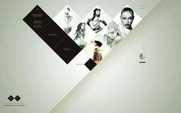
Guillaume Schermesser Portfolio
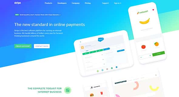
Stripe
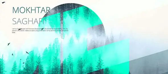
Mokhtar Saghafi Portfolio
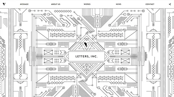
LETTERS, INC.
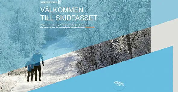
Skidpasset
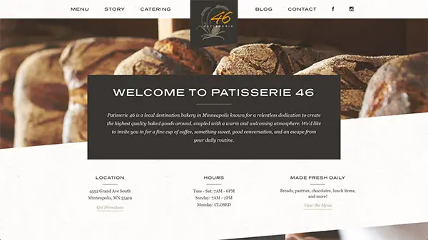
Patisserie 46
Oli Lisher

Paseo Itaigara
Timberline Tours

Curated

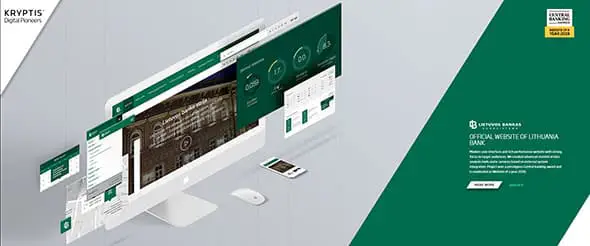
Kryptis
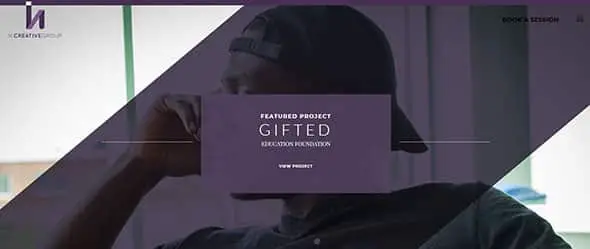
H. Creative Group
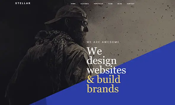
Stellar
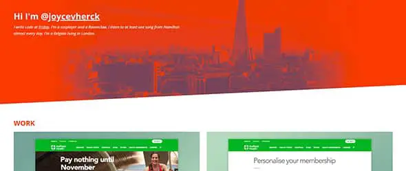
Joyce Van Herck
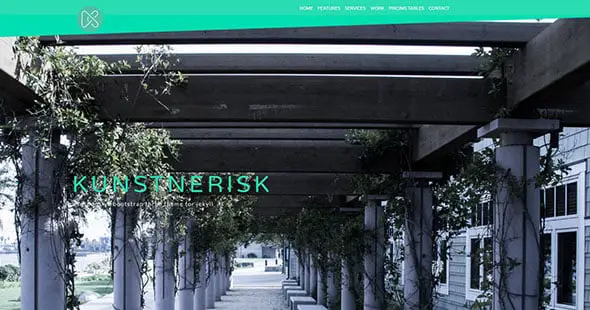
Kunstnerisk


It is the way we can use lines for different purpose. Great way to show it.
Brilliant use of lines. Innovative, different, and definitely high on visual appeal. This post has given me food for thought for my next design. Thank you for sharing these web designs.
Webalys is the best and the Letters Inc is the worst design. I don’t know why you have added it in the list. However, the list was awesome and I got several new ideas while going through your list. Thanks for sharing this.
It’s great how these lines have been used and it makes the site look original and well placed. Nice selections!
Nice collection, we can use Razor Jam design for consulting websites. Because It has two main parts one for the image of owner and 2nd for the view.
Very useful for examples of Web Design!
Thanks for great collection!
Love this collection! You’ve done a great job to put all these designs together in such an inspiring collection)
thanks your nice ideas! Navy Design and 3D home site is very attractive.. and cool color…. we are waiting for more….
https://www.halones.com
Hi Chris,
Thank you for sharing.
You definitely have good list there.
Case 3D is a personal favorite but other designs are quite inspiring too!
Will try these out for our future projects!
Cheers!
Georgette
so great and useful to me , Thanks
Very professionally and thematically design websites.. Designers should get inspiration from them all..
Awesome Collection
Great showcase. I liked Patisserie 46 a lot.
Nice collection but case 3D is a class apart and stands out completely.
Great list. Love the angle line designs. By the way, the H. Creative Group link is broken.
It is not broken .. there is an extra path on there called “https://line25.com/articles/www.hcreativegroup.com” … I imagine the “https://line25.com/articles/” path should be removed for the website to work perhaps :)