Line25 is reader supported. At no cost to you a commission from sponsors may be earned when a purchase is made via links on the site. Learn more
Creating a truly original design for a corporate presentation folder can be difficult. Presentation folders have become a staple in business’s print marketing collateral, so at times, it can feel as if everything you come up with has been done before.
While it’s not rocket science, there is a science to creating a unique design. A powerful design doesn’t need to be overpowering. Here are some tips for creating original presentation folders from the printing experts at Company Folders, Inc. to help you find the perfect balance and make your next design stand out.
- Play with different shades of gray
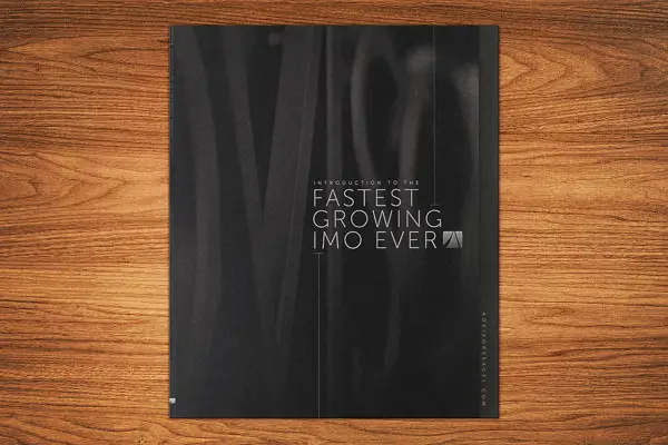
Sometimes, bright colors can be too much. The gray-scaled charcoal lines on the cover of Advisors Excel’s presentation folder give it a new level of texture. Black and various shades of gray combine to create a sleek, elegant design. Its sans serif font caps off the modern look.
- Make their fingers tell the story
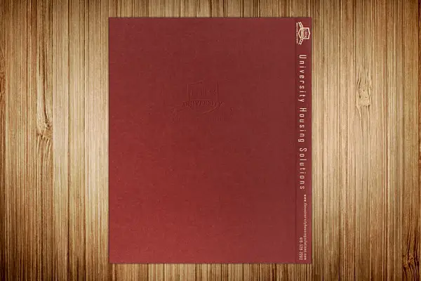
One way to make your design memorable is to appeal to people’s sense of touch beyond holding the paper. People will form a connection to University Housing Solutions when they run their fingers over the embossed logo on the cover of this file tab folder. As their fingers continue to the tab, they’ll feel the smoothness of the shiny gold foil stamp against rough linen stock and feel compelled to look inside.
- Add Depth
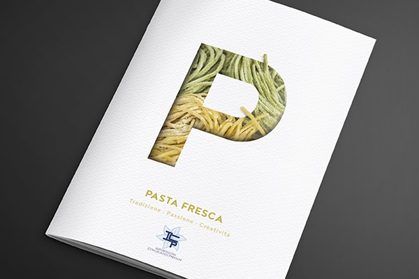
Adding another dimension to a design adds a complex element to an otherwise simple design. Recipients will want to grab a handful of fresh pasta when they get this promotional brochure folder from Pasta Fresca. The clean, three-dimensional design looks like a die-cut of a large P that you can pull the yellow and green noodles through on the cover, making people hungry for some delicious pasta.
- Keep it Simple
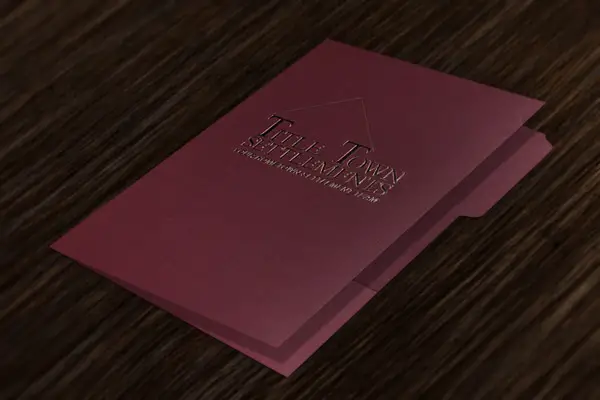
A simple design can spark just as much inspiration as a complex one. Title Town Settlements features only its logo on the cover of this real estate folder, but that doesn’t mean it isn’t unique. A roof connects the Ts in the company name, putting everything a homebuyer needs under one roof, while the gold foil stamp represents luxury and wealth.
- Use Multiple Imprint Methods
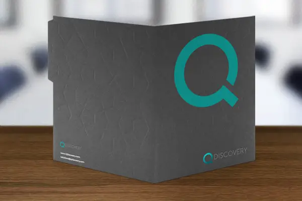
This file folder design combines multiple imprint methods to create an innovative design for QDiscovery. A debossed cobblestone pattern stands out on the solid, gray background and provides a pretty cool texture to the folder. The company’s name still stands out at the bottom of the cover with a shiny foil stamped Q.
- Less is More
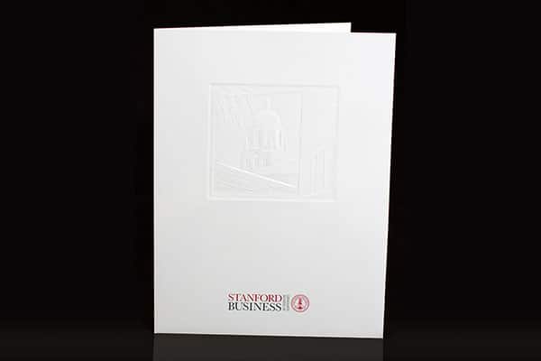
Though there is little color on the cover of this folder design, it’s far from plain. Recipients get a peek at the campus of Stanford Graduate School of Business as one of the school’s prominent buildings is embossed on the cover.
- Repeat Yourself
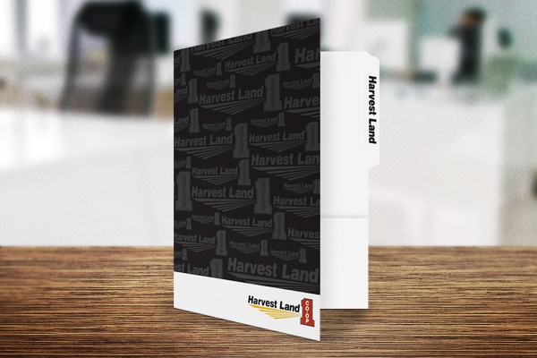
A great way to impress a brand on people is to use the power of repetition. There is no way recipients will forget Harvest Land Co-Op, as the sales folder design features the company logo printed all over the cover in various sizes. Its neutral color pallet adds some subtly to the design and allows the recipient to focus on the brand by not competing with the logo.
- Shine Bright
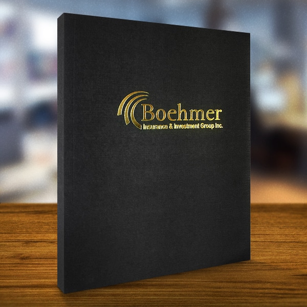
Many custom folders use foil stamps to add elegance to a design and make a specific element stand out. A fancy gold foil stamp adds a luxurious luster to this professional design for Boehmer Insurance & Investment Group, Inc. The black, linen stock adds another level of sophistication to the corporate folder and makes the company’s name pop even more on the cover.
- Subtle Elements Stand Out
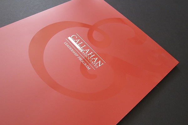
Sometimes, it’s the smallest element that can make a design special. In this case, it’s the clear coating on the cover in the shape of the company’s logo. It draws attention to Callahan & Associates by circling the business name at the center of the cover. The bold red background lets people know the contents are important and makes them take notice.
- Let the Images Tell the Story
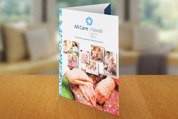
The best way to appeal to someone’s emotions is through images. All Care puts its photography skills to use with its creative design. Images of happy, comfortable elderly people are featured to make people secure in their choice of facility for their loved ones. No one image is more important than the others because the layout shows they are more powerful together.
- Be Bold
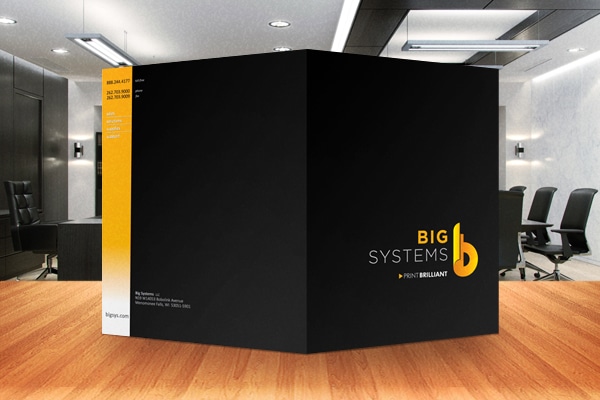
Using a bold color can have a similar impact as a foil stamp as it helps attract attention to a specific element or product. A bright yellow logo for Big Systems catches the eye as it stands out against a sold black background. Each word’s importance is highlighted with a different weight on the modern, sans serif font. An orange ombre stripe on the back draws attention to the company’s contact information.
- Highlight the Product
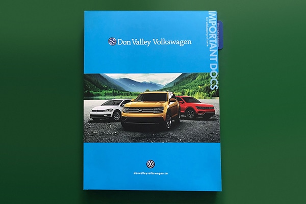
Making the vehicles the primary focus in this folder brochure design helps build the excitement customers feel when they receive it, as it’s likely one of the last things they receive before they drive their new car home. The beautiful scenery behind the vehicles illustrates the peaceful, serene feeling drivers will have on the road. A blue background represents the security people feel with the Don Valley Volkswagen brand.
- Use Complementary Colors
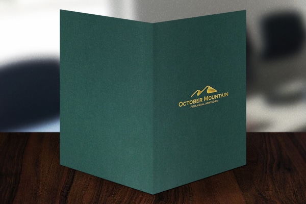
It’s important to be mindful of the colors used in the design and what they represent. These colors work great to illustrate the October Mountain brand in more way than one. A shiny gold foil stamp stands out against the dark green linen stock, similar to how new gold coins would shine against money. Fitting because the business is home to financial advisors. In addition, the forest green background represents the mountains of the great outdoors to remind clients of the business name.
- Everything Doesn’t Have to be Centered
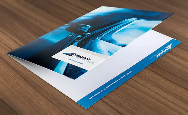
While many specialty designs will print logos or prominent images in the center of the cover, it’s okay to play off the sides, too. McMahon Automotive Group is a great example of that. The sleek new car is speeding off the side of the folder, which lures clients to look inside at its documents. The logo features three strips that mimic a smooth highway and highlight how smooth the process of getting a new car will be for clients.
- Go Beyond the Cover
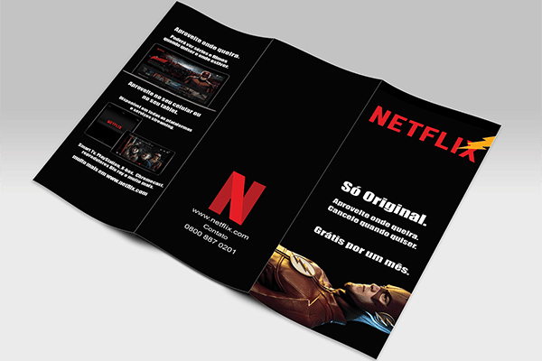
It is important to have a compelling design on your cover, but that doesn’t mean it has to end there. This Netflix tri-fold brochure uses elements of “The Flash” throughout the brochure, while staying true to the brand’s identity. It doesn’t overdo it with a lot of flashy movie images, instead keeping it simple with one large image of “The Flash” at the bottom and his classic lightning bolt logo at the top. More images from the movie are inside to highlight various ways viewers can watch.