Line25 is reader supported. At no cost to you a commission from sponsors may be earned when a purchase is made via links on the site. Learn more
Minimalism is a timeless design style. It uses the least elements and places them strategically to express more with less. Usually, minimalism is considered to be easier than the maximalist design. This is because it looks far less complicated visually. However, that makes it all the more difficult to put across the brand’s message with minimum elements. Minimalism itself has seen a recent spurt in popularity as a movement or a design process. Neo-minimalism is a further development of traditional minimalism practices and aims to take it to the next stage. It is stricter when it comes to reducing more elements and making use of negative space more, making the design still look appealing, using mesmerizing typography and colors.
The reason Neo-minimalism is gaining widespread popularity is that people are being drawn towards the less is more philosophy. It’s about communicating effectively rather than communicating everything, quality over quantity. The trick is to find a way to most creative with least elements.
Why maximalist design can be limiting:
Complex designs or maximalist designs can be suffocating. There are too many elements all over the place that doesn’t allow breathing space in the design. It can get overwhelming and tiring for the audience. There are so many elements that need a certain share of your attention that you might get lost in the entire process. Even if the design looks pleasing, you might get so invested in it, that forming an overall perception about the true message could be challenging.
Minimalist designs are also easier to remember. All religious symbols often are a single character or illustration that has such power that all people belonging to religion can identify it anytime, anywhere. Complex designs can be challenging to remember in comparison. Hence summarizing all that the brand is about in the least elements and space possible makes it easier to remember.
We’ve understood the parent design methodology of minimalism and discussed the limitations of the maximalist design approach. Now let’s understand how to implement Neo-Minimalism in design:
1. Using creative fonts with caution:
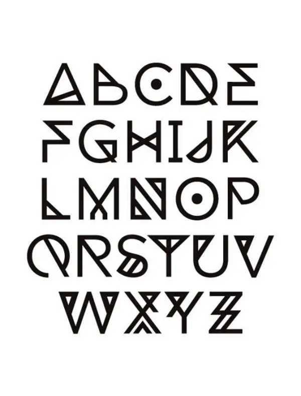
Since neo-minimalism beliefs in using as fewer elements as possible, it is important to ensure the ones you use are engaging and appealing without compromising on legibility. Many times designers use typography for their design project and implementing neo-minimalism. They at times go too far to get creative and compromise on the legibility, which makes understanding the design more difficult. Hence you need to find the right balance between creative and legible. Avoid using more than two font types.
2. Using strong images:
Strong images have a direct impact on achieving the neo-minimalist design. They help create focal points. Select the image you want to use, by keeping in mind balance, symmetry, contrast and open space. The focal point can be on the subject of the photo, and you could still balance the design out by placing your name on the side. This way, the design wouldn’t look forced but subtle. This also would help the audience first to feel what they do seeing the image. Secondly, to see your name as a solution or way to get exactly that. This helps them form a connection between the product/service with your brand.
3. Use simple colors:
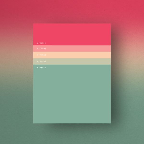
Since the design technique requires minimum elements, the design style should also complement it. If you try using gradients or fills, the design might look too worked upon, and untidy. Hence try using simple colors that complement each other. Generally, designers stick to two-three colors only. Using two colors helps create more interest and a pop effect. Colors often help create an emotional as well as an insightful link to the product with the audience. By using limited colors you emphasize the impact of that color on the overall design by many folds. This helps create a sense of urgency as to what the color represents. Different colors could invoke different reactions or actions such as donating, get started, buying and subscribing.
4. Maintain balance:
Ensure that the entire composition is in balance. Use elements of different weights across the canvas in the most minimum count. Since there are lesser elements to play with, balancing can be a little difficult as you can’t counter each element with another. Make use of negative space in a way that the design looks overall pleasing.
5. Flat Design:

Design trends have seen all sorts of development in recent years. Many designers have started using complex real to life graphic elements to make the design look as real as possible. There is also the support of 3d rendering for many such design practices. However, in recent times, there has been a recall for flat and simpler designs, especially in minimalism and neo-minimalism. Applying 2d visuals instead of intrinsic detailed elements helps the designs feel simpler and more welcoming to the audience.
Applications of Neo-Minimalism:
1. Logos and Designs:
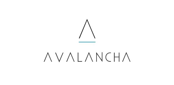
The simpler a design is, the easier it is to recall. Neo-minimalism is the best way to capture viewers’ attention and also their recall ability. For neo-minimalistic logo design, designers often use geometric shapes. They’re easier to understand and remember since they are the basic shapes we are taught about since childhood. Shapes like square, circle, rectangle and triangles also create a sense of balance and proportion. This helps create focal points for design.
Other than geometric shapes, you could also use monoline and flatforms. Many big brands often rely on a minimalistic design approach for their logos. Like the M for McDonald’s helps easily recognize the logo with the brand. The color yellow also is almost synonym to the brand. For small businesses, neo-minimal design practices are cost-efficient and time-efficient as well.
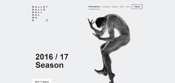
2. Websites:
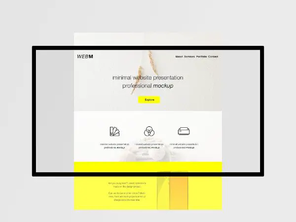
For any website design, the top priority should be providing value to its visitors. It should help visitors navigate without feeling lost or overwhelmed. The ideology of being true to the business and avoiding extra noise is a crucial characteristic of neo-minimalism. For achieving a simple and effective UI, there are certain neo-minimalist design principles that you should know.
Firstly, try using whitespace. Whitespace is the space between two different elements of a composition. This helps improving user experience. It also helps the audience focus on your website content and product.
Using bright colors in a neo-minimalistic design can be tricky. As a designer, you need to find the right balance between vivid backgrounds that are appealing and too colorful backgrounds that get irritating. Generally, a trick to do this is to complement the vivid bright colors with soothing low tones and hues.
Secondly, try using fonts that are bold and beautiful. You can experiment with any fonts, until and unless it’s legible and easy to read. It should also capture the attention of your users. For neo-minimalistic website design, typography often holds the ground for compensating for lack of other design elements such as imagery and animations.
Fonts can also help create a hierarchy that can help navigate the audience to find what content is more important and what is less. Sans serif font is the best font type to implement neo-minimalism in design.
3. Package Design:
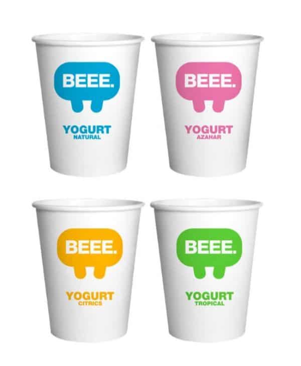
Neo-minimalist design practices aim at using graphic elements in a way that it doesn’t distract the audience from the central focus point of packaging. Hence having a neo-minimalistic package design helps products stand out from the rest of the products on a shelf.
It helps the customer to easily recognize the product and make instant decisions to purchase it, saving them time and energy. Using neo-minimalism helps reduce the conflict and confusion of decision-making time hence leading to better conversions.
Apart from the appeal it has to the potential customers, it also has a positive impact on the environment. This attracts environment-friendly customers towards the product and packaging as well.
Using neo-minimalist design is also economically viable, as it cuts down on cost by a significant margin. Since the brands save money using neo-minimal approach, it translates to benefits for the customers as well. They get the products for a lower price. Hence it creates a win-win situation.
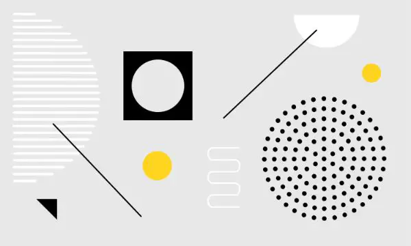
4. Icons:
![]()
Icons are an accurate representation of your mobile or desktop applications. They are the first interaction your potential customer has with your app before they even decide to download it or not. Hence it is crucial to make the icons as appealing as possible. For this, many designers believe in using neo-minimalistic design principles. Hence design icons that are easy to understand. For this use minimum elements and flat designs that are 2d in nature.
Many times, the designer only uses the silhouette or outlines when the objects are relatively simple to comprehend. Many people misunderstand minimal as simple to design. This isn’t the case; it is more complicated and requires more significant details. Minimal icons need to be sharp and accurate. Otherwise, they wouldn’t convey the message they are supposed to.
Now that we have understood where to apply neo-minimal design trends let’s understand when to use it.
1. Reaching out to a sophisticated audience:
Neo-minimalism is an open-end design style to some extent. It allows the audience to interpret the design in a way they seem best. Hence such designs require a two-way engagement. Not all audiences would appreciate this. Some people like the inclusion of many graphic elements as it holds their interest as they have many elements to explore. Hence, neo-minimalism might not work for everyone; hence, your target audience should have a certain sense of appreciation for this philosophy.
2. Targeting an audience that wants effective communication:
Neo-minimalism is a great design style for people who don’t want to waste time. Most of the traditional advertisements are in forms of banners, boarding and more. This kind of advertising is known as disruptive advertising as the audience only gets a glimpse of them while in transit. It takes away from the activity they were doing and demands their attention for a split second. This in itself, can be annoying for most people to begin with. If you give them many elements to focus on, chances are the core message might not get delivered effectively. Hence using neo-minimal design here could be of worth.
3. Neo Minimalism for versatility:
One most prominent advantage of neo minimalism is that it is faster, easier to use and versatile in its utility. Since neo-minimalistic design uses the minimum possible elements, they are easier to accommodate in different formats. This makes neo minimalism great for web designs or graphic design projects as well. It also makes it great for logo design as the logo can be used on different formats such as apparels, storefronts, accessories, and much more.
4. Utilize the patterns on a bigger canvas:
There are spatial relationships to a design that can be further explored and taken advantage of with neo-minimalism. As a designer, you need to understand how your design interacts with different elements. An excellent example of this can be seen in Lightscape’s business card. The yellow strokes together look like continued lines when putting together.
Neo-Minimalism isn’t just about using fewer design elements, but also a careful and creative choice of where and when to use them. It isn’t putting a limitation to someone’s design options, but rather an exploratory style where you could get more creative with a design. It could be a little tricky at the beginning as a designer to incorporate neo-minimalist design principles. However, with practice, anyone can reap the benefits of using neo minimalism in their design.