Line25 is reader supported. At no cost to you a commission from sponsors may be earned when a purchase is made via links on the site. Learn more
Psychology and Mathematics many times have more implications on our lives than we think. Psychology helps to create surprising insights into understanding the brain’s functioning. Math is more prevalent in our daily lives than we realize, as it’s used in architecture, musical instruments, our daily commute, and much more. Hence, using the core principles of both these disciplines is a conscious effort that many designers try to incorporate in their website design. It is crucial to understand the various tools at your disposal to exploit them and get the best results out of them.
For the same reason, we discuss 10 Math and Psychology Tricks That Will Help you Design Better Websites:
1. Using Priming in your Design:
Priming refers to the psychological training of our minds that creates an association with different elements like images, sound, words and colours to define a particular thing. For instance, whenever you think of a blackboard, your mind associates with learning, school, education. Hence Priming is a memory effect in which one stimulus triggers remembrance of others.
When used to business strategies Priming can have a significant impact on consumer decisions. For instance, if a restaurant plays instrumental music, it impacts the consumer’s mind and increases their chances of ordering wine, whereas if there’s a bar with country music, that stimulates the mood for ordering a beer. When it comes to website design, the concept of Priming can have a significant impact on visitor retention and engagement if the content of a website is displayed on a website, with different background colours, the visitor’s interaction with the website which differs from colour to colour. Having a green background to a car website would lead to visitors focusing on the cost aspect primarily, while the orange-red background would trigger their stimulus to pay attention to the car details. Having an essential insight into colour theory can help you implement the concept of Priming with more efficiency for your website.
2. Guide your audience to choose rightly:

Thinking from a visitor’s point of view, they meet choices at every stage of their interaction on content available on the web. From the landing time on your website, they need to decide if they want to scroll further or switch to another website. If they need to contact you for further information or book your services immediately. You can control most of these questions as per your preferences if you ensure certain necessities to guide them through these decisions cleverly.
Focus on what is the value they’ll get for choosing you and assure them that they’re making the right choice. Put the focus on the benefit they would get in exchange for the effort or cost they’re investing it. Ensure that the visitors who have a genuine interest in interacting with your website don’t have obstacles placed in front of them that throw them off. Make sure the external links open in a new tab and not the same tab that drives your visitors away from your website. If you’re website have registration forms that need to be filled, make sure it’s available at all the right pages instead of one page that your visitors have a difficult time finding. If there are three plans that you have available for your visitors to choose from, which are cheap, intermediate, and expensive and you want to target your audience’s choosing psychology, place all the plans side by side in a table and show how the intermediate package offers way more benefits than the cheap one, but also not much less than the expensive premium package. The idea is to pitch the intermediate plan as “economical” and visitors feeling that they’re getting the best deal when they choose the second option.
3. Applying Rule of Thirds:
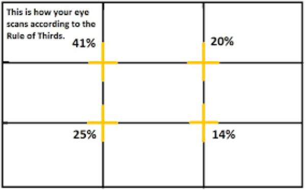
Rule of Thirds is a mathematical method of dividing a frame into nine equal parts by spacing two equally spaced vertical and horizontal lines. Its application in photography is generally well known when the photographer frames the image in a way that the subject lies on power points, i.e. two intersection points of the horizontal and vertical lines. Using this technique is known to raise a sense of tension, energy and interest in the composition as compared to keeping the subject in the dead Centre. The same concept can be applied to web design and using it would help guide users scan the page with much more ease and efficiency.
4. Golden Ratio:
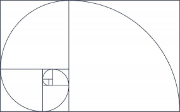
Golden Ratio is also known as the divine proportion. It is an irrational mathematical constant with an approximate value of 1.618. Using a golden rectangle that follows the principles of Golden Ratio can be arranged in mathematical ways in website design to generate beautiful designs. Using them for ads and images in the sidebars of your website is a proper application of the Golden Ratio. Using the Golden Ratio helps create a balanced and classical look. The design looks right and unconsciously pleasing to the users. Images block texts, buttons and sidebars all can be used in a golden rectangle to form a perfect design.
5. Keep it Personal:

If your visitors can imagine themselves engaging with your products or vision, the chances of them being more committed to your website. Indulging the visitors in your story, making them a part of your journey makes them feel real engagement instead of abstract or imposed engagement. Some psychological facts highlight that people react better to images that have faced in them. Generally, because they find it easier to relate to such images more. However using stock images, with imposed poses of people barely attracts any engagement. The more real people look, the better the visitors react to such content on the website. Use second-person and active style in your content to connect to your visitors in a better way. For instance “medical services catered just for you” sounds better than just “medical services”. The intimacy you want to evoke is as if you’re talking face to face to your audience even when you’re appealing to masses. Adding depth and meaning to the content on your website by incorporating all these habits help create better and active engagement on your website.
6. Keeping it Simple:
Often when you create a website for your specific product or service, it is understandable that you have a fair amount of knowledge regarding the field. You would create a website around a specific theme, idea or brand. Though this can be a great asset to assure your information on the website is relevant, it can have its downsides as you can tend to go overboard with the depth of information you’re providing because there are chances that not all of your visitors are on the same level to comprehend your information of years of experience. Often when putting the content, their chances are to have a cognitive bias that makes you assume that all of your visitors or potential customers share the same experience, understanding and attitude towards the topic at hand. This leads to negligence of clarifying important aspects and risking being misunderstood.
To avoid this, always look at the content of your website from two perspectives: an expert perspective and your visitor’s perspective. Consider looking at the site header of any existing website that targets a niche. Think of it from an expert’s point of view and see if it’s a fun wordplay that gets the message across for you, and then switch to an average visitor’s point of view and reevaluate the header. If it doesn’t make sense as the latter, chances are it won’t serve much potential to create any value for most of your visitors.
7. Using Symmetry:

When you organize your content into proper symmetry, the reader finds it more comfortable to differentiate between two text blogs and also gives an easy to follow visual guide. It helps comprehend the information in an orderly manner. If your content is not in symmetry, the reader might feel a sense of imbalance and non-linearity that might break their flow of absorbing the information, and they might find it difficult to concentrate. Now the real trick to using symmetry is, understanding its pros and cons and using both to your advantage. Since you know that breaking from symmetry makes it difficult for people to concentrate on the whole content as one, placing CTAs asymmetrically to an otherwise symmetrical page makes it stand out and catch the visitor’s immediate attention which works to your benefit.
8. Applying Hick’s Law:
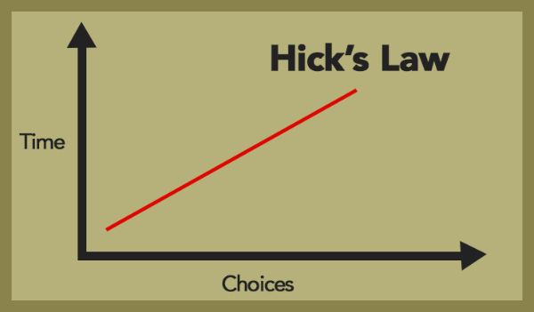
William Edmund Hick and Ray Hyman were psychologists who conducted research experiments for assessing the informative cognitive capacity of people. The study concluded that as you increase the number of choices available, the longer it takes to make a decision. Your audiences already have a lot to choose from, and they’re under pressure of choosing the right deal. When a plethora of options is thrown at them, it can prove to be stressful rather than helpful because they’ll have to refer to all the available options in-depth to make the right decision. Hence, overselling is also not a good practice. Cutting down your options to the most relevant ones that provide actual value to the visitor, doesn’t only save them time but also makes them feel at ease and more in control over choosing from a range they’re comfortable with. Some good practices for website design using Hick’s Law are using minimum fields when creating a form, as visitors might lose interest in filling long forms. Each social media button you add, adds up to the loading time of your website, so while it must seem like an ideal situation to use all the social media links in your inventory, you should stick to the bare essentials that your potential clients are mainly going to be active on. Don’t over clutter your web design with too many clickable CTAs, especially on your webpage; instead have a relevant, neatly placed CTA on your homepage at a strategically positioned place.
9. Understanding Proximity:
The Law of Proximity mentions that elements that are nearer to each other seem to be related. You should be able to intentionally use this trick by using the placement and spacing of elements in your design. Placing two elements closer together leads to the assumption by visitors that the two things are related, regardless if you meant to showcase that or not. Using proximity to ensure that visitors don’t make unwanted association is not using proximity to its fullest potential. You should use proximity intentionally to create contrast and provide clarity from a design perspective as to what content goes together, what needs to be seen differently. For instance, placing headers close to the body text helps create instant clarity that the text is related to the content below.
10. Applying Fitts’ Law:
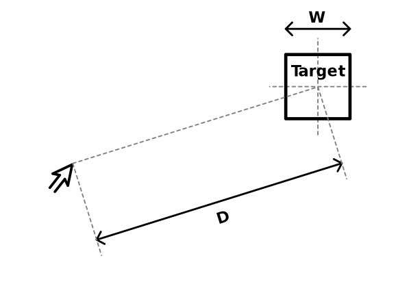
As per Fitts’ Law, the time required to move to a target is the function of the target size and distance to the target. This law can be applied to web design by focusing on the hit areas of our objects. Basically, the larger we make the clickable areas of the critical links and navigation elements, the easier they are to be clicked upon. You need to keep in mind that as web designers we are accustomed to using the keyboard and the mouse very efficiently; however, an average visitor might find it difficult to click on links that have small click area.
Often people make the mistake of coding the text of a design element where the menu bar is clickable but the entire tabs that contain them are not. Instead of just making the text clickable, it is better to add padding to that link element, increasing the clickable area. Similarly, this can be used in the reverse psychology manner as well, making the buttons or texts we don’t want people to click, that much challenging to do so, by intentionally just coding the text and not padding the extra area. So, CTAs such as save are larger and are padded throughout, whereas delete or cancel links are selectively coded to the text.
With this, we conclude the 10 Math and Psychology Tricks That Will Help You Design Better Websites.