Line25 is reader supported. At no cost to you a commission from sponsors may be earned when a purchase is made via links on the site. Learn more
We do a fair bit of trend spotting while we’re browsing for cool website designs to feature in our inspirational web design roundups. One design trend we’ve noticed that is becoming more and more popular is the split layout, where the page is divided vertically into two halves to display separate areas of content. Often these two halves are contrasting with light and dark color schemes and allow the user to make a decision on the type of content they want to see.
If you’re looking to create a stunning website with a different design, here are some excellent website which you can use as an inspiration. In this article, you’ll discover 10 exceptional examples of websites which were created using a vertical split design.
Although the vertical split layouts may seem to have the same design, there are lots of creative features which you can insert to make it unique. For instance, you can play with contrast, various animations, parallax effect, stunning illustrations, typography, graphics, video backgrounds, music, etc.
A split-screen layout usually has a full-screen design which is then divided into two or more vertical sections. When used properly, this type of layout can be used to create outstanding websites with impressive designs.
So, here they are! Get you inspiration from this exceptional websites and decide if you can use this type of layout for your future websites.
Rick & Drew
This is a stunning website which a beautiful black & white design. This split-screen website with a minimalistic design and subtle animation effects.
Fifty-Five
This vertical split-screen layout has a beautiful animated background which is enabled when hovered over. The design looks stunning with contrast and a simple but effective design. This is the landing page which takes you to the specific homepage for each city.
Blueprint: Split Layout (Tutorial)
Discover the full design of this wonderful website and see what new features you find. This two sides vertical split layout showcases two portfolios in a creative manner and with a sliding animation effect.
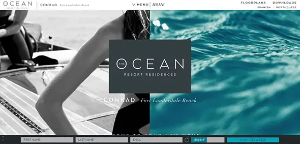
The Ocean
This is an exceptional website with a split-screen layout and a luxurious design. The designer used a full-screen layout with a two side layout as a presentation website for a resort residence. The overall design is outstanding, with eye-catching images, beautiful fonts, a fixed header design which is always at your reach, etc.
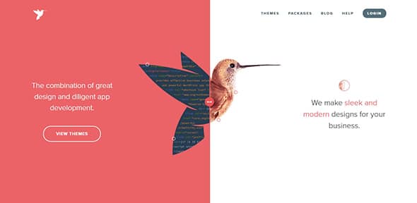
Engine Themes
This unique design will definitely get your attention. What makes it special is the creative animated image from the center and the draggable vertical side which shows more or less from each section. Also, the design is fully responsive with an adaptable screen that will perfectly fit any screen size.
Kirichik
This is a minimalistic website design with a two split-screen layout. This full-screen design gets your attention with the contrasting sides and the simplicity. However, one you hover on top of each section you’ll reveal the menu and a short description with a direct link to check out previous works.
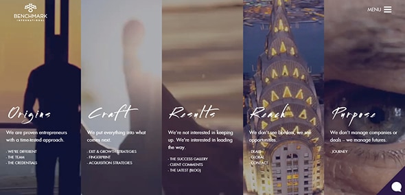
Benchmark International
A split-screen layout can be divided into countless sections, according to your requirements. This is an outstanding website design which has a creative split-screen layout that will definitely get your attention. Each section extends its layout once you hover over it to reveal its full design. Also, the video backgrounds are a beautiful asset which adds a professional look to the overall design.
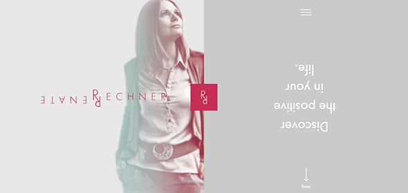
Renate Rechner
This is a stunning website with a split-screen layout. The color palette is stunning with soft colors and pastel backgrounds. A unique feature is how the designer thought the navigation. When scrolling, the entire website rotates from one side to another, to perfectly view its entire content.
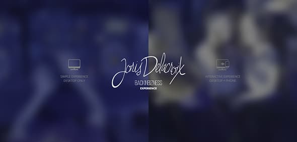
Joris Delacroix
Here’s another wonderful website with a split screen layout. The unique backgrounds are enabled on hover and you can choose which design you want to use. However the busy is the background image, the central point remains the logo design from the center of the page. Follow this link and get the full experience!
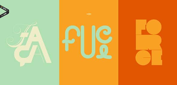
Fillet
This unique website has a creative navigation which is enabled when you scroll. The three vertical sections, with their colorful backgrounds and creative illustrations, are replaced by other ones, with similar features. Moreover, the design has a responsive behavior which allows it to perfectly fit any screen size.
Split-screen layouts are here to stay. Whether you make it part of your own design, though, is entirely up to you.




There are some really interesting designs here, I can think of couple of projects we’re currently working on where this sort of thing could be utilised. Kirichik is my personal favourite.
I like bike design layout and portfolio layouts . Thanks
When done right, vertical split layouts can look really good- like in the sites featured in this list. Done badly, it can look like one of those before/after pictures we see in newspaper and magazine ads. Great list!
Nice, all the layouts are very nicely designed!! To make out a different web design trend I think such split layouts will keep handy contribution. Thanks.
Medium.com too
Great points. However I want to suggest that we must remain flexible on Step 1 and Step 4. It all depends on how the site grows and how people actually respond to it. Changes are just an ongoing thing of a successful site.
Wow! It’s really awesome. Thanks for sharing
Wow, Wonderful collection… i like Mission Motorcycles
Really, this is a very interesting web design technique. It may definitely useful for amazing creativity and designing. Thanks for informative article.
Lovely creativity find , though the split screen does have some nice output but is the background stored as a ‘single’ image .. or is there 2 images ‘plugged’ together using CSS ?
I still don’t see why people like split designs. That’s like having two different Websites merged into one.
I love split design layouts- both in web designs and when they appear in magazines! Great compilation, Chris.
Old school flashwork scholastic layout, glad its becoming popular again.
This is wonderful article.
Chris thanks for this !!! really nice ti read this article :-)
I’ve been seeing this more and more. How about the mobile aspect? Might not look as good on an iphone..or would it?
there is zoom option available in iPhone which make webpage display just like watching on LCD
I think the two sections of the page should be closely related, like Rick and drew, Desk time and mission motorcycles, to make an attractive page. Otherwise, they will look like two different pages as you can see in coffee and Peugeot sites.
Cool split designs! Thanks for the post.
Check out this split Webdesign.
https://www.papplab.at/
this is awesome!
woah i like this
These split designs look great! Thank you!
This is great! Would work well for car manufacturers to see the interworking of the cars.
Really nice. Interesting concept and it seems to work well. Thanks for the resource of ideas!
Amazing split technique worth utility and consideration.
Like these, Chris!
If you’re able to put together the design correctly, then you’ve got a masterpiece to take advantage of. I think vertical-split designs are a fantastic tool especially when combined with that of a responsive nature. It adds a certain ‘edge’ to the look and feel of the website that is sometimes lacking from others. Big, bold but overwhelmed with simplicity is becoming far more effective and powerful than other styles of designs.