Line25 is reader supported. At no cost to you a commission from sponsors may be earned when a purchase is made via links on the site. Learn more
Web design galleries are great places to find inspiration and gain an insight into the next big trend, but you’ll often find that the same sites are featured time and time again. Browsing sites such as Dribbble where designers share their current works in progress is a great way to find some hidden gems before they hit the mainstream.
As we all know live projects can often veer off in a different direction when the client gets their say, so it’s great to appreciate some untouched designs presented exactly how the designer originally envisioned. This post rounds up over 30+ brilliant full-page web design concepts that aren’t yet live on the web. Get inspired by these creative web designs and follow their designers on Dribbble for more inspiration!
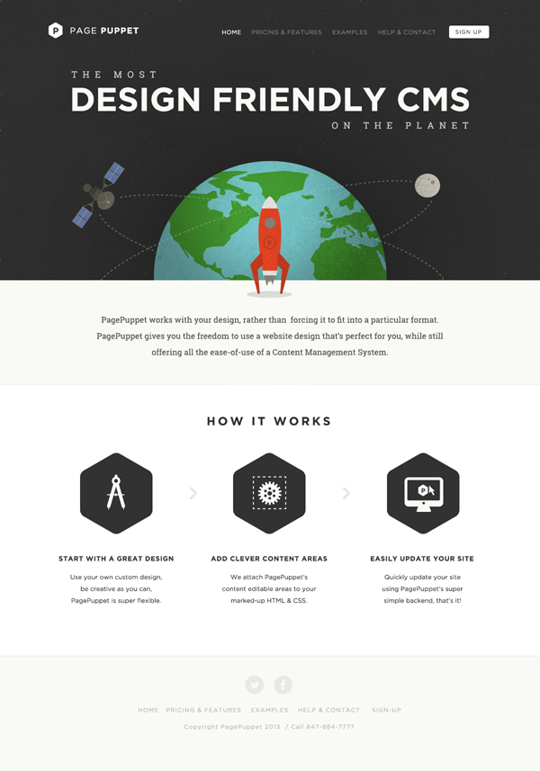
Page Puppet by Oli Lisher
The first example focuses on a minimalist design, with a large horizontal image as the first thing a visitor sees and over which the designer placed huge typography.
Dapper Ink by Joel Reid
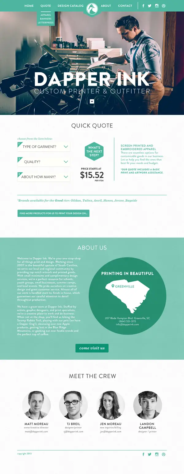
This example has a modern and eye-catching design that focuses on a green-based color palette.
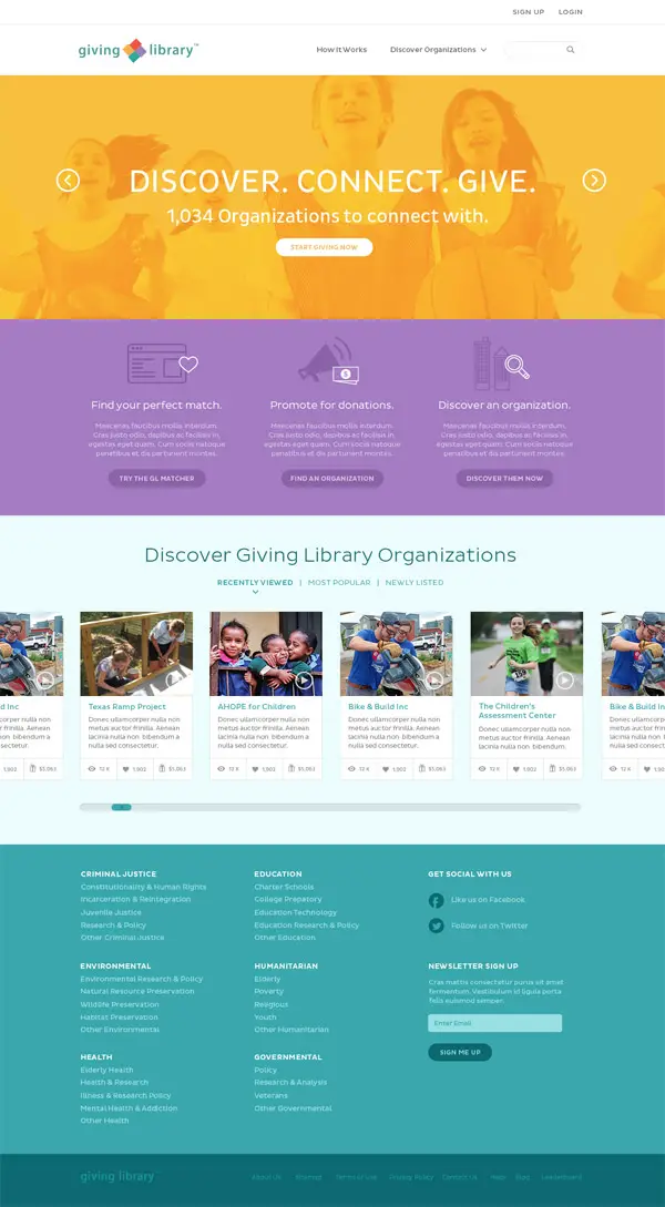
Giving Library by Meagan Ryan
This example has a friendly and colorful design layout which can definitely grab the website’s visitors’ attention.
Sun’N’Fun by Sam Stratton
Let’s continue the series of good examples that can be a great source of inspiration with the Sun’N’Fun concept which also has a friendly and colorful design.
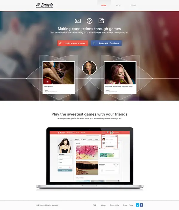
Sweetr by Julia Khusainova
If you are looking for an elegant way to promote your apps of this might be your next source of inspiration.
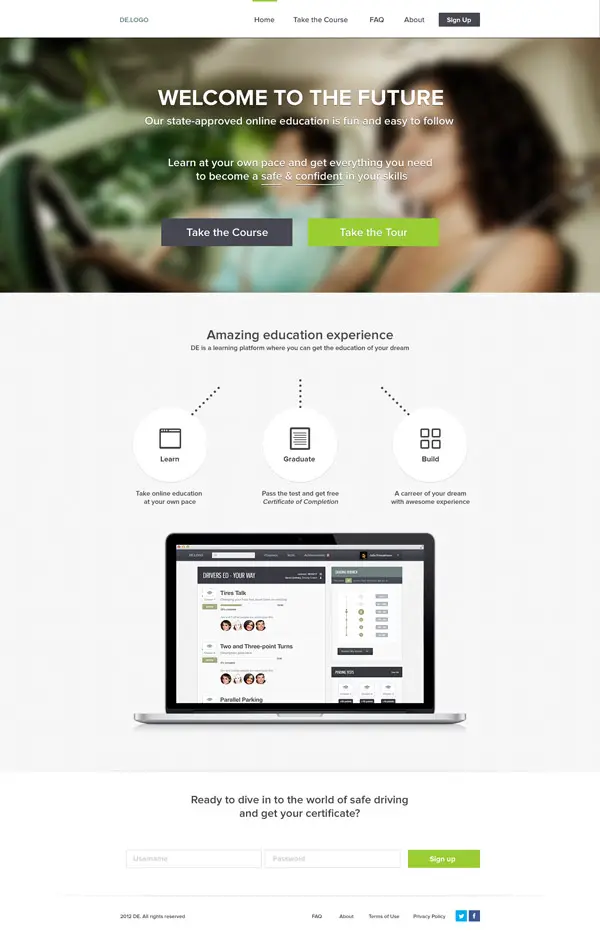
DE by Julia Khusainova
This example can be a great source of inspiration. It has a minimalist design and also uses some flat icons in the way it presents content to its readers.
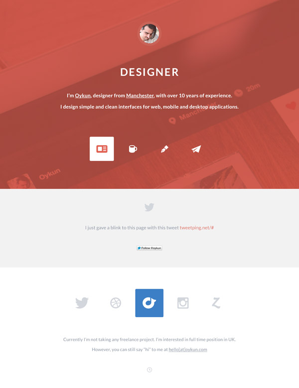
Portfolio Redesign by Oykun
If you are working on a portfolio and you are looking for a good source of inspiration you might have just found it! Have a look!
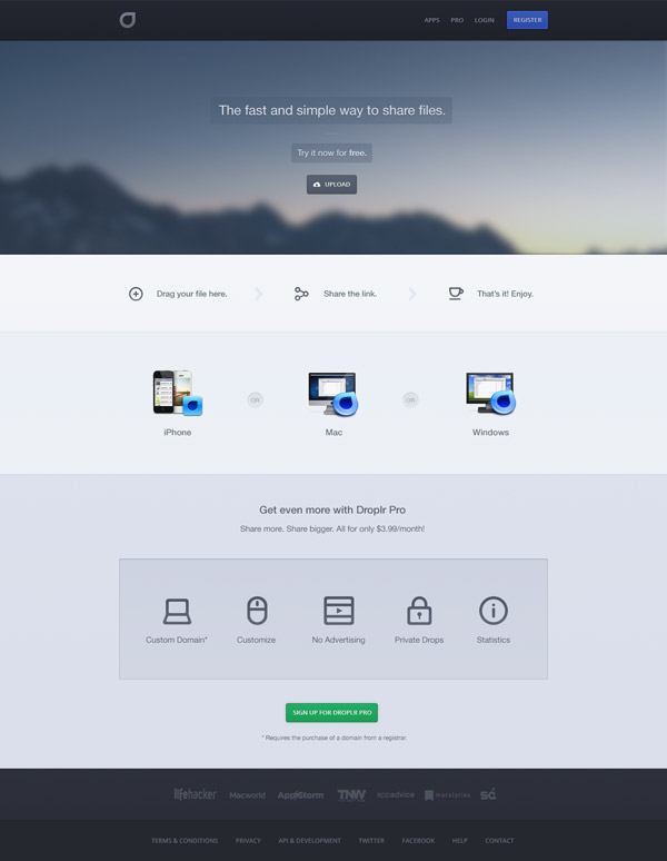
Droplr Redesign by Ben Bate
This is yet another good example of a modern and functional design. This one uses a series of horizontal bands on which the designer placed content. It also uses some nice flat icons. Check it out!
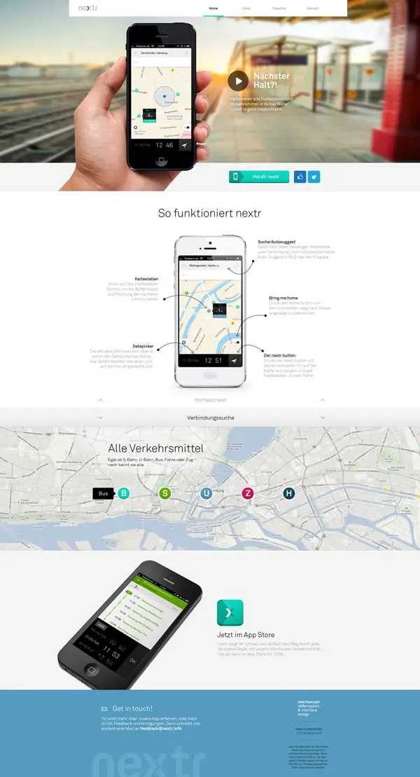
Nextr by Martin Oberhäuser
Horizontal bands have become quite trendy nowadays. Have a look at this example and find your inspiration!
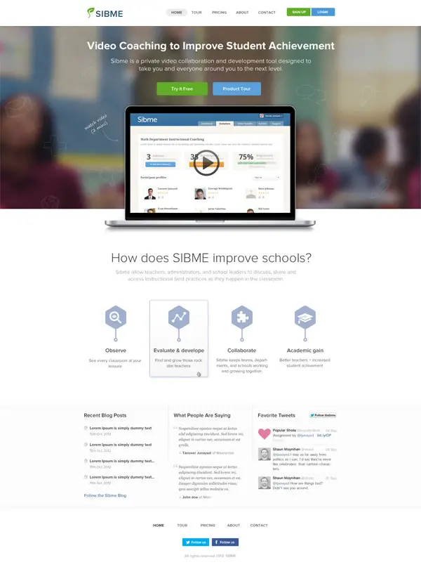
SIBME by Tanveer Junayed
This is a great example in regards of presenting content through your design. Check it out!
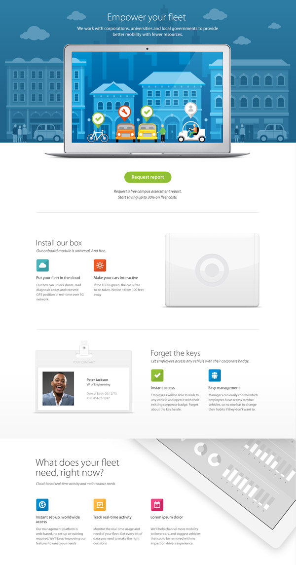
Landing Page Design by Haraldur Thorleifsson
This example has a friendly interface. It uses a white background and some really cool graphic elements.
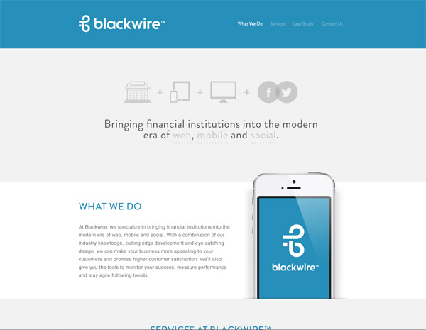
Blackwire by Charlie Waite
This is yet another good example which might become your next source of inspiration. Its design layout can be a perfect example for promoting a business of even an app.
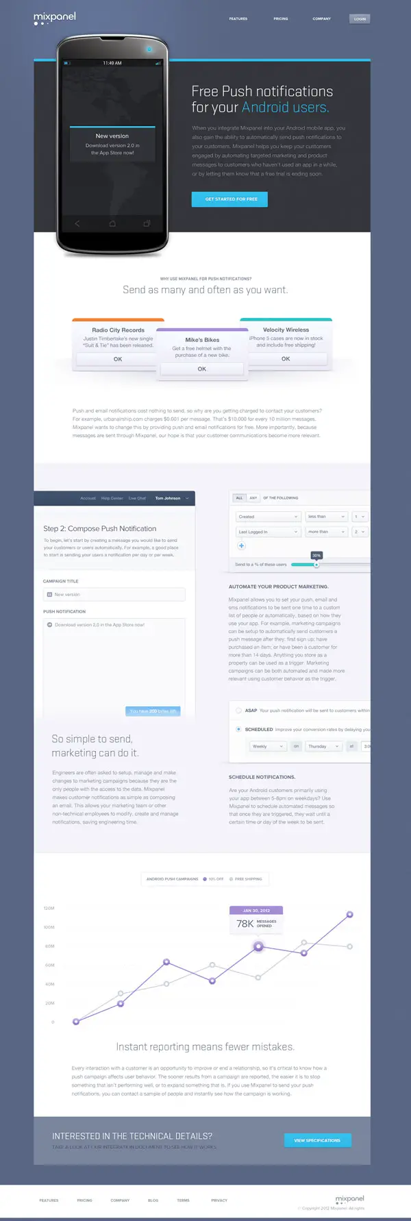
Mixpanel by Dave Ruiz
This example mixes infographics, horizontal bands and graphic elements to build a modern web design layout.
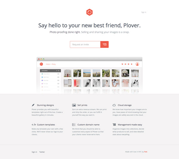
Plover by Matt Bango
This is yet another good example of a minimalist design concept. Plover is definitely worth having a closer look as it might be your next source of inspiration.
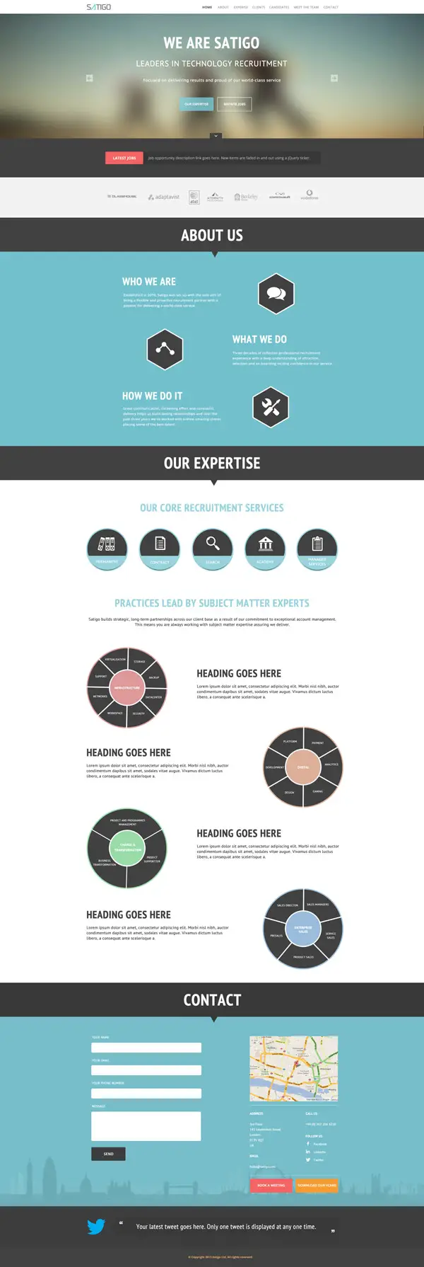
Satigo by Balraj Chana
Using infographics in your designs might give you some headaches but having the right example as a source of inspiration can ease your work.
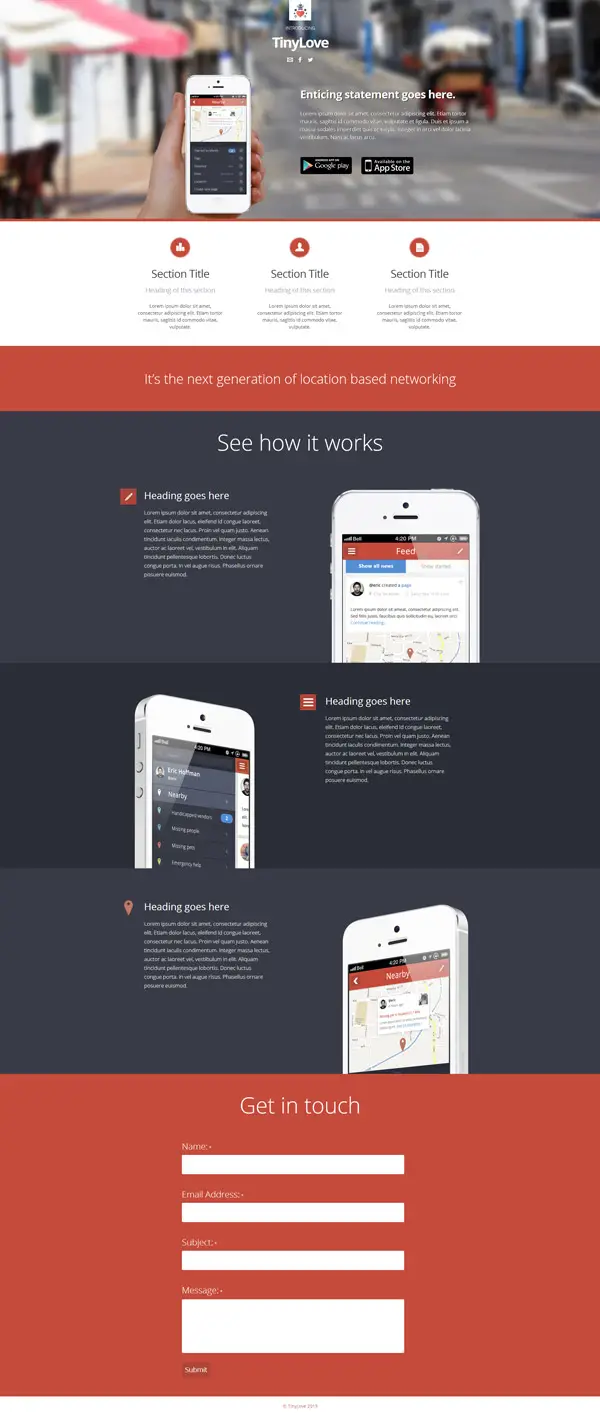
TinyLove by Balraj Chana
This is yet another good example of a design concept which can work perfectly for promoting an app or a business. Check it out!
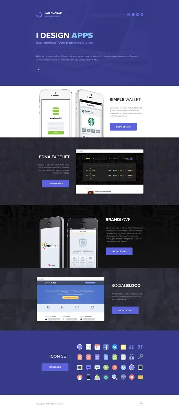
Portfolio Design by Jan Dvořák
Let’s continue the series of design concepts which are perfect for apps with an amazing example. Find out how to present everything there is to know about your app in a modern way through some easy design techniques.
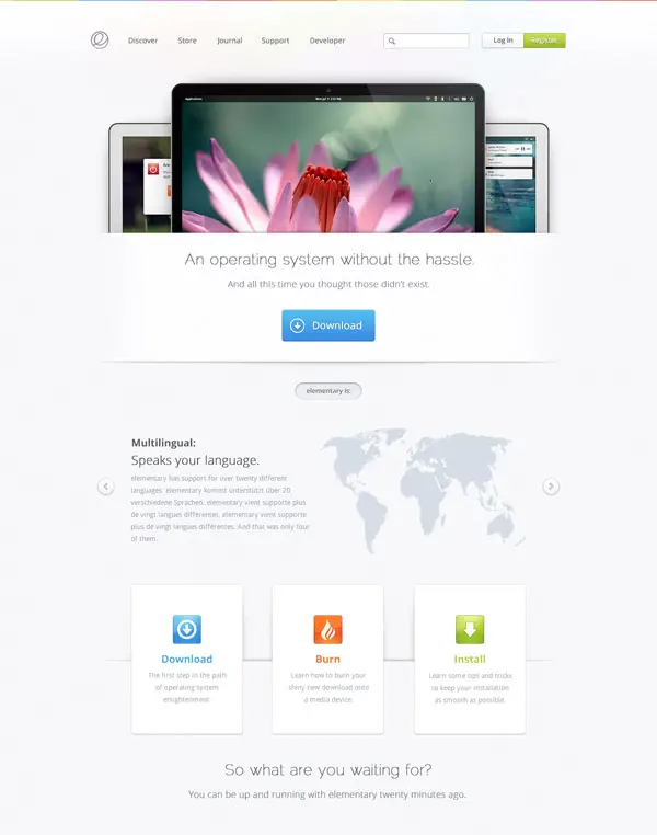
Elementary by Maxwell Barvian
This is yet another good example of a minimalist design which might be your next source of inspiration. Have a look and see if you think the same!
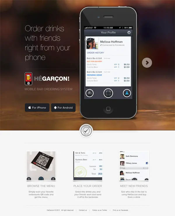
HeGarcon by Eric Hoffman
If you liked the previous examples then you will definitely love this one! This example presents a nice way of website designed for promoting an app.
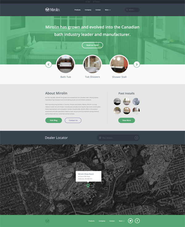
Mirolin by Mike Busby
If you were looking for a great way to add your favorite color in your design this might be the example you’ve been looking for!
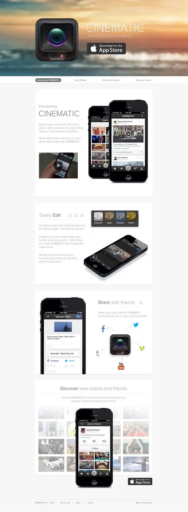
Cinematic by Eric Hoffman
Present your app in an elegant way through this amazing design concept! Have a look and see if you think the same!
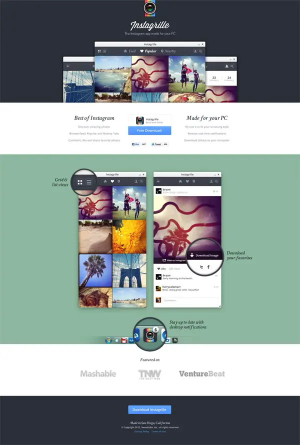
Instagrille by Bryan Sleiter
If you want more awesome examples for app promoting web design concepts have a look at this one!
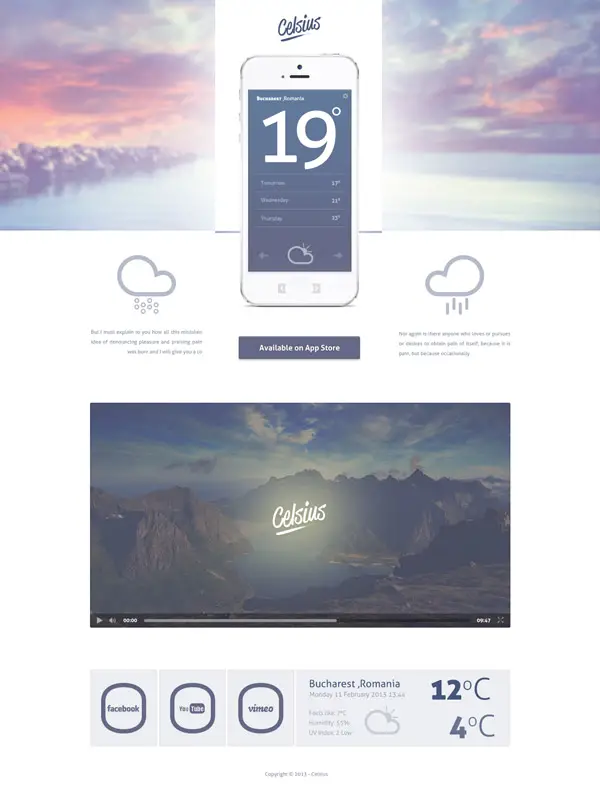
Celsius by Paul Flavius Nechita
This design concept has an elegant minimalist design which can definitely grab people’s attention!
Circle by Tom Brennessl
This example presents some really good ways of presenting content about an app. It is definitely an example worth following!
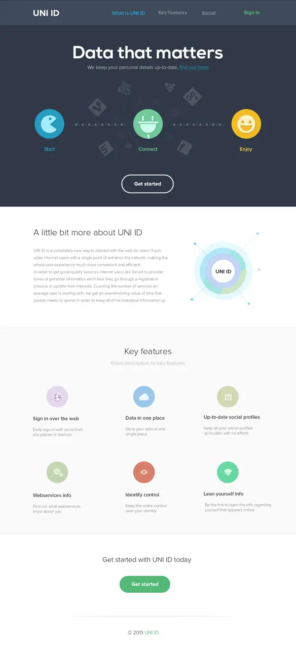
UNI ID by Max Litvin
Check out this amazing example and see if you find your inspiration in this eye-catching minimalist design.
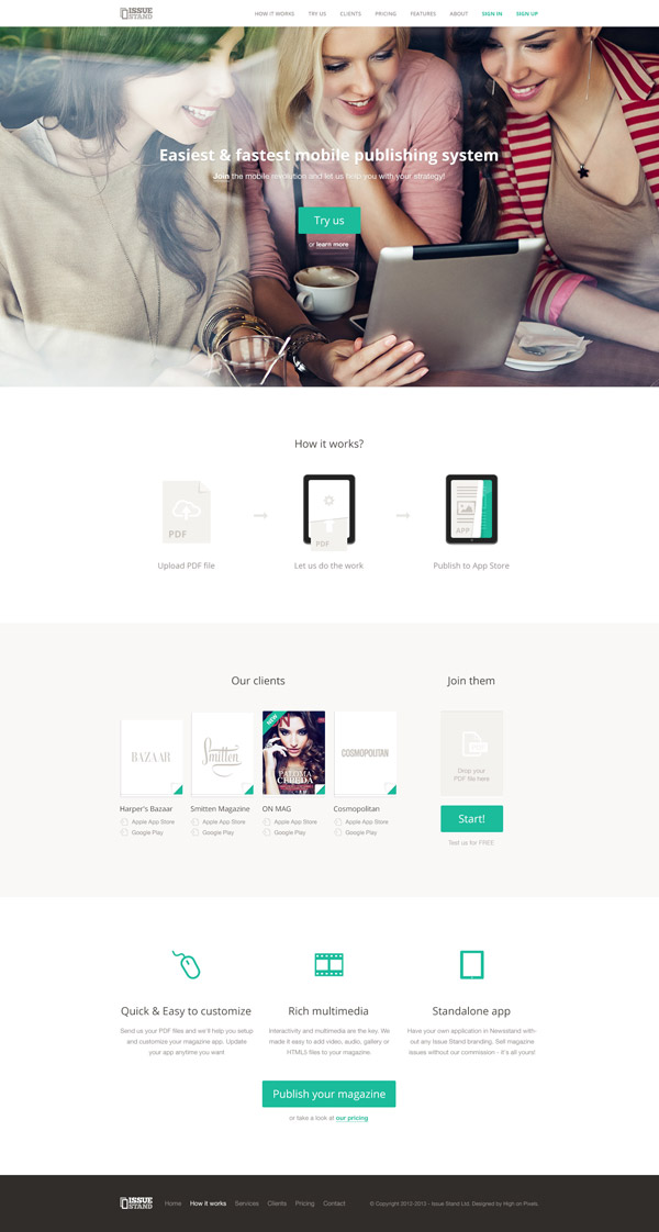
Issue Stand by Pawel Kadysz
If you liked the previous examples you will definitely love this example. Have a look and find your inspiration!
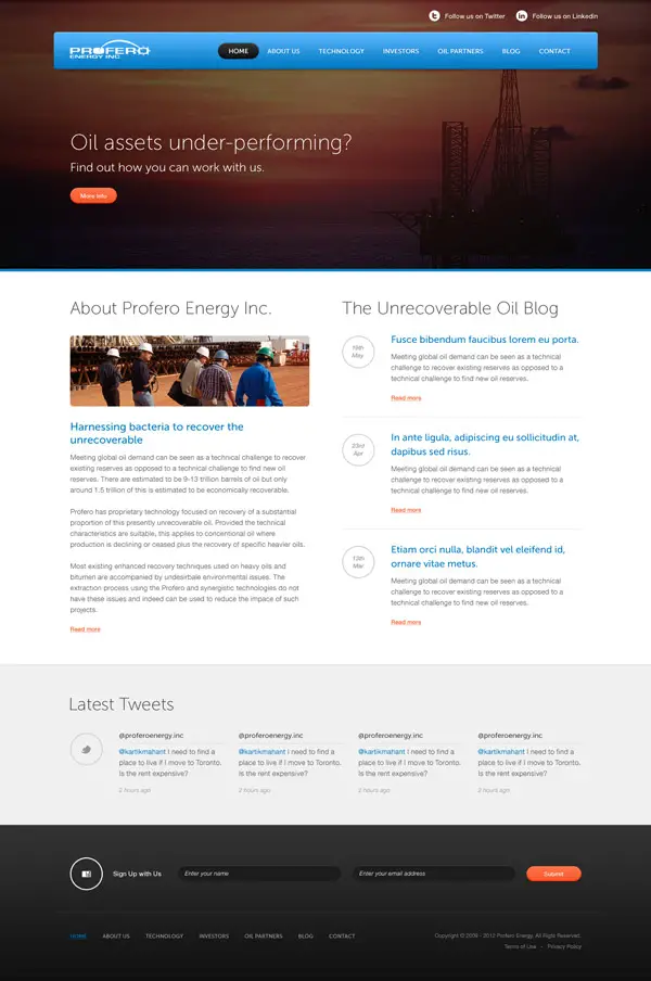
Profero by Kartik Mahant
Check out a nice way to present content to your website’s visitors through this amazing design concept!
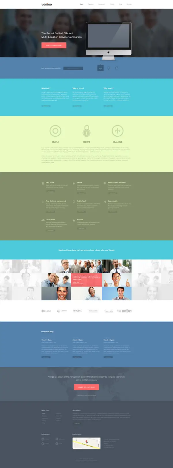
Vonigo by Kartik Mahant
Have a look at the way this concept mixes colors and check out another great way to present apps and businesses.
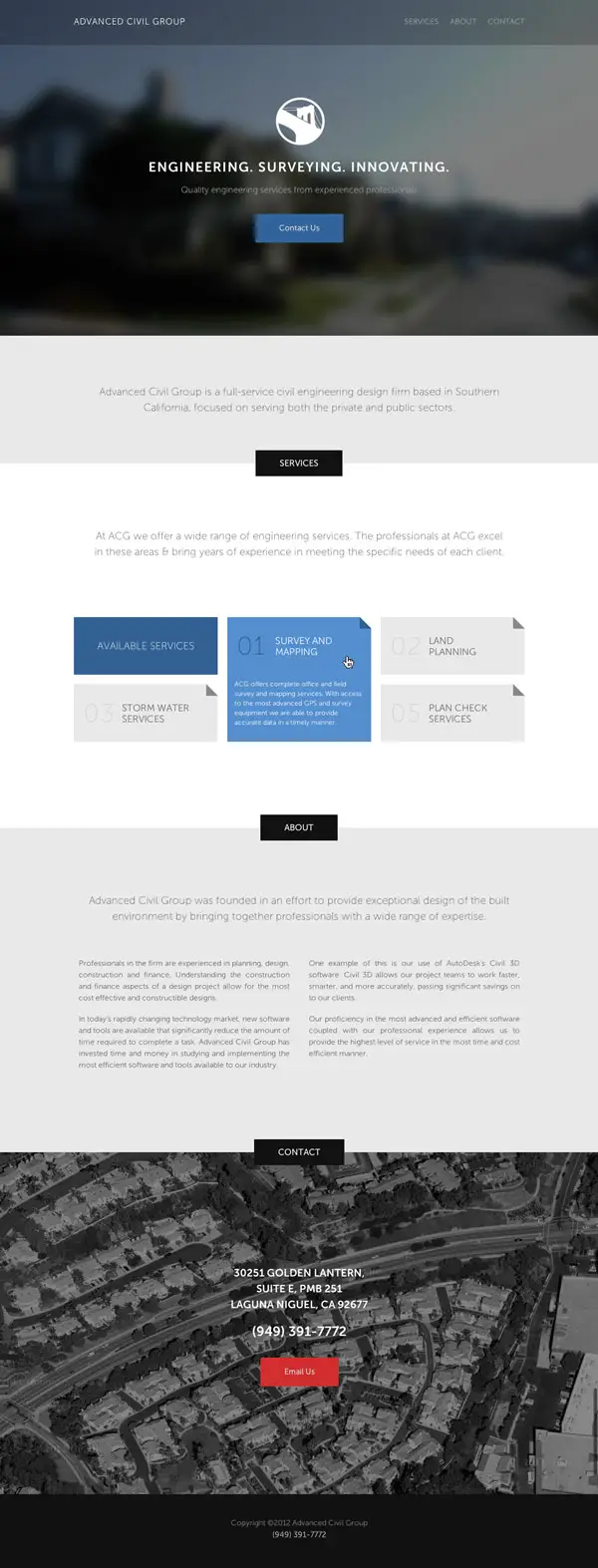
Advanced Civil Group by Josh Austin
If you like minimalist designs then you might want to have a closer look at this one. It is definitely an example worth following and using as a source of inspiration!
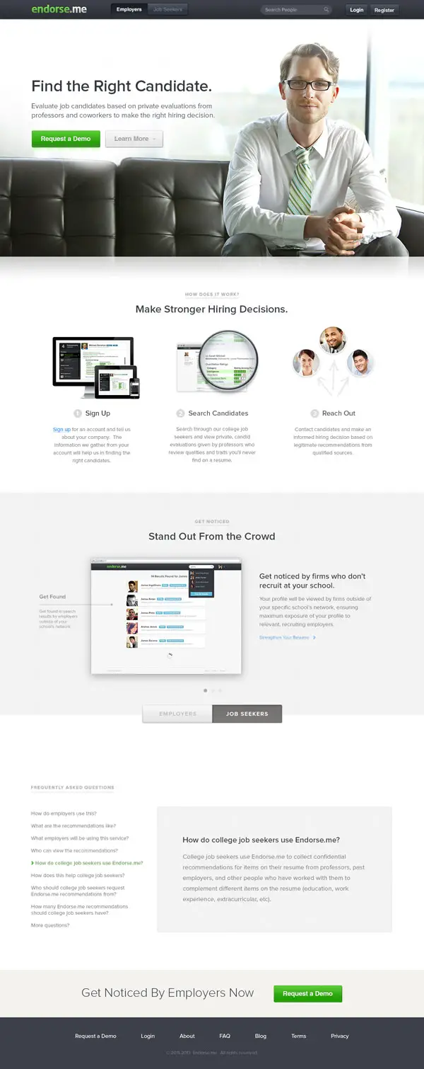
Endorse.me by Phil Lester
And if you liked the previous examples you might also want to check this example!
Foubert by Gil Huybrecht
This one has a friendly interface design and uses a pale pink color palette. Check it out!
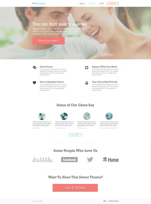
Romnance Theme by Cat Noone
This is yet another good example of an elegant interface design concept. It can definitely be a great source of inspiration.
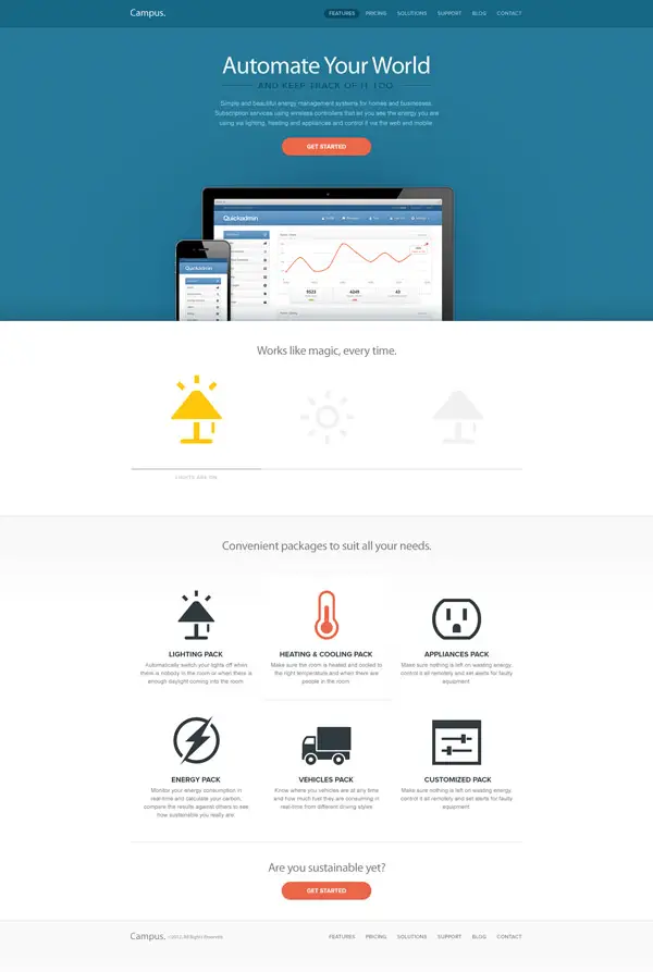
Campus by Graphorce
Last but not least, this example uses flat icons and minimalist design to present content in a creative way.




Loving some of these great designs. Hat’s off to the artists that put in the effort and produce great work.
Working as a freelance web designer I’m always looking for inspiration for new projects and I think the simplicity really works for most brands that want to get their message across. More info, less clutter!
Great collection, thanks for the interesting read.
very inspiring showcase. I love the Dapper Ink by Joel Reid =)
Very much appreciable post. Specially websites collection, it really gives the inspiration to design some beautiful web designs. Thanks……..
Great collection, making the web a prettier place!
Some very nice designs here.
I love the flat design. As a freelance web designer myself its definitely a trend that i’m following at the moment. I think one of the other key elements in all of these designs is the use of a good colour palette. With the two combined its a win win! Great collection of sites.
hi
your site is perfect thanks a lot…
nice collection of flat designs!
Cool and Beautiful Website Designs.
Very cool concepts.
While these site designs do look clean, appealing, and trendy now, they might look dated soon (or merely similar to their competitors!) I’m not sure that this strategy is in the client’s best interest, as they’ll probably need to pay for a design overhaul sooner rather than later.
Nice roundup Chris.
Whilst I agree with the others that most of them do seem similar, that’s what trends are. I’m sure if you did this same type of post in 6 months or a years time there would be a different “look”.
These people aren’t just using flat design. A lot of them are using the same front-end frameworks as well. These graphic designers need to hire some real front-end developers.
I should clarity that I do think the designs look nice, but there needs to be more uniqueness.
Chris, I’ve been following your emails for the last couple of years and I have to stay you always provide something of relevance. Thank you for your continued efforts!
Very good!
Wonderful styles. =D
I personally like “UNI ID” and “Endorse.me” the most.
Well flat UI is the real deal at the moment and since these are under construction at this very moment, why not to follow it.
Looks like all of ’em are following the same trend :)
They’re all quite similar, aren’t they?
Yeah..
Exacly Flat design :D
Yes they are … a nice widescreen image and 3 columns beneath to make it mobile compatible :)
Nice combos of jQuery would be good and something that has a unique web design would be truly awesome.