Line25 is reader supported. At no cost to you a commission from sponsors may be earned when a purchase is made via links on the site. Learn more
When users land on your site, your typography will send a message before a word is read, or a button has been clicked.
Typography shares a message about the purpose of the website, creating an atmosphere and setting the tone for a site.
When designing the font for your website, consider the message you would like to put across. What would you like your users to feel or experience when they first glimpse your site?
Typography creates a personality for a website, makes it unique, and how you incorporate it into your design will determine how viewers will respond.
Typography in internet website design is a continually evolving field that continues to offer new options all the time.
This means that when designing or redesigning websites, there are a great many options for a font to choose from. This gives web designers the opportunity to incorporate a wide variety of fonts into a design.
Both the arrangement of typography on a page and the fine details are important. Designers not only focus on the choice of font but on connections between text and the ways that letters are used in the text body.
Create a structure
Before a designer even starts to work on website design, there are a number of decisions that can be made around typography, and the way it will be shaped into a design. Typeface selection (and particularly the way in which different fonts will be integrated into a design) can be established.
Hierarchy (importance of content and information) can be explored in order to understand how this will be incorporated into the lettering. After this, a designer can establish a relationship between page design and typography.
This means using the different building blocks of a page, such as paragraphs, words and letters, and creating a relationship between these elements. This will lead to beautifully designed words creating a positive reading experience.
Size and hierarchy
When working with text, your goal is to balance size so that your text is easy to read.
This means ensuring that letters are large enough to be legible and clear while ensuring sentences are well ordered and easy to follow.
This ensures readers will easily be able to understand the content of your site.
However, not all messages are equally important, and text can be used to create a hierarchy, showing readers important factors such as headers or sub-headers, before delving into the finer details. This shows readers what to read first.
Some designers like to add typographic illustrations on their websites so that they can draw attention to a brand or a title. You can use that as an alternative to a big regular font.
If you don’t know how to do such an illustration, you can learn a bit of PS with the help of typography tutorials. There are lots of things you can learn. Alternatively, you can try various type effects from Codrops.
Some of them don’t work in all browsers, so use them with caution.
Limit your options
When designing a page, keep your range of fonts simple. Two or three different typefaces will be enough to get your message across without cluttering the page or overwhelming the reader.
It is still possible, however, to use variables within the text. Many fonts come in bold, italic, regular and condensed.
This enables you to add different weights to your message. A bold subheading, for example, could be used to attract a reader’s attention.
60 characters per line
You might be tempted to put as many characters as possible on a line of text, but that is not a good idea. A smaller number of characters per line is important if you want to have good readability.
You will see different recommended values for characters per line. Some put them at 50, others at 75. I recommend 60 if you want a good reading experience.
On mobile, things are a bit different. In apps or responsive designs, you should have 30-40 characters per line.
Mix and match
Choosing a typeface is often the most complex part of a designer’s job. Don’t forget to make sure that the fonts are safe for web.
There is a wide range of choices to choose from, but many can be broken into ‘serif’ and ‘sans-serif’.
Letters can also be distinguished by height, and bowl shape (the width of rounded letters).
These factors help a designer explore how effectively different fonts will work together.
Understanding how letterforms work together means that there is no need to stick to a single style of font. Sometimes combining elaborate headers with sleek fonts is an effective way of creating contrast, while ensuring a positive reading experience.
Forget hyphens and justifications
When working online, the most important aspect of typesetting is easy legibility.
Therefore, it is important to omit all aspects of design which will make the text difficult to read. Hyphens and full justifications often impact reader legibility. In some projects, these are best avoided.
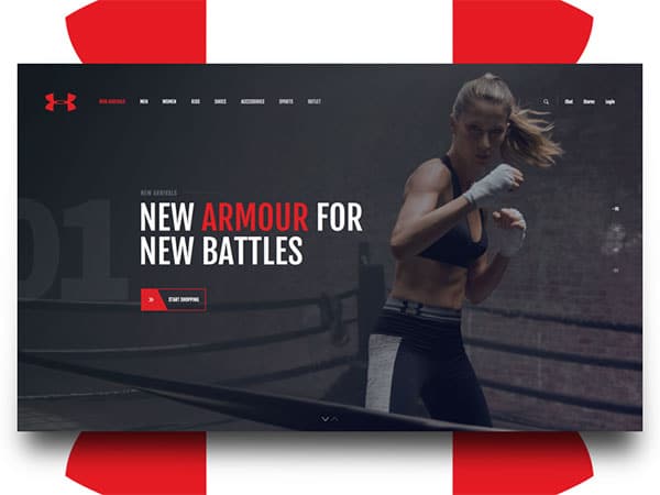
Contrast, size, and color
By using contrast, you will be able to attract the attention of your readers. This may mean a vivid white message popping out of a black background, or a dazzling orange phrase emerging from a muted blue setting.
There are multiple ways to create contrast. Look for combinations which use light against dark or muted and vibrant colors.
Contrast allows your messages to pop. As a result, simple backgrounds are often best for allowing text room to stand out. If your background is busy, increase the size of your lettering to ensure your message stands out.
Measuring text
Measure refers to the size of your text box. This can run from left to right across a page, run like a newspaper column, or consist of different shapes and sizes.
The measure adds to your design because it can impact on reader experience. If lines are too long or too short, they can be tiring for the reader, whose eyes are continually running across the page.
Don’t go all caps. Please don’t.
I’ve seen this in many instances where I wish I hadn’t. It might work well on forums, chat rooms or on Reddit, but don’t use all caps in a website.
Want to use all caps for a small title? Maybe you can. But think about the fact that all-capital print slows down the speed of scanning and reading when comparing to lower-case type.
Read, read, read
When you are familiar with the text you will be adding to your site, you will have a greater idea of how it can be used to create an effective whole.
Don’t limit yourself to reading the text-only before adding it to the site though. The message is important, but reader experience will assist you with understanding the text from a viewer’s perspective.
How does the line spacing impact? Are the letters large enough? Are the lines easy to read? Does the text feel awkward in any way? By ensuring the text is well presented, you will assist your reader in engaging with your website.
Ending thoughts
Typography is an important part of the design which will ensure a beneficial reader experience.
However, it is often ignored or considered to bring little gain. By spending time with your design, you will be able to create clear, legible and effective content that will provide brand identity and ensure viewers return to your site.