Line25 is reader supported. At no cost to you a commission from sponsors may be earned when a purchase is made via links on the site. Learn more
Let’s just begin with stating the undeniable fact that a brochure is a final document that organizes all the details about your business/company. It is the handout that you provide to the client to spread awareness about your product or service. A poor brochure design would drive away potential clients to the greedy hands of the competitor brands.
A brochure is necessarily a single leaflet that combines and portrays every detail about the company, product, service, event, a campaign or any other vital information. It is usually a bi-fold or tri-fold piece of paper. Still, some other designers also experiment with z-fold, c-fold or any other customized fold, substantially increasing the cost of design and production per fold.
For designing an impressive brochure, there are specific key points that need to be kept in mind before settling on a design and giving it for print. While most of the companies now pay for a digitized version – rather than print media – a brochure can prove to be essential lead-nurturing marketing collateral.
A well-designed brochure is a reminder to the client – and other people who might not be from your field – of what your business is all about; it sets you apart from the competitors out there.
TIPS TO DESIGN A BEAUTIFUL BROCHURE:
An expertly designed brochure can educate its viewers, convey a sharp image and credibility of the company, increase the target audience and persuade clients to take actions. Creating the perfect brochure might turn out to be challenging – even for graphic designers, but worry not – here are some tips and tricks to come up with beautiful advertisements that leave a mark!
1. Know your objective:
A brochure is one of the most direct ways of communication you can have with a client/customer. It is a part of communication design that attempts to have an immediate effect on the other person. This is why it is necessary to know what idea is that needs to be put forth precisely. Is it a benefit concert, an event, campaign for a cause, or merely an informing technique?
In either case, it is a direct conversation between you and the audience, so it must be crisp and to the point. Whatever is in the mind of the designer should translate as it is on paper.
2. Knowing the customers:
Since brochure design is a communication tool, it naturally becomes more important to target the right kind of audience for your collateral. That way, it’s easier to capture their common interests and use them as a USP for your business as well. For example, if you wish to target acts for an open mic event, naturally you should choose a design that has something to do with singing, poetry or maybe even a comedy action!
The more accurately you position yourself in an interest group; more it would trigger a response to the brochure. In case you are unaware of the kind of information you need to place your business in the market, you can always take time and talk to salespersons or maybe even directly to the customers to map out a practical design to offer.
3. Decide on a Fold:
While designing a brochure is simply a creative process, it is almost inevitable to decide the number or type of folds you would want it to be accompanied with. This mainly depends on the amount of content you want to include as well as the design you select for your brochure – considering the white spaces, images and aesthetics. Following are the major types of folds used commonly by graphic designers:
1. Gatefold:
Gatefold is a kind of handout design primarily used for high-end marketing purposes. It is a corporate design, and when done with minimal aesthetics (a perfect balance of colour, typography), it can work wonders. This kind of fold is composed of an 8-panel structure for a maximum display of information and graphics; the “gates” of the design are side-by-side and create a compelling effect – often giving a more luxury feel to the brochure if done with a premium quality paper.
2. Bi-fold:
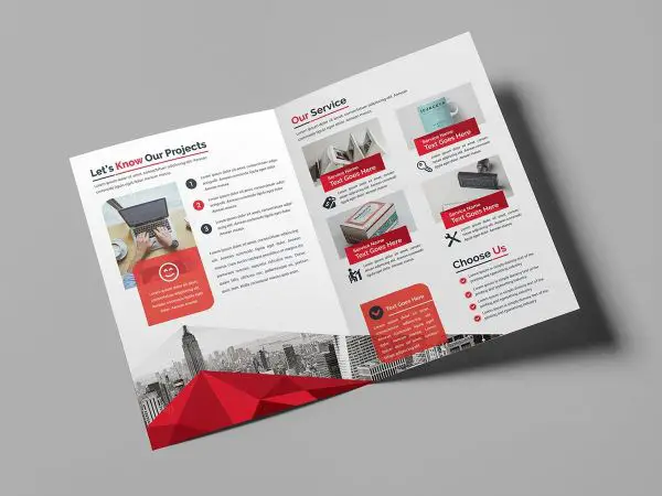
Just as the name would propose, this kind of brochure has two folds and four panels. Primarily used by organizations, a bi-fold brochure has a front cover, back cover and two internal panels that consist of all the information a company has to put forth about its products and services. With a unique eye for graphic details, a bi-fold brochure can easily be converted into a booklet.
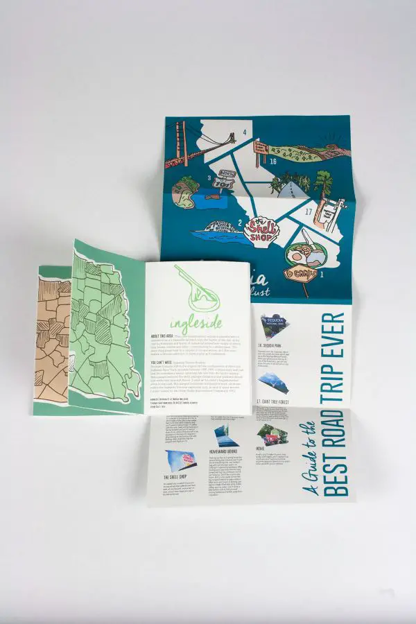
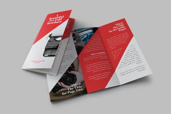
3. Tri-fold:
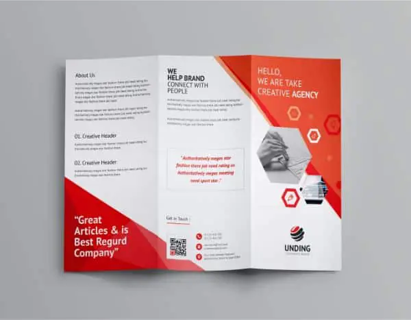
This type of brochure is called tri-fold – it has three-fold and six panels, ample space to present all the essential information about the products and services. A tri-fold brochure is one of the best marketing techniques – for presentation purposed and other necessary information. While designing this type, the graphic designer must be aware of its structure, the opening side as well as how to emphasize more on particular things. For all the mentioned reasons, a tri-fold is a superb way to present, even with minimal composition skills as well.
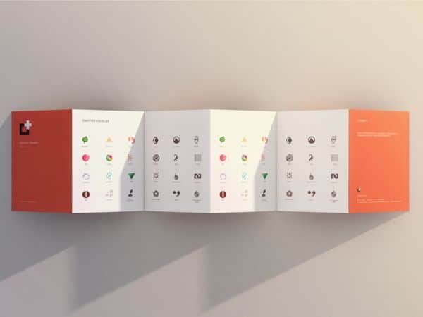
4. Z-fold:
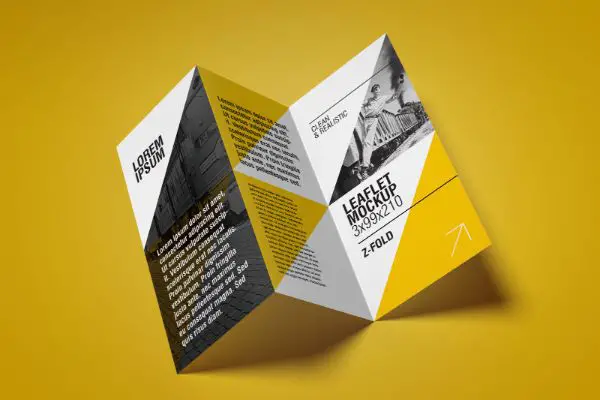
While a Z-fold can easily be confused with a tri-fold, this brochure features an exciting look exactly like its name. It consists of 3 panels, with six sides with giving ample space to compose information. What’s more – this design challenges the designers with its visual hierarchy pattern that is almost like an accordion (musical instrument). It has an extravagant look that appeals to the eye quickly and is even easier to work with for hierarchy of content.
There are more exciting ways to settle on a fold for your brochure – depending on the intricacy of design and amount of content you wish to put out there. While an intricate design may have to be created from scratch, these basic template styles can go a long way with a maximum result if composed with the right key points in mind.
4. Be Creative and Unique:
In this age of digital ease, it is tough to stand out in the print media. Creativity becomes paramount when you are fetching for reasons to stand out from your competitors. An aim for such times must be to create a design that is so unique and functional that even in a stack full of leaflets and tabloids, your brochure would be the first to stand out.
The brochure has to be such that everyone must get message spot on – both visually and through the content representation as well.
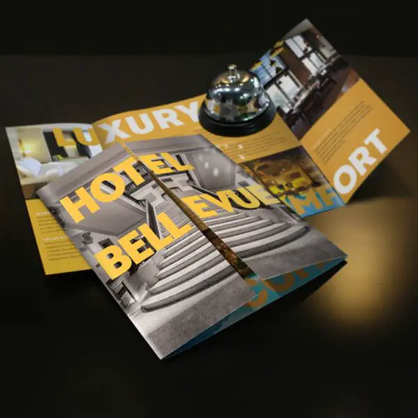
5. Chose Fonts Wisely:
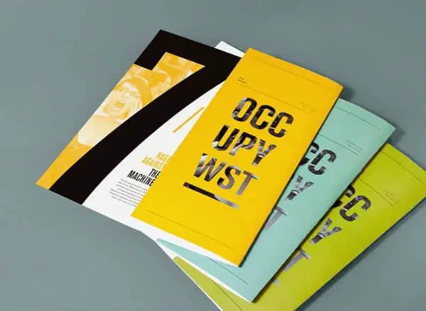
While selecting a large number of fonts for a brochure might sound tempting, settling on the ones that belong to a similar family is always a wise choice. Make sure that you’re not creating a blunder with several fonts on the same page unless all of them are from the same font family – even then, don’t go for more than three typefaces.
A change of font wherever a visual hierarchy is expected is a must as it only enhances the aesthetic as well as the visibility of important points/words. If your company/business has a signature font, stick to it as it helps with the branding and portrayal of a brand image.
6. Get to the Point:
There is no better way to say this, but – get to the damn point! It’s a brochure that you are making, not a book! So the more precise it is, the more space you get to play with graphics and make it enjoyable.
Too many achievements and successes about your company can confuse the readers/customers, and in return, that can pose out to be an issue. Instead, focus on the main points that highlight your company’s product or service and stick to it until the end without introducing more unnecessary topics.
7. Say no to Big words:
While jargons might sound impressive, sometimes, the brochure is not the place to display your vocabulary. A brochure is a piece of information about the company in the pure, nascent form. Even for a person with the most primary knowledge about the language to understand. In other words, you reduce the credibility instead of increasing it. The safest rule for brochure design is sticking to basic English and make it through with ease – for both, the designer and the customer!
8. Design for your Readers:
One of the top-notch rules for graphic designers is to prioritize the design from their reader’s point of view, and just let their opinion take a back seat meanwhile. As a designer, it becomes vital that you see the brand from the shoes of a potential client. If the readers love to see pink on a fashion brochure, even if you strongly dislike the colour, you would have to incorporate it in your design.
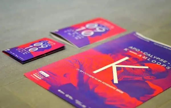
9. Choose the right colors:
Much like fonts, settling on particular colors can always be a challenge. Sometimes the audience reacts to a specific brochure positively due to its bold choice of colors, while some people ignore the colors from plain sight as well. It becomes crucial to take note of the mood and tone of the brochure in such cases – for example; you would never go for a chirpy color like yellow for a topic such as blood donation.
If your company or organization has signature colors, make sure to use them wisely in your design. You can also create a color palette accordingly with the signature colors to suit the design.
10. Choose a High-Quality Paper:
In terms of marketing, a flimsy paper is equal to a weak handshake. If you wish to set an impression on the client/customer, it is imperative to choose the right quality of the paper. Make sure you go for a high-quality sheet, even though it means more expenses. A good quality brochure not only attracts attention but should also urge the reader to keep it as a memory.
Going for a good quality paper conveys the message that your company cares about the readers and makes an effort of quality towards them, quickly building a brand image in their minds.
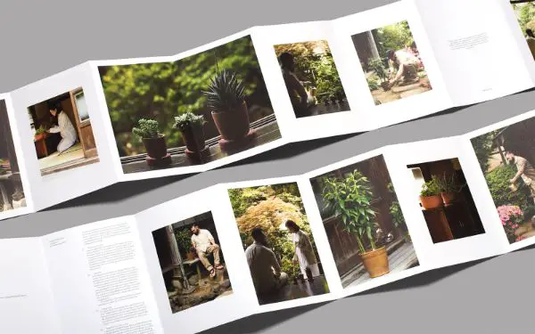
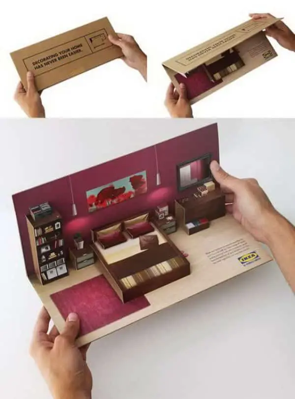
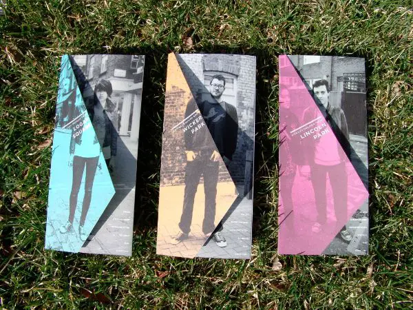
11. Add appropriate images:
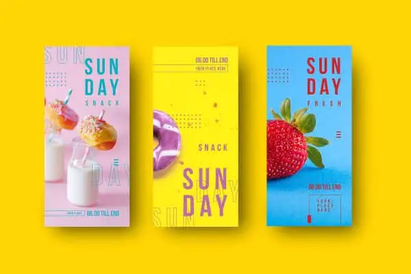
Imagery often attracts more audience than a small set of headings put up in flashy fonts. Visuals also stick in the memory longer than sentences or keywords, so it is always wise to make your brochure a string quartet of imagery! A brochure without a single image is more like a boring leaflet that eventually dries off.
Make sure you use striking images that attract the audience and surround your visuals with furthermore beautiful colour palette and texts. Also, while at it, make sure all the photos are relevant to the theme of your brochure – if you can attempt a shoot, especially for the brochure – nothing like it!
12. Give an Option:
If you have the freedom to make use of your ultimate design skills and develop multiple brochures, you must dive in and give it your best shot. Today’s market explicitly asks for change, and one way to use a traditional advertising tool like a brochure is by providing more options with the same opportunities than only just one.
This choice gives the audience an option to chose which one suits their personality, likes and interests – which can also prove to be a study for your next projects.
13. Make the Brochure worth Keeping:
Essentially, this means try to make a brochure that would last long. Use the best quality of paper available keeping in mind the purpose of the brochure, use the right colors and fonts and add valuable, relatable content. Apart from just the visuals and information, the brochure needs to have the ‘feel-good’ element that makes the customer want to hold onto it, even if not use it.
While brochure designing can prove to be a fun task, at the same time, it is daunting since it is the most official document about a company or business. It must be authentic in a real sense, unique and creative. Before beginning the process of design, make sure to have all your content and visuals sorted and a rough grid planned to ease the graphic juices a bit. Hopefully, these tips would help you come up with some striking brochure designs!