Line25 is reader supported. At no cost to you a commission from sponsors may be earned when a purchase is made via links on the site. Learn more
The everyday doodle is often left hiding away in a designer’s sketchbook, never being fulfilled in life as a complete design, but every now and again doodles get their chance of being part of the big picture. In web design, designers often strive to inject creativity into their interfaces and layouts. The good old pencil can be a highly useful tool that can easily add personality to a design, giving that feeling of originality that you just don’t get with crisp, smooth digital effects. This showcase of creative doodles in web design provides a wealth of inspiration and shows how hand-drawn elements can add that tactile and low-fi feel to a website design.
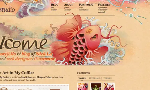
N.DesignStudio
N.DesignStudio’s website features Nick La’s works and even some tutorials. It uses a Koi fish illustration that gives his site an original look.
Web Designer Wall
The Web Designer Wall is one the most popular design blogs thanks to its content and appearance. If you’ll take a look you’ll also notice that the background uses quite an interesting doodle.
Creative Cruise
Creative Cruise has a catchy appearance with their colorful animated website. You can check it out or, if you want, you can hop on-board and get inspired by like-minded creative professionals.
Friday Cat
Friday Cat is a website that presents a different cat each Friday. Scroll down to see the rest of the cats or propose one yourself!
Artattackk
This website is nearly entirely made out of doodles. How cool is that? It belongs to a team of creative minds that usually build stars and planets but also some websites in their free time.
Miki Mottes
Miki Mottes is an illustrator, animator, and designer and this website will only surprise you with creativity as you scroll down. Not only will you find a gallery of projects but you’ll also notice that the entire web site is a carefully thought and designed.
Denise Chandler
Denise Chandler surely stands out with her animated doodle that turns into an illustration. Scroll down to find more of her doodles!
Joby

Joby’s website works as a personal scrapbook. It starts with a white horizontal band that shows quite an interesting doodle and then showcases all the projects he’s worked on until today.
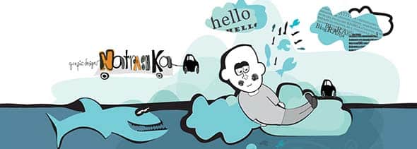
Natrashka
This is a graphic designer’s website that starts with a nice doodle and a warm hello. If you’re interested you can check some more doodles or projects in the gallery below.
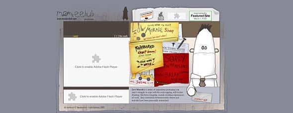
Low Morale
This website focuses on presenting one character’s struggle to cope with a series of animations and doodles.
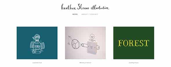
Heather Sloane
This is Heather Sloane’s gallery that showcases her work over the time. You’ll see doodles, illustrations, and other cool stuff.
Wefail
This website uses doodle to create a frame for the content they post. They also have some cool short films you can watch.
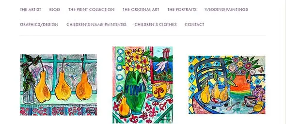
Deborah Cavenaugh
This is website is Deborah Cavenaugh’s blog which does not only use one of her beautiful paintings as background but also showcases a gallery of other projects.
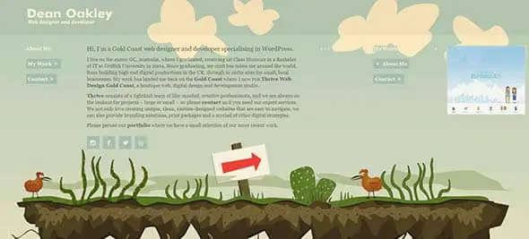
Dean Oakley
Dean Oakley is a web designer and developer that specializes in WordPress and this is his horizontal scrolling website. You’ll also notice an illustration that gives a friendly warm vibe to his page.
319Heads
This is yet another example of a website that uses doodle. This time everything starts with a cool logo and ends with an amazing gallery of impressive artwork.
Who is Red
Red’s page is one that makes you smile when you see it. This is a business card website that portrays Red Russak through a nice illustration.
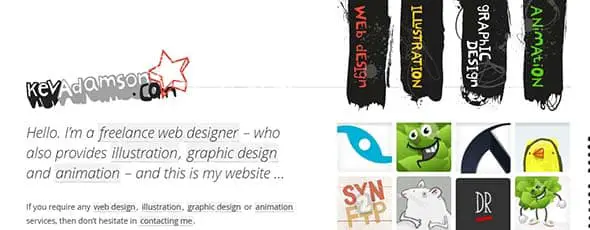
Kev Adamson
Kev Adamson’s website also uses doodles in its design layout which makes the interface look more friendly. Even the web menu has a unique design approach.
Leihu
Leihu uses a cool illustration on its home page. If you like it you can also check out his portfolio or read some of his thoughts.
Legwork Studio
This is yet another example of using doodle in your next project. Get inspired by this cool site and check out their creative slideshow.
Suie Paparude

Suie Paparude has a cool and original website that uses doodle that makes you want to check out their music or book a ticket to their next concert.
Rleonardi
This website uses Robby Leonardi’s illustrations to portray himself. You’ll out it’s divided into 3 parts: a game based resume and two portfolios.
Masterofshapes
Master of Shapes combines typography with a doodle in the site’s header and the result is amazing! Check out this design-driven interactive studio website!
Sean Halpin
This is Sean Halpin’s business card website. He is a web designer who uses illustrations to best display what he can do and how he can help.
Hasrimy
hasrimy.com specializes in designs that are ‘out of this world’! They have a horizontal scrolling website that uses doodles, galleries and so much more.
Stuffandnonsense
Stuffandnonsense uses doodles and illustrations in their web design which gives the site a familiar touch while also laying out important information to their readers.
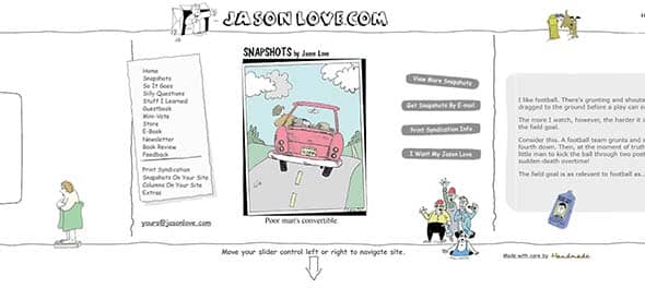
Jason Love
If you’re in the mood for a creative website, then Jason Love’s project on handmadeinteractive is your go-to. He uses doodles and illustrations, asks questions and tells stories.
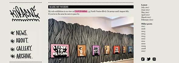
Kid Acne
Kid Acne is a passionate artist, illustrator, print-maker and emcee and he spent most of his time writing graffiti. His site best shows his hobbies and interest as it uses many doodles in its web design layout.
Daydreamdesigns
They’re a full-service creative agency and they use doodles and illustrations on their website’s background and menu. They share their friendly attitude and passion for the job through their website.
A Crayon’s Life
A crayon’s life uses a repeated doodle as a background texture. This gives the website a sensitive and familiar touch.
Pikaland
Pikaland focuses on connecting the dots between creativity. It uses doodles in its background and showcases a large range of illustrations and arts.
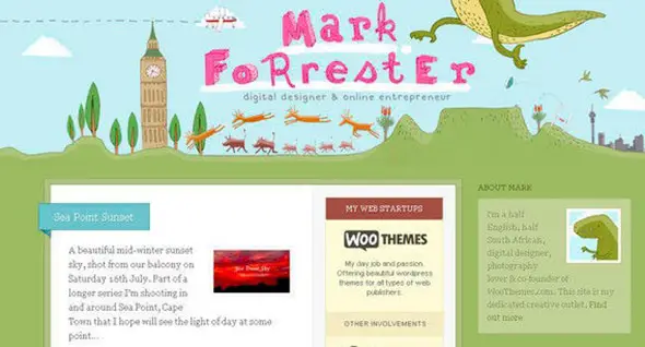
Mark Forrester
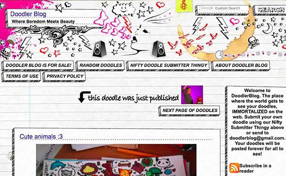
Doodler Blog
Jan Cavan
Jan specializes in user interface design, illustrations and iconography and his website is a good example of using your creativity to the maximum.
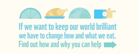
Assets.wwf.org.uk
This horizontal scrolling website uses doodles and typography to raise awareness about the food we eat and how we could keep our world brilliant.
Smallman Records
Smallman Records uses doodles in their header and as their background to give their website a friendly and creative touch.












I’m browsing through designmeltdown.com and I came upon this site. I’m happy to see my design is included in the list. :D Thanks!
Really cool post… Very creative and inspiring websites. I started in this business because as a kid, all I did was doodle around… Drawing caricatures on my school books (I have the attention span of a fruit fly)… As a grown-up I still do (every phone conference I have ends up being nothing but a date on top of the page and nothing but caricatures). I honestly hadn’t ever considered putting any of that on the web… until just now. So a very enthusiastic thank you for your post…
I love the “doodle” style on websites, I think it adds a touch of personality…
A nice list to refer back to! :)
I love to see this kind of design on websites, too bad i’m not creative/arty enough to do this myself
Great list, we have inspiration now…Thanks…
thanks chris
I liked web designer wall a lot and thanks for including it in the list. I am going to build a site and going to post it in a contest held by grafikguru.com
This is a good collection of doodle sites. I enjoyed checking them out. I love building sites artistic like these you have listed.
Can’t get more unique than if you doodle it yourself. Thanks for rounding up these great looking sites.
Great list, we have inspiration now…Thanks…
What was awesome :O
Thanks!
It is amazing what having no limits can do with designers creativity. I wasn’t even able to pick a favorite.
I recently became friends with a Wacom tablet and am very excited to apply some of these concepts to my future projects. These are great examples! Thanks Chris Spooner!
Nice collection. Thankfully you only focus on great work as I know a few of things I’ve created would find their way on to the not so great list…
I have to admit Chris, I’m a bit sad that I didn’t make the list :(
This is a killer list though. My favorite kind of site designs to be honest.
Nice list!
What is the best technique for creating doodles in web design?
Draw it with a pencil and then scan it in?
Hi!
Maybe it would be more elegant to use a graphics tablet or something similar, but since I do not own any device like this, I used exactly the method you described.
If you need the doodles just for web and you do not want to print them as large posters, this works really good.
Stunning list, very inspirational.
– as are you: )
Thanks Chris.
Great collection. I think this kind of web design is becoming more appealing at the moment.
Excellent list Chris. Just like everything you publish on line25 :-)
These are gorgeous! Thanks for showing them.
Great roundup Chris. I was going to say that it’s an excellent Monday Morning round-up, but it’s still Sunday evening here. :)
Nice collection. Definitely a great source of inspiration. While this trend might be slightly overused, I think if done right, it can really make a website look very nice.
Great list Chris. Beautiful! Right what I need for my Monday morning inspiration ;) Thanks for sharing!
~ K.