Line25 is reader supported. At no cost to you a commission from sponsors may be earned when a purchase is made via links on the site. Learn more
Table of contents:
show
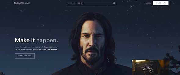
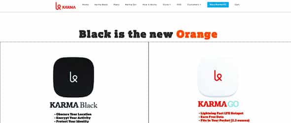
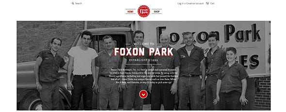
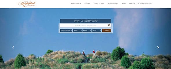
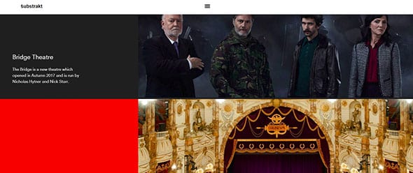
One layout trend I’m sure we’ve all noticed recently is the use of full screen horizontal stripes. These horizontal sections are often identified with differing background colours or photos and span the whole screen to create a striping effect as the user scrolls down the page. This post showcases 30 great examples of websites utilizing these horizontal stripes and shows how this layout helps split up the page into clear sections while making use of all the available screen space across all resolutions.
Janko At Warp Speed

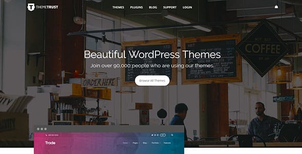
Theme Trust
HR Software

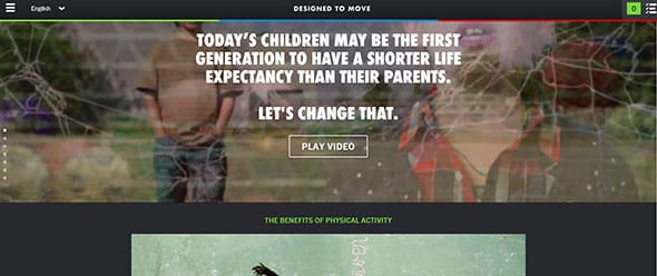
Designed To Move
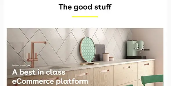
Engage Interactive
MetroTwit
Fhoke

Hanno

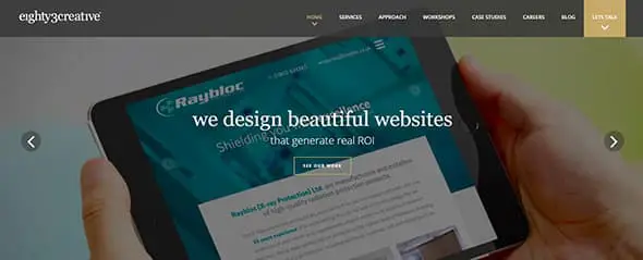
eighty3creative
Lorenzo Verzini
Balboa & Bedford
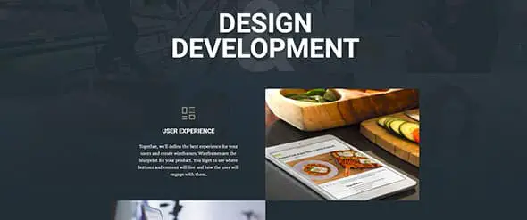
By Association Only

Squarespace
Playground Inc.

SEED SPOT

Cileos

Karma
Foxon Park Beverages
Always Creative
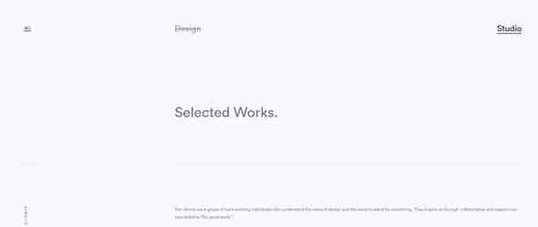
FMCA

HelloWallet

Work by Mark

Chaptr

Kiawah Island Real Estate
Iconic Furniture
![]()
Hum Creative
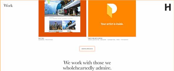
Theory

Substrakt
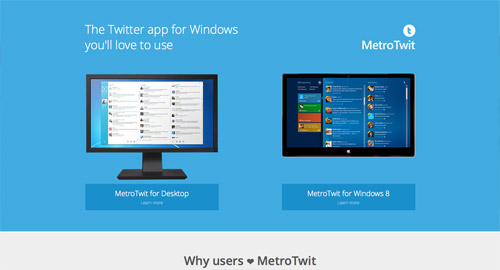
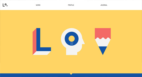

Some of the best sites I’ve seen share this kind of layout. It’s important to have clean, crisp and clear layouts with a prominent call to action. Some of these designs achieve this really well.
Chris, this is one of the best blog post ever.very well written. The world are moving towards to the beauty of responsiveness.. Thanks for sharing your ideas..Good Luck
Thanks for featuring us again Chris. And thanks for the kind words from Brent and Max. Definitely go with a max width for your content pages even if your design would allow for full width layouts. It just feels less stretched.
Matt, BrightByte
Simon and Brent*
Horizontal stripe layout? Nice name for this type of design. I cannot count how many times I came across this type of design, and I really like it. This article can be such an inspiration to design my own custom theme.
Cool stuff. I would like to give you huge thumbs up for this article thank you. I bookmarked this article for future information. keep on writing.
Nice collection.
I particularly like the sites that use darkened photos as the background with a small amount of overlaying text as used on HR Software and Hanno.
Hardly any content but the pages don't look empty.
Awesome showcase, Chris! I agree with Simon – BrightByte Studio really makes good use of the entire browser window. No matter your screen resolution.
I also love the animated content and parallaxing image effects with this "horizontal stripe" layout.
Great sites Chris, although I would like to see some of them use a min-width, max-width rather than hardcoding to 1024. On a large screen it does tend to produce a feeling of wasted space either side of the central content. Brightbyte make good use of the space.
having a large attractive image in the background brings a dull boring website to life. I really like this web design trend. Its impressive and fresh. Lets get creative!
pagebin.com is great to create web pages. check it out.
I didn't even know they actually have a name for these types of websites but they've been trending lately. I do like this trend especially having a large image in the background. Thanks for the post Chris.
The last sentence of the introduction really sums up why this trend is thriving. For the same reason that women avoid wearing horizontal stripes on their torso, wide bands that span the width of a page create an elongating effect that makes the page fill the screen, even if the developer has set a max-width on the content area. Since responsive designers have embraced a "mobile-first" mantra, but rely on a max-width to ease the burden of development, larger screens tend to get the boot on the responsive experience. This is especially true for more complex layouts, although sites that consist of primarily text (Trent Walton's site and A List Apart) have started to take advantage of extending the content width to indefinitely meet the device's dimensions. This trend offers a clever solution, as it tricks the eye into perceiving a sense of fullness while reducing the burden on the designer and developer…and it happens to look quite sleek in the meantime.
I like this style a lot. I used it myself at https://cutehtmlschool.com :) thanks for these inspirational examples!
Certainly these 30 horizontal strip layouts is a great collection. These websites are really very cool. Through these sites we can get stripping effect. We would like to see more helpful collection like this.
Certainly these 1 spam comment is a great collection. These comments are really very cool. Through these comments we can get spamming effect. We would like to see more helpful spam like this.
Haha, nicely put ;)
Certainly that was nicely put. We would like to see more spammers called out like this.