Line25 is reader supported. At no cost to you a commission from sponsors may be earned when a purchase is made via links on the site. Learn more
Minimalist approach is one of the best in web design today. When designers get into designing websites, there is a whole lot of necessary and essential things. The list of items gets piled on, and the site starts to look crowded. We have consistently striven to bring out the point that content is the most important thing when it comes to minimalist web design. Many designers continue to clutter web designs and make them look all flashy and bright. When you look at the difference between minimalist design and a regular design, you will likely prefer the minimalist design approach. To create a minimalist web design, there are certain general guidelines you should follow. We’ve put together 10 such guidelines, as follows:
1. Minimum Clutter:
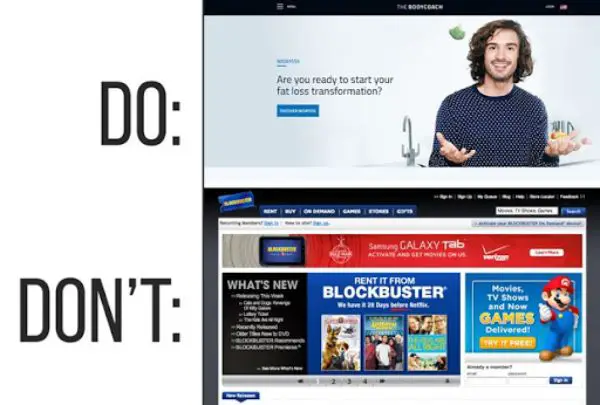
When any designer comes up with the idea about web design, there are mostly many components. Components used in web design usually includes non-important elements too which web design must not constitute. The prominent mistake designer who is new in web design make is fill up the design so that their work is prominent.
They try to make it look full, and the result is obnoxious. What you must keep in mind to have minimalistic web design is that there should be fewer elements as possible. When items reduce in the web design, all the attention goes to the central component of the web design, which is the actual purpose of the website. Minimum clutter is what must be followed rather than piling up of images and content. While having minimum clutter, all you must take care of is not to miss the important and base of the subject.
2. Fewer Page counts:
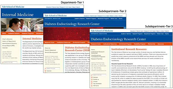
As a user, what we have done is search for such website which gives all the information in just one look. While creating a minimalistic web design, all you must ensure is that there must be fewer page counts. The more the user scrolls, he gets bored and eventually prefers another website.
To have a minimalist web page, you must consider keeping the page counts to a limit to improve the user experience and to give the page a better look. Keeping the content limited and the less page count would make the user stay on the page longer and prefer such sites more. To give it more edge, all you would have to do is, write content from the user and limit it. The more informative content and less page count would create a whole lot of traffic on the web page.
3. Simplicity:
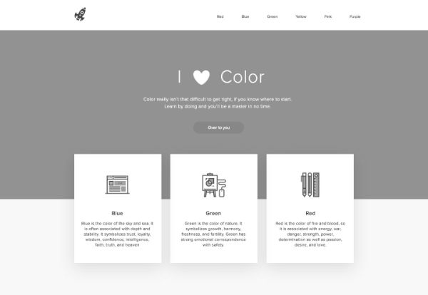
Simplicity creates a whole lot of difference in web design. Following simplicity helps you to create a plan and use content which quickly explained to users. It is about using less content and image, which still conveys the idea behind the web page. When the concept of simplicity is following, it is easier to achieve minimalist web design without much effort. Minimalist and simplicity are not the same but walks hand in hand.
When both concepts come together, you are nearing to complete minimalist web design. The trend that is followed by designers is simplicity and minimalistic approach. To get your way to minimalist web design, you must integrate simplicity in your design and to the point content. The more simplicity you choose you are bound to get noticed and be it an ongoing trend, the trend of minimalist approach is never going to get old and boring.
4. Focus to Content:
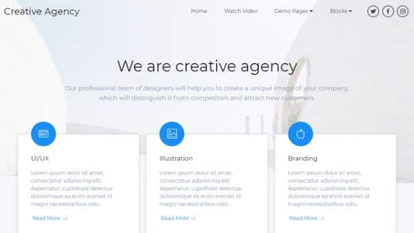
Focus on content is a must in minimalist web design. The primary attraction in such web design must be content. If the web design is all bright and flashy that takes the focus from the material; such design becomes useless. The core of the design is the content which must remain prominent throughout the web design.
This way if the content is managed and given superiority in the web design, it is bound to get more users. Any design which gives the content a back seat is not eligible to have a minimalistic approach. The minimalist web design ought to have content and design which serves purposefully to the viewers, thereby content taking charge of the whole design. The shorter and crisp the content is, the better the user experience and viewers. Make sure the content stays crisp and not explanatory to make your web design minimalist. All you must consider is to give content the importance.
5. Elements in design have a purpose:
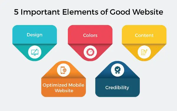
The minimalistic approach itself says the idea behind it. Just put the design and content which gives the meaning of the brand, and you have hit the right spot. The minimalist web design itself conveys that the things you put have a purpose. No new feathers or flowery things need to be adding to attract users. The user automatically tends to give attention to the minimalist web design as they convey the concept better than any other web design which has cluttered design or text.
The minimalist web design usually consists of only such text or design which serves some purpose; any additional element cancels out the minimalist approach. The elements in web design must have a purpose, then only it is said to have a minimalist approach in the right way. The way design and content form a unique blend conveying what need is becoming more viewed by the users and improves user experience.
6. Color limit:
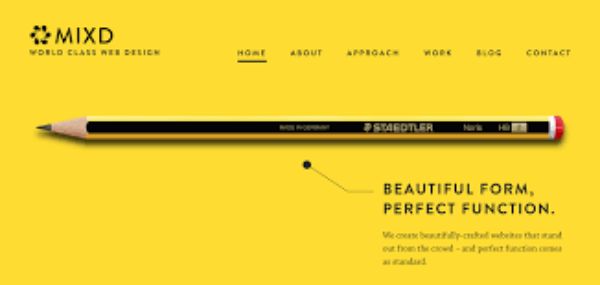
The usual technique used by the designers to make the web design funkier and flashier is by adding multiple colors to it. The more colors you use in the web design it would distract the user and can limit their presence on such pages. What works in maintaining a limit to the colors. Choose two colors which relate or convey the brand to the audience. Play with the different shades of those both colors and give a vivid yet classy look to the web page.
When you look upon to create a web design which has a minimalistic approach, then you must go for minimum colors. In case you want to create textures, then you must choose different shades of the same color. The best tip to have a minimalist web design right is by having just two shades of color. Use of multi colors in the web design has gone out of style, and usually, no one prefers it.
7. Trendy Typeface:
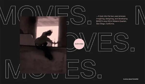
When you decide on having a minimalistic web design, you must reduce the components. On the decision of reduction of the content to highlight it, one must have a different font. The font selection should be distinctive to have an impressive look. Not only the typeface matters but also the size, type, weight and unique color. Select a trendy typeface which expressively conveys the contents. Not only the content gives the idea of the web site but also brings the attention of the user.
Always ensure that the type of font type you select remains the same throughout the web page, as it helps to have a flow and there is no disruption in the design. The kind of font style you use improves user experience and keeps the user hooked. Usually, the users tend to ignore the content and more focus on design but selecting a different font style than the usual makes sure, the user goes through the content.
8. Maintain on Upper Fold:
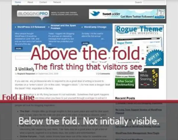
When you first find a website, all you prefer is to get the possible information on the first page itself. Always the first page defines the attention you can give. Improve the user experience, the primary information and call-to-action must keep on the above fold of the web page. When the scrolls increases, the user tends to move to another page. The best way to have the right minimalist web design all you must maintain is information and design on the upper fold.
Effectiveness of the website is only enhanced when the first fold of the page consists of the information and call-to-action. Users tend to search for information in the first fold, and when too many pages and multiple CTAs exist, it is easy to get confused. The below fold information must be secondary as the users by the time reach the second fold are usually bored and tend to ignore.
9. Background in white:
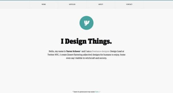
When the minimalistic approach abides to create a web design, one of the most important tips is to have a white background. Blank space or white background makes the design and text look prominent. The white background makes sure to bring the attention of the user to the specific design or content.
The background guides the attention of the user to a specific place where it is necessary. When you use a white background, it makes your content look elegant and the need for anything else to highlight your content get removed.
10. Maximum usability:
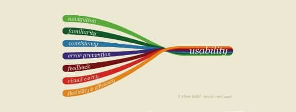
Web design can handle minimalist if it conveys the usability of the brand in a much broader sense. The flowery language or flashy design wouldn’t work for minimalist approach. The contents and design are used in web design must convey more of the usability of the brand. This would help the brand reach to its users. If the users understand the message and concept of web design, then the website design has achieved its intended result.
The only focus to get minimalist web design right is to keep the focus on usability. The web design should be interactive and should make in a way that the users get answers to their questions. Maximum usability increases the efficiency of the web page and increases the user activity by improving the user experience. Giving maximum usability in the web design allows the user to get all information they need easily.
Sometimes minimalist web design is what your business need. If at some point, you need to give a makeover to your web designs, go for a minimalist approach and see the wonders. The minimalist web design is never out of style and has a great user experience. If you are all about such web design, we have presented specific tips for you to which shall make sure, you are on the right path. All you must do is follow tips and bring the best out of your web design with a minimalistic approach.
If you are new to web designing and are looking forward to design one, opt for the minimalist web design and look for the reviews and feedback you get. Minimalist web design was never out of style and never would be as it conveys the best out of a web page and makes sure to give delightful user experience. Users prefer such web pages which serves their purpose in a defined way and have a minimalistic approach. Follow the tips and enjoy the rewards that come with it.

This article has boosted my confidence in minimalist design!
Thanks for making minimalist web design accessible and easy to understand.