Line25 is reader supported. At no cost to you a commission from sponsors may be earned when a purchase is made via links on the site. Learn more
Typesetting is the art and process of placing and arranging text on a page, a document, or a book/novel. It might look simple, but if not done in the right way, it will be full of flaws in terms of its look and layout. In all, typesetting means visual communication.
Typesetting or Typography is an art that takes years to master and a never-ending learning process. There are certain secrets to get the typesetting right. But the drill here is that as much as you will go into its depth, you will discover newer secrets to get it right and better. Here we will give you a few such secret tips to get your typesetting right:
1. Minimum Fonts, Maximum Clarity
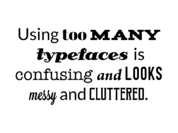
Making use of many typefaces will end up in confusion on the side of the reader. Instead, keep a few basic ideas in mind. For instance, start with the body copy, decide one font type for it. After finishing the body text, match the headers and footnotes with it to avoid any clutter. For beginners, start using one single font and gain expertise over it before you jump to newer styles of typeface. Play with styles: Modern typefaces already host many forms. Distinct styles will help the readers weigh importance to a different type of content
2. Font Families should complement each other
If you plan to use more than one type of font, then make sure they complement each other. Have a look at below example:
Typeface
Typeface
Book Antiqua and Bookman Old Style are looking similar to each other.
Typeface
Typeface
Algerian and Bradley Hand ITC look very different and Algerian overshadows the other font type.
Using two different fonts successfully in a design or layout demands an understanding of each type of font.
3. Using the Correct Font Size
Making use of the correct font size may seem an easy task, but in reality, it is essential and can sometimes make your text look bad if not taken care of in a better way. The too-large version can look bad, and also readers will only pay attention to those texts and leave the rest. The too-small version will be stressful for the readers to read. Hence the art is in finding the midway!
Few handy tips for you:
– Desktop device: Make use of 16 points or larger font size for the body copy so that it is not too large but readable.
– IOS device: Make use of 11 points as if you zoom the text you can comfortable read it
– Android device: Make use of 14 points for the Headings and 12 points for the body text
4. Justify left and NO WIDOW lines
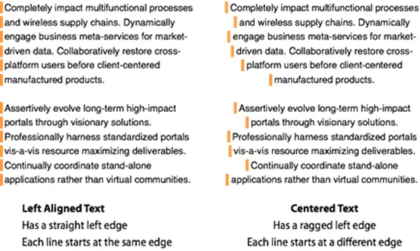
Readers are most comfortable to read when the text is justified on the left side. The reason is that our eyes quickly can move left to the right and return down after completing the horizontal line.
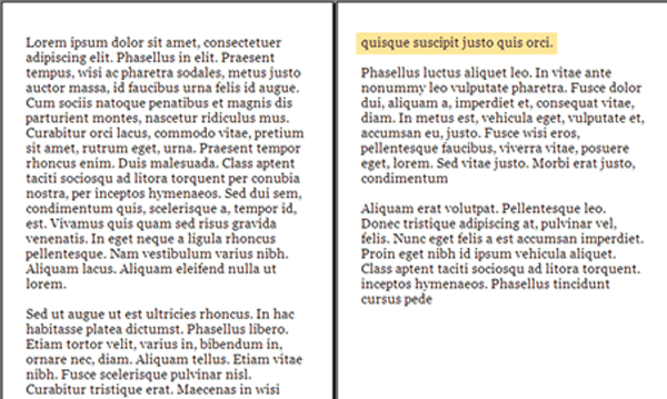
If you have observed after we end the paragraph, the last line will have just one or two words. This phenomenon is known as ‘Widow.’ Do not stretch your section till widows, end the line before that. The below image gives an understanding.
5. Use Online Resources
The web never disheartens you. There are plenty of online resources to looks for if you want help in typesetting. For example, do have a look at these resources- ilovetypography.com, typographher.com, letterformarchive.org, typewolf.com, and fontsinuse.com. Also, one can make use of Twitter/Instagram/Facebook accounts to follow specific experts in this field of typesetting. Surf online resources and you will get a tremendous amount of help.
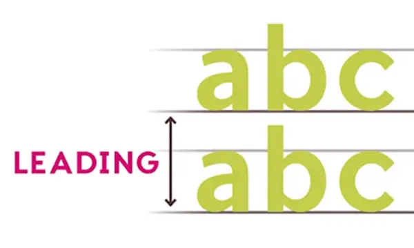
6. Set the Leading
Leading is the space between the lines. When there is a large amount of content for the design and space is too less, it will naturally be difficult to read well. If there are two large spaces, it looks terrible. Hence maintain the right amount of space between lines.
7. The perfect amount of line length
Line length refers to placing or maintaining the perfect amount of characters in one line of the text. Too short lines would be severe for the write, and excessively long lines would be intricate for the reader to read with focus. The magic lies in balancing and getting near perfection. The optimal length for desktop pages comes around 60-75 mark while for mobile devices it’s usually half the amount, i.e., 30-40 characters.
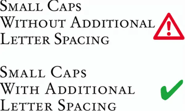
8. No Small Caps
Unless and until you know the difference between the real small caps vs. the fake ones, ignore using them. Do not shrink the full-size caps and call them small caps! And if you are ready to use real small caps, make sure the spacing is correct. They are littler lesser then lower case.
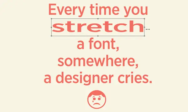
9. Do not disturb font dimensions without reason
Only and only if you have some logic, do not unnecessarily stretch the fonts or change its dimensions by pulling it as it will look ugly, not creative. If there is a need to increase the font size for emphasis then scale it to proportion to use it.
10. Finding Your Sweet Spot
A sweet spot is a combination of the font size and leading. A sweet spot ensures the best readability and least distortion caused due to the result of default anti-aliasing of the browser. Make a trial and error with the typeface you are using and find that particular sweet spot.
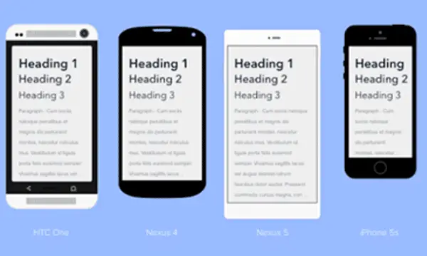
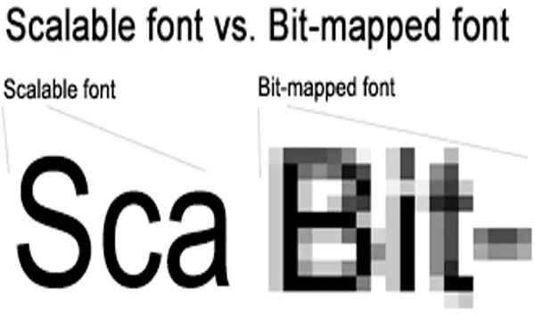
11. Check Scaling and Proportions
Different mobile devices require different resolutions. You will need to zoom in and zoom out to check whether your content matches the width of the mobile screen. Scalable fonts give much better results on different devices.
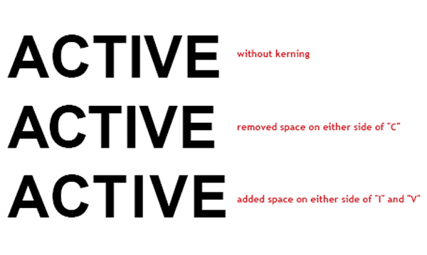
12. The art of kerning
An area where we can interfere with the natural order of the fonts is known as kerning. Kerning is an art that deserves time and patience to learn and implement, as explained in the image. This art of playing with text is performed by professional designers and it augments the overall design in an intangible manner.
13. Use grids
In layouts that emphasize on typography, making use of grids will help you create hidden synergies and harmonies. Getting alignment right is a big challenge when playing with typography. Creating such a grid helps in setting up a very neat and well-placed typography.

As Oliver Reichenstein states in his essay “Web Design Is 95% Typography”: Optimizing typography is optimizing readability, accessibility, usability, and overall graphic balance. Excellent typography skills are the beginning and end of success in the graphic designing field. Mastering the art of typesetting is a never-ending process. Hence one must keep learning. People may not compliment proper typesetting given its inherent contribution to the total design, but lousy typesetting will quickly come in the eye of readers and downgrade your overall design.