Line25 is reader supported. At no cost to you a commission from sponsors may be earned when a purchase is made via links on the site. Learn more
Learn how to design an infographic with HTML, CSS and jQuery, by following this easy, step by step tutorial. Check it out and start learning!
I’ve been wanting to get stuck into a creative infographic for quite some time, so recently I started work on a personal project that involved the design and build of a graphic to portray the stats and figures of Line25. To mix things up a little and to take it a step further, I decided to have a shot at building the whole infographic as a complete web page. Here’s a walkthrough of the project, showing how resources like Cufon and jQuery’s ScrollTo plugin were used to add some flair and interactivity to the design.
The concept
The design itself was put together in Adobe Illustrator using a bunch of Line25 stats. A limited colour palette was used to stay true to traditional infographic designs like airplane safety cards, with a couple of blues, greens and greys making up the scheme for the design. Large typography was one of the main ingredients, with League Gothic being the perfect fit with its tall and bold appearance. Charts, diagrams and icons also make up large portions of the design, all aiming to add interest to the otherwise boring facts and figures.
With the idea of building a web page out of the design in mind, I bundled in some large margins and gaps between the sections, the idea being that the jQuery ScrollTo plugin could make for some cool interactive scrolling. Swirly lines and gradients in these areas would add some visual flair as the browser window zooms past.
The basic webpage
Once the overall design concept was complete, the basic information was laid out in plain old HTML. Paragraphs of text and headings were used where possible to allow the majority of the design to be rendered by the browser, then it was all styled up with CSS one section at a time.
Intro section
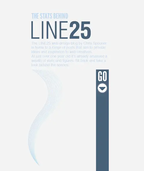
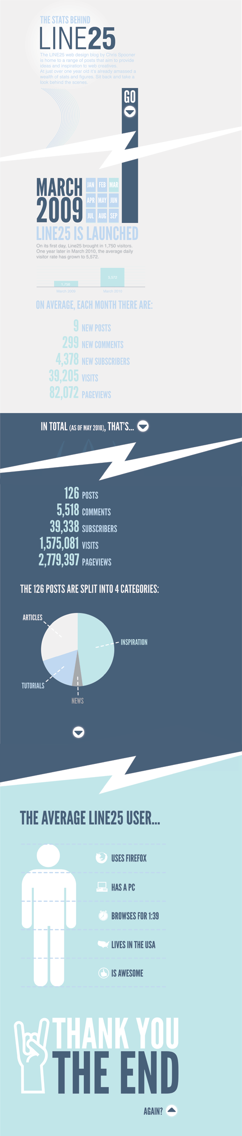
<div id="intro">
	<h1>The stats behind <span>Line25</span></h1>
	<p>The LINE25 web design blog by Chris Spooner is home to a range of posts that aim to provide ideas and inspiration to web creatives.
At just over one year old it’s already amassed a wealth of stats and figures. Sit back and take a look behind the scenes.</p>

	<p class="btn"><a href="#section1">Continue</a></p>
</div>
#intro {
	background: url(images/section-1.png) 0 485px no-repeat;
	padding: 0 0 1102px 0;
	margin: 0 0 0 100px;
}

	#intro h1 {
		font-size: 78px;
		color: #c0d8f1;
		text-transform: uppercase;
		margin: 0 0 25px 0;
	}
		#intro h1 span {
			display: block; width: 625px; height: 188px; margin: 8px 0 0 0;
			background: url(images/line25.png);text-indent: -9999px;
		}

	#intro p {
		width: 850px;
		font-size: 28px; color: #c0d8f1;
	}
		#intro p.btn a {
			display: block; width: 128px; height: 128px;
			background: url(images/down-btn.jpg); text-indent: -9999px;
			float: right; margin: 160px -3px 0 0;
		}
The intro section consists of a short header, the Line25 logo, intro paragraph and the first button element. The background of the design was added as a background image to the intro <div>, and plenty of padding added to replicate the large portions of white space. The heading is configured in size and colour, with the <span> coming in handy for some image replacement as the Line25 logo.
Section one
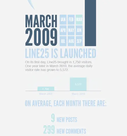
<div id="section1">
	<h2 class="march2009">March 2009</h2>
	<h2 class="launched">Line25 is launched</h2>
	<p>On its first day, Line25 brought in 1,750 visitors. One year later in March 2010, the average daily visitor rate has grown to 5,572.</p>
	<img src="images/graph.png" alt="Graph displaying visitor count from March 2009 and March 2010" />

	<h2 class="average">On average each month, there are:</h2>

	<dl>
		<dt>9</dt>
		<dd>New posts</dd>

		<dt>299</dt>
		<dd>New comments</dd>

		<dt>4,378</dt>
		<dd>New subscribers</dd>

		<dt>39,205</dt>
		<dd>Visits</dd>

		<dt>82,072</dt>
		<dd>Pageviews</dd>
	</dl>
</div>
#section1 {
	margin: 0 0 0 100px;
}
	#section1 h2.launched {
		font-size: 154px;
		color: #c0d8f1;
		text-transform: uppercase;
		margin: 0 0 15px 0;
	}
	#section1 h2.march2009 {
		width: 858px; height: 398px; margin: -21px 0 30px 0;
		background: url(images/march-2009.png); text-indent: -9999px;
	}
	#section1 p {
		width: 850px; margin: -25px 0 45px 0;
		font-size: 37px; line-height: 47px; color: #a7a9ac;
	}
	#section1 img {
		margin: 0 0 45px 0;
	}

	#section1 h2.average {
		font-size: 82px;
		color: #c0d8f1;
		text-transform: uppercase;
		margin: 0 0 15px 0;
	}
	#section1 dl {
		overflow: hidden; margin: 0 0 100px 0;
	}
		#section1 dl dt {
			width: 360px; float: left; clear: left;
			font-size: 130px;
			color: #c1e6e9;
			text-transform: uppercase;
			text-align: right;
			margin: 0 0 5px 0;
		}
		#section1 dl dd {
			float: left;
			*float: none; /* Quick and dirty IE7 fix */
			font-size: 70px;
			color: #c0d8f1;
			text-transform: uppercase;
			margin: 43px 0 0 25px;
		}
After a short scroll section one begins with a simple graphic, followed by paragraph text which introduces the first chart. The large lists of facts and figures fits perfectly as a definition list, with the two pieces of related information being marked up as either <dt> or <dd>.
Section two
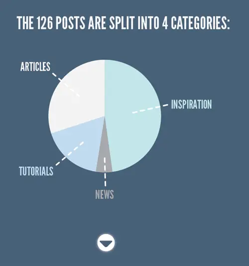
<div id="section2">
	<h2 class="total">In total <span>(as of May 2010)</span>, that's...</h2>
	<p class="btn total"><a href="#stats">Continue</a></p>
	[...]
	<h2 class="categories">The 126 posts are split into 4 categories:</h2>
	<img src="images/pie-chart.png" alt="Pie chart displaying posts per category" />

	<p class="btn continue"><a href="#user">Continue</a></p>
</div>
#section2 {
	background: #476079 url(images/swirls.png) 220px 210px no-repeat; padding: 75px 0 50px 100px;
}
	#section2 h2.total {
		font-size: 82px;
		color: #fff;
		text-transform: uppercase;
		margin: 0 0 2362px 0;
		float: left;
	}
		#section2 h2.total span {
			font-size: 55px;
		}
		#section2 p.btn.total a {
			display: block; width: 128px; height: 128px;
			background: url(images/down-btn.jpg); text-indent: -9999px;
			float: left; margin: -32px 0 0 10px;
		}
		[...]
		#section2 h2.categories {
			font-size: 82px;
			color: #fff;
			text-transform: uppercase;
			margin: 0 0 150px 0;
		}
		#section2 img {
			margin: 0 0 150px 0;
		}
		#section2 p.btn.continue a {
			display: block; width: 128px; height: 128px;
			background: url(images/down-btn.jpg); text-indent: -9999px;
			margin: 0 0 0 415px;
		}
Section two switches from a grey background to a dark blue, and starts with a short title and swirly pattern graphic before heading down to the meaty information lower down. This graphic is added as a background image to the section2 <div> and lots of padding added to bump down the content. Classes on each title allows the sizing to be altered to adhere to the original design.
Section three
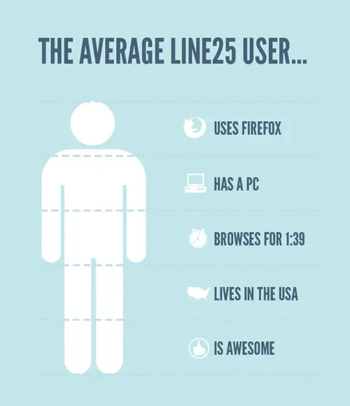
<div id="section3">
	<h2 class="user" id="user">The average Line25 user...</h2>
	<ul>
		<li class="firefox">Uses Firefox</li>
		<li class="pc">Has a PC</li>
		<li class="time">Browses for 1:39</li>
		<li class="usa">Lives in the USA</li>
		<li class="awesome">Is awesome</li>
	</ul>

	<img src="images/thankyou.png" alt="Thank You, The End" />

	<h3>Again?</h3>
	<p class="btn"><a href="#intro">Back to top</a></p>
</div>
#section3 {
	background: #c1e6e9 url(images/gradient.jpg) repeat-x; padding: 4100px 0 200px 100px;
	overflow: hidden;
}
	#section3 h2.user {
		font-size: 120px;
		color: #476079;
		text-transform: uppercase;
		margin: 0 0 100px 0; padding: 100px 0 0 0;
	}
	#section3 ul {
		width: 534px; height: 1135px; padding: 75px 0 200px 600px;
		background: url(images/user-bg.png) no-repeat;
	}
		#section3 ul li {
			list-style: none; height: 60px; padding: 40px 0 30px 130px; margin: 0 0 106px 0;
			font-size: 70px;
			color: #476079;
			text-transform: uppercase;
		}
			#section3 ul li.firefox {
				background: url(images/firefox-icon.png) left no-repeat;
			}
			#section3 ul li.pc {
				background: url(images/pc-icon.png) left no-repeat;
			}
			#section3 ul li.time {
				background: url(images/clock-icon.png) left no-repeat;
			}
			#section3 ul li.usa {
				background: url(images/usa-icon.png) left no-repeat;
			}
			#section3 ul li.awesome {
				background: url(images/awesome-icon.png) left no-repeat;
			}
		#section3 img {
			margin: 0 0 100px 0;
		}
		#section3 h3 {
			font-size: 70px;
			color: #476079;
			text-transform: uppercase;
			float: left; margin: 0 0 0 830px;
		}
		#section3 p.btn a {
			display: block; width: 115px; height: 115px; float: left; margin: -30px 0 0 10px;
			background: url(images/top-btn.png); text-indent: -9999px;
		}
Section three begins after another short scroll which transitions from the dark blue background to mint green. This section presents information overlaid over a graphic, which is set as the background of a <ul> and the information itself marked up as <li> elements. Classes on each <li> make it easy to attach icon graphics alongside each title, and margins align up each list item between the dotted area of the background image.
Entire HTML in summary
Javascript coolness
A couple of simple Javascript resources quickly add some extra coolness to the design. Firstly we have Cufon, which allows us to bring the League Gothic font from the concept into the web based design. Then there’s the implementation of jQuery and the handy ScrollTo plugin which adds all the fancy page scrolling functionality we need.
<script src="js/jquery.js" type="text/javascript"></script>
<script src="js/cufon.js" type="text/javascript"></script>
<script src="js/League_Gothic_400.font.js" type="text/javascript"></script>
<script src="js/jquery.scrollTo.js" type="text/javascript"></script>
<script src="js/scripts.js" type="text/javascript"></script>
In total there’s five Javascript files; the jQuery library; the Cufon script; a Cufon generated font file for League Gothic; the ScollTo plugin for jQuery; and finally my own scripts file for activating and configuring all the Javascript functionality.
To activate League Gothic on the appropriate HTML elements, they’re inserted into the scripts file like so:
Cufon.replace('h1, h2, h3, dl, ul');
As for the scrolling, I already added anchor links to the relevant element IDs in the HTML, so to implement auto-scrolling, the ScrollTo plugin is activated:
$(document).ready(function() {
	$("p.btn a").click(function() {
		$.scrollTo($(this).attr("href"), 1000);
		return false;
	});
});
Rather than write commands for every button, I targeted the ‘btn’ anchor, then used .attr("href") to grab the target from that particular anchor. return false; then stops the original HTML anchor link from working.
The final design
So here it is, the final result of my little experiment!
Comments are closed.