Line25 is reader supported. At no cost to you a commission from sponsors may be earned when a purchase is made via links on the site. Learn more
Some people think entrepreneurship is easy, but they cannot be any further from the truth. Many entrepreneurs struggle and work very hard to get their startup going and most of the time, what appears to be an overnight success, actually implies lots of years of hard work with multiple ups and downs.
When developing branding for startups, one must take into account that a brand strategy should reflect the client’s positioning statement.
The marketplace is a crowded space and setting your startup apart from others is a very important step to success. One of the most important ways to differentiate your startup from the crowd is to focus on a good design. Creating products that look good certainly is a good strategy.
These 40 branding ideas for startups we showcased below are examples of great visual identity projects that have already proven to be successful and that reflect certain branding design trends.
Also, keep in mind that behind every thriving business stands a brand design that’s easy to remember. Brand boards are very useful to keep you focused on the image you want to build for a company and maintain the unity of the brand. Brand boards are particularly useful for showcasing your branding design to your client. A brand board gathers all the branding elements in once place, such as logo, business card design, packaging design, letterhead design, as well as color palette, images, typography, and patterns. This way you can quickly evaluate your brand design’s strengths and correct what needs to be modified.
Besides listing below some creative branding ideas for startups, we decided to also show you some cool brand boards with inspiring designs. Take a look and let us know which ones you like!
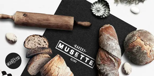
MUSETTE bakery
This is the family business of two siblings. In their bakery, they use no preservatives, everything is natural and the homemade pastries are wrapped in a stylish black-and-white patterned packaging.
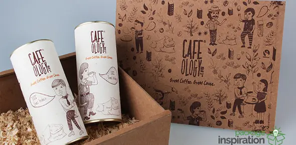
CAFEOLOGY
CAFEOLOGY is an independent supplier of beverages (coffee, tea, and sugar, ethically sourced from farmers in Colombia, Costa Rica, the Dominican Republic) to restaurants and cafes, which promotes its core value of only supplying fair trade products.
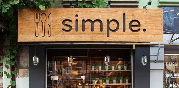
Simple
This is a design for a restaurant with simple and unusual food made from local, seasonal products. This is a new generation fast-food restaurant, focused on simple and original recipes.
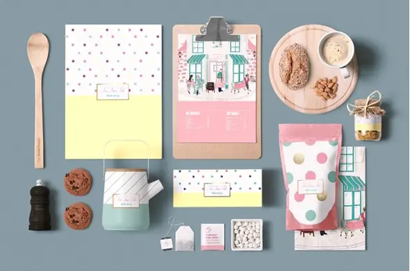
Tea Time Tale Branding and Packaging by Arya Vijayan
This is another wonderful brand board that includes many elements that show the unity of the company’s brand.
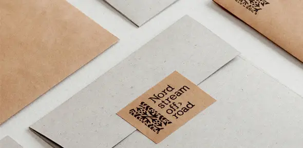
Nordstream Off-Road
This identity design is created with a focus on the company’s main audience, composed of strong men who like hunting, fishing and safari on Kola Peninsula. The logo represents letter N entered in the tire tread image.
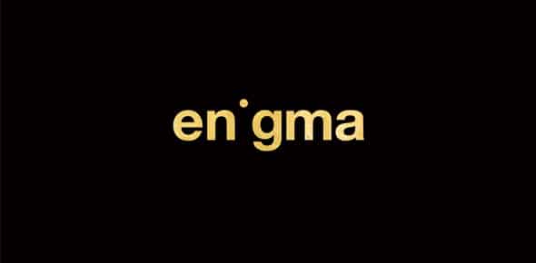
Enigma Personal Identity
Enigma was the name of a machine used during World War 2 that had a rotating encryption mechanism, which allowed encrypting and decrypting messages. This design is simple and clever.
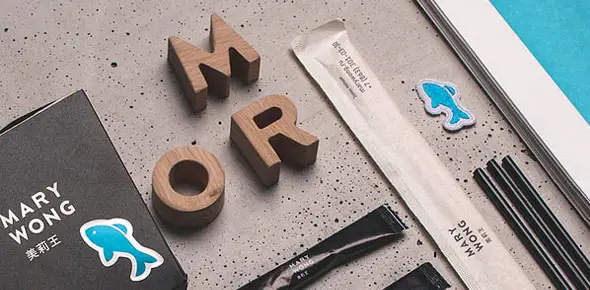
Mary Wong Brand Design by Fork
Mary Wong is a chain of noodle bars from Russia. They combine Asian accuracy with an American spirit. Created by studio Fork, the brand identity combines a sense of reduced objectivity with lovely elements and illustrations.
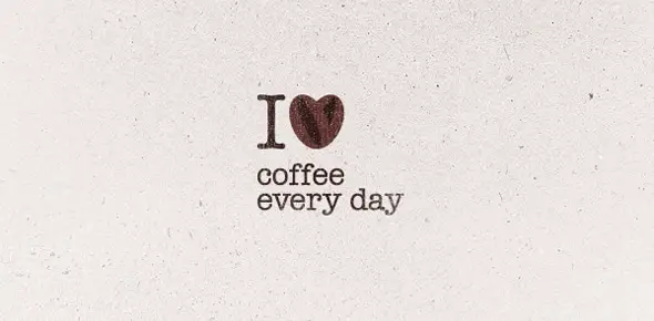
I Love coffee every day
This is a corporate identity project designed for a coffee-to-go chain. The unique idea is that the logo can vary by using simple markers or stickers, depending on the day of the week.
Personal Branding
This project is quite nice with its angles and sharp edges. The result is an excellent brand identity design.
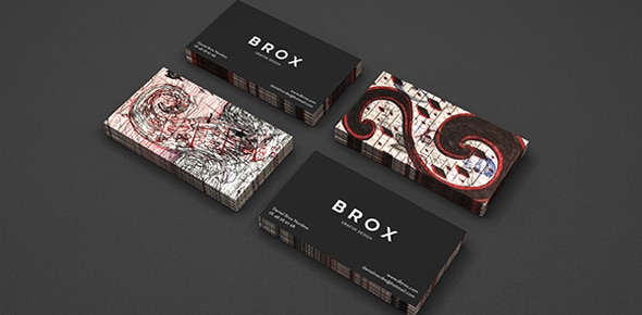
BROX – Self Branding
Brox is the idea of a graphic designer created for self-promotion. The central idea was to mix a clean look with some sketches from an old sketchbook.
Branding and Website Design: Bespoke Creative by Tomasz Mazurczak
Bespoke Creative is a design, marketing and sales team that specializes in bedding, wall covering, and window covering. Tomasz Mazurczak created this full corporate identity visual with various versions of the logo, for this project.
Veletex
The idea for the sign was born around letterform V, which stands both as an initial for the company and a sign for victory. The structure and color of the sign correspond to the idea of ‘blue ribbon’, a reward for excelling in quality.
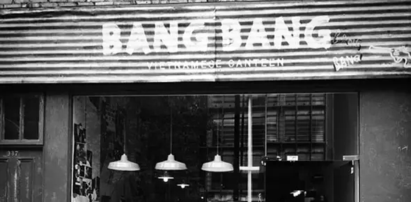
BangBang — Branding on Behance
This is a graphic design project for the rebranding of a London Vietnamese canteen. The black and white design enhances the atmosphere through patterns, handwritten typeface, and dynamic layouts.
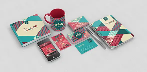
ESTÚDIO DHARMA
This design represents the new visual identity created by Estúdio Dharm. The final visual identity is created with the help of different colors and textures.
This Coffee Branding Concept Creates Simplicity Through Color-Coded System
This is an amazing brand board that showcases the creativity of the designer. Beautiful packaging design combined with amazing typography and a color-coded system to recognize each flavor.
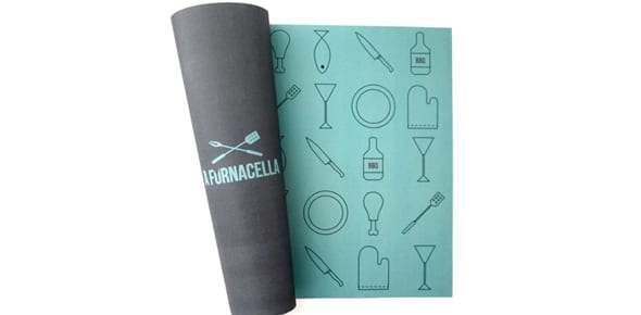
Artwork di francesco pesce
This portfolio includes various promotion materials for “A Furnacella” restaurant. Black and light green dominate the visual identity created by Francesco Pesce.
Beautiful Branding for Spanish-Mexican Restaurant Montagu
This is a beautiful branding design created for Spanish-Mexican restaurant Montagu. The two elements included in the design – detailed black and white illustrations and colorful photography – compliment each other perfectly.
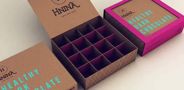
HNINA
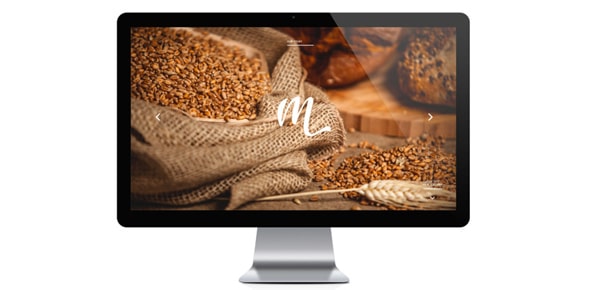
Isabela Rodrigues has created a lovely and bold look for Hnina, a healthy chocolate alternative.
RESTORATION HARDWARE BABY & CHILD
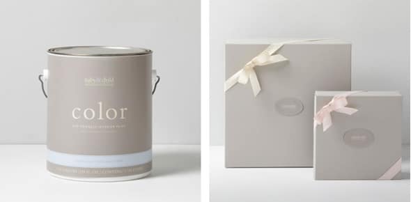
This design packaging is distinctive and reflects the attitude and ideology of this luxury home goods company. Designs were inspired by the places from which products were gathered.
Inspice: Packaging Set of 3
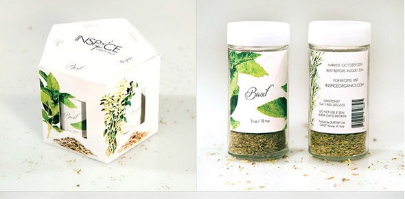
This design was created for a high-end herbal brand: Inspice. There were created a series of three packages for products that would be sold in stores (cutting board, spice pack, and an olive oil pourer).
Mitsuori Architects designed by Hunt &Co.
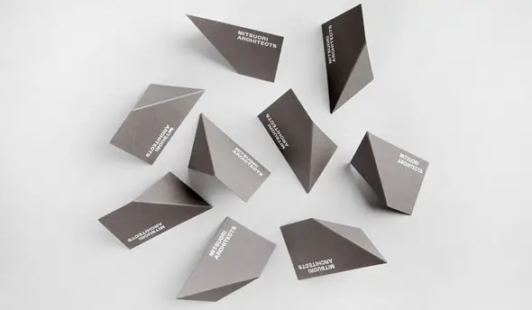
Mitsuori Architects is an architectural design studio that creates high-quality structures and spaces that combine aesthetic beauty with careful planning and thoughtful detailing.
200 Years Coffee – Logo and Identity
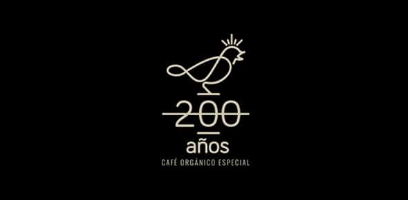
200 Years Coffee brand was created to please connoisseurs of a real cup of coffee. The idea of the design was to create a clean and clear symbol that showed how special this organic coffee is.
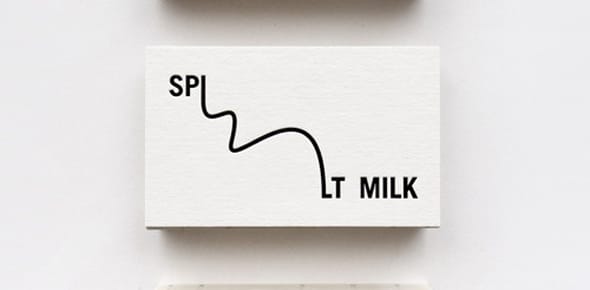
Split Milk
This is a visual identity project for a Melbourne-based interior design team, Spilt Milk. This identity design does not rely on just one logo but on a range of interchangeable logo variations, all showing the letter ‘I’ “spilling” into the ‘L’ in different ways.
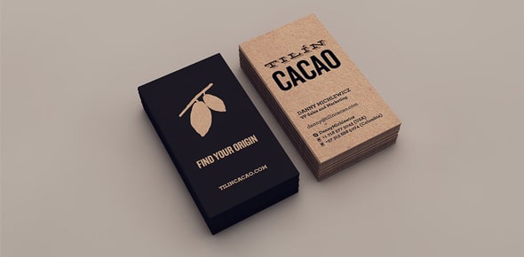
TILÍN CACAO
Sweety Branding Studio created packaging and branding for Tilín – a chocolate brand from Colombia. The design includes an illustration that represents the past of cacao cultivation with a beautiful twist featuring all-cap style typography.
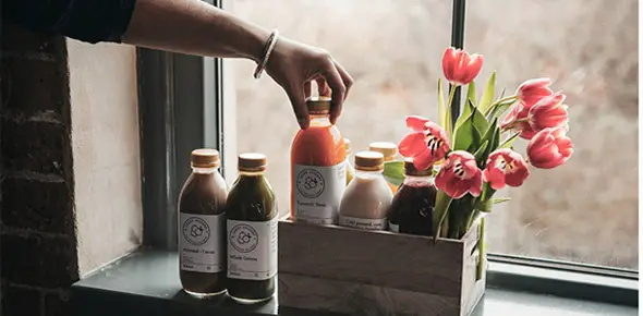
Leeds Juicery
Leeds Juicery is the first cold-pressed juice company in Leeds. The visual identity focuses on capturing purity, meditation, health and the Ayurvedic science.
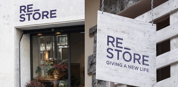
RE_STORE
This is an eco-friendly packaging design that reduces the environmental impact. Re_store is an initiative to recycle and to recover used materials and transform them into new products.
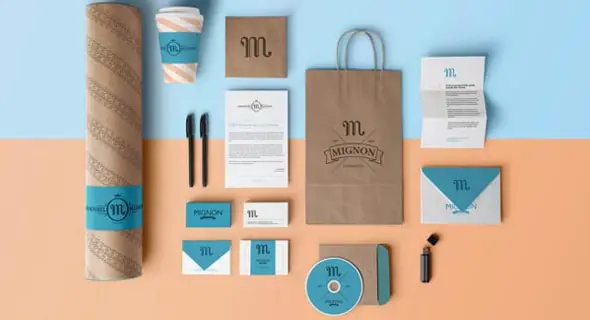
Mignon
Mignon is an old, traditional confectionery business in Marseille, France. French designer Benoit Galangau conceived a new, modern visual identity concept for Mignon.
Branding Inspiration: Puree Organics by Studioahamed
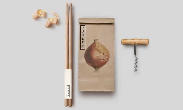
Studioahamed has created this special brand identity for Puree Organics, a medicinal vegetable garden where the public can buy naturally farmed food located in their neighborhoods.
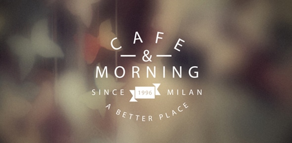
Cafe & morning
This chic and creative packaging design was created for Cafe & Morning, a coffee shop that was founded in 1996, in Milan.
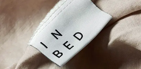
In Bed
In Bed is an online store that retails homeware items created by Japanese and American designers. The result is an interesting contrast of typographical austerity and fine details.
Artwork di andrea petruccio
This business card design is simple but professional, created by Andrea Petruccio, a graphic and web designer.
Hawksfield – Identity
Hawksfield is a modern real estate agency situated in Cambridge. Its identity consists of a letter mark and a dynamic graphic system.
Lola & Gray Branding by Mint Studio Design
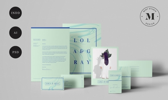
Lola & Gray branding includes the following design elements: business card, letterhead, envelope, postcard and appointment card. The design has a marble pattern that can be easily edited to fit any brand.
Solution – Juice Bar
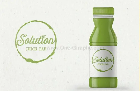
This fresh looking design was created by JBS, a team of former juice bar owners who have joined to make smoothies and blended beverages.
Zdunkiewicz Studio / Self Promotion
These beautifully executed designs are self-promotion materials for Zdunkiewicz Studio. Their business card designs are extremely creative.
HARMONY WITH NATURE
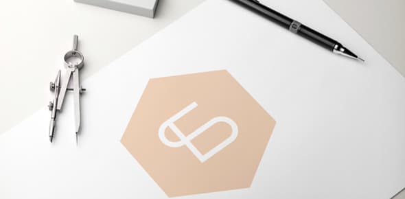
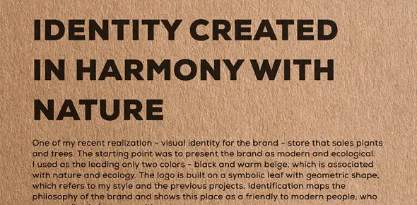
This is a visual identity design created for a store that sales plants and trees. For this design, there were used only two colors – black and warm beige – and the logo is built on a symbolic leaf with a geometric shape.
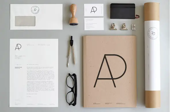
A Panzer
This interesting promotion material was created for A PANZER studio by Anne Katharina Schulze and Tim Panzer.
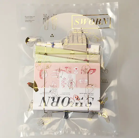
SWORN
“Sworn” is an amazing series of book designs. The acts of joining hands symbolize the ways people establish relationships.
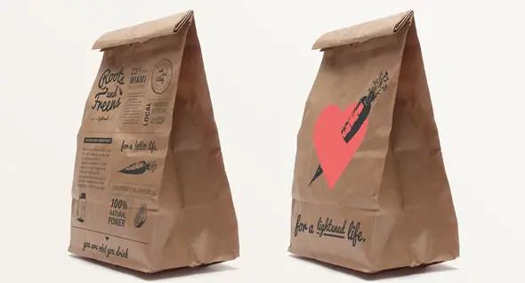
Roots & Freens
This a visual and branding identity created for Roots & Freens restaurant. The design includes a modern menu and a farm stand inspired.
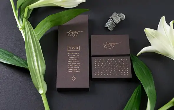
Branding Identity Design – Sergej
This corporate design project has an elegant, high-end look. The designers gave special attention to the details, such as textures and materials.
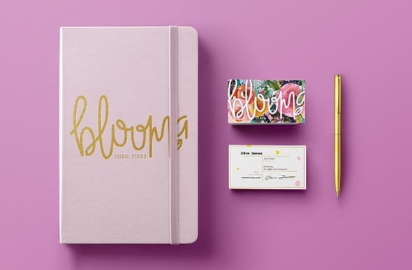
Blooma Floral Studio by Lizzy Cantu on Behance
This is another lovely example of a brand board where you can see a couple of branded products. The colors are stunning and the designs are well-thought, simple but effective.
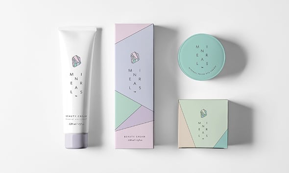
MINERALS NATURAL CARE™
This is a very creative branding projects that you can see beautifully displayed in this brand board. The fonts and colors are delightfully chosen for an eye-catching design.
BARRO BLUE
Here are some products from the branding department, lovely showcased on this brand board. Get inspired by this item and start creating your own designs.
New Branding + A Free Brand Board Template
Check out this brand board and use what you learn to create your own projects. You also have instructions on how to use it properly.
Rebranding | Brand Board + Website
This is a rebranding project. See how the designer started the process and also the final result. This info will surely come in handy in your future projects.
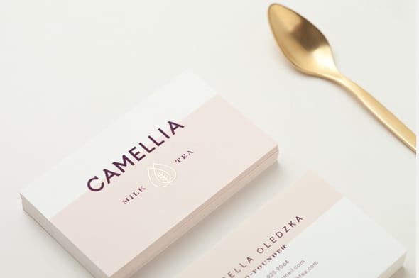
Camellia Milk Tea on Behance
Check out this stunning concept design and see what new things you can learn. This is a small bit from a brand board that contains all the characteristics of the brand.
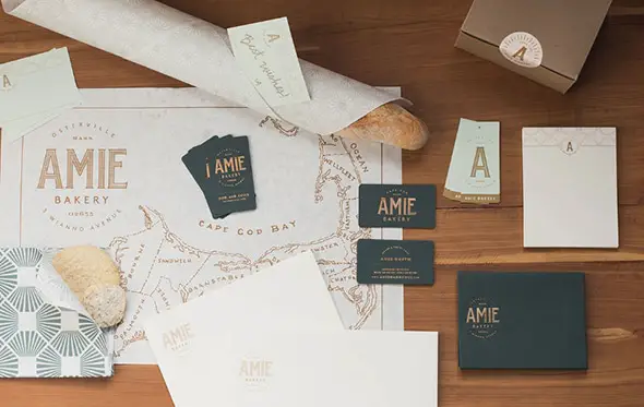
Amie Bakery
Here you have an excellent brand board that includes multiple items. See how the designer created these various products, with different shapes and uses, but in the same style.
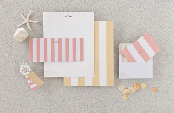
PilyQ Branding by Wallnut Studio on Behance
This is another example of a brand board that you can use as an inspiration to create your own. The things you learn will definitely be useful in the future.
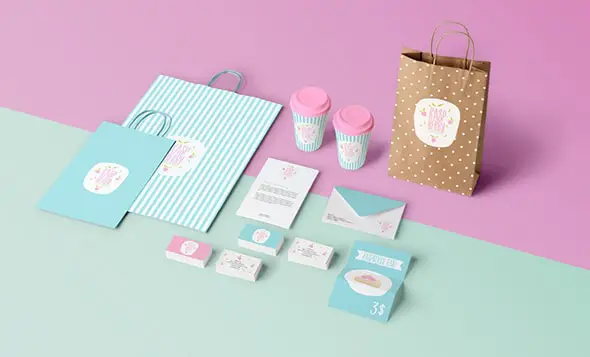
Raspberry – Vegan, and Organic
Here are some various products from a patisserie that uses only vegan and organic products. This brand board showcases the unity between the design of all these elements.



Very cool! I really like the Mary Wong branding!
In the era of startups, such post was really much needed.
I hope this will surely help getting some initial momentum to the startup businesses
this is really useful for me!