Super Cool CSS Flip Effect with Webkit Animation

Home » Articles » Super Cool CSS Flip Effect with Webkit Animation

Line25 is reader supported. At no cost to you a commission from sponsors may be earned when a purchase is made via links on the site. Learn more

There’s some seriously cool transform and animation effects available through the webkit engine that can really spice up the web experiences for users with the Safari browser. Here’s a quick look at how the rotateY property can produce a flip effect, and how it can be used to create a super cool Transformers themed top trumps design.

View the Transformers Top Trumps CSS demo

View the demo

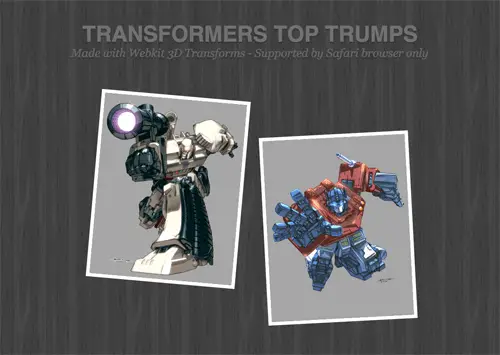
Safari browser required to experience the animated Webkit flip effect.

Webkit flip transition in action

Flipped view CSS flip effect

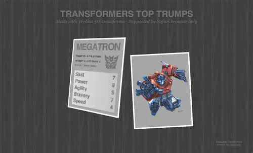
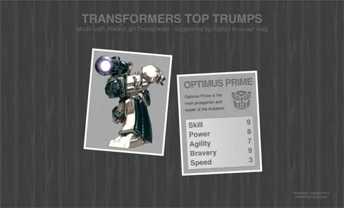
The example I’ve put together shows how the flip effect can be used to reveal information as if flipping over on a card. Hover over the Optimus Prime and Megatron top trump cards to see their scores. Now, let’s take a look at how it was made.

The HTML

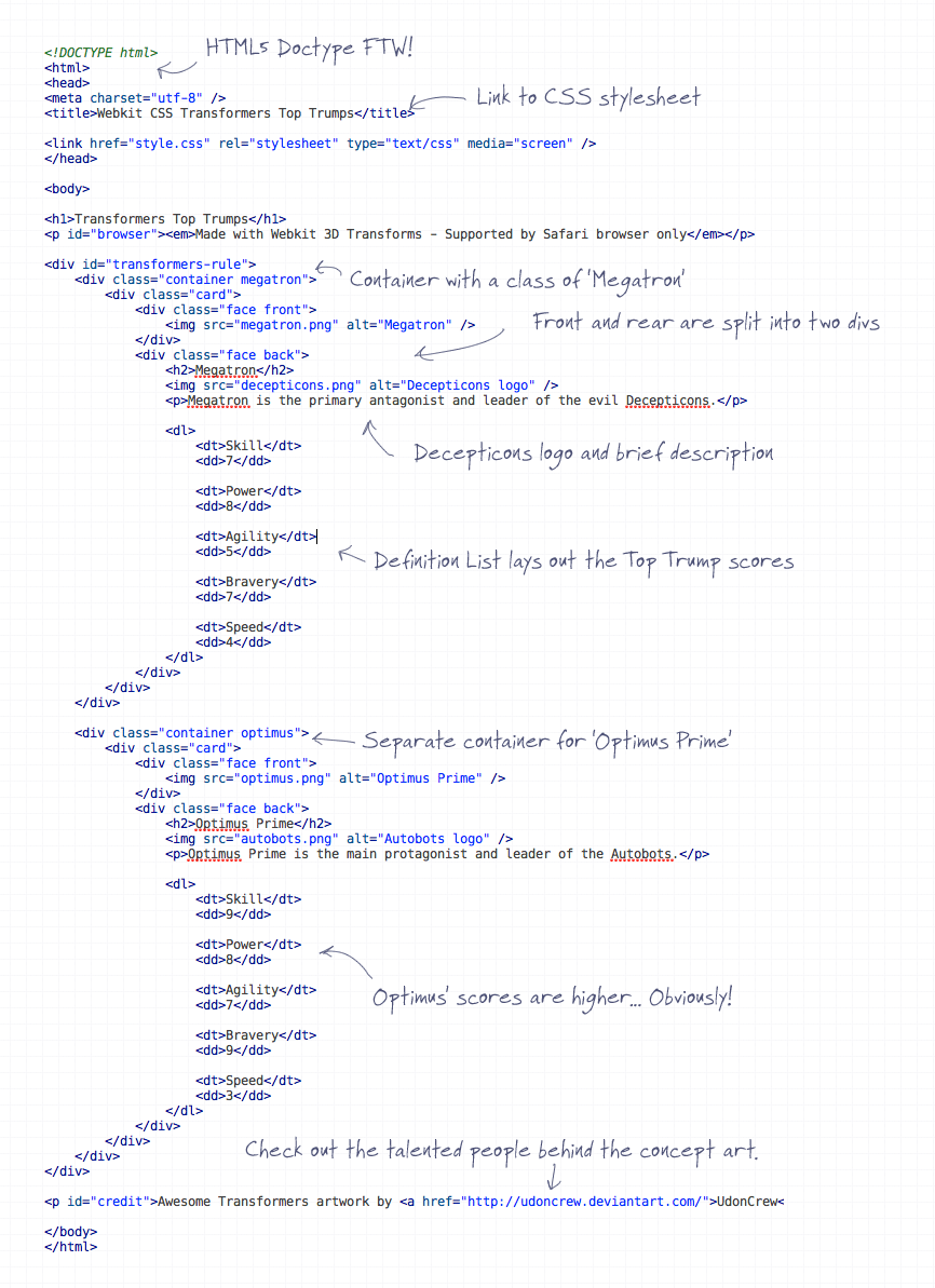
<div id="transformers-rule">
	<div class="container megatron">
		<div class="card">
			<div class="face front">
				
			</div>
			<div class="face back">
			
			</div>
	 	</div>
	</div>
</div>

The HTML is pretty simple, it’s basically made up of a couple of <div> elements to form containers for each card.

<div class="face front">
	<img src="megatron.png" alt="Megatron CSS flip effect" />
</div>
<div class="face back">
	<h2>Megatron</h2>
	<img src="decepticons.png" alt="Decepticons logo CSS flip effect" />
	<p>Megatron is the primary antagonist and leader of the evil Decepticons.</p>
	
	<dl>
		<dt>Skill</dt>
		<dd>7</dd>
		
		<dt>Power</dt>
		<dd>8</dd>
		
		<dt>Agility</dt>
		<dd>5</dd>
		
		<dt>Bravery</dt>
		<dd>7</dd>
		
		<dt>Speed</dt>
		<dd>4</dd>
	</dl>
</div>

The front and rear face of the cards are split into two more divs and the relevant content placed inside them.
On the front is a single image, whereas on the back is the complete spec for each character. A <h2> creates a title, paragraph element and image for a brief description, then the scores are listed out in a definition list <dl>.
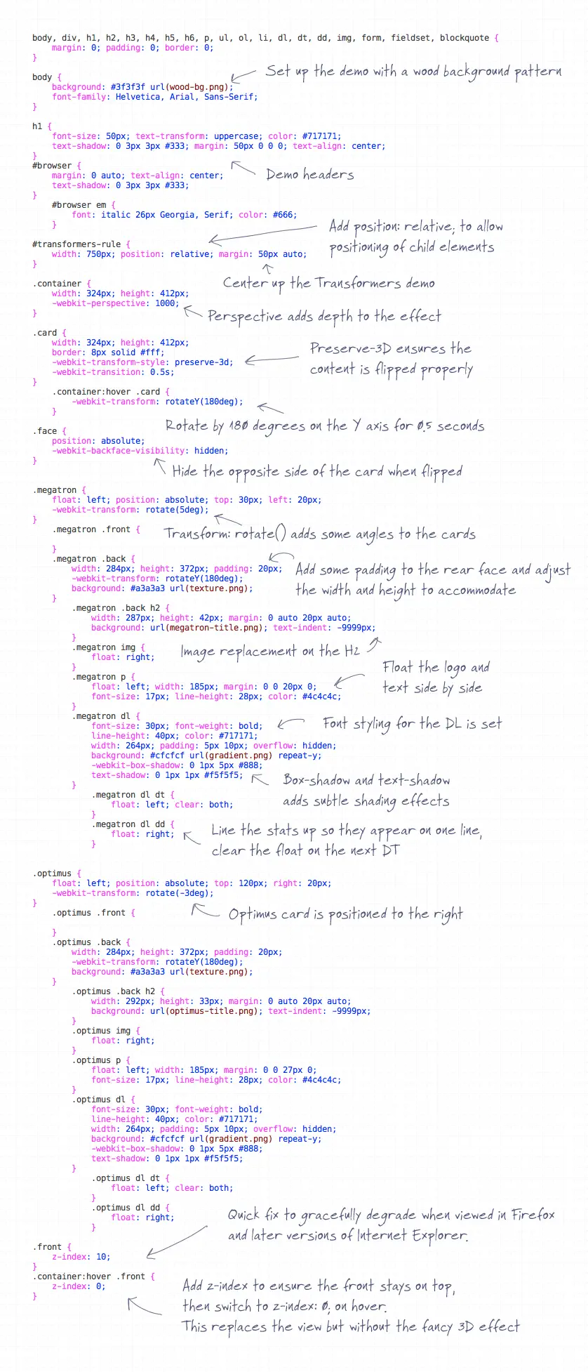
The CSS

.megatron {
	float: left; position: absolute; top: 30px; left: 20px;
}
	.megatron .front {
		
	}
	.megatron .back {
		width: 284px; height: 372px; padding: 20px;
		background: #a3a3a3 url(texture.png); 
	}
		.megatron .back h2 {
			width: 287px; height: 42px; margin: 0 auto 20px auto;
			background: url(megatron-title.png); text-indent: -9999px; 
		}
		.megatron img {
			float: right;
		}
		.megatron p {
			float: left; width: 185px; margin: 0 0 20px 0;
			font-size: 17px; line-height: 28px; color: #4c4c4c; 
		}

The background of the card is first given a repeating grey texture, then each of the HTML elements is styled up. The h2 is replaced with an image of the same text but with some added Photoshop effects. The font-size and colour is set on the paragraph elements and they’re floated alongside the Autobots and Decepticons logos.

.megatron dl {
	font-size: 30px; font-weight: bold; 
	line-height: 40px; color: #717171;
	width: 264px; padding: 5px 10px; overflow: hidden; 
	background: #cfcfcf url(gradient.png) repeat-y;
	-webkit-box-shadow: 0 1px 5px #888;
	text-shadow: 0 1px 1px #f5f5f5;
}
	.megatron dl dt {
		float: left; clear: both;
	}
	.megatron dl dd {
		float: right;
	}

In order to display the character specs side by side, the definition title (dt) and definition description (dd) are floated left and right respectively. The definition list element (dl) itself is given the gradient background and text styling, which is inherited down to the dt and dd.

The webkit animation

.container {
	width: 324px; height: 412px;
	-webkit-perspective: 1000;
}

.card {
	width: 324px; height: 412px;
	border: 8px solid #fff;	
	-webkit-transform-style: preserve-3d;
	-webkit-transition: 0.5s;
}

In order to get the whole thing working a bunch of webkit animation and transform properties are brought into play. Starting at the top, the container divs are given a -webkit-perspective of 1000 to add some realism to the flip motion, otherwise it all seems a little flat. Next, -webkit-transform-style: preserve-3d; and -webkit-transition: 0.5s; are added to the card div. The preserve-3d transform style simply ensures that child elements follow the three dimensional motion rather than staying flat and the transition value of 0.5s sets the speed of the overall effect.

.container:hover .card {
	-webkit-transform: rotateY(180deg);				
}

.face {
position: absolute;
-webkit-backface-visibility: hidden;
}

When the card is hovered by the mouse, a webkit transform of rotateY(180deg) is added, which rotates the object 180 degrees on the Y axis. -webkit-backface-visibility: hidden; is another fancy webkit property that is put to use on the face of each card. This ensures the opposite side of the card is no longer visible, without this the object would simply flip into a mirror image rather than display the other side.

The full HTML

View the full HTML

The full CSS

View the full CSS

View the Transformers Top Trumps CSS demo

View the demo

Be sure to show DeviantArt user UdonCrew some love for their awesome Transformers concept art.

Author
Iggy
Iggy is a designer who loves experimenting with new web design techniques, collating creative website designs, and writing about the latest design trends, inspiration, design freebies, and more. You can follow him on Twitter

37 thoughts on “Super Cool CSS Flip Effect with Webkit Animation”

  1. With all of the potential for scams concerning
    diamonds, buying diamonds online almost
    seems unthinkable! However, you actually
    can purchase diamonds online, without any
    problems as long as you are careful.

    First, think about your reasons for wanting to
    purchase the diamond online, as opposed to
    making a purchase from a local jewelry store.
    The most common reason is price. Due to
    low overhead costs, online jewelers and
    wholesalers are able to offer lower prices.
    However, you must be careful sometimes
    a price that is too low is a sure indication of
    a scam.
    =================
    <a href="https://oldfashiongirl.com" rel="dofollow">Fashion Girl</a>

    Reply
  2. Hey Chris,
    Did you have problems getting this to work in Chrome? I am trying to using this effect on a site I am working on but I can only get it to work in Safari, in Chrome the front doesn’t show.

    (Sorry for the repeat, I wanted my picture to show up)

    Reply
  3. Hey Chris,
    Did you have problems getting this to work in Chrome? I am trying to using this effect on a site I am working on but I can only get it to work in Safari, in Chrome the front doesn't show.

    Reply
  4. Shame other browsers don't support it yet? Last I checked anything either tagged -moz or -webkit are just recommendations as the standard isn't even done yet. Gotta love it going to be the mid-90's again having to code for specific browsers. Wait what am I thinking people just run scripts anymore and say they are webdev's. Oh well.

    Reply
  5. Love it Chris. It's a shame other browsers don't support this yet. Your code is easy to follow as well.

    Also love it transformers.

    Reply
  6. The necessary information you posted in your blog is excellently designed and has lots of beneficial articles that could be used as one great resource of knowledge of various aspects!I think you provided the best services for everyone.

    Reply
  7. Awesome, checked it out in firefox – lame, saw it working in Safari – Sexy! Love the flip animation good work Prime.

    Reply
  8. Yeah, I have the same trouble as Arvin, it's kinda weird and annoying. (This is in chrome – I haven't tested it in any other browsers yet).

    Still, awesome tutorial Chris. Are you in a Transformer mood lately? Aren't you working on a transformers text effect tutorial too?

    Reply
  9. How can you say it is better in chrome? The whole point of the exercise is to showcase 3D perspective in a transition, something that Chrome cannot do yet. Seriously download the latest Safari (v5.0) and see how this should really work (or buy an iPad)

    Reply
  10. actually i like the effect better in chrome, although there's a bit of screen flickering, it's not as blurry as in safari.

    Reply
  11. I have the same issue as Arvin Bautista in Chrome, but i guess with some work it could be fixed, or maybe the next update of Chrome?!

    Reply
  12. Anyone else have it acting weird, that when you mouse over the image first immediately flips to the other side, and THEN does the flip animation? It's super close to perfect, but this was giving me a headache looking at it.

    Reply
  13. @kieron

    The 3D transition doesn't work in Chrome's version of WebKit, it just flipps on a y plane, download Safari and compare the 2

    Reply
  14. @maneatingfish

    you could probably add some JS event listeners for the 'touchend' events on both cards [https://en.wikipedia.org/wiki/DOM_events#Touch_events] and real execute it that way if you want ipad compatibility. on the desktop those wouldn't fire so the ipad specific code could all be contained

    Reply
  15. Excellent example.
    And it mostly works on the iPad too!
    The 3D transition works but the mouse over doesn't, both cards flip simultaneously, (which no doubt could be fixed)
    But this means that this cool effect can be employed in iPad only websites to great effect

    Reply

Leave a Comment

Verified by MonsterInsights