Line25 is reader supported. At no cost to you a commission from sponsors may be earned when a purchase is made via links on the site. Learn more
Grids are normally seen as blocky layouts with strict rows and columns, but grids don’t always have to be so structured. Modular grids provide a balanced layout by dividing up your content into equal measures, but the ability to span multiple columns ensures the content appears interesting and dynamic. Modular grids are becoming increasingly popular in web design, often combined with images and bright colors to create a patchwork quilt style layout that neatly presents a large amount of content in a small space.
In today’s showcase, I provide 20 great examples of websites that are created with modular grid layouts. These grid websites bring harmony and order to a chaotic amount of content! Get inspired!
Column Five
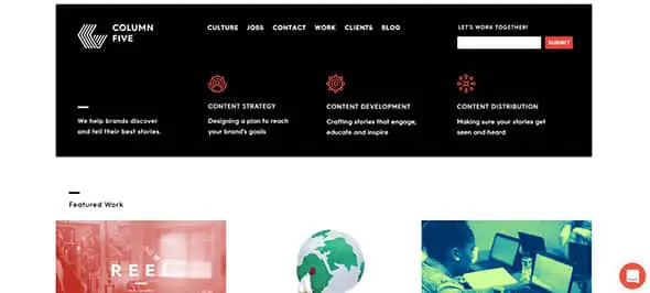
Column Five’s website divides its website’s content into rows and columns and also presents it in a creative way. This is a great way to showcase key features, services or featured work on a website.
Hatch

This example doesn’t use equal rows and columns. It has a full-screen modular grid layout with different sizes of thumbnail images and typography. It is yet another good example which is definitely worth using as a source of inspiration.
Bodhi
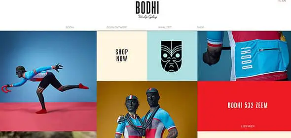
Bodhi is yet another good example of a website that uses a modular grid layout. They did not divide content into equal rows and columns, and by doing that, they managed to make the website look more dynamic.
MCQ
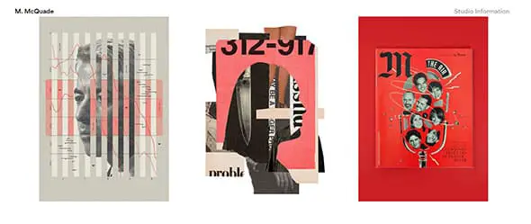
MCQ uses a minimalist design and a modular grid design layout. The result is elegant and it can be a great source of inspiration for future projects, especially for online portfolios.
Script & Seal
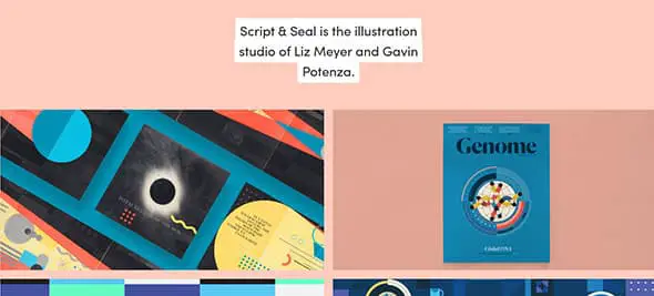
A light pink background and bright thumbnail images presented in a grid layout always work well together and this example proves it!
Lees Ferry
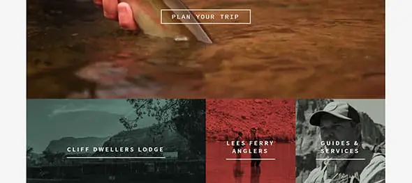
If you liked the previous examples then will definitely like this one as well. This is a great example of a website that uses a modular grid, but in a slightly different way. The elements are placed together, with no margins and space between them.
Csaba Gabor-B

If you were looking for a website that uses a full-screen modular grid, this example might be exactly what you had in mind. Again, this grid has no space between columns and rows.
Native Shoes
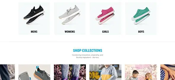
Check out how you can use modular grids on an e-commerce website on Native Shoes’ website and find your inspiration! Grid layouts are perfect for featuring products on an online shop.
Design Your Life
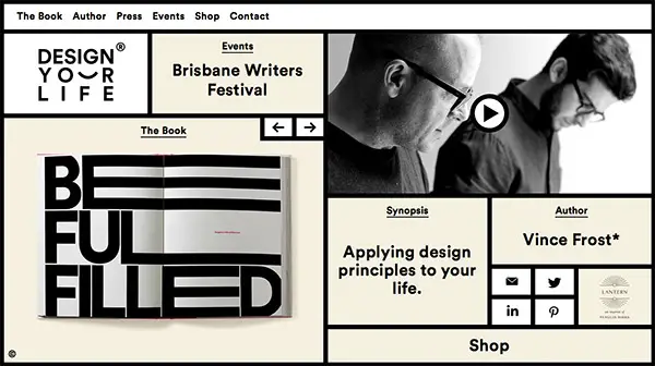
This is a great and creative way to use modular grids. It is definitely an example of a unique design which can be a great source of inspiration for future projects.
Résidence Mixte
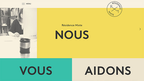
If you are thinking of a cool way to mix colors, typography, and pictures in a modular grid design layout, then you might want to have a look at this example to see if this is what you had in mind. This website mixes different ways of presenting content and manages to create a really eye-catching website.
Leodis Lager
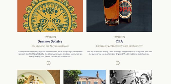
This example uses minimalism and a modular grid layout to present content to its website’s visitors. It has a very well chosen color palette and the font pairing is just perfect.
V76 by Vaughn

This is definitely a creative way of using modular grids. This is yet another cool example that doesn’t place its content in equal rows and columns, but manages to present their products in a unique way.
Quincy Réquin & Associés
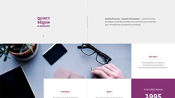
This example is definitely worth following as it can be a great source of inspiration. It has an elegant design based on a modular grid layout, with no spaces between the grid elements, and successfully combines text rectangles with images.
Everlovin’ Press
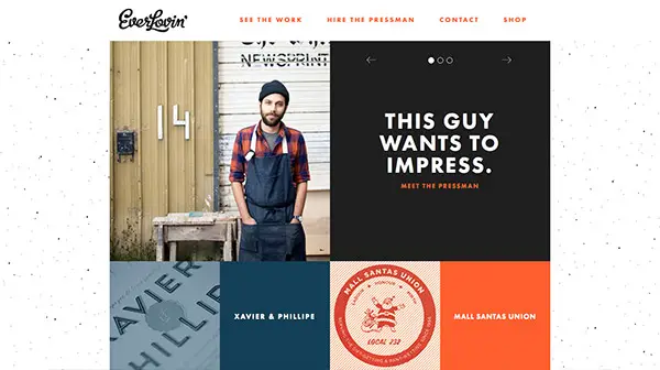
How about another good example of using modular grids in your designs? This grid layout combines text cards, with colorful cards and images/illustrations. The squares also have different sizes. Check out Everlovin’s website and find your inspiration.
Mercer Tavern
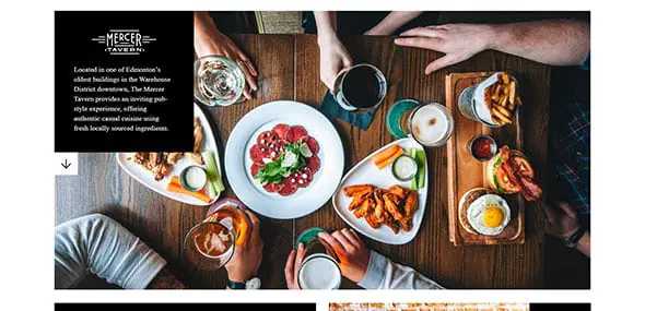
This website is focusing on presenting a tavern and its products through an eye-catching modular grid website layout. The grid layout is simpler in this case.
Matchstic
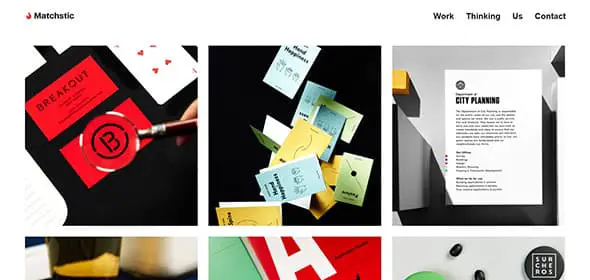
If you were looking for yet another good example of a website that places content in equal rows and columns this might be exactly the website you had in mind! This is a basic grid layout with equal white spaces between the elements.
KATVIG
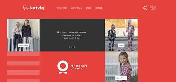
KATVIG uses flat colors, images, and a modular grid layout to present content to its website’s visitors. This is yet another good example that can be a great source of inspiration for future projects.
White Frontier Brewery

This is yet another good example of a website that uses modular grids in a creative way. It also has a vertical menu bar that blends in perfectly with the proposed design.
Peachey Photography
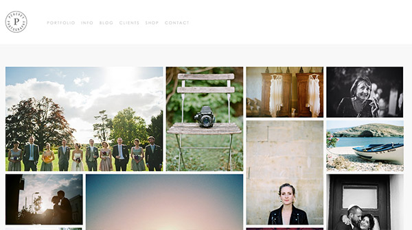
This website is yet another good example of using modular grids to make an elegant design. This one is perfect for a photography portfolio and might be a great source of inspiration for future projects. It is definitely an example worth following!
Sebastian Sejer & Co
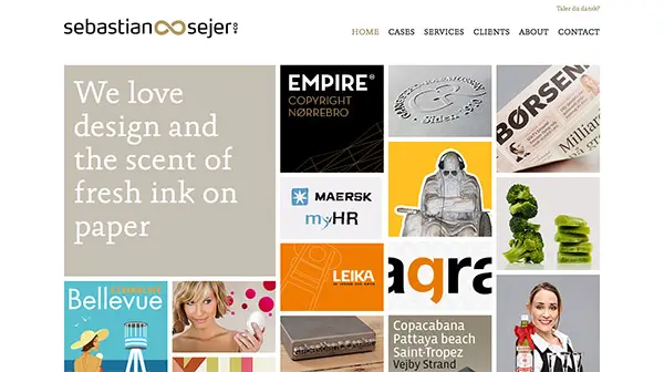
Last but not least, this is Sebastian Sejer & Co’s website. This website also mixes minimalist with a modular grid layout to create a good-looking web design layout.
Want to build a grid website yourself?
Design & Build a Grid Based Web Design with CSS
I’m currently working on a new WordPress theme called ♥grid, which lives up to its name with a clear grid-based design. Follow this step by step walkthrough of the design and build process, right from the initial Photoshop concept, through to writing the HTML structure, styling up with CSS then adding clever functionality with the jQuery library. Learn how to design and build a grid-based web design with CSS, by following this easy, step by step tutorial. Check it out and start learning!
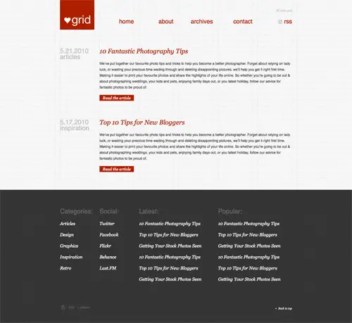
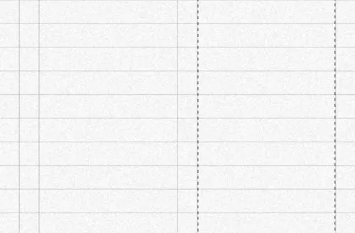
The ♥grid concept is pretty minimal in its design, using a limited colour palette of light grey, dark grey and a highlighting colour of red. The background of the design makes use of a subtle texture for a tactile feel, but the main feature is the strict grid-based layout. The design makes use of a 24px baseline and 6 column grid, which becomes a design feature itself as it remains visible as part of the design.
The design concept
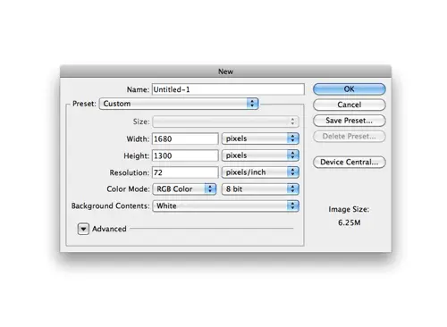
The design of ♥grid started in Photoshop. I always begin my website designs with a fairly large canvas of around a 1680px wide, this helps me gauge how the site will look on a typical widescreen monitor.
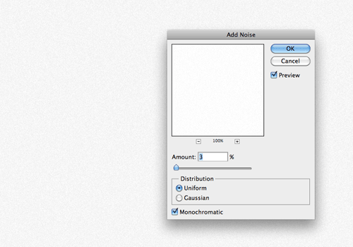
The background of the canvas is filled with a light grey tone, then given a touch of texture using the Photoshop Noise filter at just 3%.
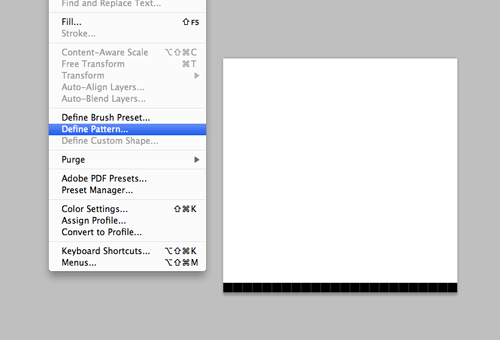
A new 24x24px document is created, in which the repeating pattern for the baseline grid is created. Just a single 1px line across the lower edge of the canvas is all it takes. This pattern is then defined as a pattern.
The pattern is then filled across a new layer and set to Multiply to render the white area transparent. The vertical grid lines are drawn manually, then duplicated and moved by hand. The cursor keys nudge the lines by 1px, or by 10px while the Shift key is held. Gutters are measured at 21px, and the column widths are 139px.
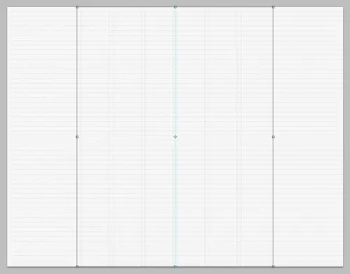
All the vertical lines are grouped together once six columns are created, then aligned centrally on the document. The basic grid is now ready to be decorated with the actual page elements.
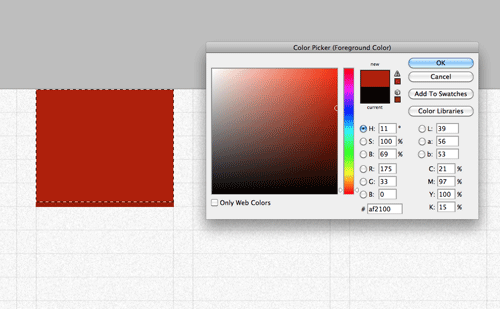
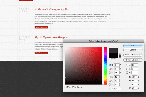
The logo comes first in the top left corner. A selection is made within the first column and filled with red.
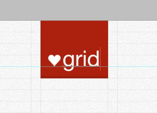
The ♥grid logo is then placed inside the logo container, and aligned on the baseline grid.
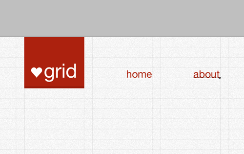
Navigation elements are then placed on the same baseline, and aligned to the right of each of the five remaining columns. Being links they’re given a red colouring.
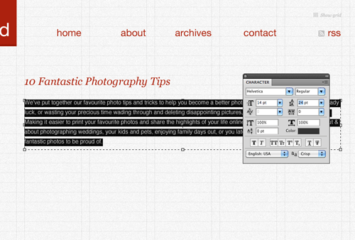
Being a theme for a blog the content is made up of sample blog posts. The first post is laid out and spread across columns two to six. Georgia is used for the post titles as a stark contrast against the Helvetica body text. The body text itself is edited so the line height matches the height of the baseline grid.
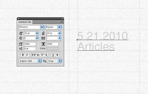
The first column is reserved for some meta information about the post, such as post date and category. These are laid out in a lighter grey to give less prominence, but at a larger type size. The 24px line height is maintained to keep the consistent leading across the design.
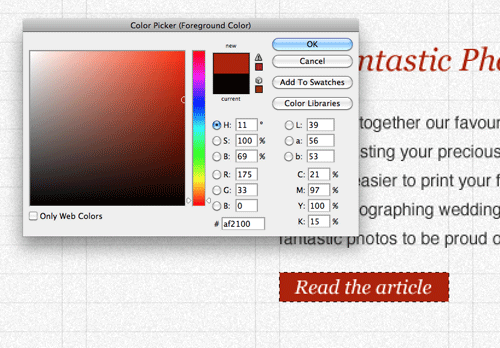
Read more buttons are styled up with a red background and serif Georgia text to give the links extra prominence.
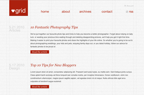
The design begins to take shape as two sample blog posts show the white space and structure across the layout.
The lower portion of the design switches to a darker grey, giving a contrasting footer area. A large selection is filled with a dark grey and given the same noise treatment as the background.
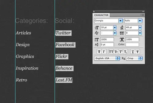
The footer area features a range of lists, these lists begin with two short lists of Categories and Social links. Headers are set in Helvetica, while the links are treated with Georgia at double the line-height.
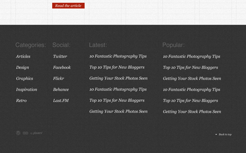
Links in the lower portion of the design are set in white to give contrast against the dark grey background. The first two lists fit within a single column, while the second to span across two columns.
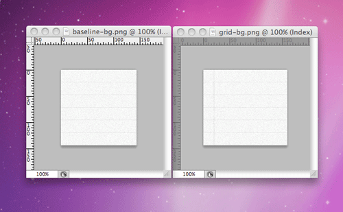
Now the design concept is complete, the individual images can be exported ready for the building stage. This starts with the repeating background graphics, taking into account the gridlines so they are recreated when the graphic repeats.
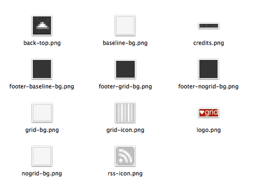
Being a lightweight design, the number of image files is pretty low. Two versions of the background are exported, one with, and one without the grid. This will be developed as a feature at a later stage where the user can toggle the grid lines on and off.
Creating the HTML structure
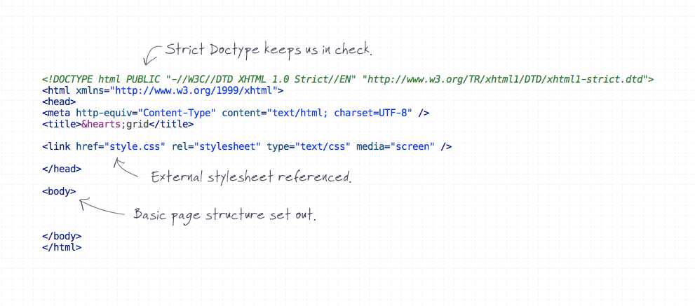
The next stage of the build is to write out the HTML structure. This begins with a typical webpage layout with Doctype, head and body.
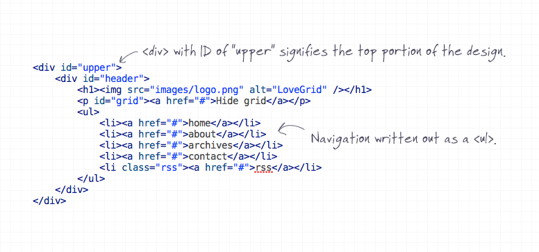
The top portion of the design is contained in a <div> with an ID of upper, this will be a hook for the baseline grid pattern in the CSS stage. The logo and navigation list are written out as <h1> and <ul> elements.
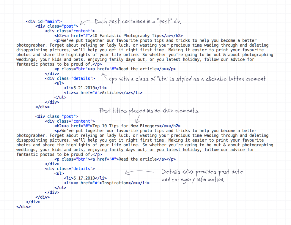
A <div> with an ID of main contains the main content, and each post is separated with individual <div> elements. Inside each post the content is split into two <div> elements, so the post content and post details can be floated side by side. Despite the details coming first in the design, they are written second in the HTML to keep a logical order of information, these can be positioned correctly by floating them with CSS. Post titles are laid out as <h2> headings, following on from the <h1> used in the header. <p> elements with a class of btn are used to represent the read more buttons.

In the lower portion of the design, each panel is laid out in its own <div>, with <h3> elements identifying the lists of anchor links.
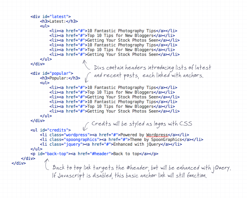
After the four list panels, the three credits are laid out in a <ul>. Information is given in the anchors, but the actual logos will be displayed using CSS. Finally a back to top link is placed in a <p> element. This back to top link targets the #header, but will later be enhanced with jQuery so the page scrolls automatically, but it’s important to maintain the functionality using a plain old same-page anchor for those without Javascript enabled.
Styling the design with CSS
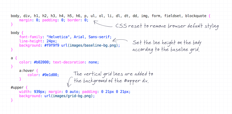
With the HTML strucutre in place, the design can now be styled with CSS to match the original Photoshop concept. The CSS starts with a reset to remove any browser defaults, then begins styling up the page body. A global font style of Helvetica is set, followed by a line-height of 24px to match the baseline grid. The baseline grid itself is added as a background-image to the body, whereas the vertical gridlines are set as background images on the #upper div.
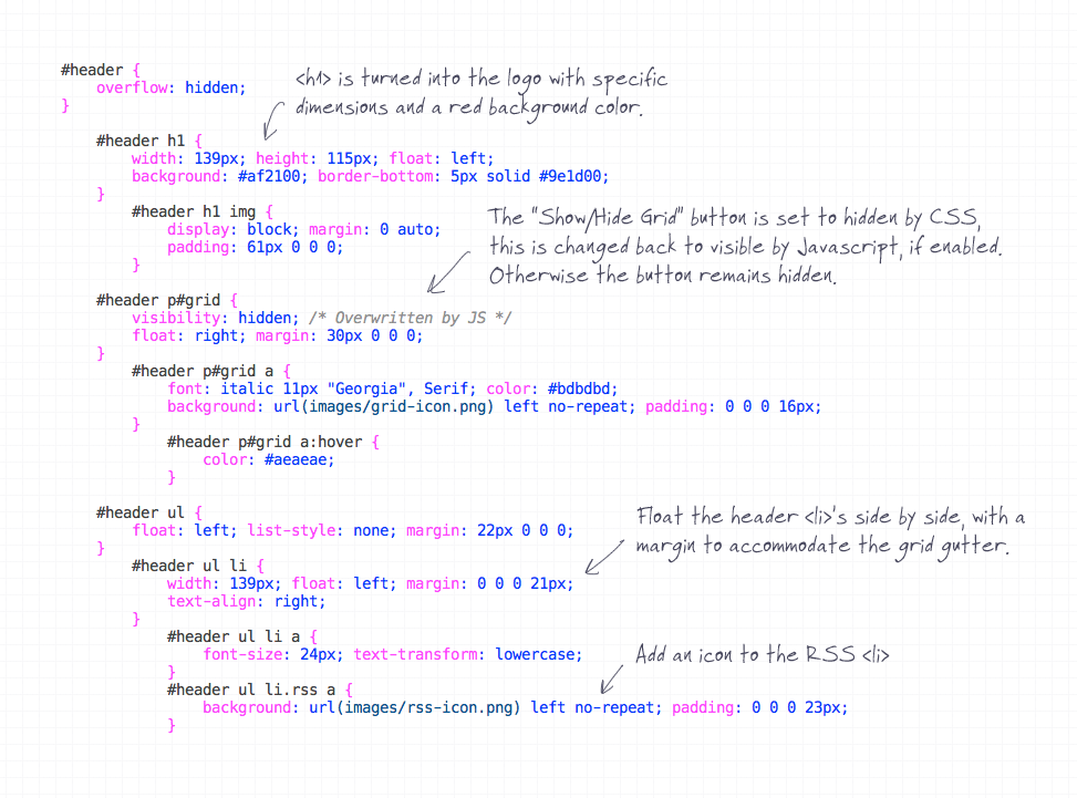
The <h1> is given specific dimensions and a red background to match the design. The”Show/Hide Grid” button in the header is styled accordingly with the small icon as a background image, but is set to visibility:hidden;. Being a function that relies on Javascript, this button will be made visible again using jQuery so users that don’t have Javascript enabled won’t see it. Navigation <li> elements in the header are floated side by side and given specific widths and margins to match the size of the grid columns and gutters.
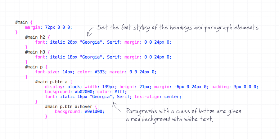
Fonts are styled up in the #main section, with headers being set in Georgia, body text set in grey Helvetica and buttons set with a red background. Each elements also has a 24px bottom margin to bump the following content down an extra line on the baseline grid.
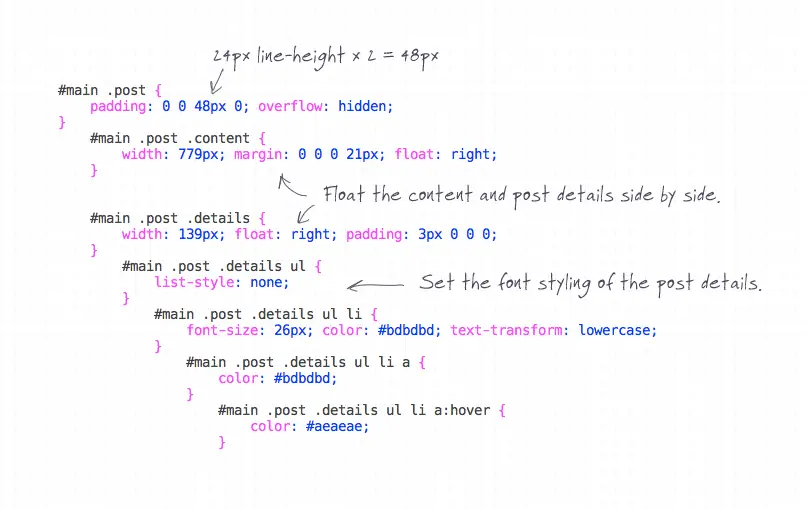
Each post <div> has 48px of bottom padding, this equates to two baselines as well as the 24px margin on the paragraph elements, leaving three lines between each post. The content and details divs are floated side by side, and their contents styled appropriately in accordance to the Photoshop concept.
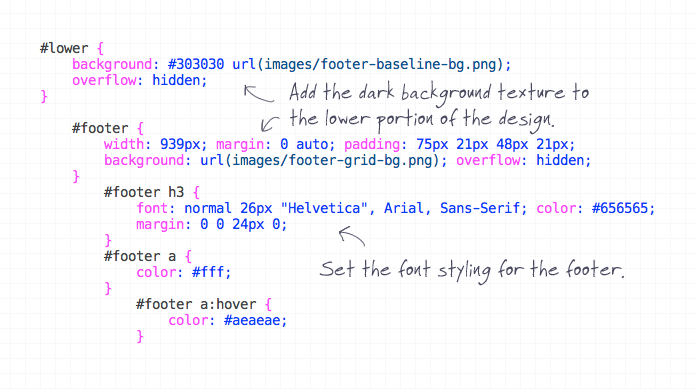
The #lower and #footer sections of the design are given new background images to generate the darker footer styling. Font styling for the footer is then reset, making headings a subtle grey colour and links in a more legible white against the dark background.
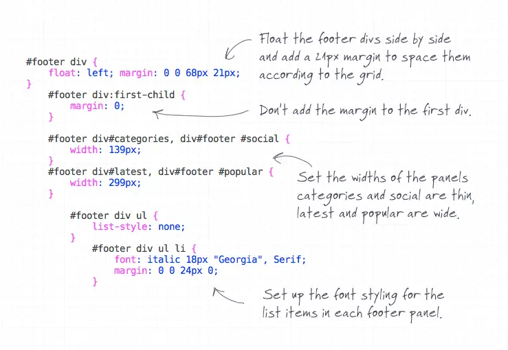
The four links panels are all floated side by side and given left margin to space them according to the grid gutter. The footer already has padding to take into consideration the first gutter, so the margin on the first div is removed with the :first-child pseudo selector. Panels one and two are set at the width of one column, while panels three and four span across two columns so are given a greater width, as measured from the Photoshop document. The list of links in each panel is styled to match the concept, with type set in Georgia at a doubled line-height.
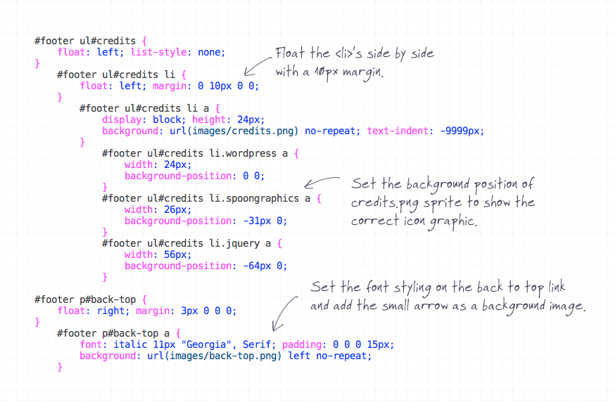
The credits list items are floated and given the appropriate margin, as well as the sprite background image. Each individual <li> is then given specific background-position settings to display the correct logo. Finally the back to top link is floated over to the right, given the smaller font size and treated with a background image to render the small arrow. A small 3px margin helps tweak the text into place on the grid, ensuring the link is aligned by the text baseline, not the bottom of the icon.
Enhancing with jQuery
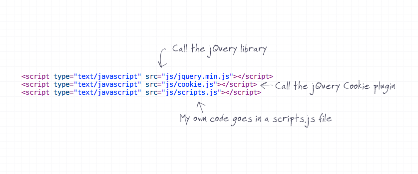
The design and webpage is now nearing completion, with the HTML and CSS page matching the Photoshop concept exactly. Next up is the extra Javascript functionality. Three Javascript files are reference in the HTML head, the jQuery library, the jQuery Cookie plugin and my own scripts.js file, which will include all the handwritten code to activate everything.
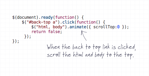
The first function to be added is the auto-scrolling back to top link. This code states that when the #back-top anchor is clicked, animate the body and html to the position zero. return false; is in place to stop the original anchor from working, so the effect relies only on Javascript.

Next, the “Show/Hide Grid” button functionality is created. First, the button needs making visible after the CSS was set to visibility:hidden; earlier. Then the toggle() function gives commands for when the button is turned on and off, these include adding or removing the class nogrid to the body and changing the text of the anchor.
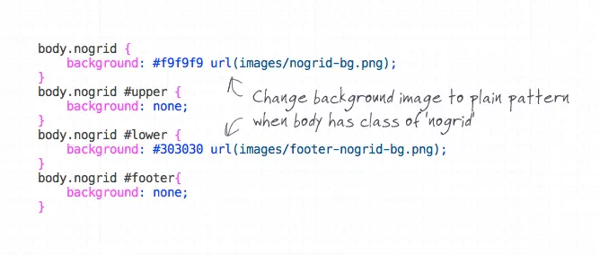
In order for the effect to work, extra CSS styling needs to be added to actually change how the page looks when the page body has the nogrid class. This is where those alternative background images come into play.
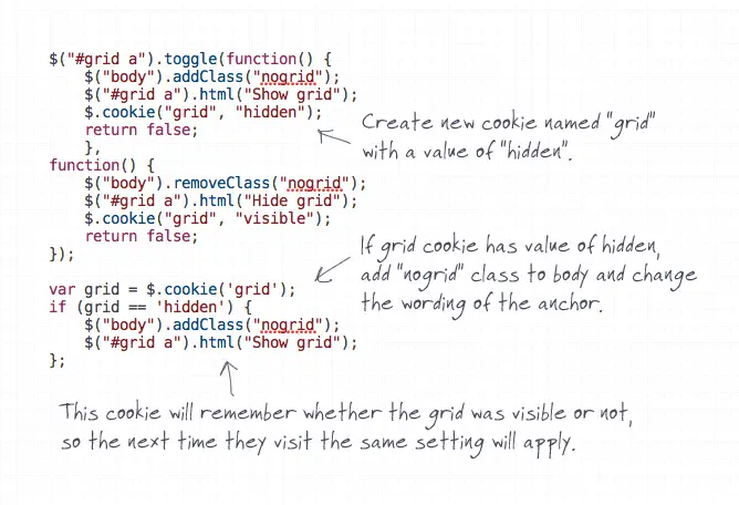
The effect works great, when the user clicks the “Show/Hide Grid” button, the grid is toggled on and off, but once the page is refreshed, or a new page is visited the grid comes back. In order to save the setting the jQuery Cookie plugin needs setting. $.cookie("grid", "hidden"); creates a new cookie named grid with the value of hidden when the button is clicked. A couple of lines of jQuery then check if the cookie is present, and if so the addClass() and .html() functions are repeated. Now whenever the user visits the effect will be in the same state as they left it.
Comments are closed.