10 HTML Entity Crimes You Really Shouldn’t Commit

Home » Articles » 10 HTML Entity Crimes You Really Shouldn’t Commit

Line25 is reader supported. At no cost to you a commission from sponsors may be earned when a purchase is made via links on the site. Learn more

It has been over a couple of years since I posted my HTML tag and usability crimes posts, both of which are amongst the most popular articles here on Line25. There’s something about this title people just can’t resist! Let’s take a look at ten crimes you may be committing in your HTML content. These won’t exactly land you a life sentence, but I bet almost every one of us will be guilty of at least one of these petty crimes.

Crime 1: Not converting your ampersands

Ampersand

One of the most common HTML validation errors I see when checking the code behind Sites of the Week features are unconverted ampersand characters. It’s easy to simply paste in your content from an external document and forget to transform your & characters into the correct & HTML entity.

Crime 2: Making your own ellipsis

Ellipsis

Did you know those three dots used to indicate a pause in a sentence are called an ‘ellipsis’? Rather than typing three periods or full stops it actually has it’s own glyph as the … HTML entity. The spacing between the dots in the entity is much tighter than the standard spacing between three full stops or periods. Remember, there’s only ever three dots (four in certain situations), don’t be the person who extends their ellipsis to 6+ dots………..

Crime 3: Incorrect use of the em dash

Em dash

I’m definitely guilty of this one myself. I can never remember when to use Em dashes over En dashes, and what’s worse I tend to stick in a plain old hyphen which makes the crime even more serious! The Em dash or — in HTML entity format is typically used to separate a break of thought in a sentence.

Crime 4: Incorrect use of the en dash

En dash

Similar to the Em dash crime, the En dash is another form of dash often misused in our body copy. The En dash or – in its HTML entity form is used to express a range of values or a distance, so essentially the En dash is placed where you would say the word “to” when talking about age ranges or a journey between two places.

Crime 5: DIY Copyright symbol

Copyright symbol

I’m sure we’re all familiar with the international copyright symbol—the letter C with a circle around it ©. Rather than use this standardised symbol, sometimes people decide to construct their own with brackets, (c), probably because they couldn’t figure out the keyboard combination to insert the symbol in Word. Thankfully it’s much easier for web designers with the easy to remember HTML entity of ©.

Crime 6: DIY Trademark symbols

Trademark symbol

Similar to the copyright symbol, the trademark symbol has its own HTML entity glyph as &trade;, so there’s no need to design your own from styled <sup> or <span> tags.

Crime 7: Plain text fractions

Half fraction

Another common addition to every day body text is the use of fractions to show quarter, half or three quarters in their shorthand, numeric format. I’m sure we’re all guilty of writing 1/4, 1/2 or 3/4 as opposed to their HTML entity counterparts of ¼, ½ & ¾ as &frac14;, &frac12; & &frac34;.

Crime 8: Plain text mathematics symbols

Divide symbol

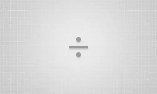
Common mathematical symbols such as add, minus, multiply and divide are also misused in general body text. The add and minus symbols not so much, as they’re easily created with their designated keyboard buttons, but multiply and divide are usually seen as the letter x, an asterisk *, or a slash /. × and ÷ symbols can be easily created with the HTML entities of &times; and &divide;.

Crime 9: Supersized degree symbols

Degree symbol

The degree symbol is not the most common glyph used in every day body text, but it’s necessary when talking about temperature, angles or longitude/latitude map locations. We often see the degree format in disguise as a plain old letter o, but it can be created correctly using the &deg; HTML entity like so: 45°.

Crime 10: Somewhat straight curly quotes

Curly quotes

A massive pet peeve for many, the incorrect use of quotes in textual content is one of the most common typographic errors on earth. The standard quotation marks entered with our keyboards are the numerical type which indicate a unit of measurement such as 5′10″. When quoting people, curly quotes should be used with the &ldquo; and &rdquo; entities: “Now I, Skeletor, am master of the universe”, or for single quotes the &lsquo; and &rsquo; entities.

HTML Entity names vs entity number

Every HTML entity can be written as its name value &copy; or as its numerical value &#169;. The main advantage of using an entity name is the character is easily recognisable as the name often relates to the actual entity in question (copy = copyright). However entity names aren’t as well supported as entity numbers, which have good all round support.

Author
Iggy
Iggy is a designer who loves experimenting with new web design techniques, collating creative website designs, and writing about the latest design trends, inspiration, design freebies, and more. You can follow him on Twitter

67 thoughts on “10 HTML Entity Crimes You Really Shouldn’t Commit”

  1. One grammar crime you should not commit: “It’s” with apostrophe always means “it is.” Possessive (“belonging to it”) is always “its” without apostrophe. In the ellipsis section, you write, “it actually has it’s own glyph,” which means “it actually has it is own glyph,” which is nonsensical. Please correct.

    Reply
  2. Ellipses are only ever three dots. Sometimes they come at the end of a sentence where they are followed by a period.

    The “H” in “hellip” stands for “horizontal”. A vertical ellipsis is &vellip;.

    On OSX an ellipsis is alt+;

    Reply
    • “On OSX an ellipsis is al+;”

      That depends on the keyboard being used. For example, on a Spanish keyboard it is Alt-. (Alt and full stop).

      Reply
  3. Your DYK for ellipsis is incorrect.
    As a longtime master typographer (and programmer and network engineer and published author (not of blogs or self-published ebooks, but REAL books)……. the 3-char ellipsis indicates that CONTENT HAS BEEN LEFT OUT.

    Reply
  4. Very useful article! All web designers and developers, copywriters and authors etc. keen on being as professional as possible (which can ultimately only be a good thing) should have this page bookmarked.

    The … entity is a very useful one to remember, and even though I’ve been using it for a few years, occasionally three dots will slip through the net, when you’re typing at 80 words per minute, and thinking at 300 words per minute its easily done!

    So I find a periodic and very careful find & replace is sometimes the order of the day.

    Reply
  5. Thanks Chris! for this Excellent post, I often overlooked some of these entities – Now I'm going to correct my old mistakes :-)

    Reply
  6. Great post, but what about hellip, there’s actually no such symbol, just three dots. It was once invented for monospaced fonts where three dots were to wide, but if you are not using monospace, you should not mess with hellip. It doesn’t add nothing to your typography.

    Reply
    • There's actually another as yet unmentioned reason for using &hellip; that goes well beyond how pretty (or typographically correct) it might look – and that’s accessibility. Screen readers like JAWS don’t say anything when they encounter an ellipsis, but they say “dot dot dot” when ever they come up against three periods. Which can get very tiresome if it’s reading a particularly suspenseful passage&hellip;

      Reply
  7. Or you could *just* use Linux with its keyboard variants containing all the caracters you need from the press of a few buttons.

    Ex: Copy = © (AltGR+C).

    Reply
  8. Hmm I like your post but the heading is totally wrong; most of these examples you bring up are spelling crimes, not HTML crimes. If you're to use &mdash; or &ndash; has nothing to do with HTML, right?

    :-)

    / Patricia

    Reply
  9. I think many of us as designers are guilty of all these. I know I was when I was just starting out. As someone mentioned above, more typography errors/mistakes than HTML.

    This is a very well put together post Chris! Thanks!

    Reply
  10. Of the ellipsis, you say “The spacing between the dots in the entity is much tighter than the standard spacing between three full stops or periods.”

    Not true! The ellipses in many good, common fonts have more generously spaced dots than three periods. Vincent Connare’s output seems to be exceptional in this regard…

    (Also in that para, there’s a redundant apostrophe in “has it’s own glyph”.)

    Reply
  11. Excellent coverage of an often overlooked area- especially the ellipses and quotes! Makes me want to go through my old code and fix all of my mistakes!

    Reply
  12. Crime 11: Use of hand-made quotes at all instead of marking the quote with the correct html element q and doing the rest with css.
    This prevents you also from crime 10.5 &hellip; (<- curious who this will turn out)

    Reply
  13. Todd: Daddy? Are you going to jail?
    Ned: We'll see, son. We'll see.

    Thankfully there is a WP plug-in that does these for me. I know I should still do it.

    Reply
  14. A List Apart actually has an excellent article written by Peter K Sheerin about when to use Em or En dashes.

    In short, Em dashes are for indicating a sudden break — like this one.

    En dashes are to indicate a range, like 20–25.

    The article can be found here: https://www.alistapart.com/articles/emen/

    Reply
  15. Thanks for this article. Just a word for numeric entities : it is XML compatible, so i recommend to use them instead of HTML entities.

    +1 to Julian Burgess, when in UTF8, using characters instead of entities will save your database integrity.

    Reply
  16. You can just use normal UTF-8 characters, no need to encode except for the 5 in XML, & < > " '

    © ☃ …

    https://en.wikipedia.org/wiki/Character_encodings_in_HTML#XML_character_references

    Reply
  17. The Em and En hypens I didn't know about! I've always used &ndash; for all dashes wherever they were… sorry, I mean &hellip;

    Thanks Mr, Spooner!

    Reply
  18. Great post! Here is an extensive list of special characters for HTML and Flash. Handy so you don't have to memorize them all! https://www.designshifts.com/special-character-code-for-html-and-flash/

    Reply
  19. Yep, I'm guilty of crime 10. And I'll be honest, its just down to laziness! Great list Chris, this will make a useful quick reference page. Thanks.

    Reply
  20. A quick glance though an Oxford or Chicago style guide will explain the differences between the various dash lengths. Their uses have obvious functionalities which should be honoured, and not merely used for style.

    Why craft design and code and not the use of the written language?

    Reply
  21. Good post, but I always check my code in the W3C Validator. If improve then continue my work otherwise i stoped.

    Reply
  22. Thanks for the list. I usually use an editor to fix those issues automatically but sometimes it doesn't so I use w3c to find those mistakes.

    Reply
  23. That's great but what about CMSs ? How do you turn 3 dots into an &hellip; and make people use the right kind of dash?

    Reply
    • This is exactly what I was thinking. CMS's cannot be conditioned to replace characters with the correct entity.

      Reply
      • Well actually some editors (FCKEditor) do the work for you. If you don't have an RTF editor installed, you can always prune the input via PHP (preg_replace etc.).

        Reply
  24. What about just using the Unicode characters instead? Alt+0151 on the numeric keypad of an em dash —, Alt+0133 for an ellipsis… etc.

    Reply
    • If you use the unicode characters they will ultimately get converted by a parser and break.

      Basically – don't use them unless you can absolutely guarantee that your output is only going to be unicode based.

      Reply
      • In 2000, that was a reasonable consideration but by now it's not worth doing anything other than fixing non-UTF-8-safe software. It's a simple, easy feature and it won't treat your global audience as second class.

        Reply
  25. I agree with most of these but…

    As someone for whom English is a second language I, frankly, find the existence of four different designations for a "line in the text" a bit insane. I mean I'm expected to remember the difference between what – a hyphen, two types of dashes and a minus – and that difference being only the length of the line. Yep, crazy :)

    Reply
    • That's understandable. But you have to remember that html is a language written in English so it carries with it certain idiosyncrasies.

      It gets worse when you start mixing the charsets.

      Reply
  26. Err… isn't the numeric value #000? or is that other than if you require the use of the ASCII equivalent?

    Another important thing to remember with these entities is that it also depends on your parser within your application, the charset specified and the MIME TYPE.

    A good start. Money symbols are another classic error you see everywhere. you'd think &pound; was obvious.

    Reply
  27. Small correction: the straight quote and double straight quote&mdash;the non-curly characters&mdash;aren't supposed to be used in place of the prime and double-prime characters.

    Instead use &amp;prime; and &amp;Prime; to properly format 5&prime;10&Prime;.

    Another small niggle: The hyphen character doesn't replace the proper &amp;minus; character.

    Thanks for pointing out the importance of using the right character in the right place.

    Reply
  28. This is definitely a good post, you make me want to go back and check my code and look for any of these errors.

    Reply
  29. Good reminders, I always check my code afterwards in the W3C Validator, because it always shows these "faults"! .. or should I write:
    &lsquo;faults&rsquo;

    Thanks for sharing, Cheers & Ciao ..

    Reply
  30. Thanks for this Chris, I knew all of them but have to admit I have still continued to be guilty of a few – especially with dashes and quote marks which I always tend to get wrong even in print (where at least thankfully it's not my writing).

    The above hyphen being proof haha.

    Reply

Leave a Comment

Verified by MonsterInsights