
Line25 is reader supported. At no cost to you a commission from sponsors may be earned when a purchase is made via links on the site. Learn more
In web design, footers often receive less attention than they deserve. The website footer serves as more than just the bottom section of a page; it functions as a valuable navigation tool, information resource, and brand reinforcement opportunity. This article explores 25 best website footer examples that demonstrate how this often-overlooked element can enhance user experience, support business goals, and complement overall design aesthetics.
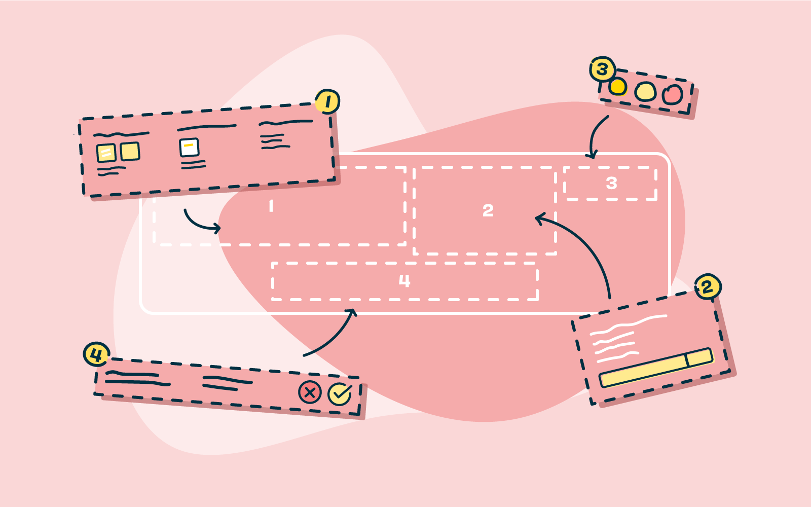
Before exploring the examples, it’s worth understanding why footer design matters:
- Footers provide essential navigation options when users reach the bottom of a page
- They offer space for important links and information without cluttering the main navigation
- A well-designed footer can improve user experience and reduce bounce rates
- Footers present opportunities for email sign-ups, social media connections, and legal compliance
- They reinforce brand identity through consistent design elements
1. Apple

Apple’s minimalist footer perfectly aligns with their overall brand aesthetic. Their website footer features a clean, organized grid of links categorized by product line and service type. The simple gray background contrasts subtly with the white main content area, creating a distinct but harmonious separation. What makes this footer effective is its comprehensive navigation system that doesn’t overwhelm users despite containing dozens of links.
2. Mailchimp
Mailchimp demonstrates how a footer can be both functional and personality-filled. Their website footer includes standard elements like navigation links, social icons, and legal information, but presents them with their signature playful design touches. The footer incorporates their brand colors and includes their mascot, creating continuity with the rest of their site experience.
3. Airbnb
Airbnb’s footer design excels in organization. They group links by category: Support, Community, Hosting, and Airbnb. Each section contains relevant links that help users find information quickly. The footer also includes language selection, currency options, and social media links, serving global users effectively. This comprehensive but clean approach makes navigation intuitive despite the wealth of options available.
4. Spotify

Spotify’s footer uses a dark theme that matches their brand identity while organizing information into clear, accessible columns. Their website footer includes links to company information, communities, useful links, and social media. The contrast between the dark background and light text ensures readability while maintaining their signature look and feel.
5. Slack
Slack’s footer design demonstrates excellent information architecture. They organize content into logical categories, including Product, Resources, Company, and Policies. Their footer also includes a language selector and social media links, all presented in a clean, readable format that complements their overall design aesthetic.
6. Dropbox
Dropbox uses its footer to organize a substantial number of links without creating visual clutter. Their website footer categorizes information into Products, Community, Support, Company, and Trust & Privacy. The clean design and ample spacing make navigation easy despite the volume of information presented. Their footer successfully balances comprehensiveness with usability.
7. Asana
Asana’s footer cleverly uses color to separate different sections while maintaining visual harmony with the rest of their site. Their footer design includes product information, resources, company details, and language options. The footer also features a prominent newsletter signup form, recognizing the value of this real estate for lead generation.
8. Shopify
Shopify’s footer serves its diverse user base by organizing information into clear categories, including Online Store, Shopify, Resources, and Company. Their website footer design maintains sufficient white space for readability while comprehensively covering all relevant links for both prospective and current users. The footer effectively serves as a complete site map.
9. Notion
Notion employs a minimalist footer design that perfectly matches its clean, uncluttered brand aesthetic. Their footer includes only essential links organized in a simple grid layout. This approach ensures users aren’t overwhelmed while still providing access to important resources and information. The footer demonstrates that sometimes less is more in effective design.
10. Figma
Figma’s footer design balances comprehensive information with visual clarity. They organize links into product, resources, and company categories while including social media links and legal information in a separate section. Their footer maintains consistent spacing and typography that aligns with their overall design system, creating a cohesive user experience.
11. Adobe
Adobe manages to present an extensive set of resources in its footer without overwhelming users. Their website footer organizes links by products, focusing on their Creative Cloud applications. The clean grid layout makes it easy to scan, while color and typography choices align perfectly with their overall brand identity. This footer effectively serves as a complete resource hub.
12. Squarespace

Squarespace, known for beautiful design, extends this philosophy to its footer. Their website footer features a clean, grid-based layout with ample white space that makes information easy to scan. They group links by category and include a prominent newsletter signup form. The minimalist design aligns perfectly with their brand promise of sophisticated simplicity.
13. Etsy
Etsy’s footer reflects its creative, community-focused brand. Their footer design includes standard sections for shopping, selling, and company information, but also prominently features their community values and sustainability commitments. This approach reinforces their unique market position while providing all necessary navigation elements.
14. Canva
Canva’s footer successfully balances comprehensive information with visual clarity. Their website footer organizes links into categories, including product features, company information, and resources. The clean design with ample spacing makes navigation intuitive despite the wealth of options available. Their footer also prominently features their social media presence, building community engagement.
15. Stripe
Stripe’s footer design exemplifies clarity and organization. They segment their numerous products and resources into clearly labeled columns while maintaining their signature minimalist aesthetic. The footer also includes region-specific information, acknowledging their global user base. This approach makes their complex product ecosystem navigable and accessible.
16. Tesla
Tesla’s footer reflects its innovative, minimalist brand identity. Their website footer organizes information into clear categories while maintaining significant white space. What stands out is how they include their vehicle lineup in the footer, ensuring users can always access their primary products regardless of where they are on the site.
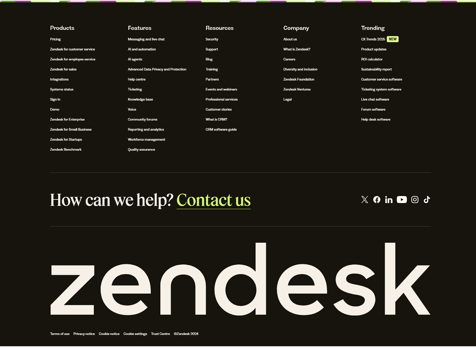
17. Zendesk
Zendesk’s footer design succeeds through thoughtful information architecture. They organize links into product, resources, company, and support categories. Their footer also features language selection and region-specific information. The clean layout with sufficient spacing ensures users can easily find what they need despite the comprehensive nature of the information presented.
18. Trello
Trello’s footer incorporates their playful brand personality while providing comprehensive navigation. Their footer design includes standard sections for products, resources, and company information, but presents them with distinctive Trello visual elements. This thoughtful and branded approach earns Trello a spot among the best website footer examples, balancing creativity with functionality to enhance user experience.
19. HubSpot
HubSpot maximizes its footer’s utility by organizing its extensive resources into clear categories. Their website footer includes sections for their various products, resources, company information, and customer support. They also include a prominent call-to-action for their free tools, recognizing the footer’s value for conversion opportunities.
20. Salesforce
Salesforce demonstrates how enterprise companies can create navigable footers despite having extensive product ecosystems. Their footer design organizes products and resources into logical groupings with clear headings. They also include region-specific information and language selection, acknowledging their global customer base. This thoughtful organization prevents information overload.
21. GitHub
GitHub’s footer exemplifies how technical platforms can create user-friendly navigation systems. Their website footer organizes links into product, resources, and company categories. The dark theme aligns with their developer-focused brand while maintaining perfect readability. Their footer also prominently features their social media channels, building community engagement.
22. Starbucks
Starbucks uses its footer to reinforce brand values alongside providing navigation. Their footer design includes standard sections for about the company, careers, social impact, and business partnerships. What makes it stand out is how they incorporate their commitment to social responsibility directly into the footer structure, reflecting their brand priorities.
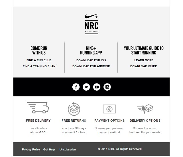
23. Nike
Nike’s footer balances comprehensive information with brand aesthetics. Their website footer organizes links into clear categories, including products, help, about Nike, and social media. The black background with white text creates a strong visual contrast while aligning with their powerful brand identity. This approach ensures visibility while maintaining brand consistency.
24. Patagonia
Patagonia’s footer reflects their commitment to environmental responsibility alongside providing navigation. Their footer design includes standard elements but also prominently features their activism initiatives and environmental commitments. This approach turns the footer into a powerful brand statement that reinforces their core values with every page visit.
25. Revolut
Revolut’s footer design demonstrates how financial technology companies can balance comprehensive information with clean design. Their website footer organizes links into product, company, help, and resources categories. The clear hierarchy and ample spacing ensure users can easily find information despite the technical nature of their services. Their footer also includes app download links, recognizing the importance of mobile for their service.
After analyzing these 25 best website footer examples, several best practices emerge:
- Organize information into logical categories with clear headings
- Maintain consistent branding through colors, typography, and visual elements
- Include essential links without overwhelming users
- Consider the footer as a conversion opportunity through newsletter signups
- Ensure mobile responsiveness in the footer design
- Use white space effectively to maintain readability
- Include legal information and compliance elements
- Consider region-specific content for global audiences
Conclusion
The website footer represents valuable real estate that, when designed thoughtfully, can enhance user experience, support business goals, and reinforce brand identity. The best footer design examples presented here demonstrate various approaches to balancing comprehensiveness with usability, organization with aesthetics, and functionality with brand expression.
For those looking to improve their website footer, consider the specific needs of your users, the nature of your content, and your primary business goals. A well-designed footer serves as both a practical navigation tool and a final impression that can leave users with a positive feeling about your brand.
What footer design approaches have you found effective for your website? Which of these examples resonates most with your brand aesthetic? Consider implementing some of these ideas in your next design iteration to improve user experience and site functionality.
Relevant search keywords for images: “modern website footer design,” “responsive footer layouts,” “creative footer examples,” “minimal footer design,” “footer navigation best practices”
Want more inspiration on creating powerful website footers? Check out our related articles featuring more of the best website footer examples, tips on footer layout design, and strategies to improve user experience and site navigation through effective footer elements.