Line25 is reader supported. At no cost to you a commission from sponsors may be earned when a purchase is made via links on the site. Learn more
With the help of some advanced selectors, a dropdown menu can be easily created with CSS. Throw in some fancy CSS3 properties and you can create a design that was once only achievable with background images and Javascript. Follow this tutorial to see the step-by-step process of building your own pure CSS dropdown menu.

The menu we will be creating features two subcategories that appear once the parent link is activated by a hover. The first series of sub-links appear underneath the main nav bar, then the second series of links fly out horizontally from the first dropdown. Take a look at the CSS dropdown menu demo to see it all in action.
View the pure CSS dropdown menu demo
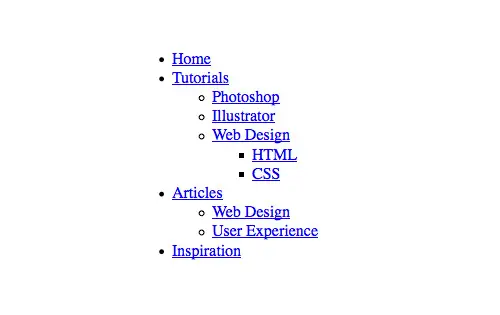
The HTML Structure
<nav>
	<ul>
		<li><a href="#">Home</a></li>
		<li><a href="#">Tutorials</a></li>
		<li><a href="#">Articles</a></li>
		<li><a href="#">Inspiration</a></li>
	</ul>
</nav>
First up we’ll need to create the HTML structure for our CSS menu. We’ll use HTML5 to house the navigation menu in a <nav> element, then add the primary navigation links in a simple unordered list.
<nav>
	<ul>
		<li><a href="#">Home</a></li>
		<li><a href="#">Tutorials</a>
			<ul>
				<li><a href="#">Photoshop</a></li>
				<li><a href="#">Illustrator</a></li>
				<li><a href="#">Web Design</a></li>
			</ul>
		</li>
		<li><a href="#">Articles</a>
			<ul>
				<li><a href="#">Web Design</a></li>
				<li><a href="#">User Experience</a></li>
			</ul>
		</li>
		<li><a href="#">Inspiration</a></li>
	</ul>
</nav>
The first sets of sub-menus can then be added under the “Tutorials” and “Articles” links, each one being a complete unordered list inserted within the <li> of its parent menu option.
<nav>
	<ul>
		<li><a href="#">Home</a></li>
		<li><a href="#">Tutorials</a>
			<ul>
				<li><a href="#">Photoshop</a></li>
				<li><a href="#">Illustrator</a></li>
				<li><a href="#">Web Design</a>
					<ul>
						<li><a href="#">HTML</a></li>
						<li><a href="#">CSS</a></li>
					</ul>
				</li>
			</ul>
		</li>
		<li><a href="#">Articles</a>
			<ul>
				<li><a href="#">Web Design</a></li>
				<li><a href="#">User Experience</a></li>
			</ul>
		</li>
		<li><a href="#">Inspiration</a></li>
	</ul>
</nav>
The secondary sub-menu is nested under the “Web Design” option of the first sub-menu. These links are placed into another unordered list and inserted into the “Web Design” <li>.
So far this leaves us with a neat layout of links with the sub-menus having a clear relation to their parents.
The CSS Styling
nav ul ul {
	display: none;
}

	nav ul li:hover > ul {
		display: block;
	}
Let’s begin the CSS by getting the basic dropdown functionality working. With CSS specificity and advanced selectors, we can target individual elements buried deep in the HTML structure without the need for extra IDs or classes. First, hide the sub-menus by targeting any UL’s within a UL with the display:none; declaration. In order to make these menus reappear, they need to be converted back to block elements on the hover of the LI. The > child selector makes sure only the child UL of the LI being hovered is targeted, rather than all sub menus appearing at once.
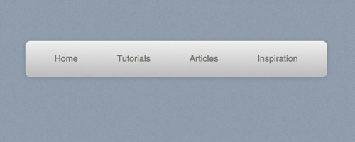
nav ul {
	background: #efefef;
	background: linear-gradient(top, #efefef 0%, #bbbbbb 100%);
	background: -moz-linear-gradient(top, #efefef 0%, #bbbbbb 100%);
	background: -webkit-linear-gradient(top, #efefef 0%,#bbbbbb 100%);
	box-shadow: 0px 0px 9px rgba(0,0,0,0.15);
	padding: 0 20px;
	border-radius: 10px;
	list-style: none;
	position: relative;
	display: inline-table;
}
	nav ul:after {
		content: ""; clear: both; display: block;
	}
We can then start to style up the main navigation menu with the help of CSS3 properties such as gradients, box shadows, and border-radius. Adding position:relative; will allow us to absolutely position the sub-menus according to this main nav bar, then display:inline-table will condense the width of the menu to fit. The clear fix style rule will clear the floats used on the subsequent list items without the use of overflow:hidden, which would hide the sub-menus and prevent them from appearing.
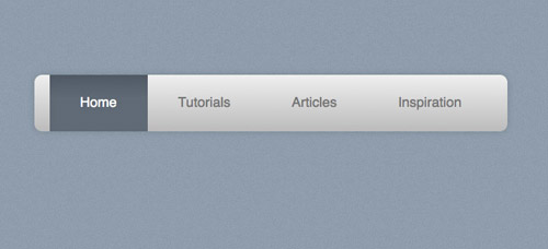
nav ul li {
	float: left;
}
	nav ul li:hover {
		background: #4b545f;
		background: linear-gradient(top, #4f5964 0%, #5f6975 40%);
		background: -moz-linear-gradient(top, #4f5964 0%, #5f6975 40%);
		background: -webkit-linear-gradient(top, #4f5964 0%,#5f6975 40%);
	}
		nav ul li:hover a {
			color: #fff;
		}

	nav ul li a {
		display: block; padding: 25px 40px;
		color: #757575; text-decoration: none;
	}
The individual menu items are then styled up with CSS rules added to the <li> and the nested anchor. In the browser, this will make the link change to a blue gradient background and white text.
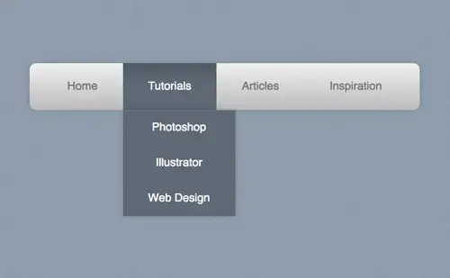
nav ul ul {
	background: #5f6975; border-radius: 0px; padding: 0;
	position: absolute; top: 100%;
}
	nav ul ul li {
		float: none;
		border-top: 1px solid #6b727c;
		border-bottom: 1px solid #575f6a;
		position: relative;
	}
		nav ul ul li a {
			padding: 15px 40px;
			color: #fff;
		}
			nav ul ul li a:hover {
				background: #4b545f;
			}
The main navigation bar is now all styled up, but the sub menus still need some work. They are currently inheriting styles from their parent elements, so a change of background and the removal of the border radius and padding fixes their appearance. To make sure they fly out underneath the main menu they are positioned absolutely 100% from the top of the UL (ie, the bottom).
The LI’s of each UL in the sub-menu doesn’t need floating side by side, instead, they’re listed vertically with thin borders separating each one. A quick hover effect then darkens the background to act as a visual cue.
nav ul ul ul {
	position: absolute; left: 100%; top:0;
}
The final step is to position the sub-sub-menus accordingly. These menus will be inheriting all the sub-menu styling already, so all they need is to be positioned absolutely to the right (left:100%) of the relative position of the parent <li>.
The Completed Pure CSS Dropdown Menu
I have so far used the menu on the first page and the loading speed has increased tremendously.
very good article… thanks
Not accessible for keyboard users; there’s no way to access the sub menus with only the keyboard.
We have developed a very similar menu from cero in our marketing online company web page. We implemented a mega menu programatically that you can download and use as you want.
Thanks!
I am trying to place the menu bar at the center of my page but its not floating to the center, I have tried to use the margin: tag and float: tag but nothing happens. Someone please help.
Anyone know how to get this working on IE?
Thanks for this post. I am using a version of your menu and I am very pleased with the results.
James R. Martin
I have so far used the menu on the first page and the loading speed has increased tremendously.
Hi! I can’t seem to make the dropdown menu display when I hover on nav bar. I copied the entire code to try to make it work. I’m using Chrome and Firefox. Please help. Thanks!
Hi, I’m pretty new to web design so this may be silly to ask but, I’d like to rework this in to a full width nav bar and I’m not entirely sure how to do that honestly.
I cannot find the words to thank you for this simple clear tutorial that has enabled me to change my navigation menu from java to 100% CSS. I have so far used the menu on the first page and the loading speed has increased tremendously. What a good man are you! You really helped to learn something new and valuable. What I have learnt here I have applied it straight away and it works so well. From the bottom of my heart I sincerely thank you more than 100 times.
great tutorial thank you !
Great solution. Can it be adapted to a mobile use case where we have touchscreens, and therefore the :hover pseudo class doesn’t work?
I tried this example. The only problem is that it pushes everything else down on the web page.
Hi
Great post. I’m trying to implement your solution so that it drops down one big box with 2 columns of text. Can you tell me how I make the drop down box wider?
Very good tutorial. Well explained and I could modify to fit my needs. Thanks!
nimeipenda sana(i loved it so much)… am happy that’s why i wrote in swahili too
Great tutorial. I really like the drop down menu. Surely I’ll use it on my blog. Thanks for the awesome share.
Great tutorial!
How can I change the font color? (Take the #000 black and white put #fff)
Thanks!
Very very nice design indeed. Looks simple and neat. It’s not necessarily distracting. Very nice.
I retyped the whole code into my editor and tried out in Chrome. Unfortunately didn’t drop down for some reason. The main bar is there but when I hover over it with mouse nothing happens. It’s just flickering the background of the button.
how can I adjust the word wrapping on sub menus?
Thanks, this tutorial is awesome.
It helped me a lot & also I got many new things to learn from this tutorial.
Once again, Thanks
I’m hoping to use your menu sample in my next project, but I have a problem with it. it is NOT 508 compliant. in other words, the sub menus do not display if instead of a mouse to “hover” you use your keyboard to tab into a menu item.
I tried the following but it didn’t work because li tags don’t seem to fire the focus event:
nav ul li:focus > ul{
display:block;
}
I’m still researching how I can overcome this.
Really helpful for beginners like me. Thanks for sharing.
it works nicely
Hey,
I’m having a problem trying to get this drop down in te center of my webpage (horizontaly). Everytime I try to put it in the center it just stays at the same spot ?
I’m using Brackets and with the live editor I noticed that in css nav ul {} fills my whole webpage horizontaly although the drop down isn’t that big.
Any solutions for this ?
nav {
text-align:center;
}
This tutorial no longer works. Drop down menus do not drop down. I have copied and pasted all the code.
Hi Shaun, it still works fine. Which browser are you testing with?
very nice tutorial……………….
amazing no such tutorial online i was looking for such tutorial since long time
Very expertly implemented. Thanks.
Awesome….
Hi Iggy
This is wonderful.
I want sight change.
photoshop Illustrator and web design to appear as it is (without the hover effect). And HTML and CSS should have hover effect as it is . How can i change my css code? Can you plz help?
This was exactly what I was looking for! Thank you! I am building my own website, and I try to keep it simple and very informative. I don’t want to add a footer, instead I’ll use a drop-down menu, but I wanted to use CSS rather than scripts.
thanks!!!
I made drop down manu for my blog.
but there are a problem in my sub-drop-down manu.
Instead of the sub menu showing down from the parent’s menu, what should I do to change the sub menu show up from the parents menu.
Is it possible to make menu shift up if more item in the menu are out of the page?
I don’t understand some of your codes. But your work is nice, I’ve tried it :)
Really helpful for beginners like me. Thanks for sharing.
Great menu design!
I’d like to use it exactly as is with one exception. I’d like to see whatever menu option the user chose in the Main Navigation Bar (top menu level) remain highlighted (with the hover color) until the next Top Level menu choice is selected at which time that old choice should revert back to the original non-hover color and the new menu choice should remain highlighted with the hover color.
Anyone have any ideas on how to accomplish this with just CSS code for this menu design or ASP.NET code in the Master Page?
Thanks!!!!
i could not use of this plugin in ie 8.
Can anyone help me about there is a space before and after the text(buttons)
I change somethin I have no space in the end but in the begining still have it I have tried everyting all paddings and margins doesn’t work :/
Thank you for this tut, it is really good.
My Ddown work all good until i this point in the css:
nav ul ul {
background: #5f6975; border-radius: 0px; padding: 0;
position: absolute; top: 100%;
}
all the code after this causes a slight gap between the main bar and the dropdown fields, and the dropdown fields disappear before i can hover over them.
can anybody help here?
Regards
Hello! This code worked flawlessly for me, except I am doing it vertically instead of horizontally. I am having some MAJOR issues trying to get the text to float to the left though! It’s stuck in the middle no matter what I do. Please help :(
I’m super new to HTML and CSS and I was wondering if there was some way to make this work on a mobile browser? With a media query or something, I don’t know.
Fix it for IE8:
I really like this drop down menu, but I want to resize it and I’m having trouble. It’s a big too large vertically. How would I change it’s high to around 50px?
PS: New to CSS and trying to learn. Thanks!
I love the menu and the look of it. I’m using it for lyric pages for a band that does rock operas so the lyrics are important to the story. Only problem is I put the menu in a element and the lyrics in a element. As soon as the mouse moves off of the header into the main, the drop-down disappears. When I can see it, the lyrics appear on top of the menu, so must be showing behind I’ll bet it has something to do with CSS but it is way over my head. I learned my HTML, CSS and JavaScript 20 years ago.
This tutorial clarified a lot in terms of menu attributes, I thank you a lot for this! : )
good job iggy i love it and bookmark this useful tutorial
Thanks! This is great.
So, what if u want the menu to be more seperated.. like having 4 seperate buttons with dropdown? splitting the menu”bar” up into seperate buttons
Have you updated this to handle the responsive design issues with devices not having a :hover ability?
Love :-) Simple, straightforward, and well-explained. And I really appreciate that you included the styling to make it pretty, not just functional. Thanks!
nice…
thx and god bless you and the world…
a sincere blessing from hong kong..
^___^
It was so amazing post and awesome collection so that i share it my cousin and FB,Twitter friends.Great writer.Care on and write good content more beautiful pics.
Where did you learn to create a pure CSS drop down menu.
Good tutorial but does have some IE issues although who doesn't have issues with IE?
very well written tutorial. that is how a tutorial should be. HOwever, i see the demo, the sizes of the button and navbar are pretty big.
Ofcourse i can tweak it.
good work
thanks
It dosent work in ie9 > Which is really sad! I think post title is misleading . it must be
How To Create a Pure "CSS3" Dropdown Menu.
nice code otherwise.
it's cool tutorial….loved it :)
Great tutorial. Looks nice and clean – love it dude.
Awesome tutorial Thank you Chris!!!!
Awesome tutorial, that’s a beautiful menu!
Hey Chris, this is really great tutorial for creating a pure css dropdown menu. As I love to design, I always prefer to use CSS for style because CSS is really much smoother than option.
Great post, the more we can step away from heavy technologies and utilise elegant CSS the better.
Pretty cool stuff. We've been so frustrated by dropdown menus that we've started moving away from them, keeping the most important pages in the main navigation menu while relegating less important pages to footer menus. We'll give this a try. I'm optimistic that it while make dropdown menus less frustrating. Thanks for the tip!
In the course of learning responsive design, I was inspired by a new idea. It is, the idea that the entire site need not be linked from each menu (often eliminating the need for a drop-down). Keeping links within context, with a link-back to upper levels makes the site more usable, too.
Thus, in your example, selection of "Tutorials" might lead to a page on which the most important (e.g. "Photoshop") is featured with an across-the-top including "Home", "Illustrator", and "Web Design".
A drop down menu in CSS is much smoother that one written in JavaScript – and it won't get affected at all if the person chooses to disable JS on his browser (it'll still work).
Thanks for sharing!
Hello Chris Thank You Very Much For Sharing This :)
I Am Going To Install This Widget On My Blog. This DropMenu Really Rocks With Javascript :)
thank you, thank you, thank you…
nice tut.
I've seen this technique used in a few WordPress themes; it looks great! The Internet Explorer compatibility issue makes me hesitant to use this sort of thing on my main site, though.
I'm also wondering, does an advanced search engine crawler like Google's consider this masking or something else that could reduce the quality of the site as far as the crawler is concerned?
no. it does not.
It is noted in search engine tips that hidden elements in the nav element are not counted against search weight, nor are they in ul’s ;)
Thanks for the tutorial. I've recently started a new project and making the mock-up and as I didn't want to produce a full blown thing, just HTML and CSS, I really needed a decent article to follow.
Regards,
Simon Duck
Cracking tutorial! I think I'll have to use some of these techniques on my own website.
I designed my website using HTML and CSS only so this will work really well I'm sure!
Thanks Chris :)
Works in IE :)
https://necolas.github.com/normalize.css/
It's a pity it is not working with IE.
it's a pity that IE sucks.
:-)
Thats cute and awesome.
I love it,will use in future projects :)
The > child selector makes sure only the child UL of the LI being hovered is targeted, rather than all sub menus appearing at once.
Can anyone tell me what the > means for css? nav ul li:hover > ul
The immediate child element the selector met. In this case, the first ul after the hovered li.
it means > next where ur cursor blinke > means Next
Not true, Beata – this menu works in IE9+ but not in IE8 and earlier.
However, I do think one thing is missing aside from the accessibility (which I agree, Greg, is a real and important consideration) – I think it's important to have a graphical element that indicates the difference between a menu item with a drop-down or fly-out and one without. Something like an arrow or triangle to indicate that there is hidden content.
But that's not a criticism of the tutorial. Such niceties are really for the individual designer to add. And this is a very clear and well-written tutorial.
You know, drop down menus have always been a challenge for me. For starters, there's so many other sites that provide tutorials on them, but they're really hard to follow or don't provide enough details to get me thru the snags. This has to be probably one of the best drop down menu tutorials I have read. Plus the design craftsmanship behind it is amazing. Thanks for posting this Chris. It will totally be a tutorial I will find myself coming back to often.
This isn't very accessible for keyboard navigation. While the top level is focusable, no flyouts happen or even focus on those elements when hidden. I tried adding a :focus to the hover events and that still doesn't work. 1 in 5 people struggle to use the web. Using a menu like this doesn't help them.
That is because the :hover/:focus is on the li element. But when tabbing through the page, the :focus happens on the a element.
Where is the downloads of arquives?
Does it work in IE7, IE8?
Nope. As is the case with nearly every CSS3 element, you'll need another solution for IE.
there is no css3 selector in this and this method worked long before css3.
amazing and easy dropdown menu tutorial
thanks
great tutorial!!!
will start using dropdown lists from now)
Useful technique, am thinking about using it on future projects.