Line25 is reader supported. At no cost to you a commission from sponsors may be earned when a purchase is made via links on the site. Learn more
Web design trends don’t just appear out of nowhere. They rise up in response to what people need at that time and what they find most useful, comfortable, and enjoyable. Let’s explore 5 web design trends for 2022 and BeTheme’s response.
We will also cover how BeTheme, a multipurpose WordPress theme developer is ready to take on the new web design trends peaking around the corner. Using BeTheme pre-built sites, you can quickly and cost-effectively implement these 2022 trends when building (or redesigning) sites for your clients.
Five Web Design Trends To Consider This New Year
Designing your clients’ websites with the latest and greatest design trends will help them capture the attention of consumers looking for cutting-edge brands. Here are 5 trends coming in 2022 that you should be aware of:
1. Immersive Image Design Trends for 2022
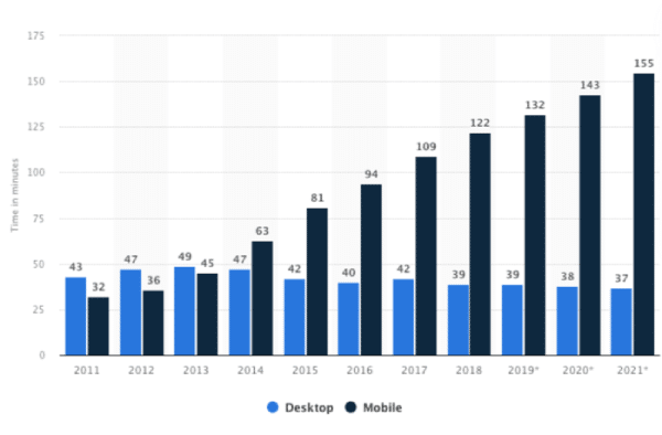
This type of web design can inspire consumers to do more this year. According to Statista, people around the world spend over two-and-half hours on their smartphones and a half-hour on their desktops every day:
While some of this time is devoted to entertainment, like social media, content streaming, and some of it to work, where does the rest go? Often, it’s to look for information on what to do outside of their screens.
If you’re building a website that sells a real-world experience or product, this is an important thing to think about. Because the most effective way to sell something real is to let the consumer “feel” it.
With products, this is easy to do. You display products from different angles, enabling shoppers to zoom in as well as to experiment with variations. But with experiences, you’ll need a different approach.
BeCottage2 Theme
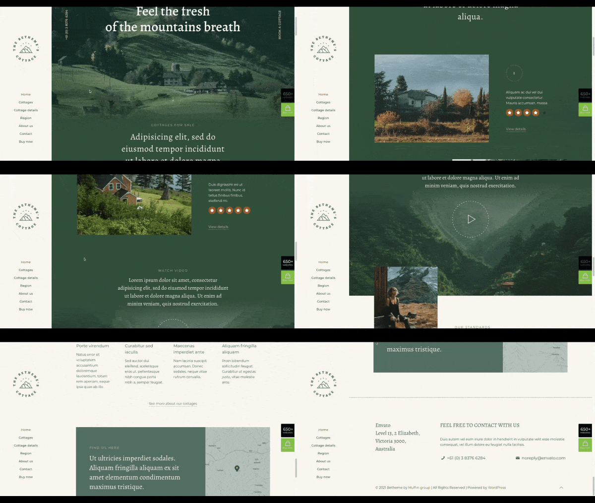
This year’s trend of immersive image design will have designers creating digital environments that feel real to experience-seekers. You’ll find many examples of this in BeTheme’s pre-built sites. For instance, BeCottage2 uses an image filter and blurring effect to make the landscape images at the top and bottom blend into the digital content:
BeSurfing2 Theme
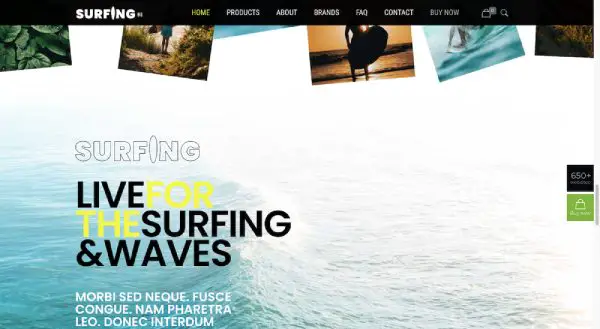
Surfing2 uses a similar design strategy, using the lighter part of the ocean image to blend it into the website background:
So, rather than move from one section to the next, visitors experience an easier flow from digital content into a natural setting.
2. Moving Typography Puts A Spotlight On Content
There are many ways to design website typography to be more eye-catching. Size, color, and style are just some of the ways. In 2022, though, we’re going to see motion applied to text, too.
While you need your clients’ sites to be easy to use, you need ways to make them stand out from the plethora of other sites and apps they visit every day. A well-timed and strategically placed piece of moving type will do that.
If you want moving elements to make a real impact, then you need to use them sparingly. And when it comes to typography, your best bet is to apply motion to the most important pieces of content.
BeDietShop Theme
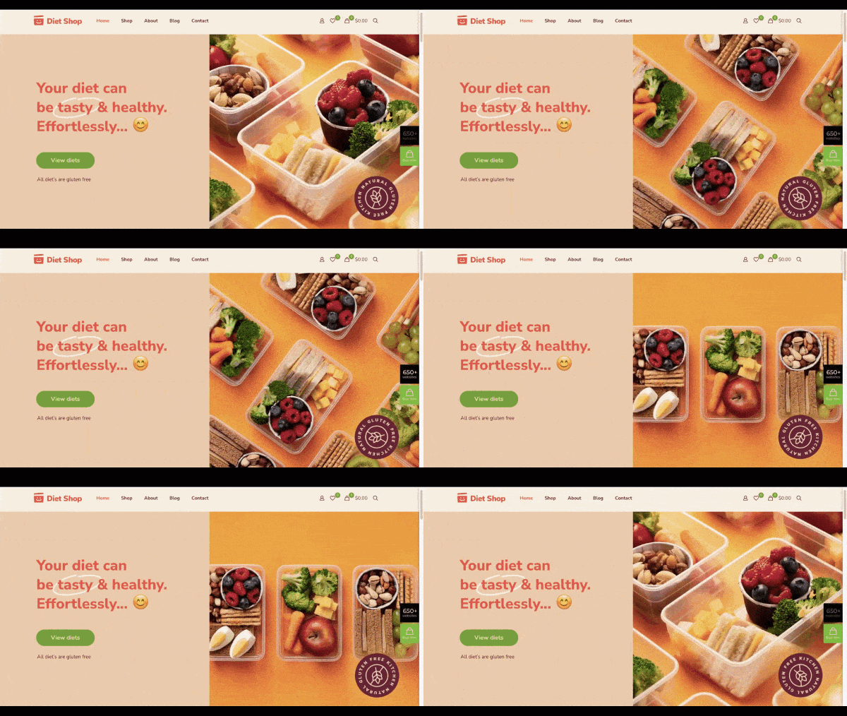
Like calling attention to a call-to-action or unique value proposition the way BeDietShop does in the hero image:
BeEvent7 Theme
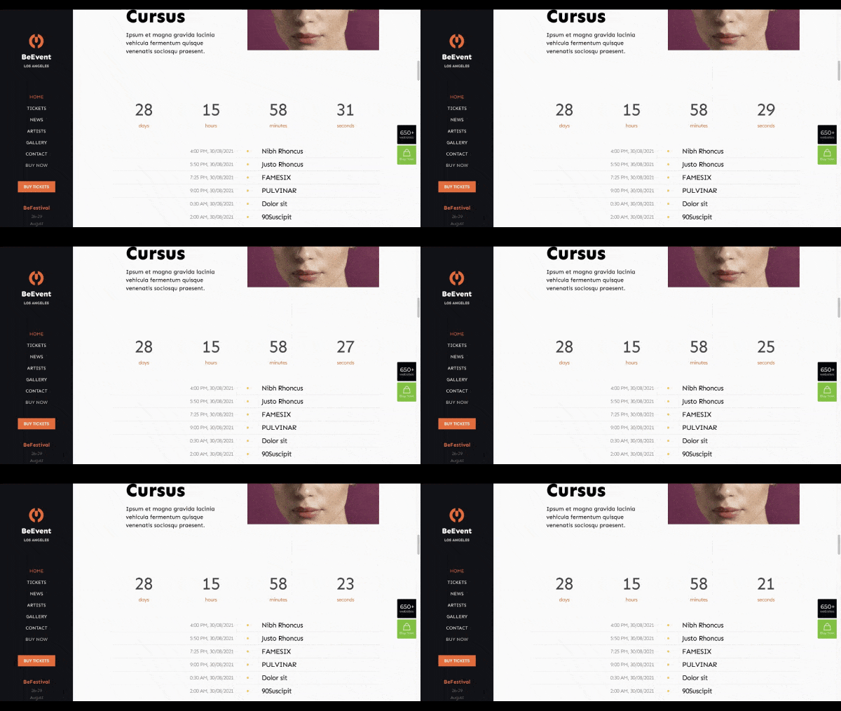
BeEvent7, on the other hand, uses motion to simulate the ticking of a clock:
There are many ways to put this particular moving typography trend to use. You can keep it slow and tick down the time to an event like this. You can also speed it up to count upwards to show off the company’s accolades (like a number of jobs completed or dollars raised).
3. Line Art Backgrounds Serve As Useful Guides
It seems like there’s a different trendy way of handling website backgrounds each year. Dramatic gradients were big the last couple of years. We’ve also seen background video sliders. And dark mode color schemes have also been quite popular.
In 2022, it’s not necessarily the color or content of the website background that web designers are going to be concerned with. Instead, it’s going to be how to use line art to create visual interest as well as provide more helpful guidance to visitors.
Background line art doesn’t need to literally point visitors in certain directions with arrowheads or anything like that. Even seemingly abstract designs can improve the user experience.
BeCoworking Theme
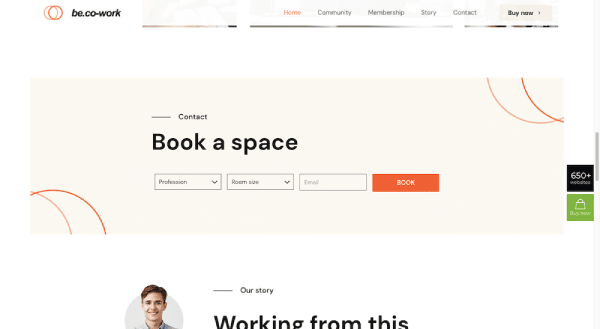
Take the BeCoworking pre-built site, for instance:
The background of this block has line art in two corners. These circular designs are an effective way to grab someone’s attention as they scroll down a page with flat and solid colors. What’s more, both of the shapes curve inward, drawing greater focus to the booking form.
BeAgency6 Theme
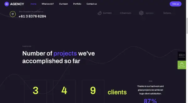
BeAgency6 is another site that uses line art backgrounds:
While the amorphous shapes may look decorative at first glance, they’re each designed to guide visitors’ eyes throughout the content.
Considering how many ways there are for people’s eyes to scan across a page, having subtle lines like these to keep them focused on the right parts can do wonders for website engagement.
4. Interactive Graphics Provide More Context For Users
The basic goals for every website are the same: (1) Get visitors to engage with the content and (2) get them to convert. The more visitors you get to engage with the website, the more of them should convert.
As a web designer, how do you get them to engage though?
One way is to make key elements look interactive. Like designing buttons to look like they’re clickable compared to the otherwise flat elements around them. Or to make images or icons transform or animate the second a visitor hovers over them.
But you don’t just want users to engage with elements that take them from one place on the site to another. You don’t always want them to be in motion. Part of a website’s job is to get visitors to stop so it can educate them. You can use interaction design to get visitors interested in learning more. You’ll just need to get creative about it.
BeInterior6 Theme
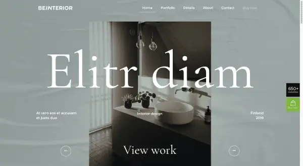
One way to do this is to turn what would otherwise be a scrollable content experience into a slideshow. BeInterior6 has an attractive example of this at the top of the home page:
Scrolling has become so automatic these days. But if you add clear controls — and maybe even an auto-rotate setting — to the slider, you’ll get visitors to stop and engage with important content like a portfolio.
BeDentist4 Theme
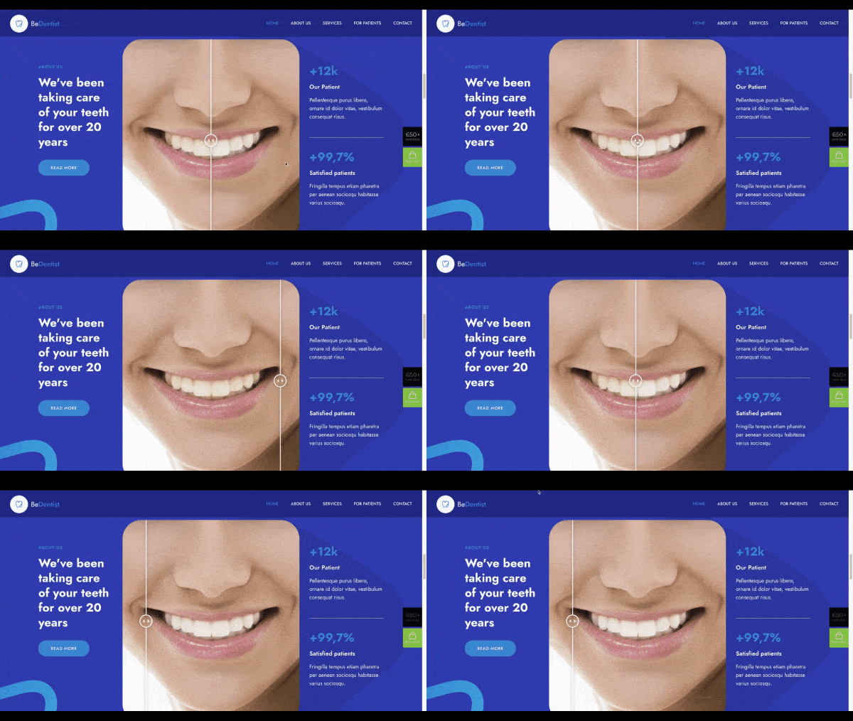
Another option is to create a unique feature like this Before/After image on the BeDentist4 site:
The designer could’ve placed the Before and After images side-by-side. However, this slider forces visitors to actually work for the reveal. Plus, it’s a much more fun way to reveal the results.
5. Positive color palettes send the right vibes to visitors
There was a time where designers were obsessed with choosing the perfect color to elicit the right emotions from visitors — especially colors that would compel them to click or convert.
But what exactly is it that makes colors emotion-provoking? And, more specifically, what makes a color elicit a positive response?
According to color theory, there are many factors that affect how colors are interpreted by people. The shade of the color. The context in which it appears. The culture of the people looking at it. Also, the way the color contrasts with the other colors on the site.
So, it’s not like you can just use a “happy” splash of yellow on every site you build and instantly transform visitors into satisfied customers.
Instead, consider the circumstances of the site you’re building as well as the people who will visit it. In 2022, that will mean considering how external factors and disruptions (like the supply chain crisis, for instance) may require websites to feel less intense and safer.
BeBabyShop Theme
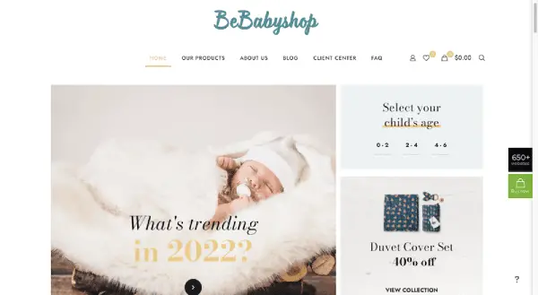
Most websites should be able to create a gentler experience through color. BeBabyShop, for example, uses a variety of soft tone backgrounds to offset the products:
BePizza5 Theme
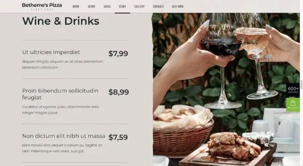
BePizza5 also has a more neutral color palette, starting with dusty green and ending with dusty pink, with plenty of beige tones in between:
This isn’t what we commonly see in casual restaurant design, so this actually works well in setting the establishment apart from others that use a more excitable color palette.
Web Design Trends Of 2022 And A Little Help From BeTheme
As the world outside feels unpredictable or out of control, or when people are going through a major transition, it’s no surprise that the digital world will try to bring balance to that external chaos. And that’s exactly what we’re seeing in the coming web design trends for 2022.
When new design trends get ushered in, it doesn’t need to be a stressful time for web designers. With a little help from BeTheme’s pre-built sites, which are always built using the latest and greatest trends, the foundation is already there for you. Plus, with new sites coming out all the time, there will be many different ways to repurpose these sites and take advantage of 2022’s web design trends.
As a bonus, BeTheme is the total WordPress web design solution. With 3 different builders and 650+ professional-grade pre-built sites to work with, you can use this cost-effective solution to build a completely customized site for every client — and quickly, too.
► Editors Note: Not all WordPress theme makers are ready for the new trends we’ll see in 2022. It’s worth noting that if BeTheme is ahead of things coming in web design, then it says a lot about their company and there’s a good reason they are a five-star rated theme provider.
