Line25 is reader supported. At no cost to you a commission from sponsors may be earned when a purchase is made via links on the site. Learn more
In this Digital era, having a website for your company or business is very common. But does your website have an interactive and creative design? Does your website have those design elements that make your site engaging? Your site must consist of innovative, eye-catchy design elements that can make your site stand out, as it will help you bring more clients to your business. Many people don’t know how much their business sales and brand awareness will increase if their site is responsive and consists of all the right design elements on their website.
There is so much competition on the internet. Everyone wants the best website for their business, but very few have the best website, which is responsive, user-friendly and consists of all the design elements and illustrative work on their site. If you’re brainstorming website design ideas, remember that the right site design can bring surprising results for your business. For those just starting, finding inspiring website design ideas for beginners can seem overwhelming, but studying successful examples can provide excellent guidance. Here are 15 best examples of website designs that have pushed the boundaries to make their site unique and at the same time effective in their respective fields.
1. Feed:
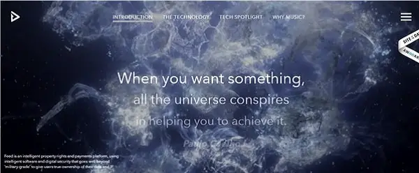
Feed music is a fascinating concept. Their homepage is very attractive. They have brilliantly executed the design and other usability elements. The site gives you a great user experience. The site has a great combination of animation and videos, which enhances the look of the website. When looking for ideas for website design that incorporate multimedia elements effectively, Feed’s approach demonstrates how animation and video can create an immersive experience. The graphics are hands down the best thing on their website. The site is very engaging. You can find anything on their homepage itself. Once you reach the footer, two CTA’s are there: one to learn more, and the other to schedule a meeting. These CTA’s are a great way of creating engagement on the site. Overall, the site looks stunning. The site has a dark theme. The graphics and website design work like a cherry on the cake for the website.
2. Make Your Money Matter:

Make your money matter is an organization whose website has a vibrant and joyful vibe. The site is very engaging, and the animations used are just amazing. The site uses parallax scrolling. It will take you on a journey, and through that, they will tell what their mission is and how they work. They have shown this journey by using different design elements. It’s unique how they have given information and benefits of why one should invest. Through their animation and site design, anyone can be convinced, and anyone can easily get inspired by their site design. For those seeking creative ideas for website design, their use of animation to tell a story provides excellent inspiration. Because of the animation and other illustrative work, the site is very engaging, and anyone will enjoy it while scrolling. In the end, the CTA is appealing, and it’s an excellent way to engage and convert visitors into customers.
3. Media Boom:
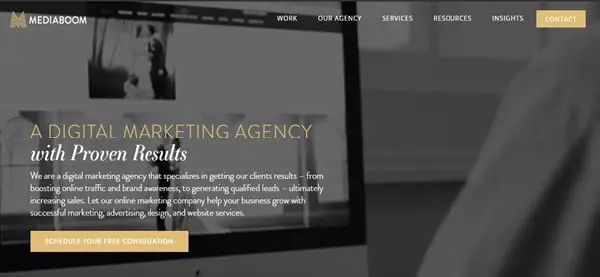
Media Boom is a digital marketing agency. Their site design is classy and elegant. The color theme of black and orange is very eye-catching and gives the site a very stylish look. They have used a silent video on their homepage, which is suitable for the site’s engagement. The CTA’s are placed in the header and other sections of the homepage so that they can’t be ignored and the visitor can quickly get in touch with them. When searching for creative website design ideas, Media Boom’s strategic use of color and video demonstrates how simplicity can still create impact. The site also has a chat room on their homepage so that visitors can communicate with them. The content on different sections of the website gives adequate information about how they work and about their agency.
4. Thred Up:
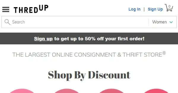
Thred Up is an e-commerce website where the site design is vibrant and elegant. The site is doing many things in the right manner. From the logo to the images, everything is perfect. The discount section is in the header section to attract visitors. They have made good use of images. The site is interactive and, hence, engaging. The colors they have used enhance the look of the site. As an e-commerce website, the good thing about the site is its navigation is self-explanatory, and you can find any category of clothes and accessories easily. For those collecting website design ideas, Thred Up shows how e-commerce sites can balance functionality with aesthetics. The site gives sufficient information about their store and what makes it different from others.
5. Simply Chocolate:
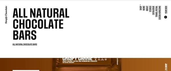
Simply chocolate’s website will make your mouth water as their website design is excellent. The images are big and bold, and the site has parallax scrolling, which enhances the site look. The site has a great user experience. Because of its design and technical elements, the site is engaging. The typography is big and bold. They have shown all the categories of chocolate they sell through the parallax scrolling and big, bright images of their product. The good thing is that they have given detailed information about the ingredients and nutrition of their product in a very creative manner. They also have other primary pages for more details. One can easily take inspiration from this site as their site is designed well. When exploring graphic design website ideas, Simply Chocolate’s use of typography and product photography demonstrates how visual elements can create an almost tangible experience. Everything on their site will give you a sweet and chocolaty feel, and you will enjoy scrolling.
6. Agora Gallery:
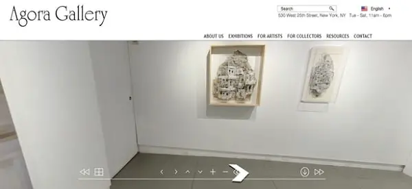
Agora Gallery’s website has a simple yet classy design. What makes them different is that they provide a virtual visitor tour of their gallery on their homepage. You can see different types of paintings and the place where these paintings are displayed. As it’s an art gallery, images play an essential role on their site. They have given information about the art gallery, about their paintings, and a blog section on their homepage. The navigation is clear, and primary pages are also there for collectors, upcoming exhibitions and the artists. For artists and galleries seeking creative ideas for website design, Agora’s virtual tour feature shows how interactivity can enhance visitor engagement.
7. Stink Studios:
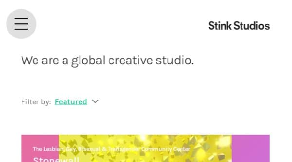
Many sites look very cluttered, as they put a lot of information on their site. But on some business websites, it is necessary to write plenty of information about their business and about other curricular activities they do. Stink studio is a creative studio, and they have put plenty of information about their projects and clients. However, it does not look messy at all. Their site design is customized, and they have used big and bold images to give further information about their projects. They have made good use of images. The photos are vibrant, big, and attractive. For businesses with extensive content needs, Stink Studios provides excellent website design ideas for organizing information without overwhelming visitors. Any site that wants to add plenty of information to its website can take inspiration from this site.
8. Overflow:
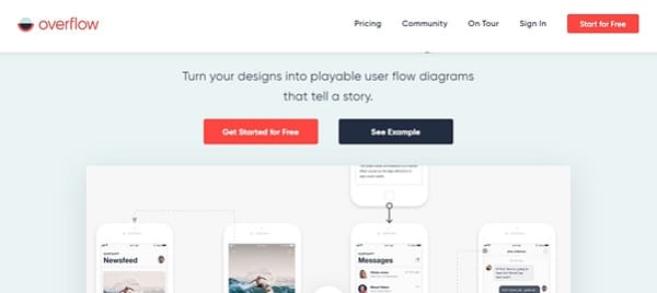
Overflow website is a design tool that helps the businesses to make story-like flow diagram designs of their product so that their customers can easily understand the product. The website shows how the tool works through a video. The site’s logo is eye-catching. The site design is attractive. The call-to-actions can’t be ignored as they are placed at the center of the homepage. The CTA’s are big and bold. The CTA is present throughout the website. The color scheme is attractive. Testimonials are also there on their site to build the trust of the visitors. For SaaS and tool-based businesses looking for website design ideas for beginners, Overflow demonstrates how to effectively showcase product functionality.
9. Crazy Egg:
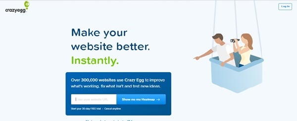
Crazy Egg site helps you to reach your website goals. From heatmaps to A/B testing, the site provides you with everything. There is social proof on the subhead for their branding and a good impression. On the homepage, the results are shown about how many websites use crazy egg so that visitors get to know how many people trust a crazy egg. The site has egg bot on their homepage to chat with the visitors; through this, anyone can easily communicate with them. The good thing is that on the home page in the header section, there is an option for a 30-day free trial, and you can cancel the subscription anytime. This will attract any visitor. Overall, the site is engaging as its homepage encourages visitors to plug in their URL. For those seeking ideas for website design that effectively convert visitors, Crazy Egg’s strategic placement of social proof and free trial offers provide valuable insights.
10. Adel Vakula:
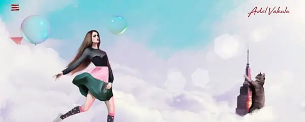
Adel Vakula is a famous international model from Ukraine. She has her promotional website where an animated version of her is displayed. The site is a visual treat for the visitors as the animations and the illustrative work is fantastic. The different looks of the model have been portrayed. Moreover, the site has used parallax scrolling in which the background images are big, bold, and beautiful. The website is customized and is built on WordPress CMS. The most interesting UI element is where you can drag and drop the outfits. The site is very engaging. Each section has stunning images of the model. You can have a look at the gallery section, where all her pictures are from different photoshoots. For personal branding websites, Adel Vakula’s site showcases innovative graphic design website ideas through interactive elements and animation. Overall, the site is unique and rare. The illustrative work is magnificent.
11. L’Oursin Seattle:
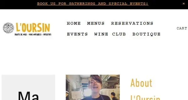
L’Oursin is a restaurant website. The website design is simple and classy. The images play an essential role on their site. They have given information on almost everything, from address, hours of operation, and corkage to parking. All the data is provided on their homepage. Visitors can get information just by opening the site. Also on the left side, an online booking option is there so that they can easily convert site visitors into site customers. The images are big and bold. The color theme is simple yet attractive.
12. RollPark:
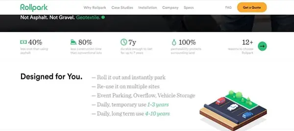
Roll Park’s website design is just amazing. The homepage includes a video where they show how they work and about their business. The site has also attached the link to other primary pages, like Why choose Roll Park? A very good feature of this site is that they have explained their way of work through animations so that visitors can understand it easily. The animations make the site engaging and enhance the site’s look. The color theme and the font complement each other. The site also has appealing CTA’s.
13. Healthline:
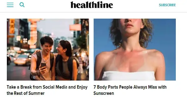
The Healthline website homepage consists of all the articles related to health. There is plenty of information given on different topics related to health. On their homepage, there is a menu of health topics and their tools. One can click on their choice of health topic and get detail information about a particular topic. Despite featuring a lot of information, the site does not look cluttered at all. They also have bold CTA on the top of their website and another CTA in the footer for more information.
14. Nowness:
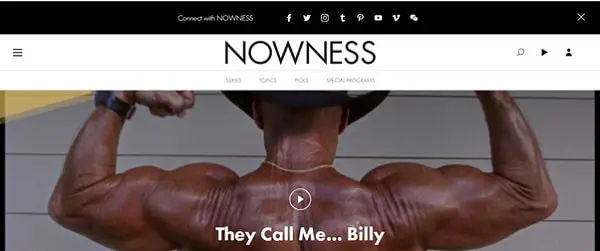
The newness website design is subtle. The black and white color theme goes with the site theme. They have a video on their homepage and have other primary pages, which include series and topics. An exciting aspect of the website is that all the blog content is videos. The entire site consists of video blog content. These videos make the site engaging and give a great user experience. The footer section has CTA’s like “subscribe” and “Become a Member” This is a great way to build community and an email list. For media companies seeking creative website design ideas, Nowness demonstrates how video content can become the core of a site’s identity.
15. Green Mountain Energy:
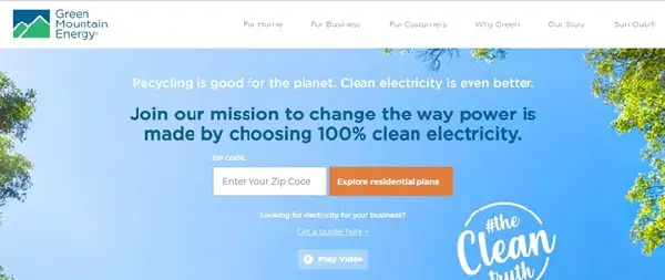
Green Mountain’s website has a pleasant vibe. You can easily understand what their mission is. They have put in the time to design the site. The site has parallax scrolling. There is a link to play the video. There is a short video that encourages the visitor to sign up. There is detailed information in the different sections on the homepage about their projects, how they work and testimonials. Moreover, they also have an app of their own, so they have attached the link to download their app. One cannot ignore their CTA’s as they are appealing. The color theme goes with the type of business they have. The content is good, and the site is engaging. They have provided sufficient information about customers, marketing, and other details on their homepage.
The websites shown above are some of the best examples for designing a website in their respective fields, through which you can take inspiration and improve your website. When implementing creative website design ideas for your site, remember that good website design plays a vital role because if your site is attractive and unique, the website has a good brand recall. Whether you’re seeking graphic design website ideas or functional ideas for website design, the key is to balance aesthetics with usability. Sooner or later, the visitor will surely become your customer.
As you begin exploring these website design ideas for beginners or more advanced concepts, focus on what makes sense for your brand and audience. The most effective creative ideas for website design are those that not only look impressive but also serve your business goals and enhance user experience.