Line25 is reader supported. At no cost to you a commission from sponsors may be earned when a purchase is made via links on the site. Learn more
Ghost buttons are amazing UI elements that have been increasing in popularity over the years. These are basically action buttons with transparent designs and are often bordered with a thin line that creates a simple shape, rectangular, circle, square, etc.
Ghost buttons have lightweight designs. Also, they tend to be in contrast with other elements, with the main purpose to draw attention to them. Moreover, their position is privileged, as they are often situated in the center of the page, in a larger size than regular buttons.
Ghost buttons integrate easily with the rest of the website’s design, given their minimalistic form. However, you should be careful about how you use them, to make sure they stand out rather than being lost in the design.
This article gathers 20 awesome examples of ghost buttons. See how the designers used them in their websites designs. Get inspired by these examples and start using ghost buttons in your future websites!
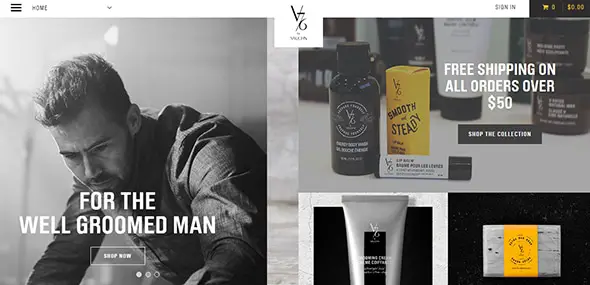
V76
This is a great example of how you can use a ghost button. In the center of the page, larger than normal buttons, with a minimalistic design that resembles with the overall design.
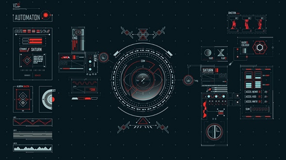
Head-Up Displays
Head-Up displays are similar to ghost buttons, but their interface includes a specific text that is included in a clear shape.
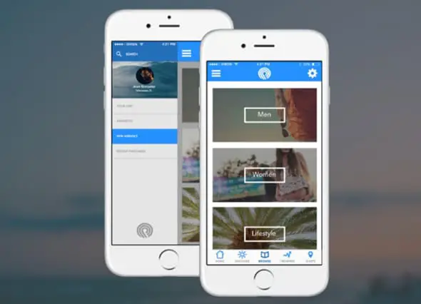
Apple iOS
The Apple iOS7 interface design included lots of ghost buttons, with a minimalistic design. These elements were created way back in 2013, and are still a popular trend on the rise.
DESIGN ELEMENTS
This website uses a small, simple ghost button on the bottom of the page, which contains a small text.
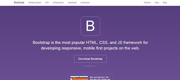
Bootstrap
This empty button that is displayed on the homepage has a simple but very effective design. It gets the job done as it gets your attention.
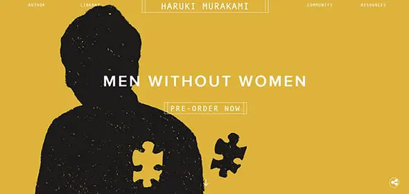
Haruki Murakami
This is another wonderful website that uses several ghosts buttons to emphasize some parts of the design and also to keep things interesting.
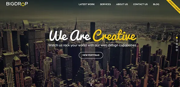
Web Design Company Website Development -Big Drop
This is an excellent example of the most common use of ghost buttons: in the center of the page, with a simple design, a small text inside a regular shape. Simple yet complex.
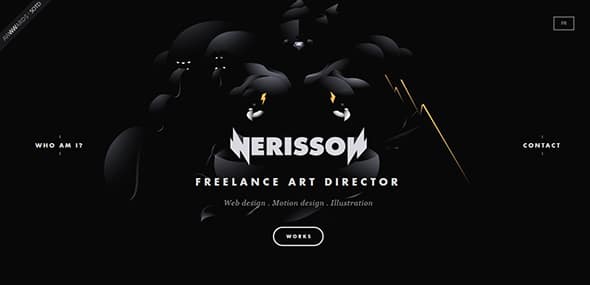
Nerisson
This is a portfolio website which has a very creative design. The designer also uses ghost buttons to highlight various items.
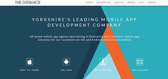
The Distance
This is another wonderful example that shows how you can use ghost buttons to improve your designs.
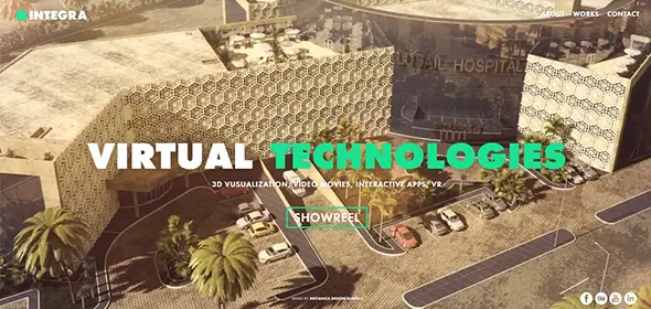
Integra
This ghost button has a neat design that mimics the colors from the rest of the web. Its’ transparent layout makes it perfect to get your attention, and at the same time doesn’t cover up the background.
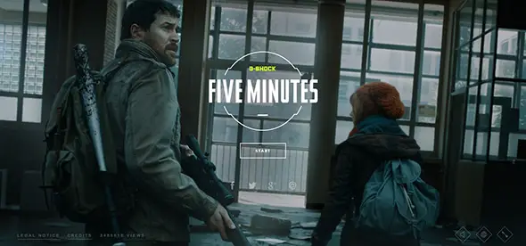
Five Minutes
This is an amazing game design that uses ghost buttons to easily control the characters. Have a closer look and see how it works.
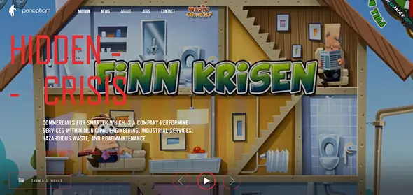
Panoptiqm
This is a stunning website that is covered up with beautiful animations. The ghost buttons are in red outlines and can be used without covering the web design.
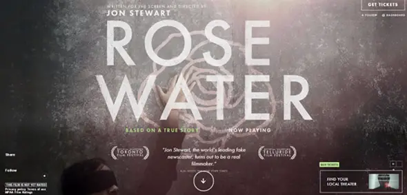
Rosewater Film
This is a beautiful website that besides the general ghost button, also features a transparent rectangle with a neat animation.
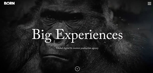
Born Group
This website offers a great solution on how you can use a ghost navigation button without getting the attention from the main image.
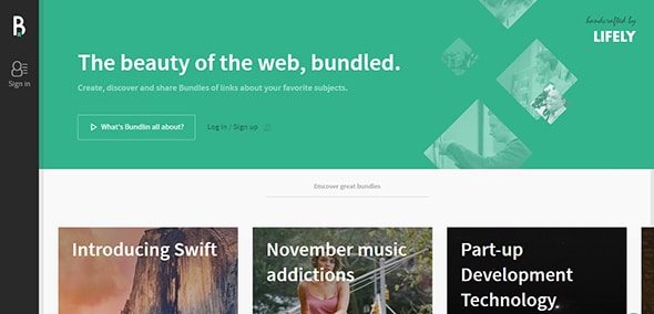
Bundlin
Bundlin’s design demonstrates one more time that ghost buttons can be very useful items in all sort of situations.
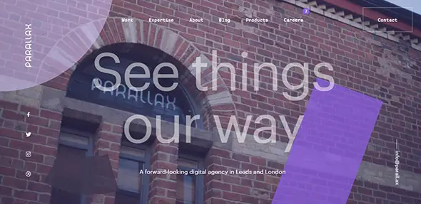
Parallax
This is a busy website with all sort of elements that are flying around. The template also features a beautiful ghost button that offers a little peace of mind.
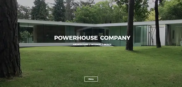
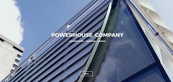
Powerhouse Company
Here is a professional website that uses ghost buttons in its design. Have a look at how the designer used this element and get inspired to create your own.
Urban Influence
This website was created for a digital branding firm. The template has a beautiful design which incorporates ghost buttons.
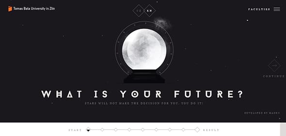
Budoucnost
This website includes an interactive quiz that was created by a university in the Czech Republic. Ghost buttons are used throughout the design in diamond shapes and they are used to navigate through the questions.
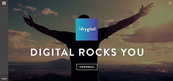
Drygital
This website was created for a Spanish digital marketing agency and it has a stunning design. As in the previous examples, ghost buttons are used in the center of the page, in the usual rectangular shape with a transparent design.


Great collection of ghost buttons. Thanks for sharing.