Line25 is reader supported. At no cost to you a commission from sponsors may be earned when a purchase is made via links on the site. Learn more
When you create a website according to your taste, you are missing the purpose of a website. You should not design your website according to your style. You should design a website that attracts your target audience that eventually books an appointment through your website or calls your office to do so. Especially for dentists, it is important to create a dental website design that is trustworthy, visually appealing and user-friendly.
To design an appealing website, you should consider factors like colors, patterns, images, and text. Also, keep in mind that the contact form on your website should work well and complement the overall aesthetic of the website. You can also create an FAQ section that answers all the common problems faced by your patients. This way, you can increase the educational value of your website. If you want some inspiration to create your unique dental website, here are 15 beautiful dental website design examples for dentists that will help you create a beautiful dental website:
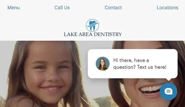
1. Lake Area Dentistry:
Lake Area Dentistry is a beautiful website with original videography. This dentistry has 4 different locations in the greater Lake Charles area, Louisiana. This website has a simple above-the-fold content feature on the homepage along with 24*7 chat support for all the queries. Lake area dentistry’s homepage will tell you about their doctors’ professional history. This is quite impressive as patients become more aware of the practice they are signing up for. They offer several services, including dental implants, dental fillings, root canal therapy, and more. All in all Lake Area Dentistry website provides a great user experience with a well-built homepage.
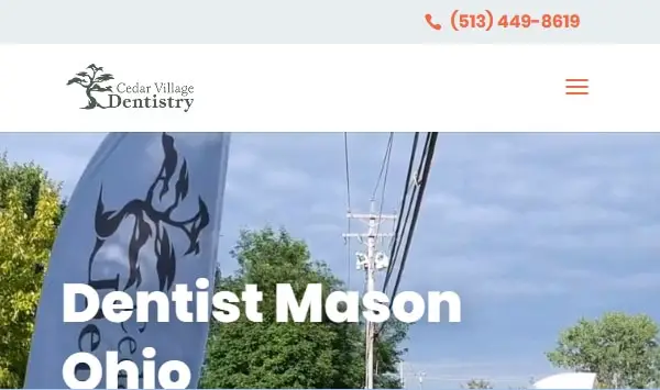
2. Cedar Village Dentistry:
Mason, Ohio has only a population of 35,000. However, most people here practice high-tech dental surgeries. The website has an eye-catching video on the home page along with the call to action option. This is a smart way to attract visitor’s attention. Cedar Village Dentistry has a lot of sections that group similar services. They have included a brief introduction of all the major surgeries they perform on the welcome page. As you scroll down on the homepage, you will find patients’ reviews in the form of the video. Cedar Village Dentistry’s website has everything on the homepage like office details, transformation pictures, support forms, and more. The website is designed using calm colors, and so visitors find it very soothing.
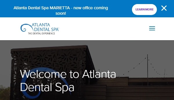
3. Atlanta Dental Spa:
Atlanta Dental Spa is establishing a new standard of excellence with its 3 beautifully designed locations that feel more like a hotel than a dental hospital. The website design, however, looks very basic. Atlanta Dental Spa’s website includes various sections including services, dental problems, about us, and more. They offer a fascinating section called “before and after,” this section displays several videos of before and after of their top dental services. On the website’s homepage, you will find a full tour of the dental office, which is very attractive. They encourage people to call or text them besides the option to chat online 24*7.
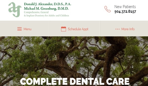
4. Alexander Dentistry:
Jacksonville’s Alexander Dentistry has experienced general, restorative, cosmetic and implant dentists. The website has a beautiful header image along with a simple color scheme (beige, white, green, orange) that enhances the visual appeal of the website. You can find in detail reviews written by past patients, along with a detailed description of their staff. This makes the website feel familiar to the new visitors. Along with several usual sections, you will find a smile gallery where they post pictures of their patients after they are treated. Everything is well-organized on the site so you can easily book an appointment for a specific doctor to avoid the waiting time.
5. Commonwealth Dental Group:
Commonwealth Dental group’s website is thoughtfully designed to meet the expectations of the visitors. After all, it is not easy to stand out in Boston, where people have high standards in terms of their health. They encourage their visitors to leave reviews on different social media platforms. The website has only one original photo, which can be improved in the future. Apart from this, you can find all the useful information in the floating header on the homepage. They have also highlighted the fact that they won the award of top dentists 2 times consecutively from Boston magazine.
6. Grand Street Dental:
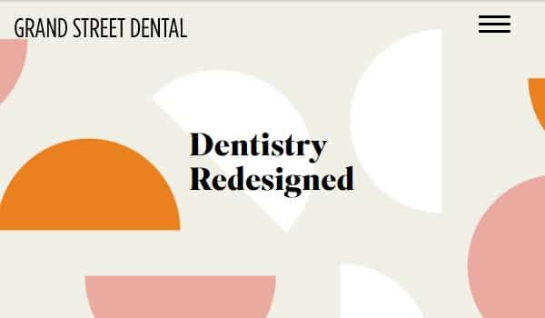
Grand Street Dental website is a modern looking attractive website. If you live in Brooklyn, this place is great to maintain your dental health. The website has all the necessary information like service details, contact information, booking option, and more. They have designed the website using soft colors, abstract shapes, and beautiful original photography. This helps the patients feel relaxed when they come to the website. The best feature offered by the website is the in-depth explanation of each procedure, including precaution and after treatment care. They have also highlighted recent press mentions from Forbes, and New York Magazine along with their patients’ reviews.
7. Toothsmith Dental Surgery:
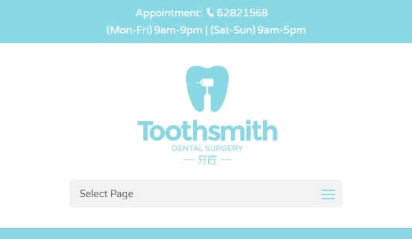
Toothsmith Dental Surgery website has a very calming color scheme (white, yellow, and blue). They have used creative icons to indicate different sections on their website, which enhances the appearance of the website. They have also displayed their cost saving packages highlighting all the details on the homepage to help potential patients decide what will fit their budget. If you are in Singapore, you should check out Toothsmith Dental Surgery. You can also share your experience with the feedback feature given in the bottom of the homepage.
8. Glo Modern Dentistry:
Glo Modern Dentistry is Hollywood’s 5 stars rated cosmetic dentist. Its website has different sections, such as patient information, treatments, dental health, cosmetic treatments, and more. They also have a video on their homepage displaying the results of their treatment. This site is not only focused on cosmetic care. They have used the website to explain common dental health concerns. This is a great way to build a patient’s trust in their dentist’s expertise. Also, this type of educational content is an excellent way to show their unique approach to dentistry. However, they should consider improving their contact form because they have included some unnecessary questions. According to research, the more information you ask on the form, the fewer people will complete the form.
9. Green Dentistry:
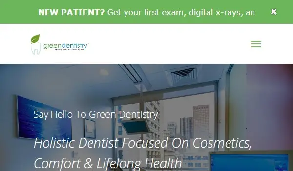
Green Dentistry has built an attractive website using the green and white color scheme. Dr. Nammy Patel practices her treatments in a health-focused city, San Francisco. She also writes a blog and has a YouTube channel that explains common dental treatments. You can find a brief introduction about Dr. Nammy Patel highlighting her education, experience, and philosophy. Along with these details on the website, you can also find their contact details. Every page on this website highlights different aspects of care and shows how they stand out from other dental practices. They also have regularly updated special offers for new patients. All this adds up to a great website that helps her practice grow. Other than high-tech dentistry, they also offer spa amenities.
10. Harrison Dental Group:
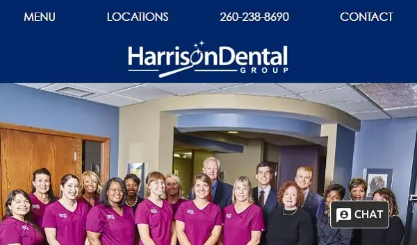
Harrison Dental Group has a very interactive website. One unique feature on this website is its navigation bar. They have a floating navigation bar, including menu, location details, and other contact details. When you click on any of these options, the website displays information without leaving the page. This reduces the number of pages a visitor has to navigate, ultimately saving time. They also offer 24*7 chat support for all your concerns related to booking appointments. The website provides a brief description of all the doctors’ along with patients’ experiences. This website is mobile-friendly, which is very important as more and more people look for dentists on their phones.
11. Timberhill Dental:
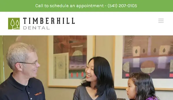
Timberhill Dental has a great website displaying original photography that makes it look familiar. The soothing color palette of the website helps patients feel relaxed. They provide a quick and concise explanation about general dentistry, cosmetic dentistry, and CEREC tooth restoration. They also encourage people to book a consultation. Along with usual sections like prevention treatment, general treatments, contact details, the website also has a testimonial section with before and after images. The website also has many comparison charts and tables that make it easy for visitors to understand the details. The website looks cohesive because each page follows the same basic layout.
12. Dallas Dental Arts:
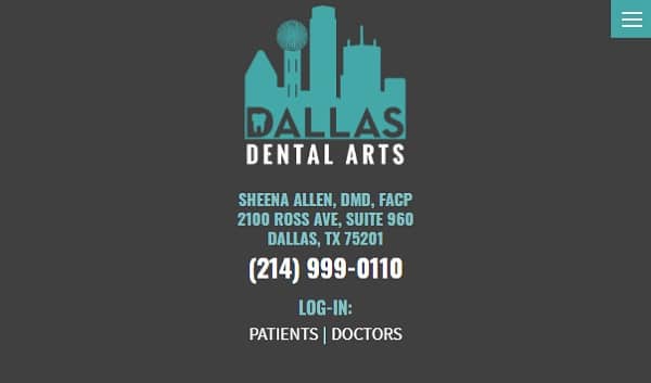
Dallas Dental Spa is owned by DMD, DDs, Lorin Berland, and Sheena Allen that has great pages that attract new patients. The unique idea of an office tour is one effective way to introduce patients to the practice. The website has lots of sections on the navigation bar such as cosmetic dentistry, technology, general dentistry, about us and more. You can even leave reviews on different social media platforms. They have highlighted four things on their homepage, namely “before & after” gallery, appointment scheduling, the introduction of the team, and a comparison of their services. The contact number and address is given on the top corner of the homepage, which makes it easier for people to contact them.
13. Kemmet Dental Design:
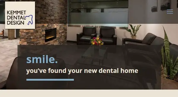
Kemmet Dental Design has a wonderful website with original photos of the office all over the homepage. The website has 2 transparent navigation bars. The first navigation bar contains everything related to the patient like forms, patient portal, contact details, and appointment option. On the other hand, the second navigation bar contains information about Kemmet Dental Design. This makes it easy for patients to access everything without scrolling or leaving the homepage. They also have videos of their services that visitors can watch to build trust in the practice before booking an appointment. Also, great testimonials from the past patients show their commitment to quality care. A unique feature they have included on their website is the 360° office tour.
14. Embassy Dental:
Embassy Dental has an attractive website with all the services listed on the homepage. They have used fun art illustrations to represent their services. You can find pictures of their doctors on the homepage, along with their practicing locations. This makes it easier for patients to know the doctors before booking appointments. Their navigation bar is specially designed for patients to contact them. They also run regular offers that are highlighted on the welcome page. However, they could add more details about philosophy, services, and detailed introduction of dentists. This would help readers develop a deep understanding of the practice while leaving the welcome page.
15. Friendly Dental Group:
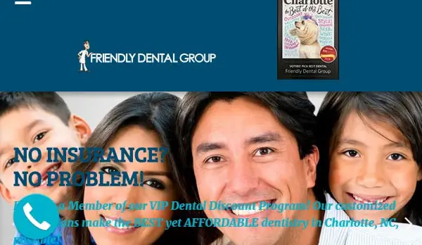
Friendly Dental Group has built their website using playful iconography and soft blue shades. This helps people feel relaxed and happy about going to the dentist. They have also highlighted their recent awards on the website. They have used animation of the “schedule an appointment” option to attract and encourage patients to book an appointment. They have a detailed navigation bar that includes dental services, blog, news, career, scholarship, and more. The practice accepts walk-in appointments and offers services in Spanish. The on-site chat features allow the patients to connect with practice, book appointments, and ask a question in seconds. They also have an area on the homepage that displays the statistics of their practice to help visitors decide in their favor.
By looking at these examples, you can design your attractive dental website design. It is essential to find your unique style and layout that makes your website look attractive. Also, keep in mind to use one color scheme for all the pages and elements so that the website looks cohesive. Changing the basic layout with every page confuses visitors and makes it harder for them to understand your practice.
One additional feature that attracts most people is the 360° tour of your office. With this upcoming trend, you can increase the traffic on your website. Lastly, while designing contact forms, keep in mind that it only contains required fields like name, email, phone number, and more. Focus on the details of your website as they are the basic building blocks of a great website. If you are not ready for a fully functional website yet, you can also create a single page website that acts as your landing page and provides all necessary information to your customers.



Here is a better addition to your list TrucareDentistry.
So beautiful. It’s awesome. ^^
Thanks for your post and sharing !