Line25 is reader supported. At no cost to you a commission from sponsors may be earned when a purchase is made via links on the site. Learn more
We’ve learned that the first things that a potential client sees when viewing your company or business, is the logo. But what happens when the logo works, and they feel compelled to visit your website in order to learn more about you and your company? The first and foremost important is your web design, but the homepage of your website is what they see first, and whether they decide to navigate and spend any time learning about you is based on how much they like the home page design, and how user-friendly it is. Today, we will discover 10 home page designs that pull clients in.
Mint
 You’ve probably heard of Mint, and if you haven’t, it is a website and app that tells you your credit score, manages your money, all based on the information you enter into it. This design is successful because it is so user-friendly, which is extremely important. You don’t want to have to click through a bunch of pages in order to find what you’re actually looking for. All the important information is laid out on the home page, with helpful images, put together in an organized way, and allows for the user to find exactly what they need, all while scrolling down one page. Simplicity goes a long way, and will keep your potential clients or customers engaged and quickly find the information they need, leading you to be successful in gaining more clientele, all because of the home page web design.
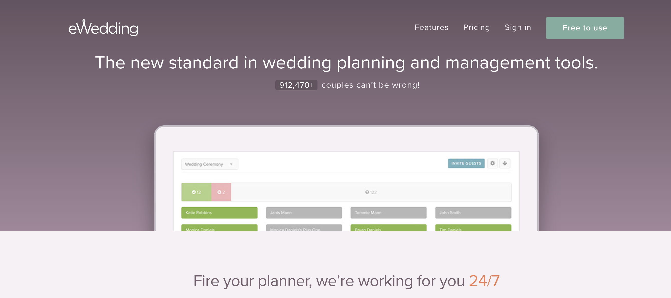
eWedding
Much like Mint, this website has everything you need right on the home page. It explains the break-down of what the website is all about, with engaging images and explanations, making it easy for any potential client to feel like they need this website to create their wedding web design and site. After scrolling and giving the necessary information that allows you to understand fully what it is all about, there are buttons to click to either start your own website, or view the available themes in order to pick and choose from a large selection that gives you the power to decide whether you want to use this site or not. A well created, transparent approach is important to keep people clicking on your home page.
Redfin
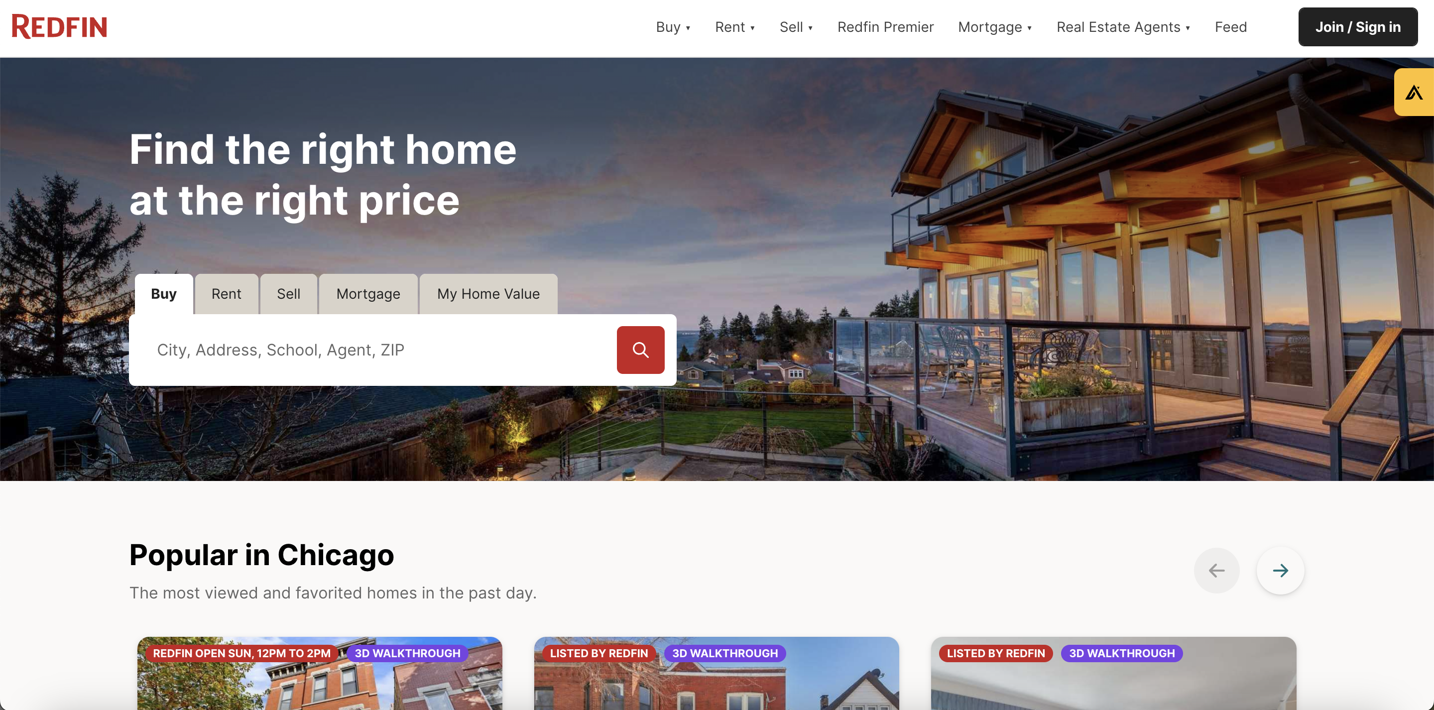 Redfin is an online website and app that has it’s own real estate agents on demand to talk to potential home buyers, and their homepage is easy to read, with deep and inviting color schemes, a call to action where you can type in your city in order to immediately look at homes near you, and when you scroll down, Redfin explains everything you need to know about the website and app, all from their homepage. The importance of an interactive homepage, for example how Redfin includes a slide bar in order to show how much you can potentially save when using the website, is futile. This home page has everything you need in order to pull clients in and keep them on your site.
Hulu
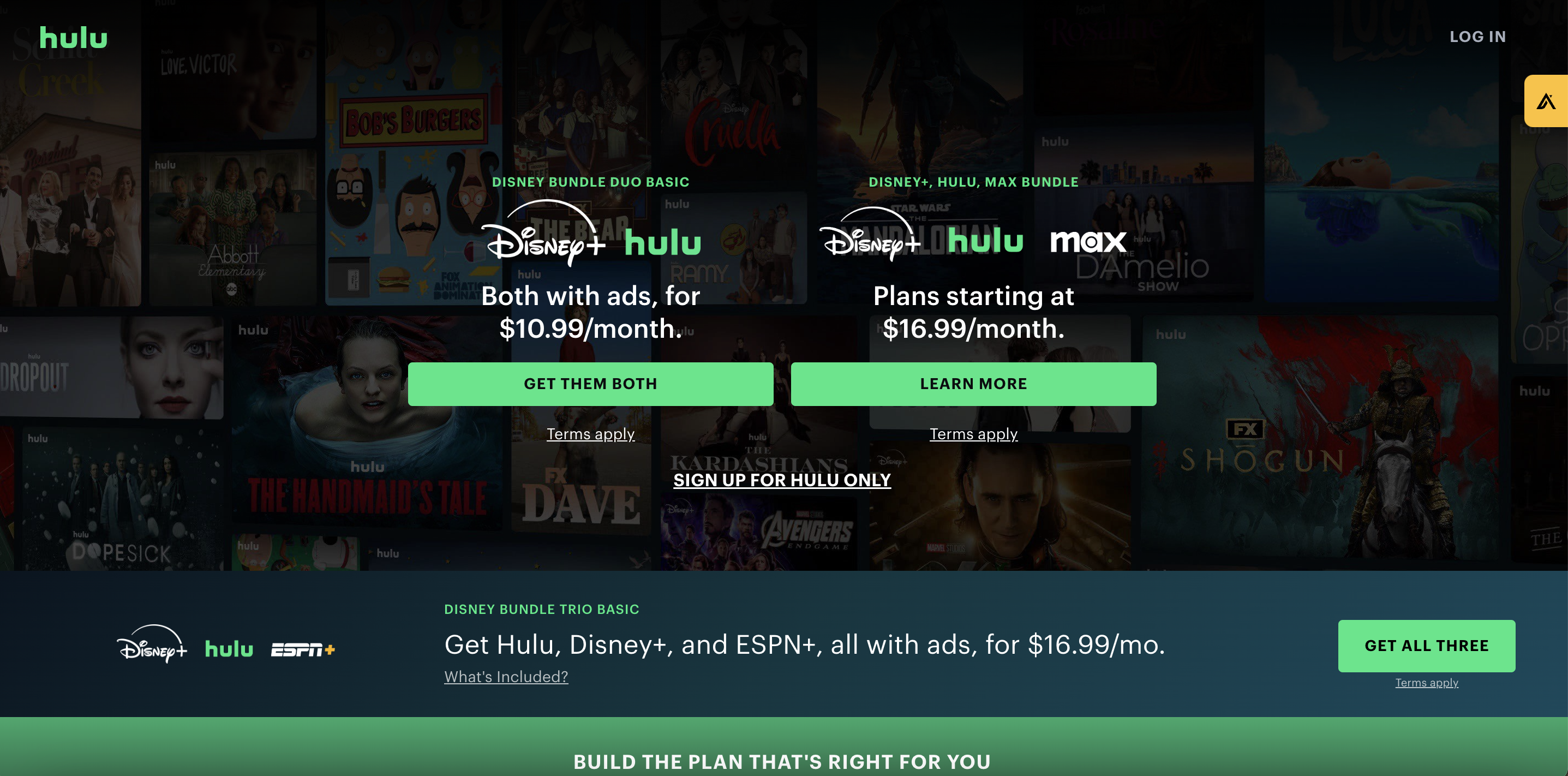
Hulu is a site much like Netflix, that offers TV shows and movies on demand, and for a reasonable price. This website home page works because it is extremely simple, and goal oriented in terms of a potential customer coming to the site for a specific reason, and being able to obtain a membership quickly and easily. With blue and green toned color schemes and when scrolling, the most popular shows and movies available are showcased, plan options are available and shown right on the homepage, a click away from a membership, with your choice of monthly or yearly. Along with an option for a free trial, Hulu can use their home page to pull clients in with their minimalist style home page with easy navigation and a modern and simple look.
Telerik 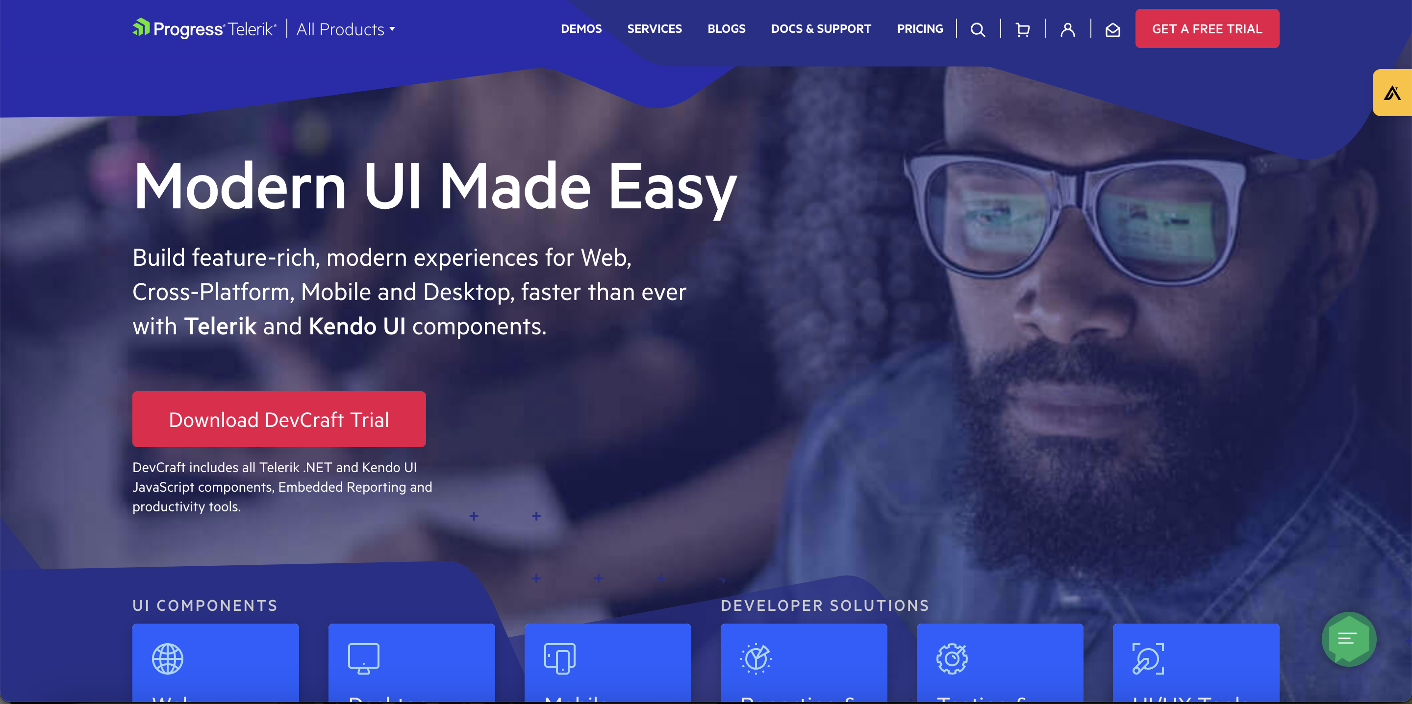
This website is used for UI and productivity and development products, like chatbots, reporting solutions and so on. Although there are many technical terms, this home page is able to simplify it by showing the highlights; such as trusted users and companies, along with offering a free trial to test out their products. The modern look of the web page is intriguing for web users, as well as user-friendly. With all of these things in mind, Telerik was able to take a complicated service and simplify it, in order to allow customers to have a pleasant experience when searching for their services.
Fiverr
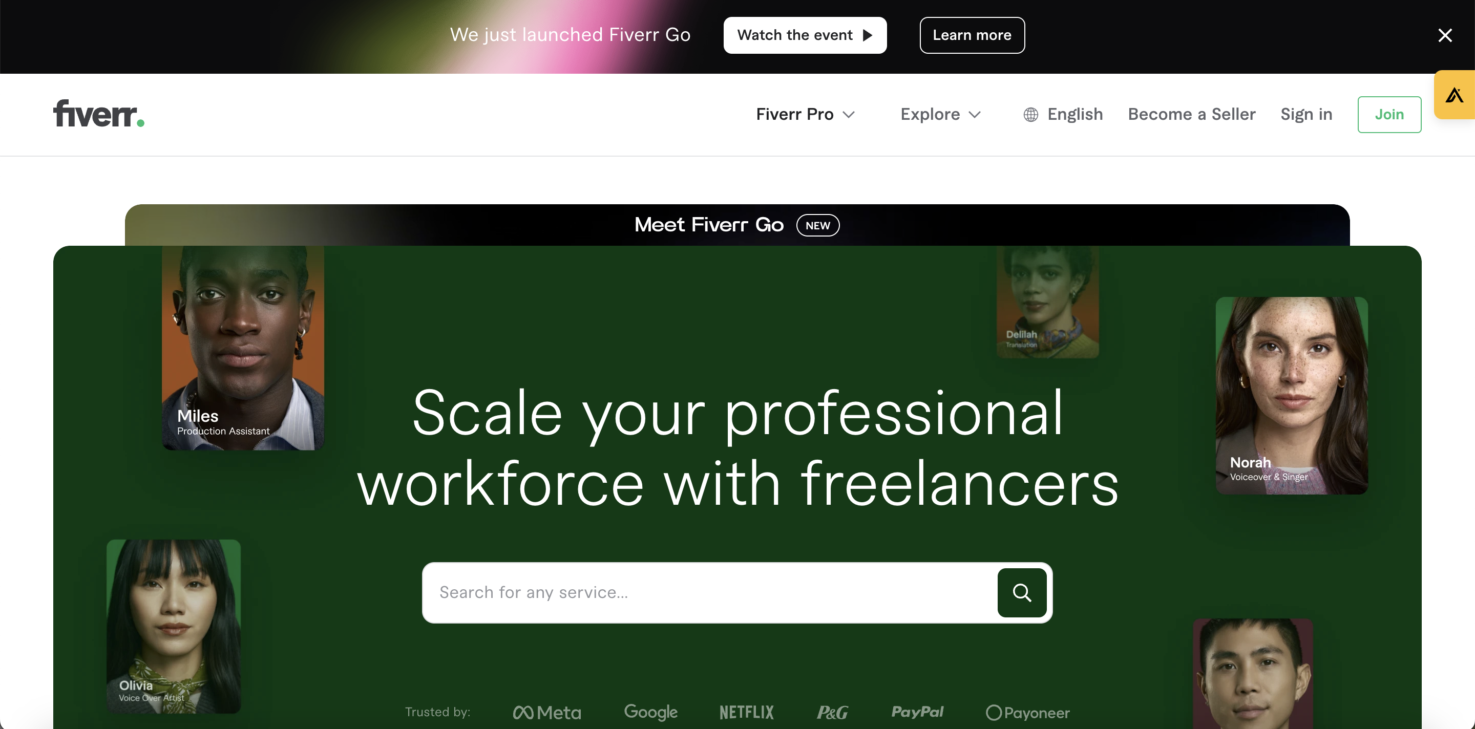
Fiverr is a website that offers work to freelancers, and give companies and businesses, as well as normal people a chance to work with professional graphic designers, web designers, illustrators, marketers and more. The home page is broken down into segments: the first part being a short and sweet description of what Fiverr is all about, along with a button linking to a membership page. Then, it showcases the most popular jobs that freelancers offer and can get when using Fiverr. After that, it simplifies and explains how exactly it works, mentioning a free sign up membership, browsing for freelancers and jobs, and placing an order to fulfill the job and/or job description. Along with reviews from trusted sources mentioning the highlights of the site, the home page can be summarized as a quick and easily accessible way to get what you need, without any problems: the definition of a successful homepage.
Basecamp
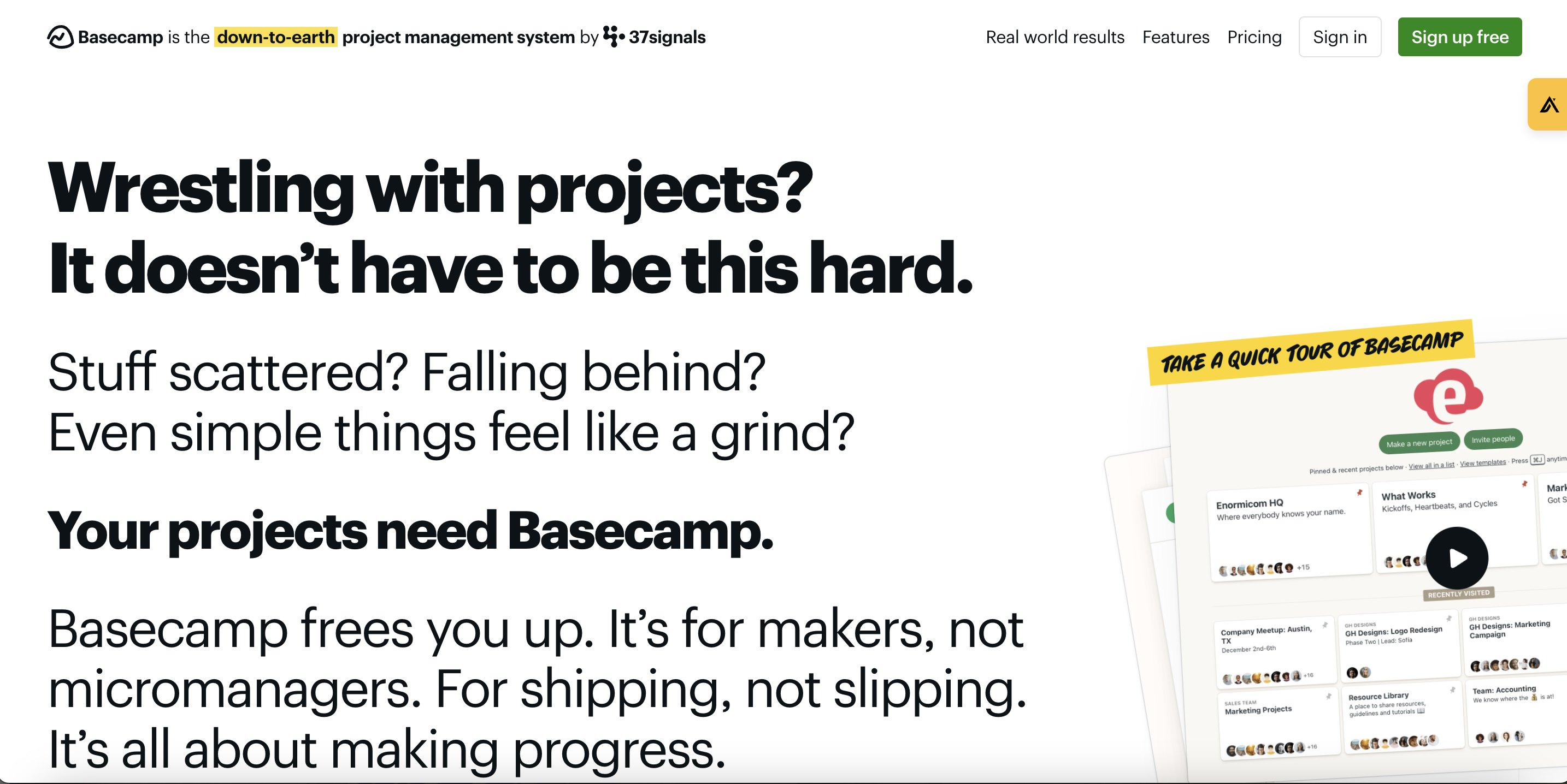
Basecamp is a website that offers memberships for teams that work together, such as a marketing agency or hub of freelancers. Starting off with a 30-day free trial, Basecamp covers all the bases(no pun intended), especially when it comes to staying connected with the people that keep your company afloat. The project manager also shows on the home page a table of the ever-increasing amount of accounts with the site, which aides in the chances of a user becoming a member. With fun illustrations, short and sweet reviews and descriptions of what the website has to offer, Basecamp has created a homepage that is so easy to navigate, it will be hard to say no.
Beyond Meat

Beyond Meat is a company that is attempting to change the way we think of meat, by selling plant based meat that tastes like the real thing. Their home page is made up of bright, colorful, and informative illustrations, images and videos that promote what their mantra is all about. At the beginning of the home page, there is a way to input your email and location in order to receive a newsletter and coupons, which is how they keep people interested and buying their products. The images of food make the consumer hungry for more, enabling them to want to buy their products at the many groceries and restaurants alike that feature their products.
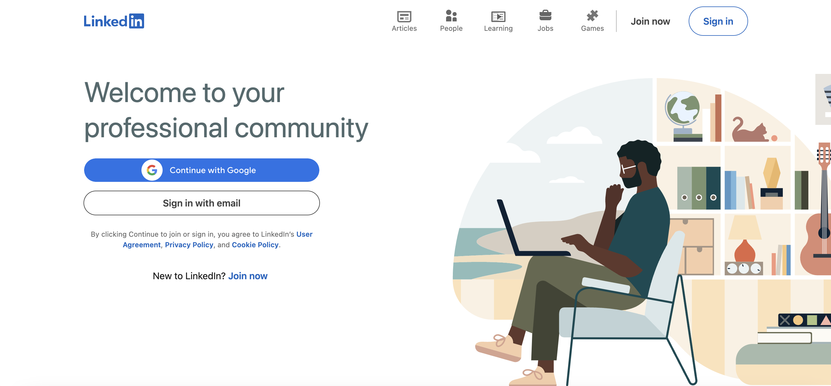
LinkedIn is quite popular nowadays. Their home page is so simple, it’s exactly what any employee or someone searching for jobs can hope for in terms of networking. The home page is straightforward: it tells you how to sign up, and that it’s completely free. If you don’t have enough care to sign up, you can search for people that you may know that already have an account with LinkedIn in order to persuade you further to sign up. Being straightforward and as simplified as possible, this website is sure to reel in people who are interested in job search, and retains a short attention span-which is important nowadays.
Medium
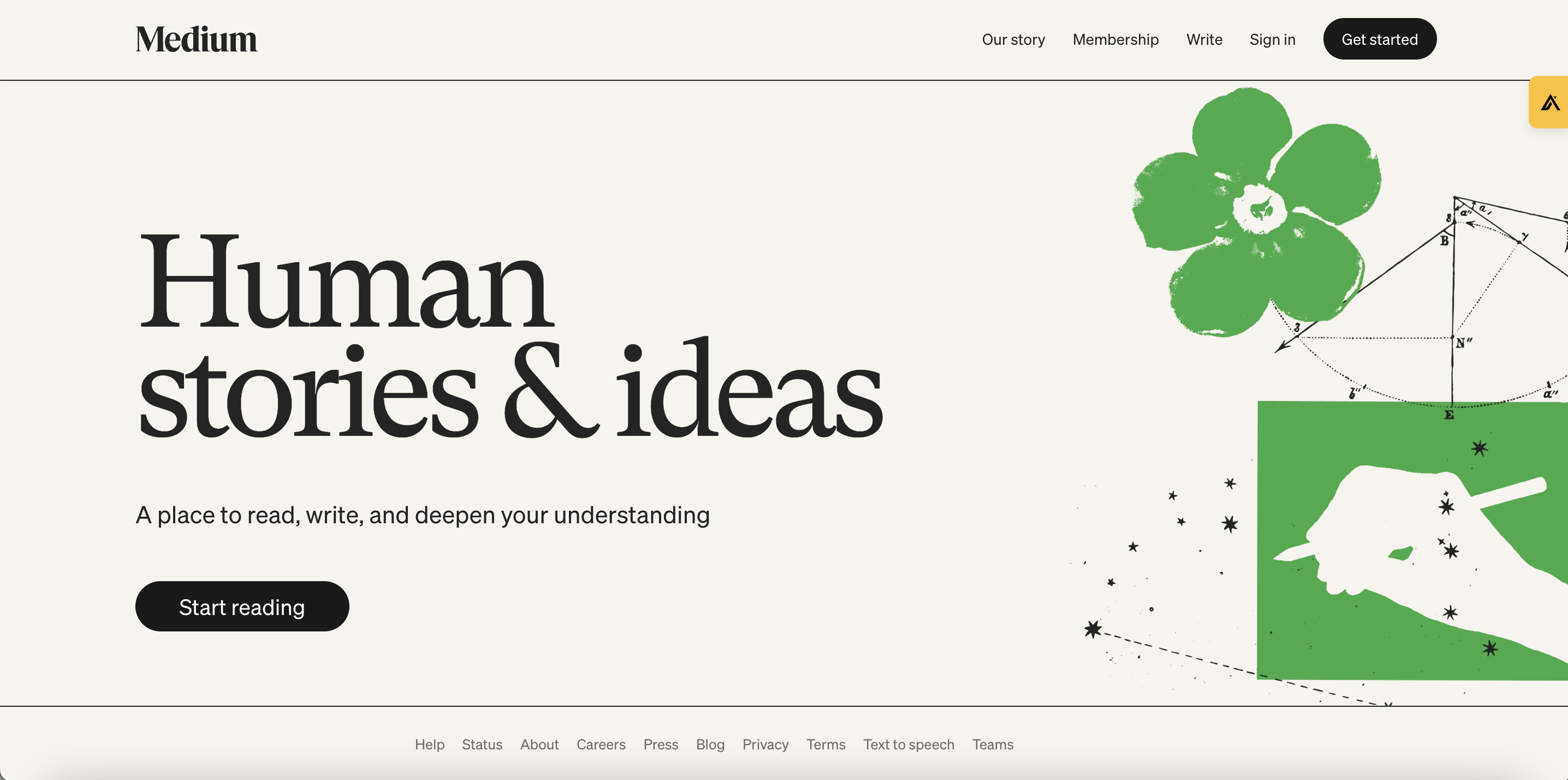
Medium is a website that offers in depth stories for subjects that you choose. The home page is a way to look into what you’ll get once you create an account, with at least one story to catch your eye based on the subjects mentioned on the site. By allowing you to choose whether you want to read six minute stories or twenty two minute stories, sign up is fast and easy, and you get all of this valuable information on the home page.
