Line25 is reader supported. At no cost to you a commission from sponsors may be earned when a purchase is made via links on the site. Learn more
Card grid layouts, made popular by Pinterest, Facebook, and Twitter, are becoming a fast-growing trend in web design, and have almost turned into the go-to format for nearly every website. They organize information in neat, little boxes, and they give any website a clean, minimalistic look. However, card grids are not just aesthetically pleasing, but also very useful as they work beautifully on any type of device.
Card grid layouts are used in a variety of different mediums, as they are perfect for organizing large amounts of content. Used in flat design, pin-style design, and in print, they separate images, text, and headlines so that the information is presented in a clear and simple manner. Each block of information is a separately thought bubble that helps the reader organize their own thoughts as they scan through a website or magazine. This trend falls under the “container-style design,” and it is highly responsive, as it can easily adjust to any changes that are made.
Furthermore, card grid layouts are incredibly popular due to their compatibility with responsive frameworks and mobile devices. This way, a website won’t look any different on a phone than on a desktop, which creates a consistency that’s is highly important and desirable in the web design world. Additionally, card-based layouts require little or no restructuring because of their ability to easily adapt to changes in screen size.
In this article, we’re presenting 40 beautiful websites with card grid layouts that we find absolutely stunning. Card grids are truly the web design trend of the future and will continue to grow in popularity for years to come. If you’re a designer, we highly encourage you to adopt this framework, as it will facilitate your work and organize all the elements of your website in a beautiful and neat way, and it will give you free rein over the flow of information, as you’ll be able to organize everything in whichever order makes more sense to you. Enjoy and let us know what you think in the comment section below!
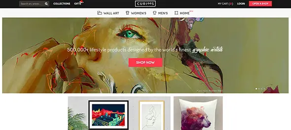
Curioos
Curioos is a platform that reunites exclusive art prints by the world’s finest digital artists.
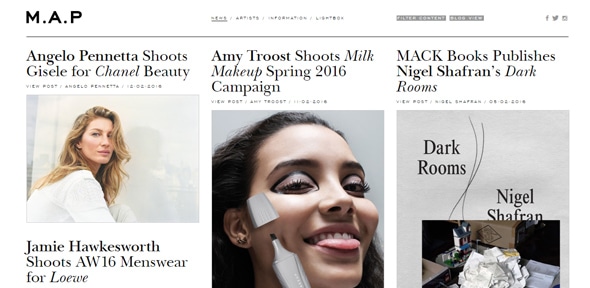
MAP
MAP is a website that showcases awesome lightbox galleries.
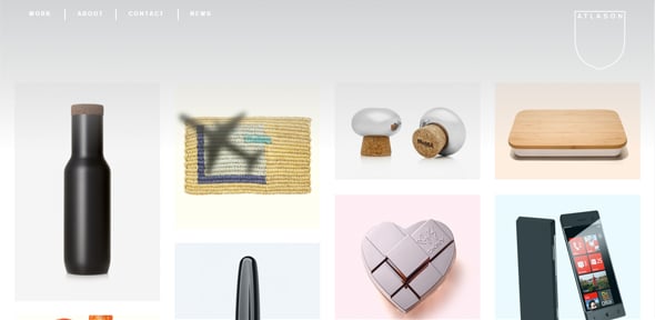
Atlason
This is a stunning examples of a grid style website with subtle colors and nice movement.
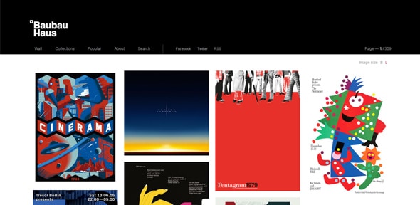
Baubauhaus
Baubauhaus is a collection of posters, illustration, typography and graphic design works.
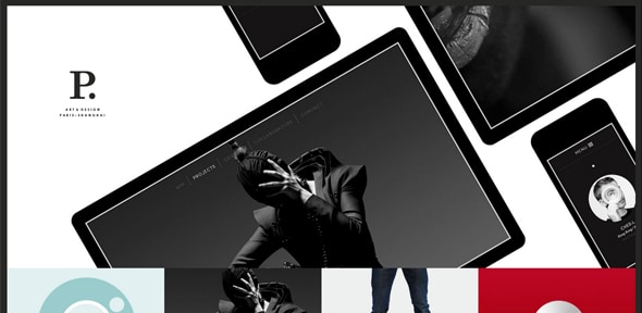
Pierrick Calvez
Pierrick Calvez is a typography artist and this is his website.
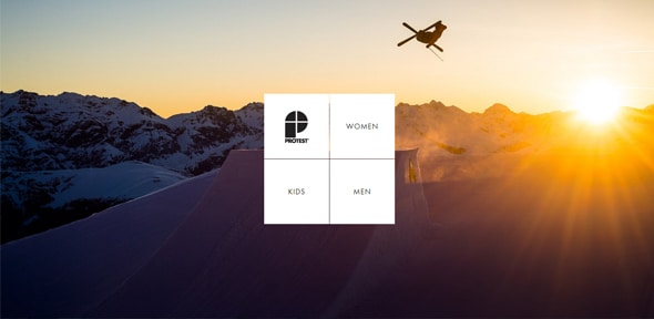
Protest
Protest is a design-led boardwear company from Holland founded in 1993.
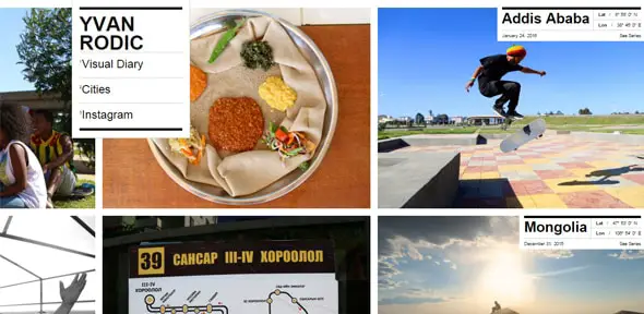
Yvan Rodic
Yvan Rodic’s website is based on big, colorful grids that show relevant photography.
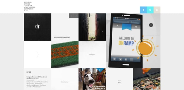
Rodgers Townsend
This website has a great grid style that creates a strong, visually appealing experience for its users.
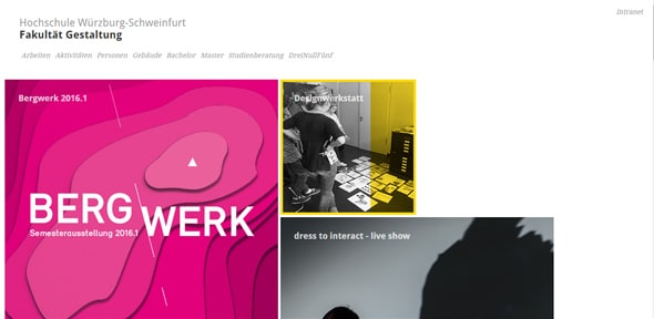
Fakultät Gestaltung
We suggest visiting this website to see a great example of a grid style layout design.
Heydays
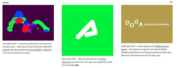
Heydays is a design agency that works with brands and big deas.
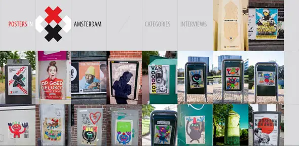
Posters in Amsterdam
Posters in Amsterdam is a very relevant example on how to present your images on grid style websites.
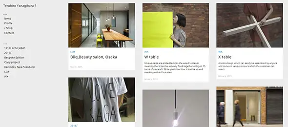
Teruhiro Yanagihara
Teruhiro Yanagihara is a Japanese artist born in 1976.
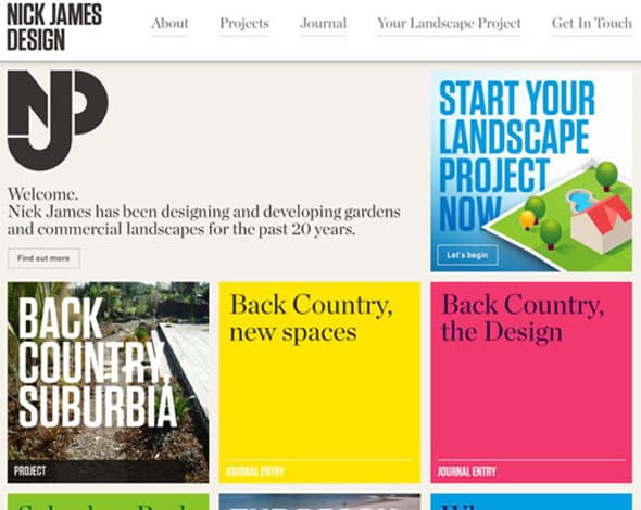
Nick James Design
Nick James is an artist that has been designing and developing gardens and commercial landscapes for the past 20 years.
Web Design
Here we have a cool example of a website that’s based on a grid style.
Natuurpunt.be Redesign Pitch
This website uses awesome photography showcased in grids to present its story.
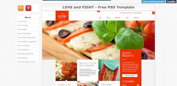
LOVE and FIGHT – Free PSD Template
This is a free PSD template for a recipe website that’s created using nice, square grids.
Great design
We suggest taking a look at this website design to find out how you can mix and match grids into your website layout too.
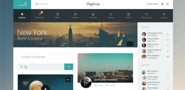
Wayfaring App
This is a project for an app design that looks both minimal and responsive.
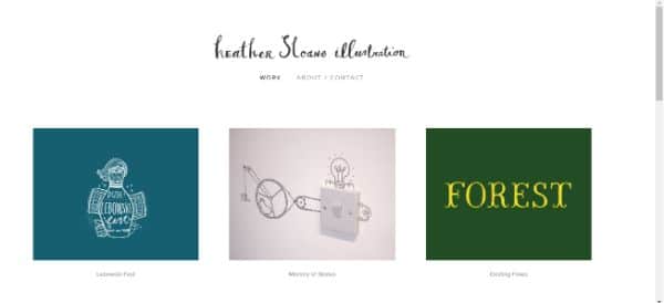
Heather Sloane
Heather Sloane is another powerful example on how to use colorful grid style compositions for your website.
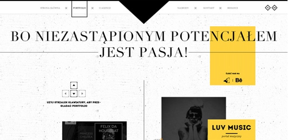
My new agency
This is another good example of how you can insert colorful grids on a simple background to create a powerful website composition.
Reiss – Sharp Suits: AW14’s Iconic New Tailoring
Reiss is a website where you can find stunning suits.
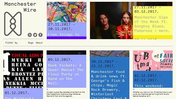
Manchester Wire
Manchester Wire is a website that hopes to keep you informed about the best things Manchester and the surrounding area has to offer.
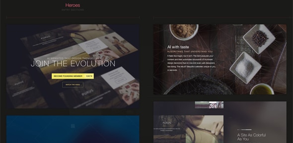
The Grid: FREE Website PSDs
Here we have a template for a website created using big, stunning grids.
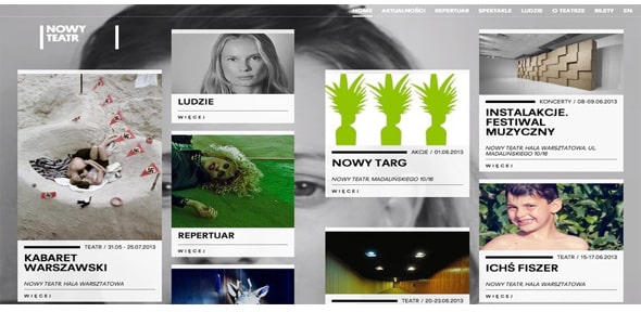
Nowy Teatr
This is another great example on how you can make the best out of a grid-based design.
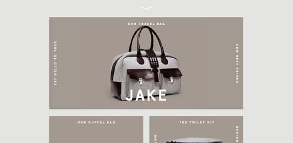
Other Stories Homepage
Other Stories is a website where you can find stunning apparel, shoes, gifts and accessories.
Smpl
This is a simple, clean Tymblr theme that’s based on a nice grid look.
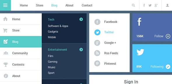
Blog/Magazine UI Kit #2
This UI kit is another great example of how you can insert grids into your designs.
Z Ballerini – Digital
This website is created using nice, tasteful grids that use only one main color.
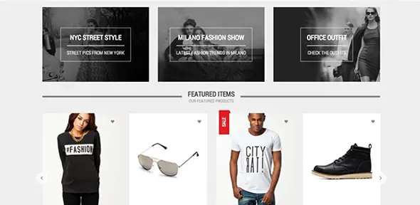
Oxygen – eCommerce Theme
This eCommerce Theme uses grids where you can showcase your products in a professional way.
Traveler Responsive Blog Theme
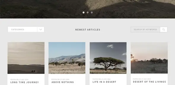
This is a great example of a fully responsive blog theme that offers a grid arrangement for posts.
NIXON
Nixon is a well-known brand of stunning watches and premium accesories.
IMDb design concept
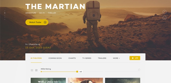
This design concept has a very modern look and is based on IMDb’s rating system.
Tripbox
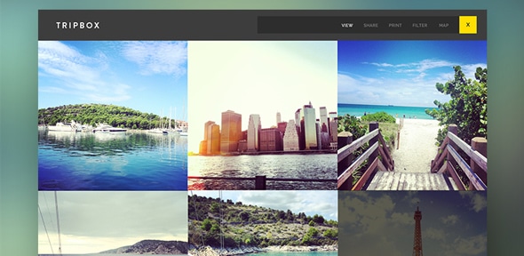
Tripbox welcomes us with a nice grid gallery full of stunning photography.
Pixar
Pixar’s website is full of colors and funny characters – all showcased on block color grids.
42 Angels
Another great example of how you can use grids and icons to create a stunning website.
Website design layout. Inspirational UX/UI design sample
This inspirational website showcases a great design composed entirely from grids of different sizes and colors that complement eachother.
This website features a background full of images showcased in grids that almost form a story.
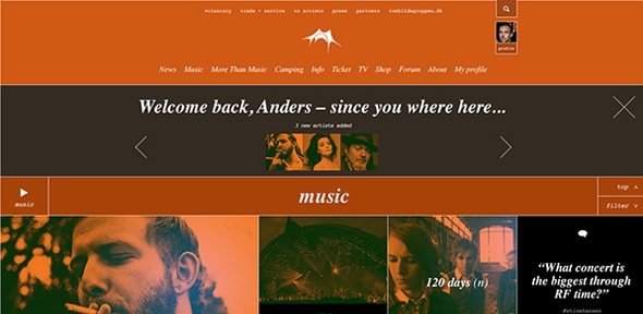
Roskilde Festival – Digital Platform —–
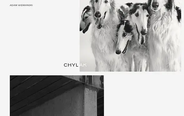
Adam Widmanski
Adam Widmanski’s portfolio website has a very minimal and simple design with big image grids.







Comments are closed.