Line25 is reader supported. At no cost to you a commission from sponsors may be earned when a purchase is made via links on the site. Learn more
Letterheads are a part of your essential stationery items, which reflect your brand and brand personality. You can say a letterhead is a more sincere and professional tool that carries all the important communication on your brand’s behalf. When a designer is hired to design a complete branding kit, he or she may not always put enough of the required focus on the letterhead because generally, the letterhead is designed with logo and as per the business card. Consistency of design is required, but that doesn’t mean you should not put effort into your letterhead designs.
Since a letterhead is on a page that your all of your connections would be seeing, it must also not fail your brand on any level. In this blog post, we have gathered some great letterhead designs that you can see for your inspiration and learning. These 17 fantastic letterhead designs are proving that a creative and unique letterhead can make a big difference. They are as follows:
1. MS Word Letterhead Template:
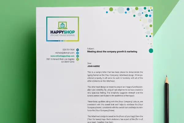
It is a beautiful design with attractive colors and layout. This MS Word letterhead design is a template, so you can use it directly for your designing purpose. It is subtle and eye-catchy with great color combinations and geometric shapes. You can see the header section is not horizontal in this design which makes it unique and creative. There are different-sized bubbles on the footer section and right corner, which adds more vibrance to the design. It’s a perfect design idea for creating a professional yet friendly letterhead design.
2. PIXFOX:
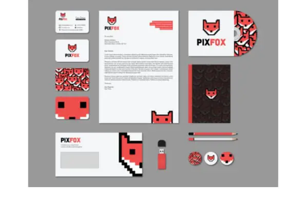
Can Timor is the designer of this letterhead. It is an excellent example for graphic designers. This letterhead is a perfect combination of simplicity and a modern approach. The logo itself is a unique design of a fox. So in letterhead designer has used bright colors with whitespace. The contact details are sitting perfectly with the logo. And the logo is also used on the footer side to fill the excessive whitespace. This way, you can utilize your amazing logo design to create fantastic letterhead designs.
3. Happy Holidays:
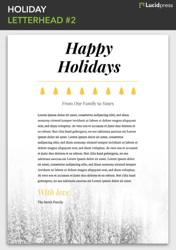
When it comes to creating fun designs for the entertainment and leisure industry, you get little advantage of boundaries. You can break the stereotypes and design a fun and eye-catchy letterhead. This happy holidays letterhead is a good example of that. Here they have used a picture associated with the holiday season and smartly placed it in a gradient style. You can see a straightforward header with a connective and unique footer section. These kinds of ideas can open many doors of creativity, and you can surely think of some great concepts.
4. Modern Law Firm:
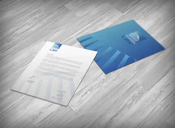
This is designed by Tugrul Ozmen. Here the logo design has a classic color combination of blue and white. And the designer has used the law firm logo in his letter design carefully. The left header corner has a logo, and the right footer corner is with contact details. You can see the logo design on the white space in opaque effect and which is filling the white space beautifully and making the design more communicating. It looks professional and classy, which is perfect for any law firm.
5. Dylan’s Barbershop:
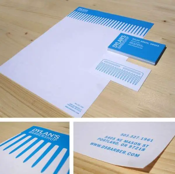
This lovely design is created by Lizzy Green. It is a simple, understandable, and attractive concept. The whole design is having only two colors- blue and white. The letterhead has a big comb design in the header section to emphasize the barbershop brand. One simple element with only required information is the essence of this design. A minimalist design can never fail the concept if you know how to use balanced elements in an interactive way. From the first glance, you can tell the brand’s core operation, and that’s what real branding concepts should achieve.
6. Unique Framed Letterhead Vector:
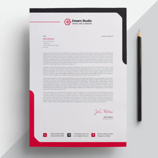
Framing in a letterhead is another element that can change the entire look. This letterhead design is from Freepik, and you can definitely use this for your purpose. It has a bright and all-time favorite color combination of designers. The white space is perfectly balanced with the red and black frame. The contact details are rightly placed, and the frame design is very attractive. The frame is not entirely covering the page; it is just for the lateral corners. You can use colors from your color pallet and create exciting frames to make your letterhead stand out.
7. Strong Yellow Letterhead:
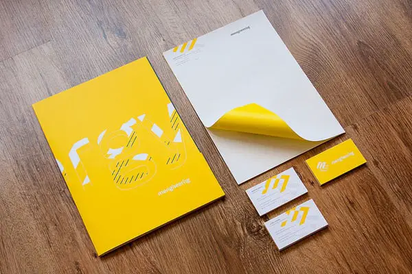
Keeping a letterhead plain white is a traditional concept. Nowadays, designers are finding exciting ways to include colors in the letterhead. Here this design has enough whitespace, but they have used bright yellow color on the page’s backside. After designing a header and footer section, if you include one of the primary colors from your brand’s color pallet to fill the backside, you can create something unexpectedly unique. It makes the letterhead design trendy and appealing.
8. Using A Signature For Letterhead:
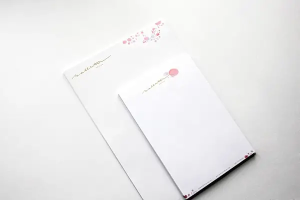
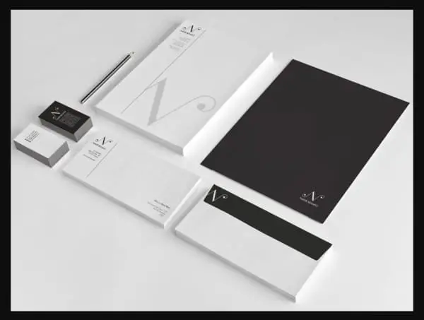
A signature in branding elements works really well to create a more personalized touch. In this design, subtle colors with a classy design go well with the header’s signature logo. These kinds of concepts are beneficial for luxurious, creative, or personalized products. Class and elegance come off just right when you send a document with this type of letterhead designs. It is one of the beautiful trends, and it is gaining popularity in some particular segments.
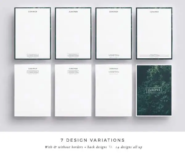
9. Juniper Letterhead:
Juniper is a unique example of a letterhead design of a reversed style concept. It is a template, and you can use it for any purpose. In this design, they have smartly used the image on both sides of the page. On the front side, you get a header and footer with a border of the image used on the other side. This gives you an illusion of letterhead on that image. So you can definitely use this idea to use an image for the backside and the border of your letterhead as well. It is a concept that would go for any sort of industry and brand.
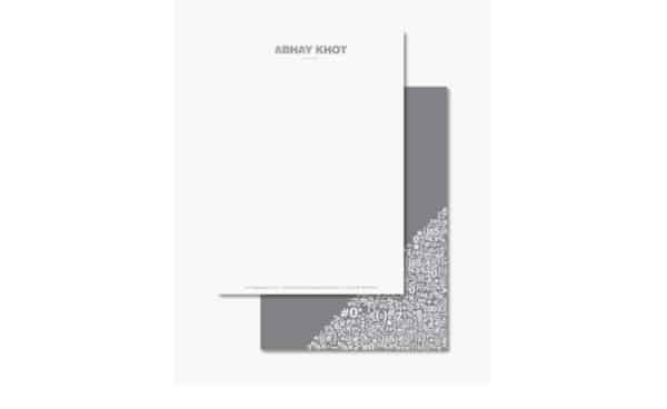
10. Creative letterhead concept:
This design is full of inspiration. The designer has used a very smart way to create a logo and letterhead design. It is for a tax consultant, and that is why you can see mathematical shapes and symbols in the logo. And the same has been used on the reversed side of the page. The design is reflecting the brand and its nature in a most straightforward manner. Here the letterhead is sleek, classy and the colors are also complimenting its brand category. It’s a complete package of inspiration for designers who wants to turn a formal or dull design into a fun and interesting one.
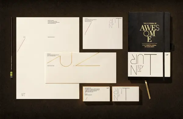
11. Turnstyle Letterhead:
This letterhead design is from the Turnstyle brand. And this exciting design worth mentioning for inspiration. From this design, you can learn that a logo design that is responsive and moldable for various purposes can really add some charm to all your branding elements. Here, this brand’s logo is very unique and interactive, and that’s what makes this letterhead design beautiful. If your design allows you to add some shapes and lines from the logo, you must find some creative ways to do that on your letterhead. And this classic and minimalistic design is communicating that very well.
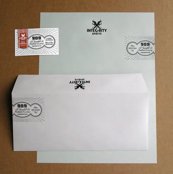
12. Innovative Typographic Letterhead:
This beautiful design is by Jared Milam. Typography is not just a supportive element of the design; you can actually make it a hero of your design, and this letterhead design is an excellent example of that. There are no attractive colors or modern layouts in this design. The logo and contact details are creating more of a vintage look. The contact details are presented here in a separate block with a traditional design. And that is why this letterhead is unique and attractive. With the smart typographic arrangement, this simple letterhead creates a noticeable impact, and that’s the essence of it.
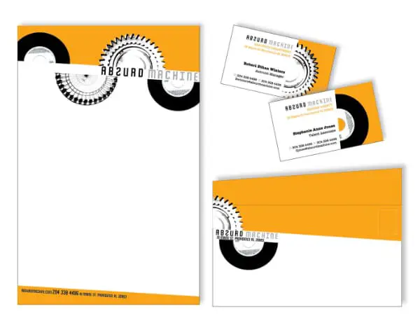
13. Absurd Machine Letterhead:
The absurd machine is a music and video production company, and this design is created by the designer Jessica Benz. in this design, colors and theme are totally justifying the industry. The logo and header section is well designed with suitable elements and placed in a more unique and fun way. Contact details are also placed in a slanted footer section. This design is not very loud or directly delivering some message. It looks trendy but professional as well. Entertainment brands sometimes prefer to keep things formal and straightforward, so in that case, you can add some relevant elements and take a unique layout to come up with a great design without any exaggeration.
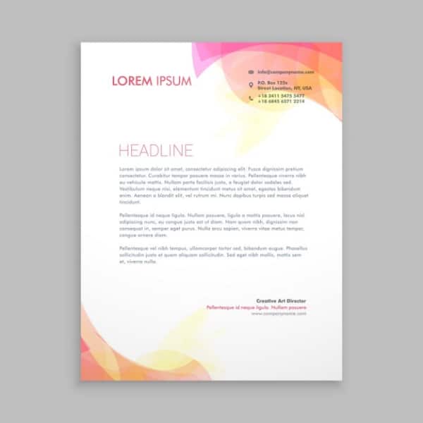
14. Colorful Abstract Letterhead:
This colorful letterhead template is modern and eye-catchy. A basic design concept with an abstract pattern can make your design rich and sophisticated. It works well in most of the segments, and it is a profitable way also. Here shades of pink, yellow, and orange on the two opposite corners adding a volume to the plain letterhead. And you get a suitable space for the logo and contact details. You can give your design any creative turn with this abstract letterhead because it provides a flexible canvas for experiments on a solid base.
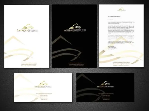
15. Embossed Gold Design:
Gold texture in designs proves luxury and trust. This letterhead design has a fantastic gold embossed theme. You can see the front page with gold shapes, logo, and contact details. And the backside has one of the best complementary colors of gold- black. This kind of color combination and theme works really well for luxurious and market-dominating brands. The gold shade is with a gradient effect, which gives the illusion of 3D, which is why this design is looking fabulous and creative.
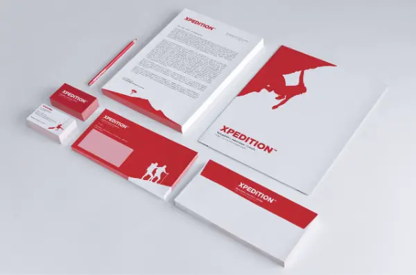
16. Interactive Design Idea:
If you are designing whole branding accessories, then you have the liberty to create an interactive format that is connected with each design. In this design, you can see the different silhouette images used in cards, letterheads, and other elements. It is a brilliant idea to paint a vast design concept in small parts. The letterhead designs here have a beautiful travel-related image in the footer section and logo in the header. You can see the minimalist approach through single color and silhouette image. This red and white design is definitely standing out because of its innovative concept.
17. Maximizing The Logo In Letterhead:
If your logo design allows you to use it in various places, then you should. Because a logo is a symbol of your brand and maximizing its use can really benefit the brand. Here, this design is very unique in many ways. The designer has not used the standard header and footer section. We can see essential information vertically placed on the left side and logo as a watermark. On the backside, there is a use of the logo as well. It is a perfect design idea of clever use of the logo on the letterhead. Adding a watermark and reversed side design can add more subject to your letterhead and help you to make it more creative and impactful.
Every branding accessory is representing the brand. And nowadays, there are lots of creative ways and tools that can put you ahead of your competitors when it comes to designing. With letterhead designs, you don’t need to come up with a completely new concept and format. Ideally, you might be using the core theme and logo design as a base of your letterhead design. But designers are becoming more intuitive and trying to inculcate many unique ideas into this for a better and attractive design.
You can come up with your unique concept, or you can experiment with anyone from the list as well. With the letterhead designs as mentioned above, you can understand what resources you have, for which brand you are working, and what you can do to make the letterhead design better and substantial.

