Line25 is reader supported. At no cost to you a commission from sponsors may be earned when a purchase is made via links on the site. Learn more
A website design is the last kind of project you would expect a designer to use pencils, pens & paintbrushes. Typically website designs are digital creations made from CSS code and web fonts, but designers still make use of handcrafted elements to add character to their designs.
Using handwriting in website design isn’t something new since most designers produce their first sketches as paper prototypes anyway. The handwritten trend has gained some popularity in the past few years because it adds a unique, custom-made feel to a website.
More and more designers have started to incorporate handwritten fonts in logos and websites, and we selected some great examples that teach you how you can successfully do this as well. These websites belong to various niches and use handwriting in different ways. See how you can use handwriting in website design as well by checking out our hand-picked examples below!
In today’s web design trend showcase, I round up a bunch of sites that feature hand drawn typography (or at least hand-drawn style fonts), to add a human element to the interface.
Do you want to create this awesome style yourself? You’ll need some cool handwritten fonts!
Kittie’s Cakes
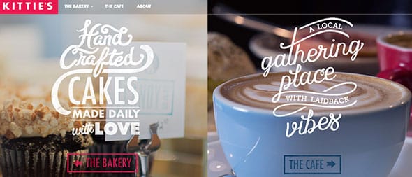
The handmade, hand-drawn trend is on the rise even in web design! We are starting to see more and more hand-drawn website designs each day! They look vintage, awesome and completely customized. Kittie’s Cakes website is a perfect example of how this trend has taken over web design. It has a wonderful way of presenting this business using photos and hand-drawn typography. The main page is divided into two parts, it has two different photos that mark the bakery business and the cafe. Each has its own representative photo and hand-drawn motto.
Miki Mottes
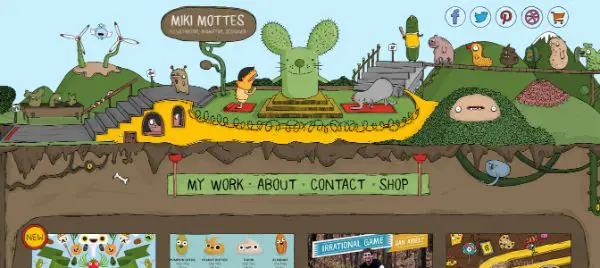
Miki Mottes also uses hand-drawn elements in its header to mark this company’s motto and services. This website looks elegant and can definitely grab visitors’ attention thanks to its impressive graphic elements, visuals and short films.
Island
Island is a web design agency’s website and they surely have an eye-catching design concept. This website is yet another good example of using hand-drawn typography to grab your website’s visitors’ attention. This style will add a more personal touch to any portfolio and also enhance your drawing/typography skills.
Cantilever
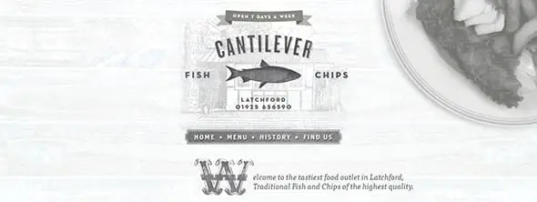
Cantilever’s website uses a monochrome light grey web design layout along with some nice hand-drawn typography. It also combines real photos with textures and hand-drawn elements with a vintage style.
Kyle Steed
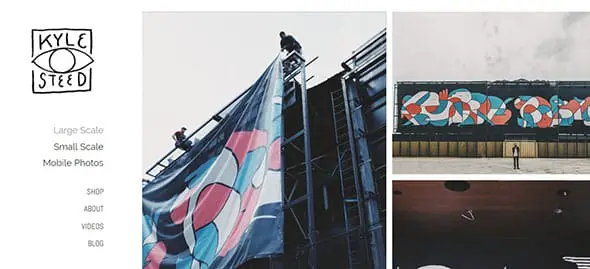
This website has an overall modern design but uses a handwritten font for its logo. It adds a nice, custom feel to the whole design. Kyle Steed mixes a vertical menu bar with a modular grid layout on which his hand-drawn logo definitely stands out. The logo is animated and uses hand-drawn elements. This website is definitely worth having in mind when creating a similar project. It looks wonderful and it can definitely grab one’s attention!
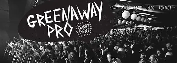
The Greenaway Pro
Of all the canvases available to designers and illustrators, websites designs are probably the last place you would expect to find hand drawn typography, seeing as web design at its core is very mathematical with interfaces crafted in code. This website focuses on presenting a charity event called the Greenaway Pro. It has a full-screen picture on its homepage with an overlayed hand-drawn typography.
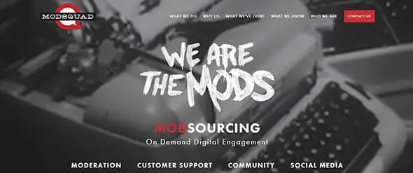
Metaverse Mod Squad
Rather than make use of web fonts and digital layouts, some designers express their creativity by using handcrafted elements in their work to add character to a design. Check out this company’s website for example, which uses hand drawn typography.
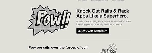
Pow
If you want to create a cute design, the handmade, handwritten style is your go-to web design trend. Pow uses some hand-drawn elements. The most outstanding one is the huge “POW!!” sign which has its inspiration in comic books’ typography. All in all, this website has a creative way of presenting content to its visitors. It is definitely an example worth following in future projects.
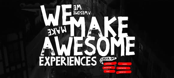
We Make Awesome Sh
With websites being built from digital code it’s difficult to imagine them being crafted by hand, but this website proves that you can combine both digital and conventional design. If you like huge hand-drawn typography then this website might be just the source of inspiration you were looking for.
Mellow Mushroom
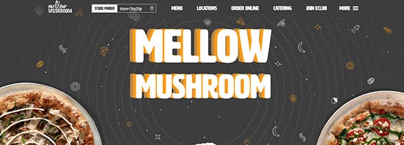
Mellow Mushroom’s website has a friendly interface design on which a lot of thought and effort was put into building it. It uses some huge hand-drawn elements right below the menu bar. It is definitely an example worth following as it may be a great source of inspiration for future projects.
Sharp & Savory
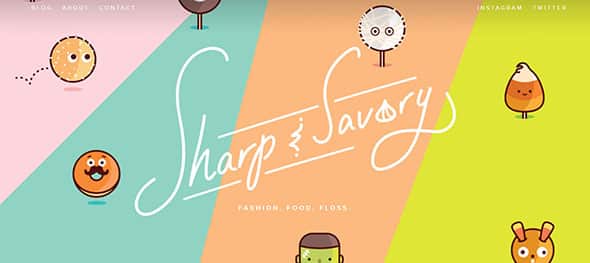
This website has a wild, vivid, colorful and innovative design approach. Sharp & Savory uses flat colors, cute graphics elements, and hand-drawn typography on its home page to make an awesome and eye-catching design. This website is a great example of using hand-drawn elements in a creative and dynamic way.
Tony & Jeanette
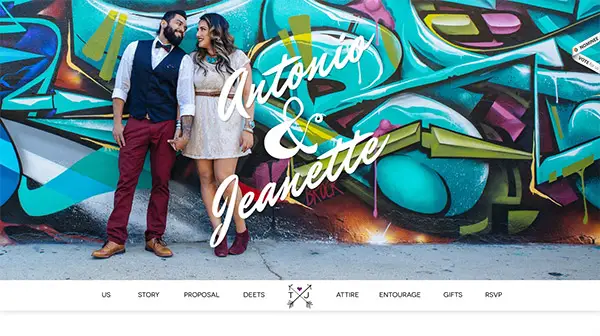
If you liked the previous examples then will definitely like this one as well. This is Antonio and Jeanette’s website and it uses huge hand-drawn typography overlayed on a huge representative image of themselves.
Denise Chandler
Denice Chandler’s website not only uses hand-drawn typography but also mixes it with doodles all the way down to the footer of her website. This website delivers a powerful message in a friendly manner and the font choice makes it feel more personal. The website is definitely worth following and a good source of inspiration for future creative projects.
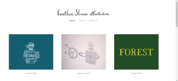
Heather Sloane Illustrations
This website uses subtle colors and impressive graphic elements to create an eye-catching website. If you will have a closer look at this example title uses hint of hand-drawn typography in web design, as in this case, in place of fonts, it boasts handcrafted typography to add a real artistic touch to the design. This is yet another good example that can serve as good inspiration for future projects.
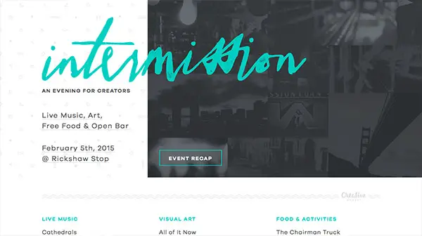
Intermission
Hand-drawing is a frequent skill of graphic artists, designers, and illustrators and is associated with creativity and inspiration. Combine it with contemporary techniques and you’ve got a recipe for success! This example uses a minimalist design with a white background and light grey typography. The company’s name and some of this website’s details, such as buttons and highlighted words, use a light blue color which blends in perfectly in the design concept.
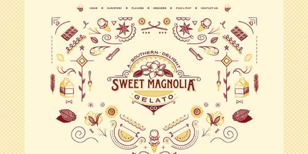
Sweet Magnolia Gelato Co.
Last but not least, Sweet Magnolia Gelato Co. has a wonderful and colorful website to promote her business. This isn’t your usual handwritten font style and because of its uniqueness adds a more friendly and personal vibe to the whole design. Make your handwritten elements truly unique if you want to stand out from the crowd, this is what this great design teaches us.

Comments are closed.