Line25 is reader supported. At no cost to you a commission from sponsors may be earned when a purchase is made via links on the site. Learn more
When given a choice of text and images to understand a certain point, many people choose images over text. Images have their way of capturing your attention and sometimes they give you thought or emotion which the text may be unable to do. You definitely have seen kids introduced to books which are more made up of images than text, as they find images more captivating. Though you may have been one of those kids who have grown up now, that natural element still lives in you, which makes you attracted to images conveying a story. Websites have to be designed in a way to have a pleasing user experience that is worked upon with people photography.
As we discussed above, users can be connected to the product only based on what can be relevant to them. And that is how people photography comes to the developers as the solution to improve user experience. People photography is frequently the best way to convey expression and emotions, be it any kind of product. In this article, we will list 15 tips on using people photography to improve your website’s UX.
1. Priority to Content:

Before adding or finalizing any images, make sure the idea behind the product is out there in content form. It lets you bring out the emotion and thought that helps you to find the appropriate images which define or reflects the idea of your product. As a fact, viewers/users tend to concentrate on the text-only for the need for information, what they get attracted to, is the image. So before the exact photograph comes to the platform, the content has to be ready. To pleasantly manage User experience, we take into consideration 2 things, i.e. users connect to the idea of the storyline is conveyed through expression and users only refer the content for information or once the curiosity.
2. Consider layout:
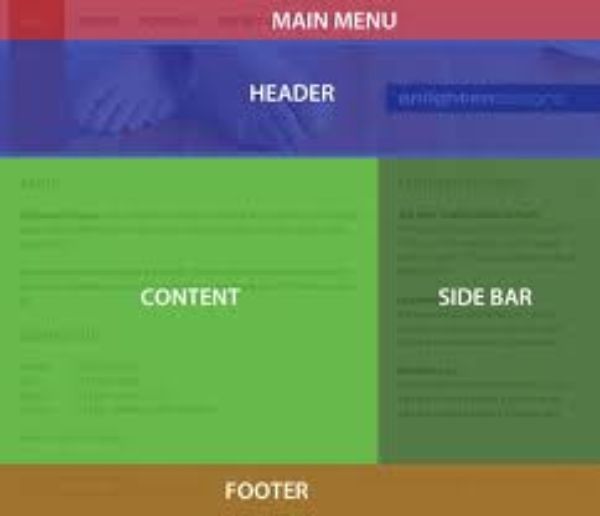
It is essential that before you find or click the perfect photograph for your product/service, always have your layouts defined. Ensure that the placed images and layouts are always aligned. It would be easy to place the photo, once the layout is final. The advantage of getting the layout prepared in beforehand is, the kind of background and colour combination we need in the photograph can be known and achieved. It helps in getting the photograph integrated with the layout as required. Make sure the layout leaves enough place for the photograph. The placements must make sure that once it designed with the photograph, should not look cramped.
3. Draw eyes to the object:

When the image placed on your website are people photographs based, make sure the object gets the attention of the person in the picture. It is a tendency to follow the gaze of the person in the picture. Always try to get the photograph that gives the subject its eyes. The subject and the object in the image may both have the point of focus. But it is made sure that the person in the image guides the user to focus on the object. The person in the photograph can present a text or an idea, not necessarily an object. The focus is guided by image to the user; then the result is obtained.
4. Be Specific:

The intention behind the photographs is to make your web design attractive and have a great user experience. To ensure it, the first thing that needs to be taken care of is to be specific about the photograph. Don’t make the image crowded with different elements that convey many ideas as it may confuse the user. Always be specific about what you intend to show.
5. Tell your story:

The only way you can stand out from the rest of the world and as well grab attention is by being unique. Every picture has to say its own authentic story, and that’s how the users connect to it. Using photographs of people let the audience know the idea behind the product or service in the best way possible. The main idea is to convey a story.
6. Show Real People:
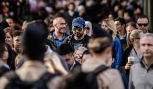
The best idea is to photograph real people with a real-life situation, and it helps to get in touch with every genre of audience. There is only one way to connect with the users by bringing the parts of their lives out there, reflecting in the images. The more realistic the photographs, the better connection. Use of vectors, cartoons and caricatures have been used and tested. Though it creates a fun element, what brings a human element is the smile, excitement and inquisitive expression of one. Nothing beats an expression in terms of making the whole user experience to the best.
7. Appropriate depth:

Did you ever find yourself going crazy over a flat photograph? If not, then never use it in your design. Whenever you decide to put a photograph in your design, make sure it has depth. Specifically, when it comes to people photograph depth is what brings the unsaid emotions and presents the idea. Overly lit and bright photographs which hide the freckles of the person in the image is not relatable. Human essence needs to be shown by way of those wrinkles and dimples. Only the proper depth in the photograph can bring out the sentiments. Isn’t it intriguing to find the hidden emotion behind those depths?
8. Relevant Images:
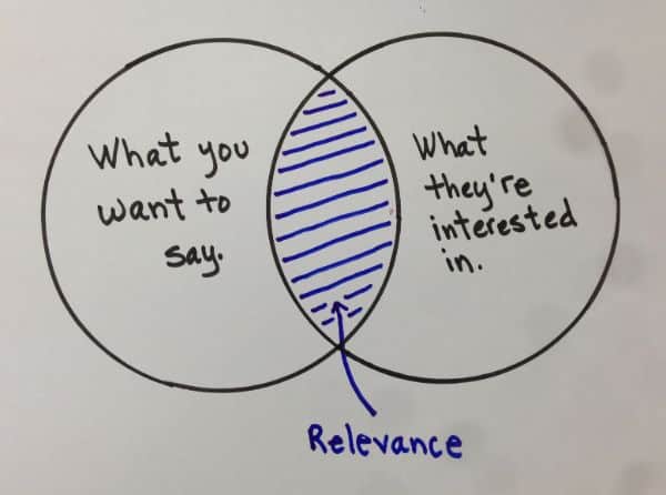
One of the forbidden things is using photographs in the design which conveys a wrong message to the user. It is mandatory to use an image which relates to the product not to confuse the user. Realistic photographs in the websites have their way of improving the user experience. Ensure you put a relevant photograph which conveys the product. When we say people photography gives an edge to user experience, it doesn’t mean abrupt photographs for the sake of it, won’t aid the intended result. On the contrary, the product should convey the idea behind the product with a relevant image.
9. Minimalistic Approach:
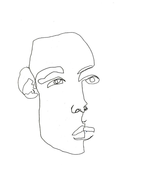
Whenever you are using people photograph in your website, make sure it is minimalistic in approach. This approach helps the photograph stand out and bring a meaning of its own other than the content. The content should not crowd the photograph in the design. The photograph has its way of bringing out the emotion by its natural way and say a story of its own. It gives space for the user to have a look at the image and read the contents. As a result, the minimalistic approach gives undivided attention and importance to both contents as well as the photograph.
10. Proper focus brings meaning:

Your photograph may have multiple people in it with objects that give the idea behind the product. If the focus is not on the subject, it makes no sense to the users. Point of focus brings out the concept spontaneously in a glance. The photographs should represent your product. The Keyline is whatever serves any elements for your product must have the point of focus in the photograph. If the person in the image conveys the idea of the product, and the focus is on other things, the idea goes to trash. When the focus is diverting, remember the user has not conveyed the exact message.
11. High-Quality Images:

Of the mandatory thing while using an image on the website is to use high-quality images. Take into consideration the design and website you are designing for and choose the image accordingly. The thing you have to take care while using a people photograph is that it should not get blurred whatever the device it be. Make sure the images you use doesn’t show pixels if it is not what you intended to show. Moreover, high-quality images give you better resolutions, even if you switch to alternative devices.
12. Chose images that blend with designs:
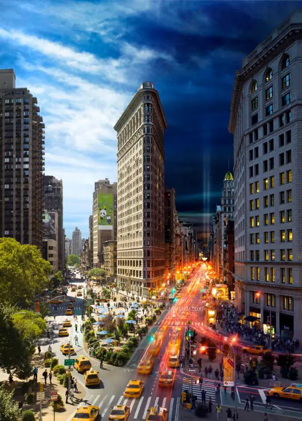
Is very necessary to make sure that your images are well coordinating with the design you use for the website. The suggestion is before going for the image, design and colours are decided to be decided. It lets the photograph gel in with the designs. It’s a must to get the images to blend with the designs to make the user experience to the next level. Firstly, when a website is in the process of getting designed, the colour code considered, which represents the product. Then it proceeds further. Lastly, it’s a must to get the design and colour to be aligned and also which gives way to the photographs to match.
13. Bring out the expression:

What’s the point of people photographs on the website without any expression? But even a poker face also sends a message. The basic concept behind using a people photograph on the website is to bring out the concept of the product by using an expression. So take care of what you want to send across to the user and choose an image wisely with the expression conveying the same. If you manage to bring out the expression, the result of creating the user experience is achievable.
14. Put out the emotion upfront:
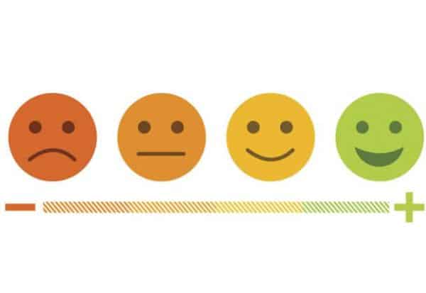
It is indispensable that a web designer must keep in mind before creating a website, what kind of emotion does he want to bring out from the user. The kind of emotion we expect from the user helps us to use an appropriate image. As a web designer, you may want the user to feel happy, excited or curious about the product. The emotion that we expect from the user is to be reflecting in photographs that are in the design. Hence, we should make sure for friendly user experience, we have to put out the emotion upfront.
15. Keep Visuals Intact:
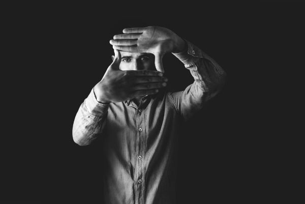
The photographs are focusing on the design on the website. You have to make sure that it doesn’t kill the visual effect. The reason for having people photograph is to enhance the user experience. At times, it is vital to keep the users also engaged with the contents. It is crucial to understand that photographs and content are not to be replaced for one another but to complement each other. Also, make sure your Call to Actions (CTAs) or other content are not overshadowed by the photographs. Eliminate every diversion that comes to your way in keeping the visual intact. Photographs, along with the content, can make the user experience worthwhile.
People photography on the website has its charm. The moment it comes to designing, it is essential that every aspect needs to be scrutinized and worked on. What is yet not realized in the design part is that photography, especially people photography, has become the core for remodeling user experience. Moreover, users tend to understand and accept specific ideas which are relevant to them by way of experience, and they look forward to connecting with the same elements. People photography in the websites does a marvelous job with that.
