Line25 is reader supported. At no cost to you a commission from sponsors may be earned when a purchase is made via links on the site. Learn more
Reaching out to the public is easier than ever before in our digital age, thanks to the internet. You may express your political ideas, connect with other thinkers, and generate cash for candidate campaigns by building a political website. A captivating website is required to establish a new firm, and a political candidate should have an engaging website to market their brand. A contemporary website is essential for any political campaign if you want to be found fast when people search for your name or political office, as well as increase your base of volunteers and supporters.
When you’re not a politician but are politically engaged and want to discuss it with others, start an online political group where members may express their thoughts, discuss important political events, or band together to achieve a shared objective or influence local political forces.
A website is a time and resource commitment, so do your homework to understand what you require before committing to a design or strategy. This necessitates understanding what attracts potential voters to a political campaign website, how your voters should engage with your website, and why you have a website in the first place.
A political website serves as the campaign’s public face. A badly designed website may make your campaign appear amateurish and call your candidacy into question. A well-designed political website, on the other hand, will inform your constituents about your campaign, your positions on critical topics, and how they can support you.
Your website must be simple to navigate for all visitors, regardless of internet knowledge. Consider how you want to structure your website before you begin building it.
All of the material you wish to include, such as the topics you want to address, your experience, and your history, should be organized into distinct parts or pages. Because internet attention spans are short, such sections/pages should be as brief as possible.
We recommend putting the most crucial information in the opening line or two of each section and restricting your pages to a few paragraphs.
Promote expertise
Whether you are a specialist in environmental concerns, crime reduction, or boosting the odds of small companies succeeding, you will want to establish a platform where you can tell people what you aim to do if elected. You will build your political brand and keep your people up to date on important subjects.
About Page
This page is firstly all about you, how much you’ve done, your achievements, and the experiences and challenges that have shaped you into the person you are today. Keeping in mind that most people aren’t concerned with you, but rather with what you can do for them or how your vote will benefit them, it’s important to link all of your experience back to the district, the concerns, and why you are the best person for the job. Be succinct, and triple-check your spelling. Check for any typos or grammatical mistakes. This is significant since errors make you appear inexperienced.
Engaging Images
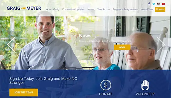
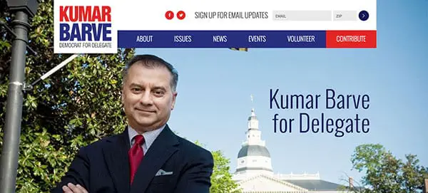
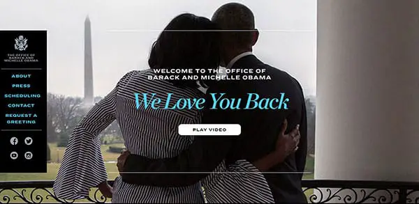
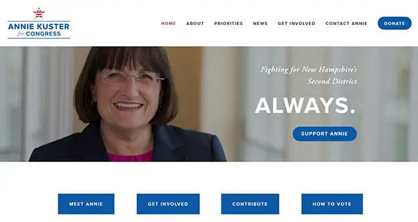
Candidates frequently populate their websites with headshots of themselves, but this isn’t the most effective approach to attract voters. While good shots of your face are required, you should also add images that people may relate to. We recommend including photographs of you with your family, as well as photographs showing you chatting to voters or participating with your community.
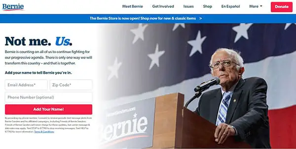
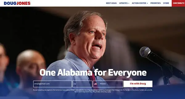
Choosing pictures for political websites necessitates a unique strategy. People’s pictures pique the interest and sympathies of website visitors. Given that the goal of a political campaign website is to help voters identify with a candidate, virtually all political campaign website designs include photos of people.
Search Engine Optimization (SEO)
If voters want to discover more about you, one of the first things they’ll do is put your name into a search engine. What will they discover? It will be quite tough to appear in those search engine results if you do not have a website.
Take note of your page titles. Make certain that they are significant. Mention your state or town/city on the website regularly. This will assist search engines in determining your location.
Use your website’s blogging option to generate as much material as feasible. Search engines prefer sites with a large number of dynamic pages.
It’s not very engaging if your website only has three pages and never updates. Get as many backlinks as you can. This entails requesting that other websites build links to yours. This might include your local political party, like-minded blogs, media websites, and campaign supporters. These links are one of the most significant criteria that search engines examine when evaluating various websites: the more links that lead to your website on the internet, the higher you’ll rank.
Social media integration
Your campaign website should include connections to your social media sites, but it should also go a step further. Find a website builder who incorporates your social media postings within your site, allowing voters to scroll through your most current posts without leaving your site. This tool may be quite useful for increasing engagement between your website and social media accounts, and it is ideal for displaying the community the buzz that your campaign is producing.
Add Polls, Events and signups
To organize your political campaign more successfully, solicit feedback and conduct surveys. Plan meetups and conferences, publicize volunteer opportunities and invite supporters to major events. Use private or group messaging, as well as live chat, to communicate with your supporters, sponsors, and volunteers.
Make it simple for those who wish to help to sign up for your email list and volunteer opportunities. Furthermore, your backend should be configured to seamlessly integrate new sign-ups into your list and segment them so that you may connect with them depending on their interests. Another important aspect of this process is making it simple for users to unsubscribe from your list if they so want.
How Long To Make Your Website Bio
There is really no right or wrong choice when it comes to bio length. It ought to be long enough to convey your thoughts but not so long that it takes days to read. The longer your bio, the more imaginative your on-page design must be. Images, bold headers, quotations, and other visual elements should be used to break up long blocks of text. If the reader has made it all the way to the conclusion of your bio, there’s a high probability they’re interested in what you have to say.
Educate without overwhelming
Political campaign websites must describe a candidate’s agenda in sufficient depth for people to grasp without overwhelming them with the material. Even if you have a lot to say about your position on an issue (and you should! ), powerful text layouts will improve the reading experience.
You may make voters’ life simpler by giving information on how to vote for you, in addition to teaching them about yourself as a candidate. Finding out how and when to vote isn’t always as simple as it should be, so having a page on your campaign website that gives people the following information will boost their opinion of you as a candidate and make it simpler for your supporters to go to the polls.
Have A Responsive Website Design
Because mobile devices account for more than half of all internet traffic, your website design must be mobile-friendly. It will also assist you in ranking better in search results.
There are plenty of political WordPress themes out there that offer both landing page design options and blog options too. These will save you the trouble of messing up anything visually.
Choosing the incorrect font or employing unappealing headlines are two common blunders in website design. To prevent these mistakes, use a portion of your marketing budget to employ a competent web designer or an agency.
Incorporate white space
Political websites must transmit a large amount of information in a short period of time, such as campaign updates, how to become involved, and the candidate’s program. Remember that white spaces between parts of text make the material easier to understand for site visitors.
Colour that matches your brand’s colour scheme may also be used to split off sections or signify a shift in content. However, white space is still the finest weapon available to a political website designer when it comes to breaking up dense, nuanced stretches of content that visitors to your website will require a minute to digest.
Set up web analytics

What you don’t measure, you can’t manage. That is a well-known adage in the business world. You may believe you have more important things to worry about than evaluating your site traffic, but it might come in useful if you’re advertising. It will allow you to track how much traffic you receive via email, Facebook, Google, newspaper articles, and so forth. It will also tell you which pages on your website are being visited. This will give you a sense of which issues are most important to voters.
Ending thoughts on making a political website
Political activists are sophisticated readers who use the internet first, whether they’re researching politicians or shopping for a car. Online, first impressions matter and they may be the difference between a few volunteers and contributions or a person leaving your site in anger and pledging to vote for your opponent.
Maintain simplicity above all. Political websites do not have to be difficult to use. With only a few easy pages, you’ll be able to convey your message in a clear and consistent manner. Political websites should adhere to the same standards as other websites, including easy navigation, consistent branding, and eye-catching high-definition pictures.
However, while designing a political website, keep in mind how you will handle key elements such as your problems page, donation forms, and candidate identities. Political websites make smart use of design fundamentals to help you rapidly develop a modern website that will capture the attention of voters.
