Line25 is reader supported. At no cost to you a commission from sponsors may be earned when a purchase is made via links on the site. Learn more
Websites are like our second home. A website works as your online image and is judged upon harshly by your users. This is the reason that making a great design for your website is very important. However, sometimes the websites really don’t look how they should, or how you originally envisioned them after they are coded from design into live sites. Following are 20 examples of bad website designs which would help you to avoid such mistakes in your website creation. Some websites made it to this list because their design elements serve no purpose, while others are so user-unfriendly that we had to include them. Please note that some of these websites are very well known. “Bad design” can be quite subjective, so before you leave comments disagreeing with our list, please keep that in mind :) If you have more websites to add, or want to comment on anything written in this bad website designs roundup, please don’t be shy to comment below.
1. AIRINDIA:
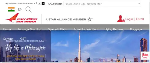
We very well know that too much of something is bad for us, mentally and physically both. This same goes for everything in the world, all and around us. The website is overcrowded with content and information, which makes it look average and confusing in every way. The title of the page is not measured and aligned as per the website fundamentals as well as the layout of the website is not designed well; this is the reason it all goes bad. The website does not follow any theme, which makes it all look visionless. There are a search button and toll-free number right at the top, intended to help the visitors, but the display makes it look all messy and unorganised. Also, the typography used on the website is entirely different on every page. The basic pointers in the website are missing, which makes it rank first in the list of bad website designs to check for.
2. ELEPHANT MEDIA SD:
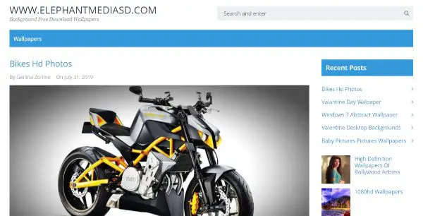
Elephant Media SD is designed for the sake of designing. It is a website for background wallpapers, the art created by various artists. The website is created by a layman who is unclear about the mission and vision of the owner. It has URL of the website as the title and logo of the website, which is the first No! No, when it comes to design segregation. The search bar on the top serves no purpose until the users are not informed about the main aim of the website. It does not have page breadcrumbs on the top or in the footer, which makes it difficult for the users to navigate through the website along with knowing the available information on the same. It would gain no SEO benefits, as there is not a single thing designed as per the Google algorithms and ranking schemes.
3. SHILLINGTON EDUCATION:
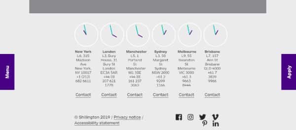
Shillington Education is a great one-page website, crowded with several elements on the home page itself. It is a multi-purpose website providing designing courses on the same platform. There are no page breadcrumbs on the top, making it difficult for the users to understand the purpose and mission of the website. It has a full footer which shows different time zone icons for NewY ork, London, Sydney, Melbourne etc. Also, the social media icons are not well displayed, which makes it look messy at the end. The website has low loading speed and is not very responsive.
4. INDIGO:
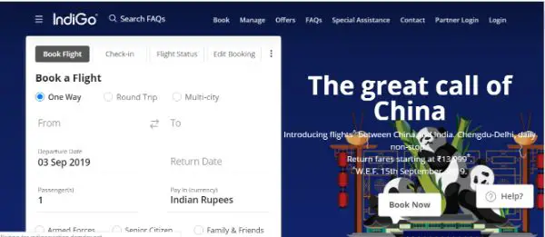
As soon as we enter the website, we find too much content and information which is almost impossible for our mind to accept and remember. The designer has tried to infuse all the information considering it all-important, which surely it is, but is not going well with the design structure. The call to action icon is too big for the first look of the website and also acquires a lot of space, leaving no space for other relevant information. The offers are displayed on the right-hand side of the website, in white; not visible to the users due to the background, jam-packed with colours. It is a very great website with an ultra-long and choking footer. The website is not constructed keeping the SEO and search engines in mind, which makes it challenging to rank on the top, in spite of having relevant content on the website.
5. IRISH WRECKS ONLINE:
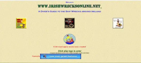
Irish Wrecks is a small one-page website. The purpose of the website is to provide guidelines about wreck shipping to the Ireland shipping industries. It is a simple website with no menu bars or any form of icons on the page, except for the awards and advertisement section. It has three bars on the website which has broken links and hampers the user experience and traffic on the website. The lack of About Us page or other information about the company leaves the user searching for more details. At first glance, it is considered as a mal-practised website to the users and would divert them immediately.
6. SECURITIES AND EXCHANGE BOARD OF INDIA:
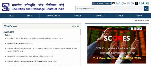
Securities And Exchange Board Of India is again a perfect example of bad website design. The website is over-crowded with content, making it look all untidy and messy for the users. The website has very poor user experience, and it is challenging for the users to get any information which he or she is looking for. It has a live news button flashing on the top, which makes it even more difficult for the users to track the news in the first few seconds, leaving the user feel irritated. The footer is unsegregated and filthy due to lack of proper structuring style.
7. STACK EXCHANGE:
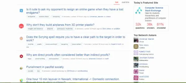
Stack Exchange has an awful start. It states about the Question and Answers of the community on the top of the homepage, which should ideally be inside expertise or speciality section under the page bread crumbs or menu. As soon as we scroll down, we see an entirely separate part of FAQS that long till the end of the website. The website has a slow loading speed compared to other websites, which make the website bounce back rate very high.
8. STUDIOMIX:
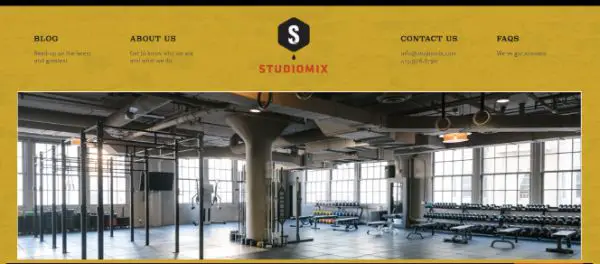
StudioMix is a medium-sized gym work out website with a forte in San Francisco. What brings it here in the list is the cumbersome call to action as well as tangled footer of the website. The design changes the entire purpose of the website as instead of showcasing it as a health knowledge-driven platform; it is entirely portrayed as an advertisement platform. Also, alter to Alt Tags, the content is displayed in the written form under the page bread crumbs, which makes it look awkward as well as take away space for important information.
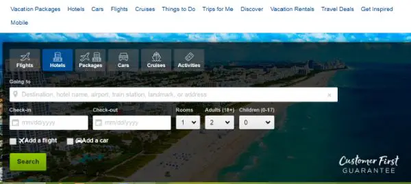
9. HIPMUNK:
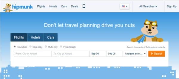
Hipmunk is a short one-page website. It is a luxury travel and logistics company, providing deals for best hotel, flights and cars during travel sessions. The layout is not at par with the others in the market as it showcases the call to action form, as soon as the user enters the website, leaving no space for discovery and understanding the company and its services in real sense. Also, it has a testimonial section in the middle of the website, which again makes it look like the website is just focusing on conversion and not for providing relevant information to the users.
10. CARTE NOIRE:
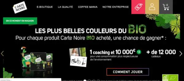
Carte Noire is an e-commerce website which is focused mainly on selling and not on user experience. It serves a very bad user experience due to the heaps of information and images on the website in the form of actual pictures as well as background images. The typography of the website does not go hand in hand with the layout of the website, as there are different kinds of fonts used on a single page, which makes it confusing for the users as well as search engine bots to crawl and index the website.
11. BH COSMETICS:
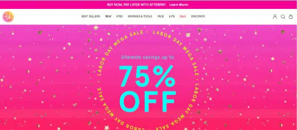
BH cosmetics is a short one-page beauty website which focuses on the selling of beauty products as well as providing information regarding the usage of the same. It has a very eye- hurting flash up, showcasing the ongoing season sale. The colour and typography of the website should complement each other, which is a different case in this website design. It also has a bad interface design due to the selection of flashy images and uneven font size on every page.
12. GATES AND FENCES:

Gates and Fences were built by an over-enthusiastic person who wanted to infuse all the information of the world under one roof. It is a website which provides gate building and fence building services for home and offices. The main reason for it being here on the list is the excessive content on the website. It does not have a specified menu or page bread crumbs to help the users navigate on the website easily. The contact details are displayed right on the top, which hides the name of the website.
13. KAYAK:
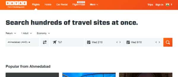
Kayak is a company associated with booking.com and caters to providing travel services to the visitors. The content is excellent but is not highlighted due to the construction and layout style of the website. The call to action bar flashes right on the top of the website, which takes the users directly to the checkout options, leaving no time to explore other services on the page. It is also not too responsive.
14. MY US:

The website has major white spacing issues which bring it to this very list. It is full of information but is not segregated well, which makes it look all cluttered and nasty. The typography used on the website varies in size and shapes at every level, makings it confusing for the crawlers while indexing the important content. It is advisable to use heading tags at every stage to help the bots to crawl and index your website for ranking purpose.
15. TRAVELOCITY:
It is a very great website, providing travel tips and packages to the customers who plan to travel around the world in the cheapest possible way. The motive behind the website is good but is destroyed by the construction and layout of the website. The call to action menu occupies the entire front page space of the website, hiding the other relevant information. The icons used are too big and occupy most of the area for irrelevant details.
16. BLUE HEAVEN COSMETICS:
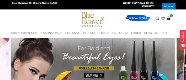
The interface of the website is smooth and exciting. The only reason which brings the website here in the list is the long list of bread crumbs on the top of the page. It is good to provide information, but it is also advisable to cut it short into different sections, which will make it easy for the users to navigate. It has a call to action button at every stage, which makes it look a little promoting kind instead of a simple e-commerce one.
17. GRACE FELLOWSHIP:
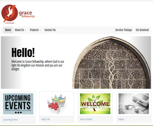
Grace fellowship is a small one-page website based on the mission of helping the community in their motivational genes. The website has less content compared to other websites but has too much white space, which gives it a scattered look. The typography of the website is very poor compared to the overall construction of the website. The lack of information on the page increases the bounce-back rate.
18. MINISTRY OF ELECTRONICS AND INFORMATION TECHNOLOGY
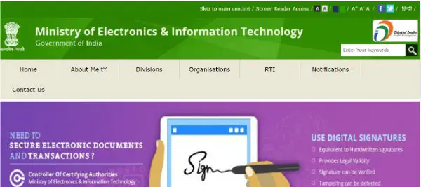
The website is too colourful and informational, which makes it look gaudy to the eyes to the users. The live update animation on the website hampers the usability and user experience of the visitors, making them divert to other platforms for the same information. If this is optimised well, the website is quite informative and can work wonders for the visitors.
19. ST. PETER’S BASILICA – VATICAN:
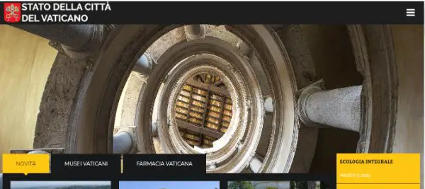
The website has illogical reading areas which make the readability and accessibility ratio quite low. Also, the interface is poorly designed, making it an average website in the eyes of the crawlers as well as visitors. It is also not too responsive, which increases the surfing time of the users without gaining any extra information to their requirements.
20. HAGIA SOPHIA:
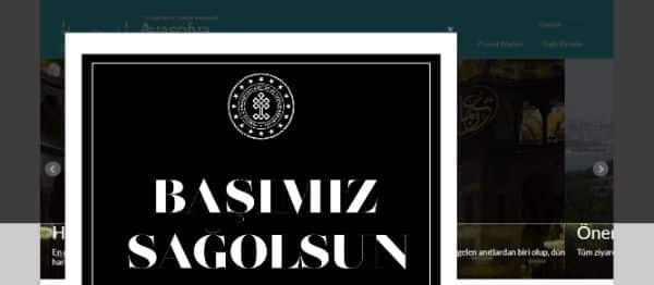
The huge pop-up in the very first goes hides the primary information on the website. The website is designed for tourists and can be accessed in multiple languages, but the website is not well structured, which makes it difficult for users to navigate. This consumes a lot of time of the users as well as the crawlers, which in turn increases your crawling budget.
Now, as you know how bad designs end up, we are sure you will follow all these proper measures before creating a perfect website for your clients.
Comments are closed.