Line25 is reader supported. At no cost to you a commission from sponsors may be earned when a purchase is made via links on the site. Learn more
Unlike the traditional under construction pages from the early days of the web, a coming soon page can nowadays prove to be a handy tool when launching a new website.
If you plan on launching a new online business, you have to think about social marketability. For having a successful business online it helps to let people know what it is you are doing, even before you actually launched your product or services. How can you do this? Easy! That’s when coming soon pages come in handy. They will help you market your business even before it is actually available to the public! You can catch leads and gain social media followers before your business is actually live.
Forget yellow hard hats and flashing signs, let’s take a look at what benefits can be seen from some of the best coming soon pages! These coming soon page designs have unique approaches and concepts which will surely inspire you to create your own awesome coming soon page! Also, learn what you should include on a coming soon page in order to make it more effective and let it help you in your marketing efforts, even before the website is actually live.
Please note that the coming soon pages examples we’ll showcase below may not be visible live on the websites because the websites are already launched. However, you can see how they looked like in the photos below. They will surely offer you the inspiration you need!
What’s a coming soon page?
Coming soon pages are in essence a teaser for what is due to come once this fabulous thing has been finished. So it’s important to give an insight on what the site-to-be is all about. They usually have a design which matches the company’s branding and also some other key features, such as newsletter subscription form and social media buttons.
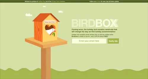
Develop a brand from day one
One benefit of placing something on your domain is that it gives the opportunity to develop a logo and brand that can be embedded into the minds of your viewers before the final site is even live. This is very important and makes your business easy to remember. See the example below! This coming soon page has a large logo and a simple footer which has the purpose of catching leads. It’s simple but effective – pretty much everything a coming soon page needs.
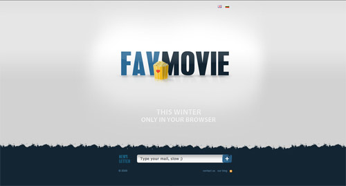
Provide email notifications or signups
It’s no use posting up an awesome coming soon page, but not providing any way of following up. It’s more than likely the viewer will have forgotten all about it by tomorrow, so being able to say ‘Hey, the site is now live – Check it out’ is super important. That’s why many coming soon pages offer newsletter subscription forms. Make sure you email the new followers right away or soon after, to give an update on how the site is going, or otherwise they’ll forget they even subscribed in the first place and you may end up with lots of unsubscribes or spam complaints.
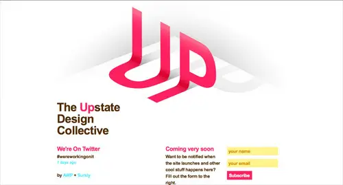
Go to town on the design
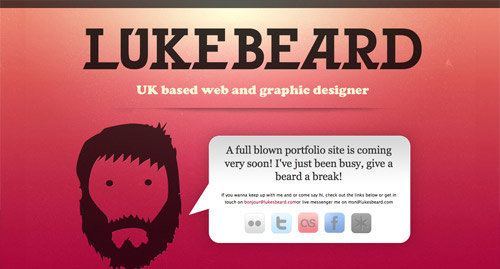
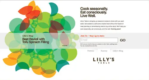
It might only be a temporary placeholder for what is coming, but this doesn’t mean it shouldn’t be given the same amount of time and effort as the completed site. Creating something interesting and enticing will help generate interest. Do this well enough and you’ll capture a few ‘Oh, this actually looks pretty good!’ sign ups. This will increase the interest for your business and you will be able to collect even more emails! Take the websites below as an example! They are simple, yet beautifully created.
Do something fun or different
Coming soon pages aren’t anything new, there are thousands of them out there already. With this in mind, it’s important to make yours stand out. Do something unique or fun. People share stuff they like, so give them a reason to pass on the link. Be creative! These coming soon pages examples can inspire you!

Email isn’t the only method of communication in today’s world of web. Social networks are important tools for communicating with users. Sites like Twitter and Facebook will allow viewers to learn more behind the scenes of the website. This way you will be able to gather some new followers, even before your business is actually launched! Make them visible and even encourage visitors to follow you on Twitter, Instagram or Facebook to find out more about your site.
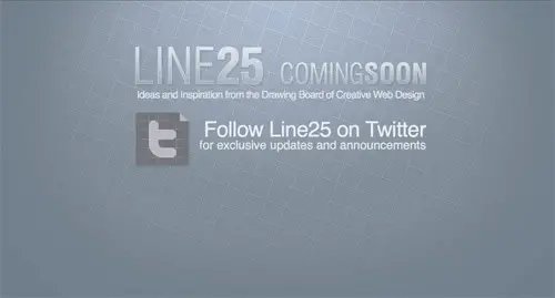
This was the coming soon page design for our website, Line25. It was simple and with a pretty straightforward call to action message – Follow us on Twitter! It worked! We managed to gather lots of new Twitter followers even before launching the site. This helped us a lot after because Twitter was our main source of traffic at the beginning.

Thanks for the guidelines – it definitely. helped to inspire us into giving our clients “coming soon” page a face-lift.
Helpful post
The watcher’s one is nicely done. Thanks for sharing!
The dialedtone’s one is also great. I can’t believe the coming soon page could be this creative.
wow.. i never realize that a coming soon page could be so fun…
Well with such creative designs at hand, why should one settle for boring “coming soon” pages? These pages are creative snippets of what you can expect from a new website…. Silver Back, Creative Zoomla and Squid Chef are my personal favorites in the above compilation.
Chris, what is your “comming soon” page?
An awesome collection; thanks Chris.
‘Coming soon’ pages are so different to what they used to be – much more interactive these days. I especially agree with building a brand from day one – consistency, consistency, consistency when it comes to branding.
Adding little pieces over a period (if done correctly) can also build anticipation, and keep the site in the minds of visitors.
Great find Chris.
Thanks for sharing!
Very inspiring!
Providing email notifications is a great idea.
Thanks for the feature. It may be of interest to know that the Lilly’s Table copy is randomly loaded from a few different version and we’re tracking newsletter sign-ups based on each version of the copy.
Built this one awhile back.
Wow.. some nice designs!
Amazing collections, I like the idea on the email notification
thanks for the include chris!
and great article, keep’em coming
I couldn’t agree more on the importance of a well designed coming soon page. Your marketing launch and your product launch are very different beasts. Get a coming soon page up ASAP (heck, before development starts) and start collecting email addresses of people who are interested in your cool new product/idea.
kewll..
Great article, thank you for sharing some very good ideas!
I especially liked the big newsletter signup that took most of the page…you def know where to do it…thanks
Great list.. thank you very much
This is like a movie teaser trailer!
Can’t wait to see the full-blow motion picture
Very inspiring list!
I didn’t find the hidden jParallax gem on the silverback site.
Great list of “coming Soon” pages. Design are really awesome. Thanks for sharing this nice post.
Thanks for posting this. It was very difficult for me to create a “Coming Soon” page for my site but got one up.
These are awesome pages, really love looking at other designers works for inspiration. Look forward to the next post!
Great post! Love the different styles!
((awesome article! Thanks!))
Great article as ever, some really inspiring pieces.
Amazing collection! My personal favorite was that of UP, others are good too. Never noticed the web pages of coming soon sites before but your article made me aware of them, thanks.
Nice post Chris.
With regards to CMI Web Studio and Michael Flarup, I think you have to judge the situation and more importantly your target audience as to whether a coming soon page is necessary. In general if you have a service of product you want to build up anticipation for its a great idea.
Unique post though Chris, thanks.
all unique design.. really nice
This is great information – thanks for the diverse examples! And I agree, all communication counts towards brand identity, from word/image one.
Best tip… don’t use a coming soon page. People don’t want to see a Coming Soon page anymore than an advertisement, and unless you’re a major organization, people don’t want to provide an email address to a website that doesn’t yet exist. Save your time and finish the work.
Wow, you couldn’t be more wrong CMI Web Studio.
Having a coming soon page is good for several reasons. You drum up page rank and incoming linkage so that you don’t launch from scratch. It’s also a good way to strike up some early hype of a new product or service. If it’s cool enough, it will spread when dropped the right places. And you’re dead wrong on people not wanting to give up their email addresses. We got more than a 100 signups on our holding page within 48 hours of launching our little coming soon page.
If it’s interesting enough, a coming soon page is an excellent tool in gathering early info about your visitors, getting them to sign up for your newsletter and generally just generating SEO Juice.
I agree with Michael. When a company hires my company it is my job to figure out why people are interested in them and what they have to offer. It may be true that people don’t want and advertisment but they do need things to help them. Don’t advertise – simply show the value of what your clients have. You shouldn’t need more than a page to do that.
Steve Jobs once said ‘if a hot dog vendor doesn’t understand your business plan then you don’t have one’ – keep the message simple!
Some times for clients we put up a simple (unbranded) wordpress blog so our clients can communicate – this works great for SEO. I know it isn’t a Splash page but I just wanted to offer the idea.
Regards
I disagree. A coming soon page is an advertisement for your company as opposed to an advertisement for your Web Hosting Company.
There will be a coming soon page while your site is bring developed, it may as well be for your company.
Chris, thx for featuring SquidChef :)
Excellent post Chris. Some great examples.
Actually just launched a coming soon page myself today for a client.
That’s a great idea. I love the designs you put up there.
This is a wonderful recopilation. Great ideas, full creativity.
still working on my own new company website. currently has just my business card in it, embedded in the new company color scheme. I should use some of the tips in this post. the ‘teaser’ in particular.
Cool post Chris! Some of them are really tempting! :)
Great post, well done! I was tempted enough by some of the pages to join a mailing lit or two…
A great post to the often overlooked aspect of design – design limbo. I love all these ideas. Also a good collection & inspiration of solid branding. Creative Joomla made me laugh. and I bid farewell to the days of under-construction Gif’s (tear)
Great examples. I agree with the importance of including good, creative design even if it is just a temporary page. Great way to start the branding of the site.
creative inspirations.
Great article, it’s really nice to see some out of the crowd designs here ^^
wonderful article, thanks for sharing.
awesome article , cheers for the include dude
Good stuff Chris! The watcher page is really cool. Thanks for sharing :)