Line25 is reader supported. At no cost to you a commission from sponsors may be earned when a purchase is made via links on the site. Learn more
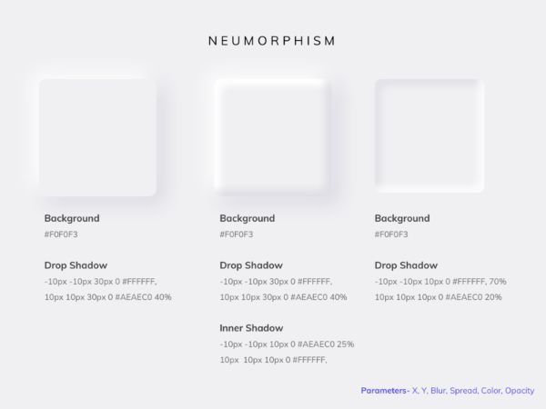
Skeuomorphism gave birth to neumorphism. Designers define Skeuomorphism as the UI design structure that imitates the real world objects which define their function. These design elements function the way their real-world counterparts function. Such design is called Skeuomorphic design. For instance, we use the recycle bin today as an example of Skeuomorphism as it mimics the real world garbage can for us to remove certain things from the system. The concept of Skeuomorphism was used first by Apple to ease out the user interface for the users. Neumorphism is a combination of flat design and Skeuomorphism that combines elements like background colors, gradients and shadows to ensure graphic-intense buttons. This allows the buttons to look more realistic with almost three-dimensional styling.
Neumorphism should not be mistaken as a replacement of flat design; instead, it is an addition to the user interface design. We have compiled this blog about neumorphism to help you better understand the concept.
The appearance of Neumorphic design:
Neumorphism encompasses a very subtle contrast element with solid colors. With the use of the right angle of lighting and shadowing, you achieve the neumorphic design. Neumorphism revolves around the design where you have the UI controls and the background of the same color. This defines how the controls appear to jump off the screen with the right amount of lighting and shadowing. A different variation to this design is that the designer makes the UI controls appear pushed into the background instead of protruding them.
For the controls to look three-dimensional, you cannot merely work with plain white or black backdrop. You need to have some kind of color element to define the shadowing and make the UI elements look as if they are protruded or sucked in. For instance, if you have a plain black background, strategic white lighting on the controls makes them appear as if they are protruding. A specific pop of color at the correct angles can change the entire design of the UI. You can also put to use Neumorphic CSS generator to have an exciting UI design where the controls appear as if they are three-dimensionally embedded in the design.
Many designers add a particular color to the shadow and lighting, which is in tandem with the colors of the brand logo. This makes the design brand-specific.
Applications of Neumorphic Designs:
The neumorphism design has been in the trend, and mobile applications have taken up those designs to design their application interfaces. Let us take a look at some of the designs that have already rolled out.
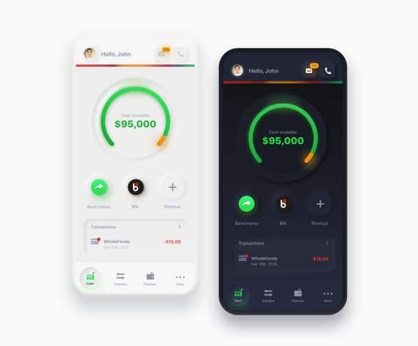
1. Banking Application:
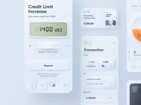
This is a banking application developed by Heartbeat Agency that has adopted the neumorphic design for its user interface. It shows every banking transaction detail that happens within the user and the bank. The user interface has a fascinating design based on neumorphism. This application is in the white background where grey has been used to highlight the shadows which make the elements pop out. A selected control looks pressed in, in the application.
The most exciting feature of the application interface is the scroll to set the credit limit. You can see the + and – symbol on either side of the scroll knob. The scroll knob appears as if it is jutted out of the user interface of the banking application. According to the design concept, they have used strategic lighting to establish the neumorphic design.
2. Music player:
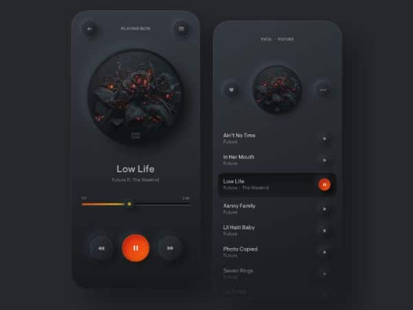
The music player here is a simple one showing the list of the tracks and the track that is currently playing. But the contrasting functional buttons and the seeking bar is worth taking a glance. This is one of the best examples of the neumorphic design concept. With the application entirely in black, you can spot the contrasting yellows and orange easily.
The track image on the top of the music player also features a three-dimensional design that is visually attractive. With the rounded elements, the interface looks interesting. The song that is playing appears selected with a black background. With orange as the background of the pressed button, it is easy to spot the pause button.
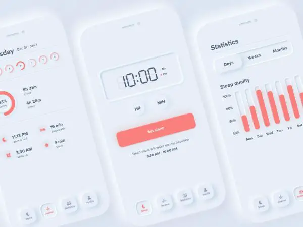
3. Fitness App:
A fitness app is loved by all fitness enthusiasts, especially if the application’s user interface is appealing. Every user likes an animated interface along with a three-dimensional appearance. This fitness app has adopted the neumorphic design concept that looks interactive, as well as appears as if the controls are protruded. Take a look at it.
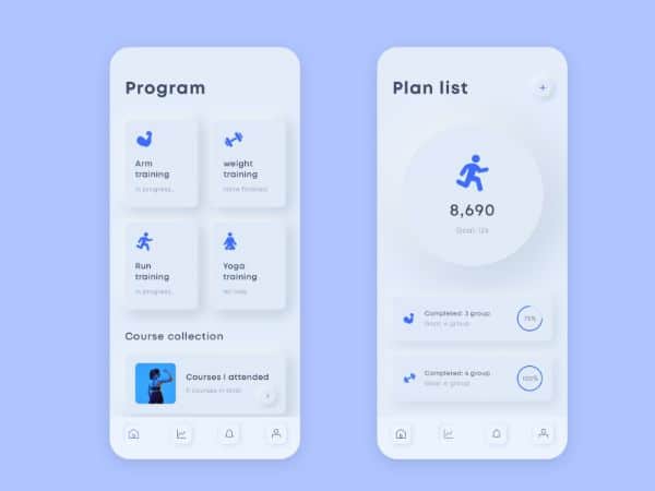
The application is designed entirely in white background with interesting user interface components. The running goal of the user appears in a round element that looks like a crater. The pressed or the selected button control seems to be sucked in the parent element of the application, which differentiates it from the UI’s other components. The design is neumorphic, but not all the items have rounded edges around them.
4. Smart home app:
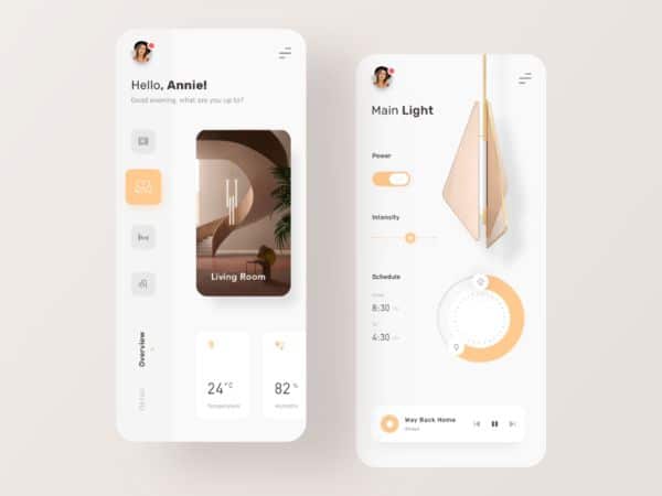
With a neumorphic design, this smart home application is attractive and visually appealing to the user. The app offers insight into the lighting controls of the selected room and allows you to control it smartly. The application design is entirely in white with orange as the color for the controls in use. With shadows for the user interface elements, the design gives the onlooker a feel of three-dimensional designs. The scroll bar on the right has smooth interaction to increase and decrease the brightness levels of the selected lighting.
5. Google Analytics Dashboard:
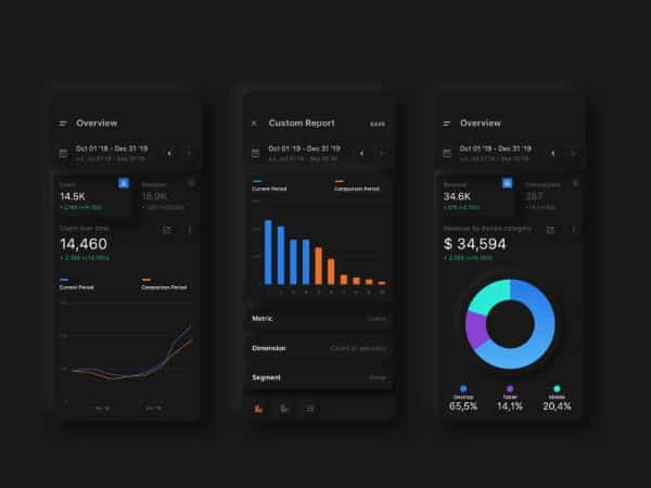
This dashboard’s UI design defines the concept of the neumorphism by having a dark theme for the application. The application is a dashboard that shows the Google Analytics data in a dark themed user interface design.
The first screen of the dashboard called Overview has an element that pops up to display the users visited. With the Metric, Dimension, and Segment popping up from the screen, it quickly attracts the onlooker. The last screen, again called Overview screen, has a revenue display element that has popped up at the top. This lets you see the revenue generated the first thing when you open this screen.
6. Shades of grey:
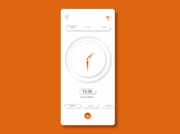
Shades of grey is a clock design application that lets you check the time and the date on your mobile device. It features a nicely-designed clock on the interface of the application. If you take a careful look, you can see that the month “January” is highlighted on the top left corner of the application. On the left bottom, you can find the highlighted day of the week. Also, the app highlights the +button at the bottom. You can click the button to add an alarm according to your preferences. The arms of the clock appear in orange along with the settings button. It is a very minimalistic yet an exciting user interface design.
Design differences between Material Design and Neumorphism:
There are specific design differences between Material design and neumorphic design. Let us take a look at each of them according to selected factors.
1. Shadows:
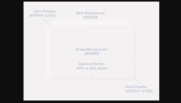
Elements in Material design can have single or multiple shadows around the controls of the User interface design. But, in a neumorphic design, the elements have only two shadows: a light and a dark shadow.
2. Background colors:
In material design, the background color of the element can differ from the parent element’s background color. But in neumorphic design, the background colors must be similar to the parent elements’ background colors.
3. Edges:
The elements can be rounded or square-edged in the material design, but the rounded edges identify the neumorphic design.
4. Borders:
Using borders in Material design can make the controls look like they are afloat above the user interface screen. With the neumorphic design, you can have subtle borders that are optional, which can improve the contrast levels and make the edges appear a bit sharper.
We established the fact that neumorphism is a combination of minimalistic design and skeuomorphic design. If we can trace back the skeuomorphic design from old designs, and think of today’s minimalistic design, we can conclude that neumorphism lies somewhere in the middle.
Useful tips to keep in mind while designing Neumorphic interfaces:
While neumorphism may be the latest trend, there are specific tips to keep in mind while designing a neumorphic interface. Let us take a look at them.
1. Use neumorphism sparingly:
The highlighted user interface elements look attractive only when the design is used sparingly. While defining the lighting strategy for each component, it is reasonable to get overwhelmed with the design and clutter the interface with lighting and gradients. Hence, the lighting factor should be defined according to the hierarchy of the elements of UI.
2. Choose illustrations over pictures:
Neumorphism is a design concept in trend because it offers a three-dimensional look to the user interface. You have to design the interface from scratch instead of clicking a picture and using it to design the interface. You can use the design interface to create an illusion that the User Interface’s appearance is three-dimensional. But clicking a photograph and using it to design the interface can destroy that illusion.
3. Enhance accessibility:
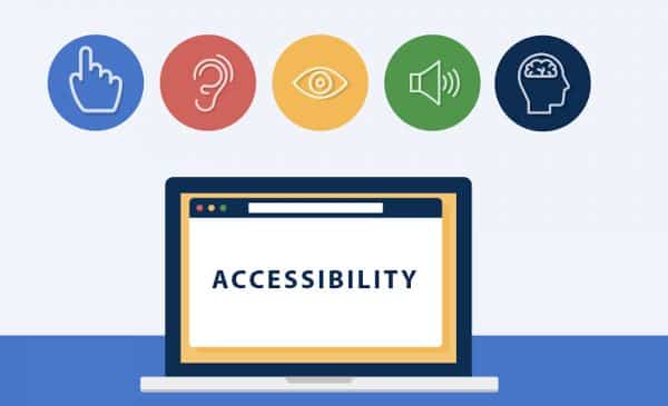
Your neumorphic design should enhance the accessibility of the controls on the user interface. Moreover, you can improve the usability by introducing animation in the design. For instance, you can add animation when the mouse hovers over a button to signify the placement of a button on the interface. Hence, introducing animation to describe the functionality of the elements can help you create interactive designs.
The merits and demerits of Neumorphic designs:
The bright side of the neumorphic design is that the design is fresh in the representation of the user interface design domain. It brings out a new visual style and sharp sophisticated visual graphics.
The wrong side of the neumorphism is, you get limited access to the colors that you can use to feed the contrast between the background and the shadow element. You fail to deliver the correct neumorphic design if there is the slightest error in the design’s color saturation. It can quickly destroy the entire interface without an overhaul.
Another downside of the design concept is the buttons. If you don’t introduce the proper button animation effects, the user may reject the design in its entirety. For instance, you have to have a distinct animation that differentiates a button on mouse click, mouse hover, and in the absence of either. The change in the color or the animation should be clear enough to communicate the user the state of the button or the user interfaces control.
The accessibility issue is another issue that comes with a neumorphic design. A user interface that employs neumorphic design works fine with normal users. When it comes to visually impaired users, the design is unusable because important things may vanish in the background. Moreover, individual users need a high level of contrast to differentiate between the elements. The UI is too soft, and the shade differences are very minute. In such a case, users with poor quality screens may not be able to differentiate between the design elements.
Conclusion:
Neeumorphic designs have ushered in a new era in the field of user interface design. Though it is a blend between the Skeuomorphism and minimalism, it offers an unmatched experience to the user. The blog covers the significant aspects of the neumorphic designs, its advantages, and its drawbacks. It is enough to make someone understand the elements on which the neumorphism concepts function. As it is an emerging trend, we should experiment with the direction and explore the fresh perspective it has to offer. The designers can play with the designs to see the outcomes and let the users say if the designs are feasible and viable for real implementation.