Line25 is reader supported. At no cost to you a commission from sponsors may be earned when a purchase is made via links on the site. Learn more
Twitter profiles have gone through some big changes over the years, with the latest layouts offering a fair few customisation options. In this post we’ll take a look at some of the options that are available to us and see what kind of clever tricks people are using to create really cool profile designs.
Twitter avatar / photo / profile image
The first step any new tweeter should take is to upload a photo (or logo). This is by far the most important aspect of customising your profile, after all, your photo is the only element of your profile that other users actually see in their stream. It’s what identifies you as a person (or company), so make sure you choose something individual or unique, like a mugshot or logo, rather than a random image.
Clever Twitter photo tricks
Transparent PNGs

The transparent PNG is especially handy if you’re using your logo as a Twitter photo, export your image as a PNG file with transparency to free it from any boundaries. When your tweets appear in a user’s stream your logo will adopt whatever background colour is used in their Twitter app.
Animated GIFs?
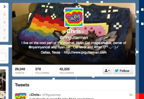
Not any more! As of September 2012 Twitter banned the use of animated GIF avatars. All existing animated GIF avatars will be left as they are, but it’s no longer possible to upload a new one.
Things to keep in mind
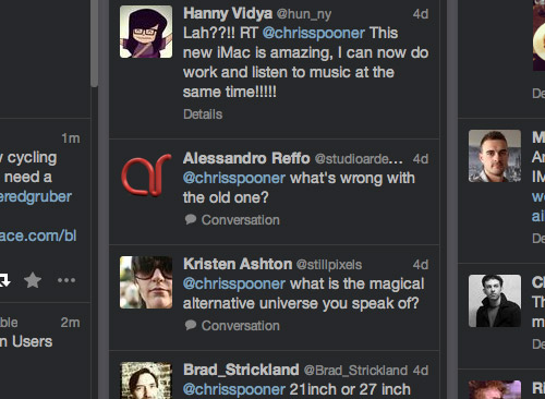
As with any avatar, remember to crop the image close enough to see your facial features. If you’re making use of the transparent PNG trick, remember that some Twitter apps use a dark background which might leave your logo illegible.
Twitter backgrounds
For years the humble Twitter background was the only canvas available for Twitter users wanting to express their individuality. Twitter has always allowed an image to be uploaded, which could either be tiled or left anchored to the top left corner of the screen. Designers would have to fade out their image to a solid colour so it blended seamlessly into the page background colour to avoid hard edges on larger screens. Today Twitter has given us a few more options when it comes to backgrounds. Firstly we have the option of a left, center or right aligned image, which gives the designer more freedom and use of white space beyond the edges of the main content area. Secondly, Twitter now allows the colour of the translucent background of the main content area to be set to either black or white to better blend with the tones of your design.
Clever Twitter background tricks
Sidebars
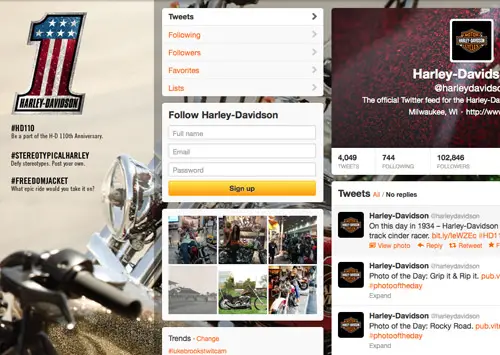
The sidebar effect was a clever idea developed way back when Twitter was in its infancy. Add additional info about yourself such as a larger photo, a short bio and your website URLs in a narrow columns to the left of your background image to give your profile a professional touch. This trick worked a little better back when Twitter’s layout was much narrower. These days the width of the content area doesn’t leave much space to play with on smaller resolutions.
Aligned headers & backgrounds
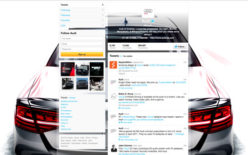
The combination of a background and header can result in a really cool profile design. Use a section of your background as your profile header to create a transparent effect. Audi’s official Twitter profile is a great example of this trick.
Things to keep in mind
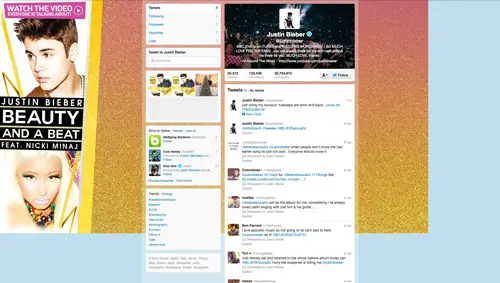
Remember that backgrounds will look different on various monitor resolutions. Fade your image to a solid colour so you don’t see hard edges on large screens and don’t make your “sidebar” design too wide otherwise the content will be lost on smaller screens.
Twitter headers
The header is Twitter’s latest addition to profile layouts, much like the cover photo adopted by Facebook. A user’s photo, name, bio and URL will be displayed in a 520x260px area which can be styled with a background image of your choice. If no background is selected, Twitter will use their default black fabric pattern. Despite being a moderate 520x260px in dimensions when viewed on the web and most Twitter apps, Twitter actually requires a header image of 1252x626px. My guess is this caters for tablet versions of profile layouts which will use a full screen header in place of the page background.
Clever Twitter header tricks
Aligned headers & photos
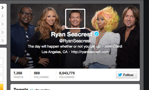
Just like the alignment of the header and the Twitter background, some users are creating cool effects by using the same images for their header and Twitter photo. Ryan Seacrest’s profile is a great example, he uses a group photo as his header and has a profile photo that aligns perfectly to place his head back on his shoulders.
Things to keep in mind
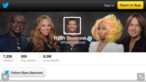
Remember that your Twitter header will have white text overlaid on top of it, so make sure the image itself is dark enough and doesn’t contain too much detail that would leave the text illegible. Twitter automatically adds a black gradient to header images to remedy this legibility issue but it can look dirty on some colour schemes.
If you’re making use of the alignment trick, remember that due to the different sizes of the Twitter header on various apps the alignment of your photo won’t always work.

Very helpful tutorial. Thank you
Thank you for this great design tutorial!
Ack. Transparent PNGs no longer seem to be working…unless they were uploaded some time ago. :(
Can you confirm this?
Thanks for the great tips. My profile is in need of an update. I'll bookmark this page.
Thanks for such good update
Thanks for such good update, I notice it little latter, will use my twitter background for my landing page design from https://www.semanticlp.com/
Great article! I'm in the midst of company name change — would love some feedback on my profile page: https://twitter.com/7thengine
Some really useful tips there chris thank you
These are awesome ideas and examples you have here I actually have my own custom twitter background too, you can take a look if you like.. https://twitter.com/developdotcom I haven't had time yet to do my twitter header, but I will be designing that to soon. Cheers for the helpful article, keep it up.
Thank you for the tips. I've been doing it a little since twitter's new layout came out. https://twitter.com/Naironic
Thanks for this share, great idea to suggest to our clients!
Thank you so much for the Twitter background and header tricks. Your article shows how much thought you've put into creating visually stunning images that engage your twitter following. I can't wait to try them out with our clients.