Line25 is reader supported. At no cost to you a commission from sponsors may be earned when a purchase is made via links on the site. Learn more
Let’s face it; any of us wants to have cool website designs that are going to get the attention of people. Combining the right design elements is crucial for the success of a website. If you ask all of your friends, at least half of them will say that the design of a site plays an important role in the credibility of a company.
This means it also influences conversions, bounce rates, and more. Still, a good design doesn’t mean a website is going to succeed, that is not enough. It also needs a clear structure that is going to make any user visiting it has no kind of problems while browsing.
Usually, a website user decides in the first seconds of use if he or she is going to stay on the site or not. So there is not that much time to convince users to stay. A strong appearance is important to get attention. The best thing to do is to make the page look good. It needs to make users want to stay and explore the website.
Best tips for developing cool website designs
Simple is always good
Google has done a great study that brought a lot of valuable information regarding website designs. The study shows that visitors don’t like a visually complex website. This sounds a bit strange because you would expect a better-looking page with website animation effects to be more appreciated. However, the reality is that it is not.
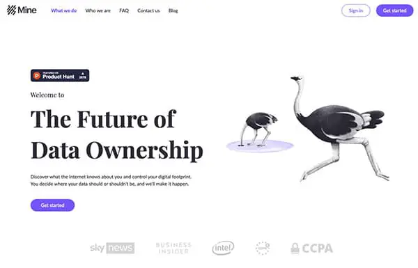
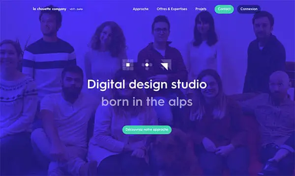
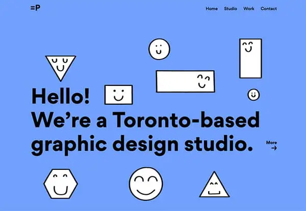
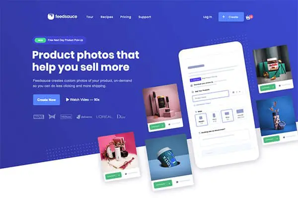
Let’s take the websites of these Berlin startups as an example. Notice that a large percentage of them don’t mess around with complicated graphics. They use a simple and efficient design that gets the point across quite fast.
The homepage needs to be minimalist
Most of us probably have never read all the words that you can see on a website. We scan pages till we get what we need. As this is the behavior that all of us have, shouldn’t it be a principle for any website from a design perspective?
The less a user has to read, click, or type on a website, the faster they will be able to evaluate the information in front of them. Make it simple, and people will love it.
Fonts
Cool website designs always go for fonts that are not hard to read. You need to make sure that the text is properly aligned and formatted. This will help the reader understand the information effectively.
The navigation on your website is not a place to try things. Keep it very clear and simple as visitors will appreciate this a lot.
Besides that, good navigation also helps search engines rank your content higher. So you increase your chances of being spotted by more users.
Visual hierarchy
This is a term that you are going to see quite often in the web design world. Developers know that cool website designs pay attention to all elements. This includes the position of images, icons, the contrast of colors, and white space.
Making sure that all these small details are well-balanced means that the page is going to look great.
Compartmentalize the designs
Grids are most of the time used for balance reasons. They just horizontal and vertical rules that help in creating a design. The well-known rule of thirds brings a nice feel to any design and gets the attention of users towards it.
Start using images and illustrations
If you don’t have your professional photos you can take advantage of stock photos. There are always solutions, and all you need to do is look for them. Depending on how the website is being done sometimes for sure, having your photos is going to play an important role.
Beware of the Fold
Another essential tip that you should note down is this one. The fold is the first glimpse of your website until a visitor explores too much. It can be one of the most important parts of your entire website design.
Make sure that your headline and any relevant call to action is going to be in this sector. This is because when you start using it, many clicks are going to be generated. This is why you need to make it count.
Use pictures with people
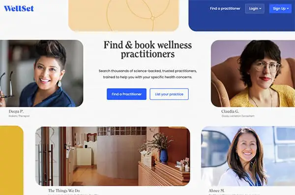
People like people, no matter what. This is why this kind of picture is quite powerful and they can be of use for any website. Any cool website designs that you are going to find are going also to include this type of picture.
Place Ads Elegantly (or just don’t place any ads)
If you don’t sell products or services, the best way to make money if by using CPC. However, it would be best if you were careful with the design of your website. You don’t want to clog your pages with random ads that look bad. Remember, the more ads you have that are placed in bad spots, the more you risk that users are not going to return to your website.
Mobile Optimization
We all know it, more and more people use their phones for browsing websites. But let’s also look at the numbers. More than 81% of internet users have a smartphone, and according to some data from Google, 61% of users don’t return to mobile sites that are hard to access. Pay attention to this; you don’t want to lose visitors.
Load Speed
As we live in a world that is on a speed rush, it’s good to pay attention to time. The loading speed of your website needs to be fast. Users don’t stay more than a few seconds on your site, and if it doesn’t load in the first one or two, they are going to live.
That being said, do some improvements to your site. Enable caching, set some expires headers, use Gzip, disable comments (if you’re using WordPress) and a lot of useless JS plugins that come with the theme by default, change your hosting, and read the many guides that are online to help you improve your Page Speed Insights score.
Contact
Make sure that the contacting information is easy to access by any people that are checking your website. The best place to add this is usually in the footer of every page. Visitors need to reach you fast so take notice of this.
But even better than this is if you’re using a meeting/appointment web app. If your site is on WordPress you can set up a booking system quite easily with a plugin. If you’re on a tight budget and/or you don’t have WordPress, you can try some open source options.
Improve
Even if you have your website done, you can still improve it in the future. Cool website designs always change from time to time. This is because feedback appears, and specific updates are going to be needed. It’s one thing to create the website in your mind; it’s another one to see how people react to it.
So, you will find yourself in the future changing the layout, the color palette, the fonts you are using on the page, as well as various interactions that the users have with your site.
Conclusion
In conclusion, cool website designs have many elements in common. They are not too complex and focus a lot on simplicity and smart functions. Use all the tips above to make your website a cool one. Ready to get started?
