Line25 is reader supported. At no cost to you a commission from sponsors may be earned when a purchase is made via links on the site. Learn more
The landing page of your website is the most important page by far. If you were to study the traffic statistics of virtually any website, you’d notice that the landing page gets more traffic than any other page, as it is usually the first page associated with any website. Therefore, it has to make a strong impact on the viewer by presenting everything in a clear and aesthetically pleasing way. There are some basic rules that you must follow in order for your landing page to achieve a high conversion, and we have gathered many great examples and templates for you to use on your own website.
This article features 40 app landing pages with high conversion designs that will help you get started on the right path. These app landing pages work on a variety of devices and come packed with great and useful features like Twitter Bootstrap 3.2.0, CSS3 and HTML5 code, responsive layouts, working contact forms, and font awesome icons. Some of these app landing pages also come with PHP and PSD files (for contact forms and mobile mockups) and full documentation HTML. So take a look and let us know in the comment section below which apps you found to be the most useful.
Treauu
There are some basic rules that you must follow for a landing page to achieve a high conversion. First of all, having a unique selling proposition is crucial! This landing page is pretty straightforward and uses the high-quality images to attract the visitors’ attention.
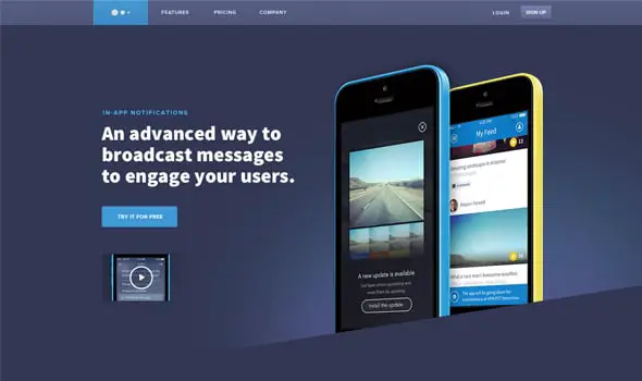
Ui In App Notification Homepage Design
Having an image or video showing the context of use is also an important aspect of a successful landing page. Here’s an example that illustrates this.
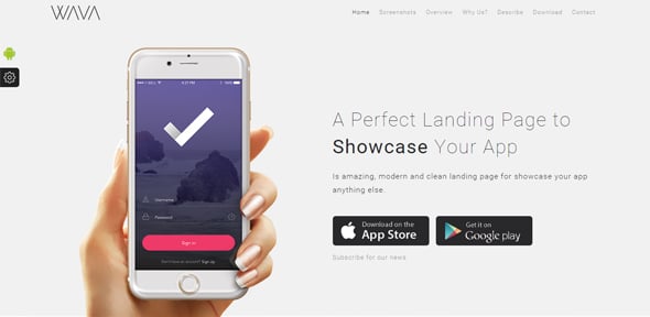
Wava App Landing Page
WAVA is a mobile app showcase for iPhone and Android, built with Twitter Bootstrap 3.2.0, CSS3 and HTML5 code. It is well organized and very easy to customize, perfect for presenting your startup mobile app website.
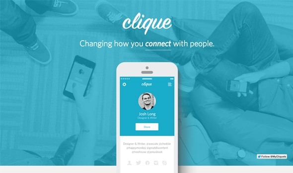
Clique
Showing a list of benefits and proof (proving to the viewer that what you propose is true, such as a customer testimonial) on a landing page are two other attributes any good LP should have.
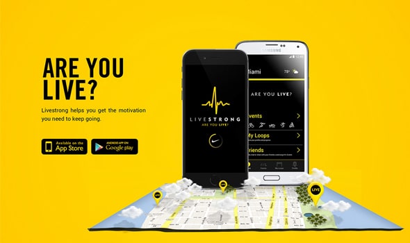
Livestrong // Are You Live?
Livestrong is an inspirational brand and a leader in the fight against cancer. This is their landing page for their app, which has the purpose of inspiring others to appreciate life regardless of their connection to cancer.
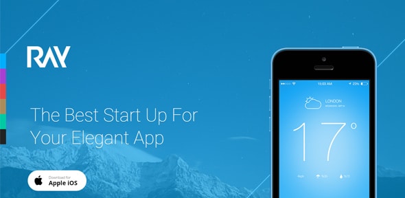
Ray – App Landing Page
This simple landing page has some elegant objects and background’s animations and an overall neat execution with great attention to details. This template can be used for any kind of app.
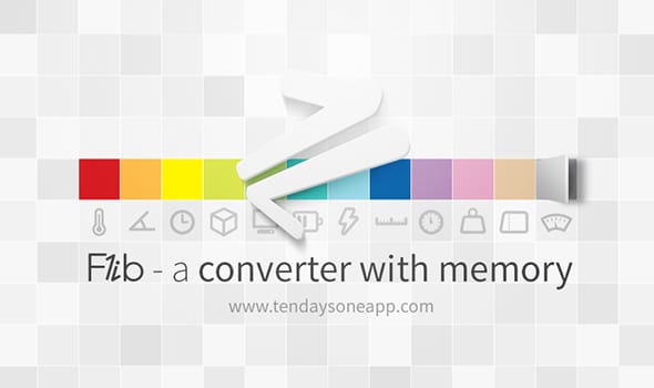
Flib – A converter with memory
This is the landing page design for Flib – the first converter app that embraces a flat design style. It provides a frictionless user experience and has some really inspiring details worth checking out.
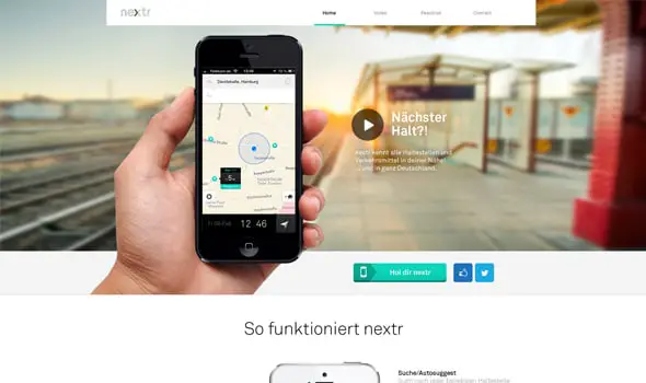
Nextr app landing page
A good landing page should have a single conversion goal – the call-to-action. Take this for example, the goal is to download the app!
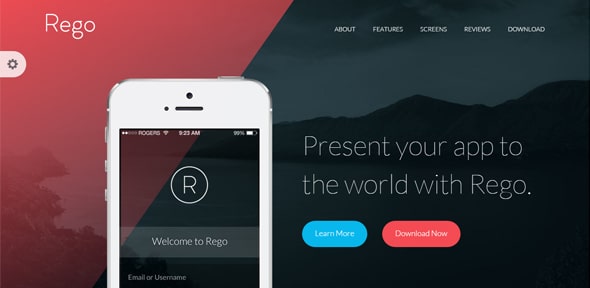
Rego – App Landing Page
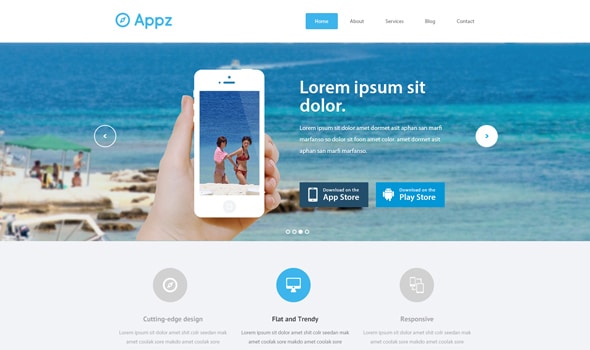
This is a modern, clean and responsive one page HTML template. You can use Rego to showcase your mobile application for iPhone, Android or other mobile devices.
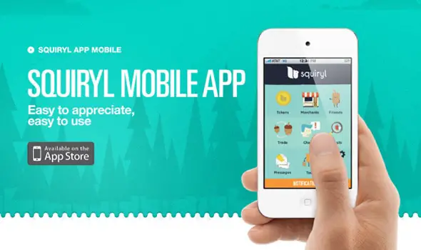
Squiryl Social Loyalty on your mobile phone
On an effective landing page design, you have to clearly explain what it is that you’re offering in exchange for someone’s personal information, in writing and through images and videos, explain what the benefits would be, provide social proof that what you’re offering will truly have benefits, and then prompt the visitor to do whatever it is that you want to accomplish (download something, fill out a form, or make a purchase.). This is a great example of a landing page for a mobile app that does just that.
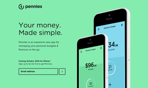
Pennies for iPhone
This is a flat, colorful launching soon page for finance app called ‘Pennies’. It features crisp devices and screenshots.
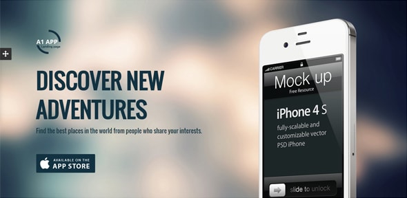
A1 App Landing Page
This is a fully responsive landing page template with five color schemes and an animated app showcase. It’s also integrated with Google Fonts, you can add parallax effects easily, and more.
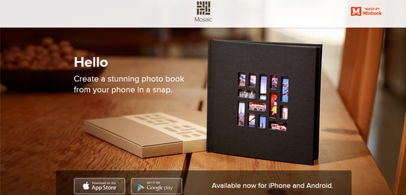
Mosaic
The call-to-action is the most important point of a landing page design, and thus should be the main target as it is critical to a pages’ conversion goal. Here’s an example of an effective CTA which invites the visitors to download the app from either Google Play or App Store.
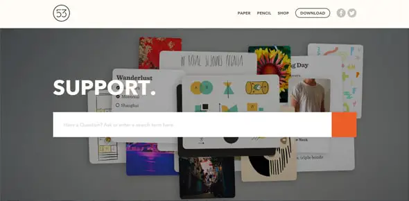
FiftyThree | Support website
The call-to-action is the one thing that the site visitors will actually be able to interact with, and it will determine what the conversion rate will actually be. The way it’s presented is up to you, but it must redirect the visitor to a page where they can share their information with you and thus increase the conversion of your website. In this case, the CTA is a search action.
Mobile App Landing Page
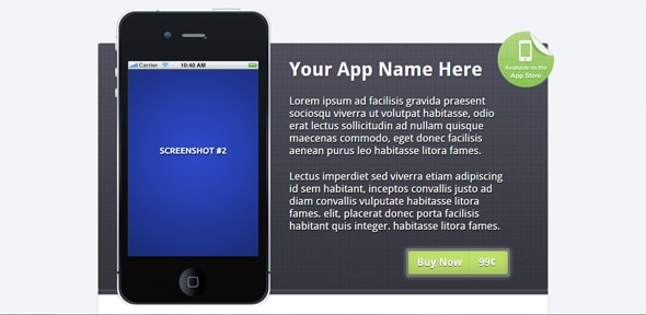
This is a single screen landing page template with support for iPhone, Android and Windows Phone Devices. It has feature lists, rotating screenshots, and multiple links.
Landing page mockup
In order to achieve a high conversion and meet all of the requirements of a successful landing page, you need a powerful design. The example below shows you how a landing page for an app should look like.
SHADOW
This is a unique example of a fully responsive and feature-rich, well organized clean design. It uncovers a whole story as you scroll through the page.
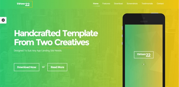
Thirteen22 – App Landing Page
Thirteen22 is a responsive HTML5 / CSS3 app landing page template based on Bootstrap 3.2.0 and the jQuery 1.11.0 framework.
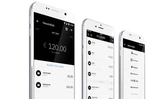
Centralway Numbrs
This landing page design doesn’t have the CTA right above the fold, instead it lets you scroll down, read the most important features of the app and then prompts you with the CTA.
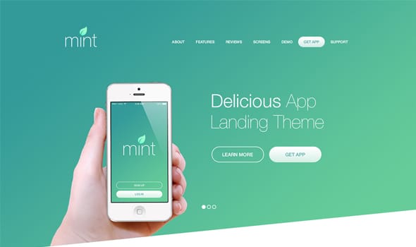
Delicious App Landing WordPress Theme
This app design landing page comes as a WordPress theme and it has 3 pre-made color palettes for you to choose from. It has a beautiful sleek design worth taking a look at.
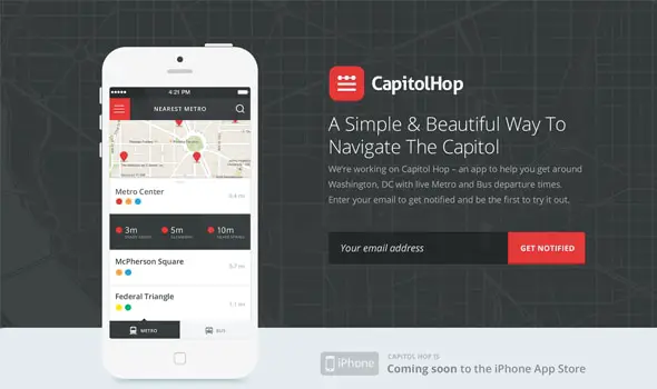
Capitol Hop Landing Page
This basic app landing page design uses red as an accent color. The CTA is not downloading the app, but instead subscribing to the newsletter to be notified when the app will be available.
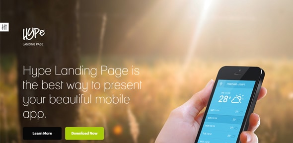
Hype – App Landing Page
This is a modern, responsive, retina ready, landing page for mobile apps. It wworks great on smartphones, tablets, laptops and even big monitors.
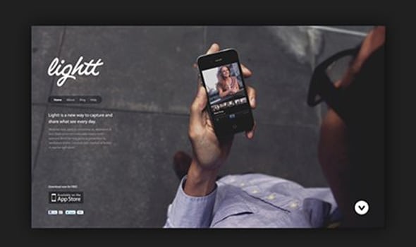
Lightt app
This design has a simple, fluid interface, looks best on retina displays and it has a straightforward CTA – downloading the app from the App Store.
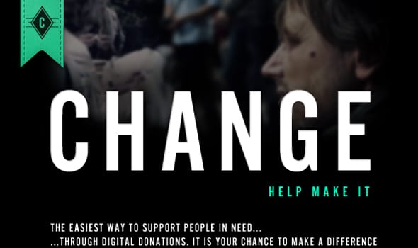
Change – Help Make It
Here’s another great landing page, this time with a dark-themed color palette. This LP makes you scroll down to get to the information which is presented in different sections of the page.
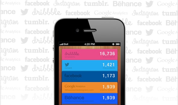
Web stats app
This is just a concept design. This concept will not be developed for now, but the concept page on Behance is a great source of inspiration.
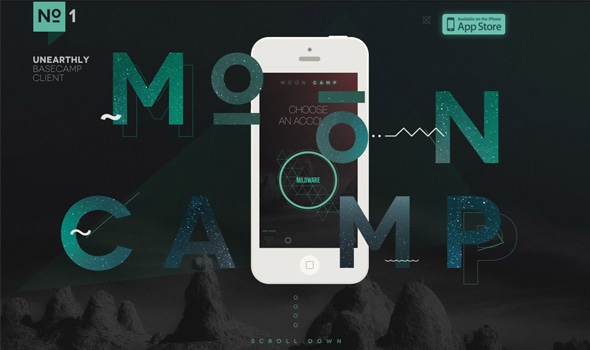
Mooncamp
This iPhone app One Pager for ‘Mooncamp’ has a dark grey and green color scheme and some beautiful infographics and moving elements that animate as you scroll down.
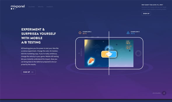
New Landing page design for Mixpanel
This is the new landing page design created for Mixpanel. It successfully combines subtle animations, with gorgeous vector illustrations and a deep purple color palette.
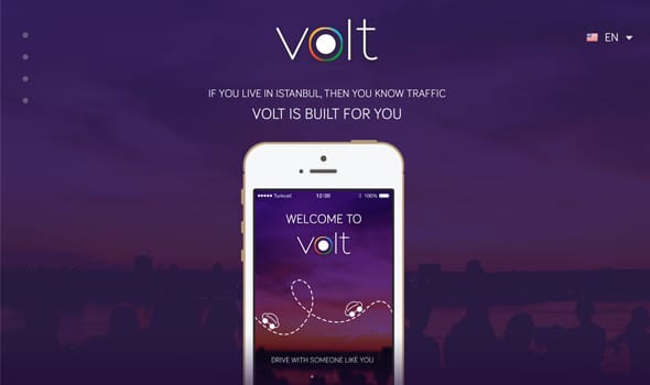
Volt Web
Here’s another deep purple color palette, this time for the app called Volt. It’s vertically oriented and has a sleek navigation system plus multiple languages selection.
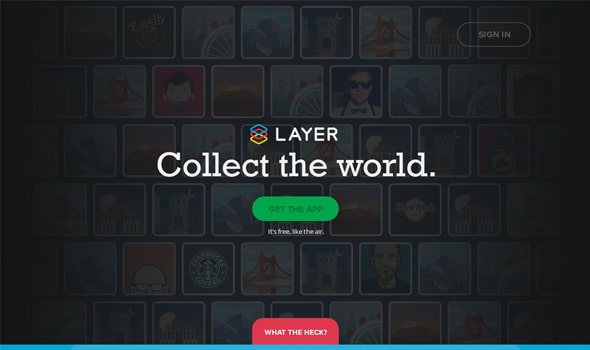
Layer (Concept)
It can’t get any easier than this! The CTA is a large green button with a straightforward message to get the app and underneath it is the assurance that it’s free, just like the air! Fun and effective.
GMC Like
This is the landing page design for a trading community – a place where you can open your mind for business.
Qemaki – App Landing Page
Qemaki is a one page Muse template with parallax scrolling, Font Awesome icons, and other great features. You can use it for app showcases, corporate, agency, portfolio, and your personal resume websites.
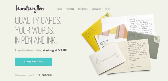
Unique Web Design, Handwrytten
This is a lovely, elegant landing page design with a great selection of fonts. It has a simple CTA right above the fold, which invites the visitor to start writing or create an account.
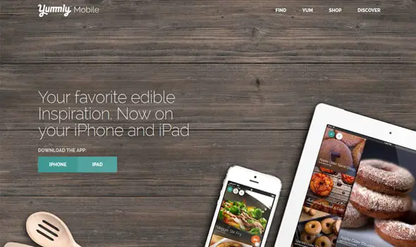
Yumml Mobile
This is a tasty website design for the app Yumml, a food/recipes app. This CTA doesn’t use the obvious Google Play and App Stor buttons, but insted it opted for a customized version. We like it!
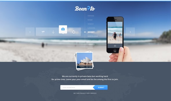
Travelling Wip
This horizontally oriented landing page design was created for a travel app. We love the transparent elements, blurred images and overall color palette which makes you think about your next vacation.
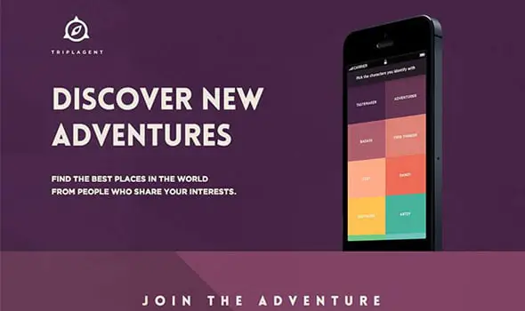
Triplagent
This great design makes perfect use of the flat design trend and uses multiple colors in this one-page LP, from purple, to orange tones and even yellows and blues.
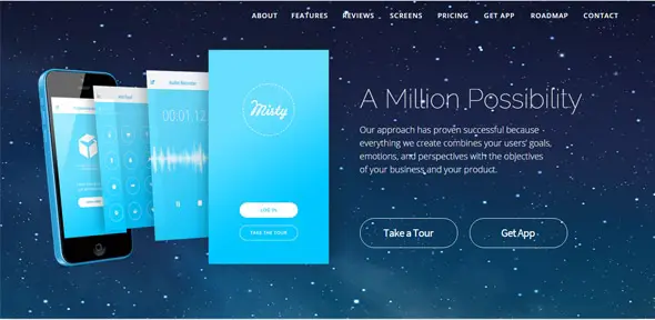
Misty – App Landing Page
This is a one-page Muse template developed and coded with the Muse CC 2014. You can use this template for corporate, agency and portfolio websites and it is fully customizable so you can modify it according to your needs.
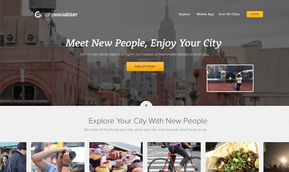
This is a simple landing page design with a large slider right above the fold and a yellow CTA which invites you to either sign up or log in to your account.
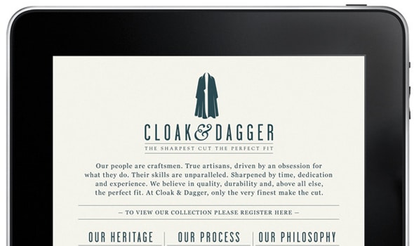
Cloak
Cloak and Dagger: The Sharpest Cut the Perfect Fit is an unusual landing page design with vintage typography and graphic elements and a CTA that blends with the design and invites the visitor to register.
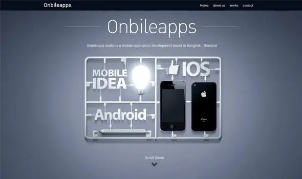
Onbileapps
This is an interesting fullscreen landing page design with an invitation to scroll down the page to find out more.
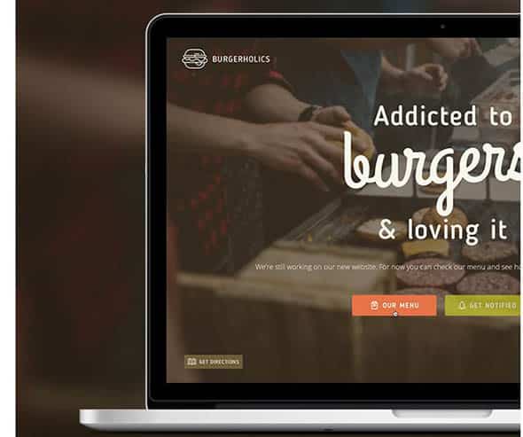
Burgerholic – Ulitmate temporary site template
Burgerholics is a responsive temporary site template built on HTML5 & CSS3 which can be used as a coming soon landing page to catch leads before the big launch.



Comments are closed.