Line25 is reader supported. At no cost to you a commission from sponsors may be earned when a purchase is made via links on the site. Learn more
This post rounds up a showcase of web designs that are all helping make the wood texture cool again. Wood textures in web design aren’t anything new, actually, they were pretty trendy after the days of “web 2.0” until they kind of lost their coolness.
Recently though, we’ve begun to see wood textures make a return in website designs and iPhone and iPad app interfaces. There are many styles, depending on what you are looking for. These websites will definitely inspire your future designs, making things even more professional.
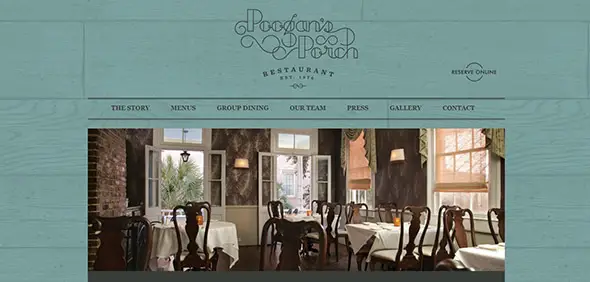
Poogan’s Porch Restaurant
This website uses a teal-colored wooden background which makes the photos and texts really stand out. The site has a friendly atmosphere, perfect for a family restaurant.
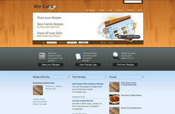
We Eatt
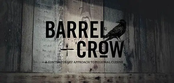
Barrel and crow
This website is a perfect example of how to use wooden backgrounds in modern web design. It also uses another popular trend – large, bold typography on the homepage.
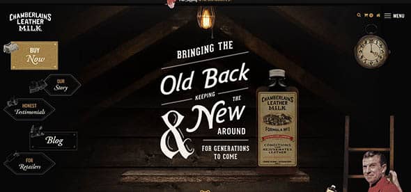
Leathermilk
This retro-themed, dark website design uses subtle wood textures that pair nicely with the vintage style and realistic images.
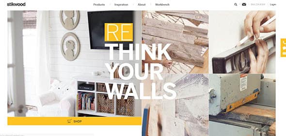
Stikwood
This website doesn’t use wood textures as background, but it has plenty of wood elements in the photos. The slider is perfect for this kind of small online shop.
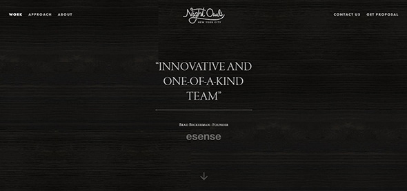
Night Owl Interactive
You could barely tell, but this website has a very dark wood texture as background. The texture is very subtle and looks modern.
Voltage new media
Here’s an example of how to incorporate realistic wood images into your design. This image is perfect to be used as a background.
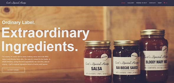
Curts
Here’s another example of how wood photos can be used as backgrounds. This adds a homemade atmosphere to the whole website.
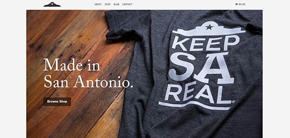
Keepsareal.com
Instead of showcasing their products on a plain white background, this apparel online shop decided to use dark wood textures instead. It looks really good!
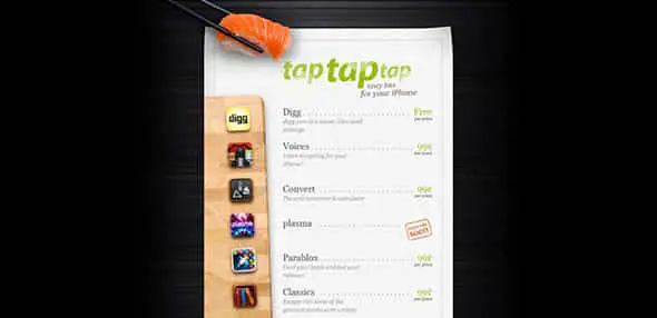
Taptaptap
Here’s a unique way of featuring your social media accounts – use a light wooden background for the icons!
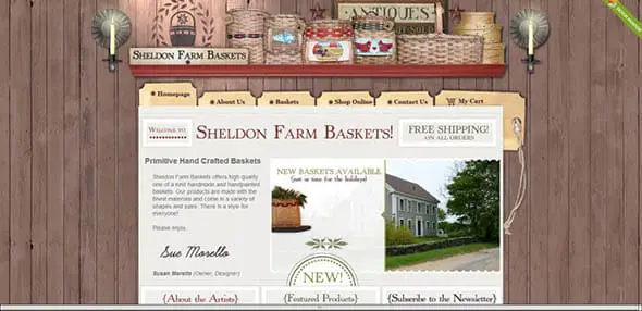
Sheldonfarmbaskets
This website’s theme is “countryside” and it’s perfectly created using old/aged wood textures as backgrounds, plus some realistic, 3D objects.
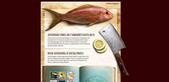
Fishmarketing
This simple website design successfully combines realistic objects, with wood textures.
Domino Box App
This is the presentation website for an app. It combines cardboard textures with wood backgrounds and looks really good, matching the app’s style.

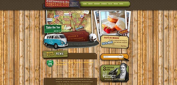
Cottonseedoiltour
This wood background may be too harsh, but it really matches the website’s niche and overall style.
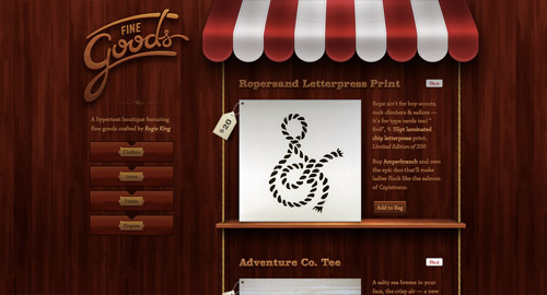
Fine Goods Market
Here’s another great example of how to use dark, wood backgrounds in web design. It also uses realistic 3D images and texts.


This is an awesome list Iggy. A good website design determine the success or failure of a web-site. Since the visitor of the page is the only person who clicks the mouse and therefore decides everything, user-centric design has become a standard approach for successful and profit-oriented web design.
Great collection. Although some of them have changed their designs yet found them very helpful in terms of new designs and textures. Thanks for sharing.
Cool….i just love learning new things, thanks for the good instruction that i have found
here.Great post, I never knew that ,for more information about web Design visit the link given
<a href="https://www.tech4sys.com">web Design</a>
I really enjoy working with wood texture backgrouds. Thank you for sharing these greta designs and layouts. Its refreshing to see the backgrounds being applied so artistically on the websites.
The Bills is cool. Do you know some tutorials on responsive designing in html5?
Hi Chris Nice List :)
2nd One Is Awesome :)
This is really nice :)
What about my site? lol! Some cool sites here!
Thanks for the post. All this looks pretty. Enjoyed the post.
Wooow…..you crazy my eyes….Your work make me dreaming….!!!!!
Thank for sharing…..
These designs are integersting and looking natural and impressive . I have these kind of stuff and many more in this link .
Its a web designing company in toronto.
<a href= "https://www.kinexmedia.ca/">Website design in Toronto</a>
Vector Mill, Domino Box App, Domino Box App have new style in wooden theme
Hipstamatic is a great example of a website using wood textures in an appealing matter. Wood textures, in my opinion, only really lost its edge because of the amount of websites that were designed using wood textures in the exact same manner which made it really boring.
Nice List, you might enjoy this one too. :)
https://www.sno-limit.com/
I think wood texture is always nice and give a website or any graphic piece a certain depth to it. Love the collection you came up with!
Shameless plug here— but I feel we did a good job over at Creative Market: https://creativemarket.com.
Who designed the deweyspizza.com site?
Great collection! Feeling like a want to make a wooden texture website right now.
yeah…it;s really nice to see..having a wooden background..i saw my friend did this..it's cool.God Bless
Nice Post.. !!
Nice collection, i like more Go Glamping because the illustration in the top.
Here is another one that I would love to throw in there that uses wood as its background: https://petewilson.tv
I think that Designer Founders website is the best here, but maybe that's because I was already backing their project over KickStart. Either way, you got yourself a pretty awesome collection Chris! Thanks for sharing.
Great collection! Feeling like a want to make a wooden texture website right now.
Dear God please open up my eyes for beautiful designs like this ! :D
tnx chris!
You do know you just called Chris god right :D ? Cause Chris open up thousands of eyes for design every day ;)
I like Reflective Liquid & Aqua because I love blue color. that’s the best color! isn’t it?!!
Hi Chris, thank you for adding our site.