Line25 is reader supported. At no cost to you a commission from sponsors may be earned when a purchase is made via links on the site. Learn more
The retro theme has exploded in recent years with nostalgic styles becoming popular in fashion, photo, and video. That is why we decided to find some of the most inspiring examples of retro style website designs and share them with you.
In the web design industry, the emergence of the retro or vintage trend has kind of evolved from the “grunge theme”, with designs taking inspiration from a particular era in history.
This post showcases 30 website designs that perfectly execute the retro style, with aged textures, muted colors, and impacting typography. Check them out!
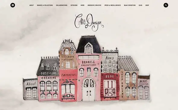
Collette Dinnigan
This is a lovely website design with a handmade feel. It uses hand-drawn images and a lovely font with decorative details and an energetic retro vibe.
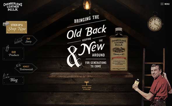
Chamberlain’s Leather Milk
This website uses a lovely vintage script, super dynamic and likely custom. It stands out and makes the website design truly unique.
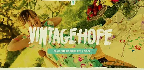
Vintage Hope
The sepia filters make this website look aged and retro. It has a perfect font choice as well and a complementary color palette.
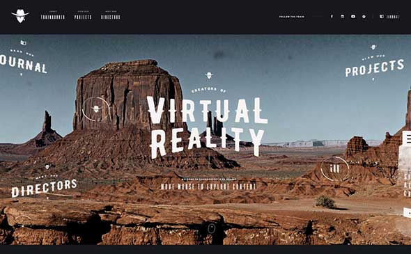
Trainrobber
This country-style piece seems to be straight out of the past and in this case, the Cowboys time. This website is loaded with retro elements.
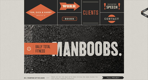
Tom, Dick & Harry Creative Co.
This is the website of an American advertising agency in Chicago, Illinois that creates integrated marketing communications.
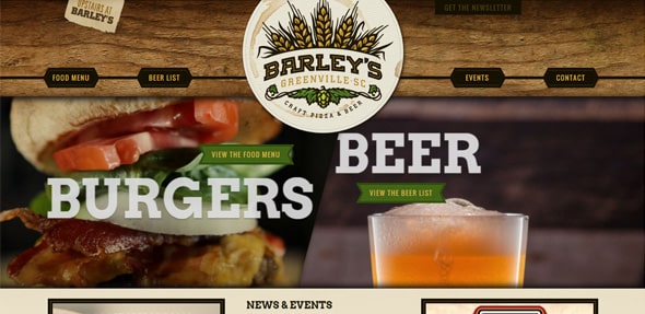
Barleysgville
This restaurant website has beautiful food images, large typography and lots of retro / vintage elements.
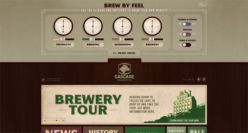
Cascade Brewery Co.
Cascade Brewery is a brewery established in 1832 in South Hobart, Tasmania. This is their vintage-inspired website design.
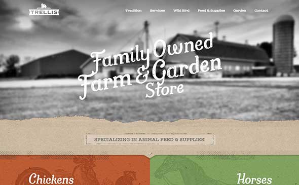
Trellis Farm & Garden
This website design uses black and white photos, old paper textures and a vintage color palette to recreate a vintage atmosphere.
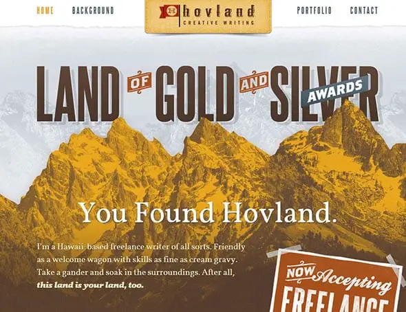
Matt Hovland
Matt Hovland is an audio engineer in Los Angeles, CA with specialties in ADR/VO/Foley recordings. This is his portfolio website with a retro vibe.
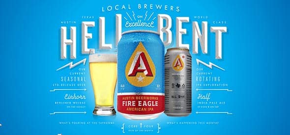
Austin Beerworks
Austin Beerworks is a Texas brewery hell-bent on excellence. Check out their website and get inspired by the bold color choices and large, retro fonts.
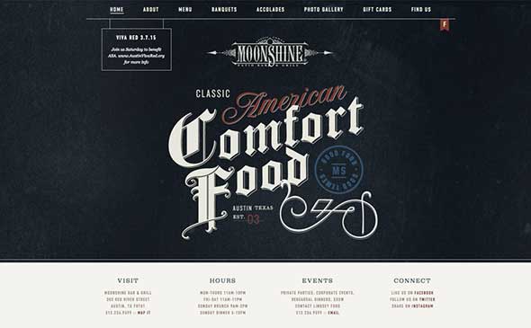
Moonshine Grill
Here is a great font featuring beautiful, retro ligatures. The website also uses great, dark textures, which make the texts stand out.
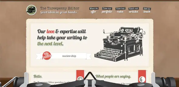
Three penny editor
Looking for a proven book editor to transform your fiction or memoir? This website offers just that. You’ll love the vintage atmosphere given by the carefully design web elements.
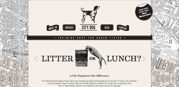
City-dog
The monochrome palette contributes to enhancing the aged style of this website design. It has some retro-inspired web elements as well.
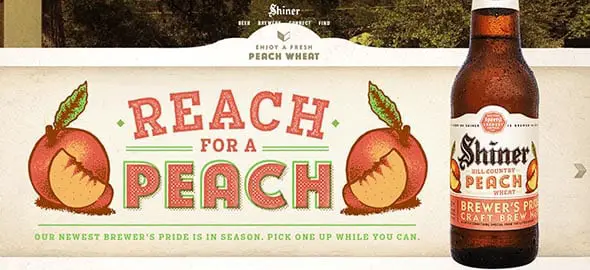
Shiner
This website design features a custom piece of lettering, which is dynamic, like most retro scripts, and has a vibrant, fun look.
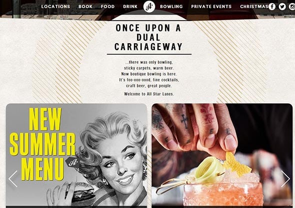
All star lanes
This is the presentation website of a bar with bowling, delicious home-made food, and fun cocktails.
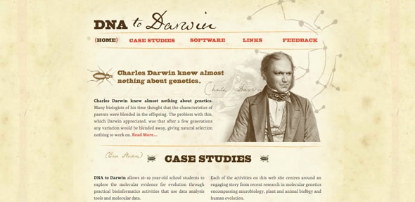
Dna Darwin
DNA to Darwin is an educational project funded by The Wellcome Trust. The website design has a retro touch.
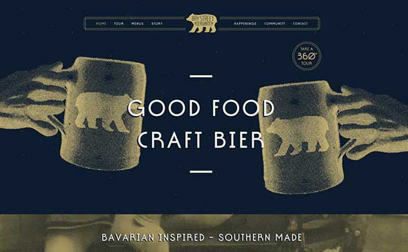
Bay Street Biergarten
This website design opted for a retro vibe, using rounded corners, a limited color palette, and simple illustrations.
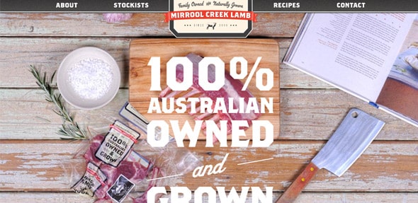
MirroolCreek
Large photography paired with bold, huge fonts, make this website very eye-catching and interesting. Check it out.
Website design for Tallahassee
This whole website has an old school, elegant feel. Even though it uses lots of retro elements, it still looks contemporary and modern.
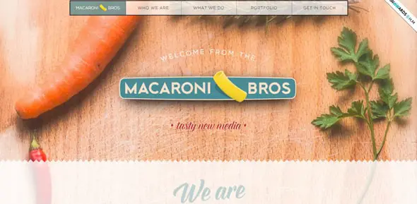
Macaroni Bros
This website uses a retro typography set and a retro color palette. It combines beautiful photography with subtle, aged elements. Check it out!
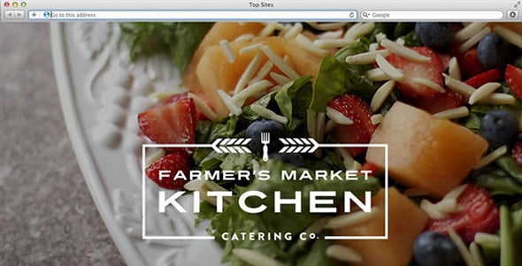
Farmer’s Market Kitchen
The color palette made the designer think of delicious homemade soup on a cold night in New England. The website looks pretty awesome and it’s truly an inspiration for retro styled website designs.
Austin Eastciders
This brand uses an eye-catching white and vintage-inspired type to create an elegant label. The whole website looks retro, but modern in the same time!
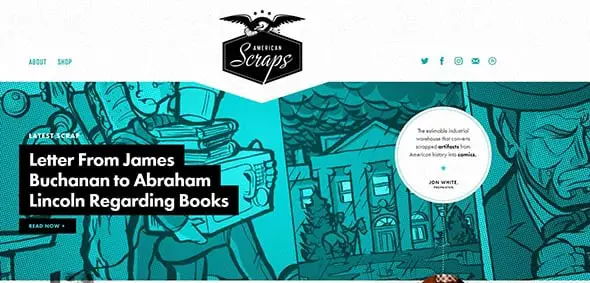
American Scraps
This is the website of an industrial warehouse that converts scrapped artifacts from American history into comics.
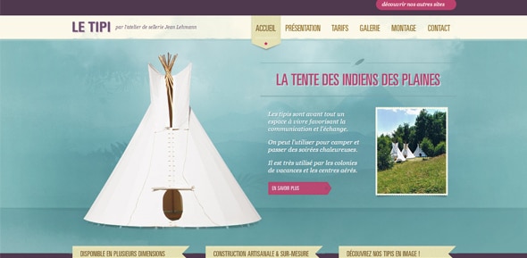
Le tipi
This website has a classical vintage design, with a retro color palette and a clever choice of fonts.
PN
Check out this lovely template that you can quickly insert into your WordPress site. This premium item has a stunning design with neat features.
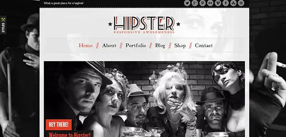
Hipster
This great WordPress theme comes with 3 color variations, a beautiful responsive design that will automatically adapt to any screen size, and other great characteristics.
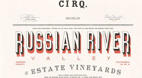
Cirq
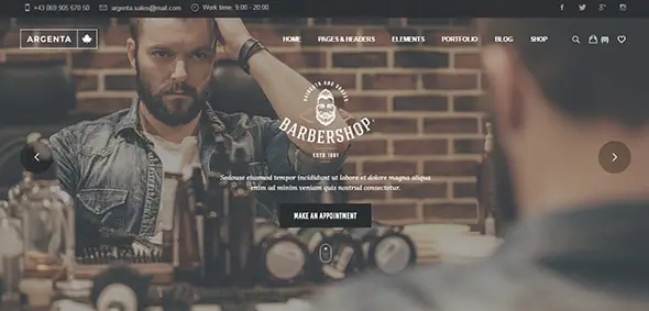
Argenta
Check out this amazing WordPress template and use it to create your next website. This premium theme can be used to build professional multipurpose sites.
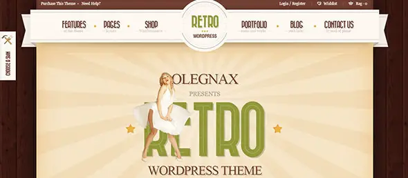
Retro
This is an excellent WordPress template with a vintage design that you can easily customize to meet your requirements.
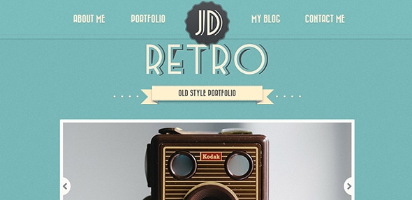
Retro Portfolio
This premium template comes with a fully responsive layout which will automatically readjust to fit any screen size. Enjoy!
I know that everyone is concentrating on modern websites nowadays, but isn’t it nice to see a vintage or retro-looking website design once in a while? If you just love the stuff that “used to be”, or have a client that specifically asked for a design that has a vintage look and feel, use the websites in this list for your vintage inspiration. I even included some pre-built vintage website templates in case you want to use a retro website template that is already made.



What also would be a cool idea is to do a retro site with a theme of the first designs that were available on the net (Aol, compuserve ect) Of course, one would have to incorporate modern elements (mobile friendly modern) – but a “retro -www” could be amazing!
Wow! That’s some impressive designs! Inspiring!
I love love love this style! But it can be a bit of a tough sell to client who are wanting something more status quo.
La Bubly – Sparklin' wine for the sparklin' mind. That's precious. I would say that other than the dark colors, this is my favorite UI and design.
I love these retro styles. Thank you for giving good collection of impressive designs at one place…………
I like your examples. Keep posting such a great article.
I love the Von Dutch site and how they combine retro and responsive web design
Awesome designs!
Very nice! I love that, thanks.
They all looked great, I love all the designs. Thanks for sharing!
great work i love these kind of designs. Can any tell me is their any particular kind of webdesigner for getting website designed in old patterns.
The design for the Barrelhouse Flat site is amazing! It really gives the site an "Old Western Tavern" feel to it.
After reading this blog entry, I think I may give my site a film noir look to it.
Some great stuff here.
We've had a retro-feel from day one, it puts clients at ease especially when dealing with a modern concept like social media they may be scared of. We're very proud of our website http://www.jibbajabbapods.com and our retro feel office too – the Comic book wall is certainly the only one we've seen in London!
Thank you for giving good collection of impressive designs!!!!!!
i like it, i will reuse this idea on my blog soon.
Loving this retro look… Really impressive designs :)
I always enjoy an elegant website with retro elements in it! So thanks for this collection!
I think this style might just be a fleeting thing (only time will tell) but I do enjoy the muted colors and textured pages. When I have an opportunity I might do my personal website in this style
(which will make this post very helpful in the future thank you!)
Awesome designs! Love all of them. Very inspiring, this could help a lot for anyone who would have plan to give some retro styles on their websites. Thanks for posting such a great list.
This is a good collection of Retro designs, thanks for sharing…
Great collection in one place, thx :-)
Love retro sites. This is a good collection of new designs I haven't seen before. Nice choice is designs.
Nice group of sites, Chris. I have to say that Bitfoundry was my favorite.
Great piece, thanks. And for some more inspiration and sources: https://www.retronaut.co/ is outstanding…
I love these retro styles. Probably some of my favorite designs!
Love it!
I am currently re-designing my site in a retro 50's style and these will come in extrememly useful for some much needed inspiration.
Cheers Chris.